A Sneak Peek Inside the Studio of Circle Line Interiors in Dnepropetrovsk, Ukraine
Words by Afrodite Moulatsiotis
Location
Dnepropetrovsk, Ukraine
A Sneak Peek Inside the Studio of Circle Line Interiors in Dnepropetrovsk, Ukraine
Words by Afrodite Moulatsiotis
Dnepropetrovsk, Ukraine
Dnepropetrovsk, Ukraine
Location
Established in 2012, by Kate Kuzmenko, Circle Line Interiors is a young interior design studio based in Dnepropetrovsk, Ukraine, producing beautiful bespoke residential and commercial projects across the country and the rest of Europe. This talented team of designers and architects recently became their own clients for the design and construction of their 140-square-meter studio space which has created a layered, charmingly detailed environment in which to work comfortably and feel inspired.
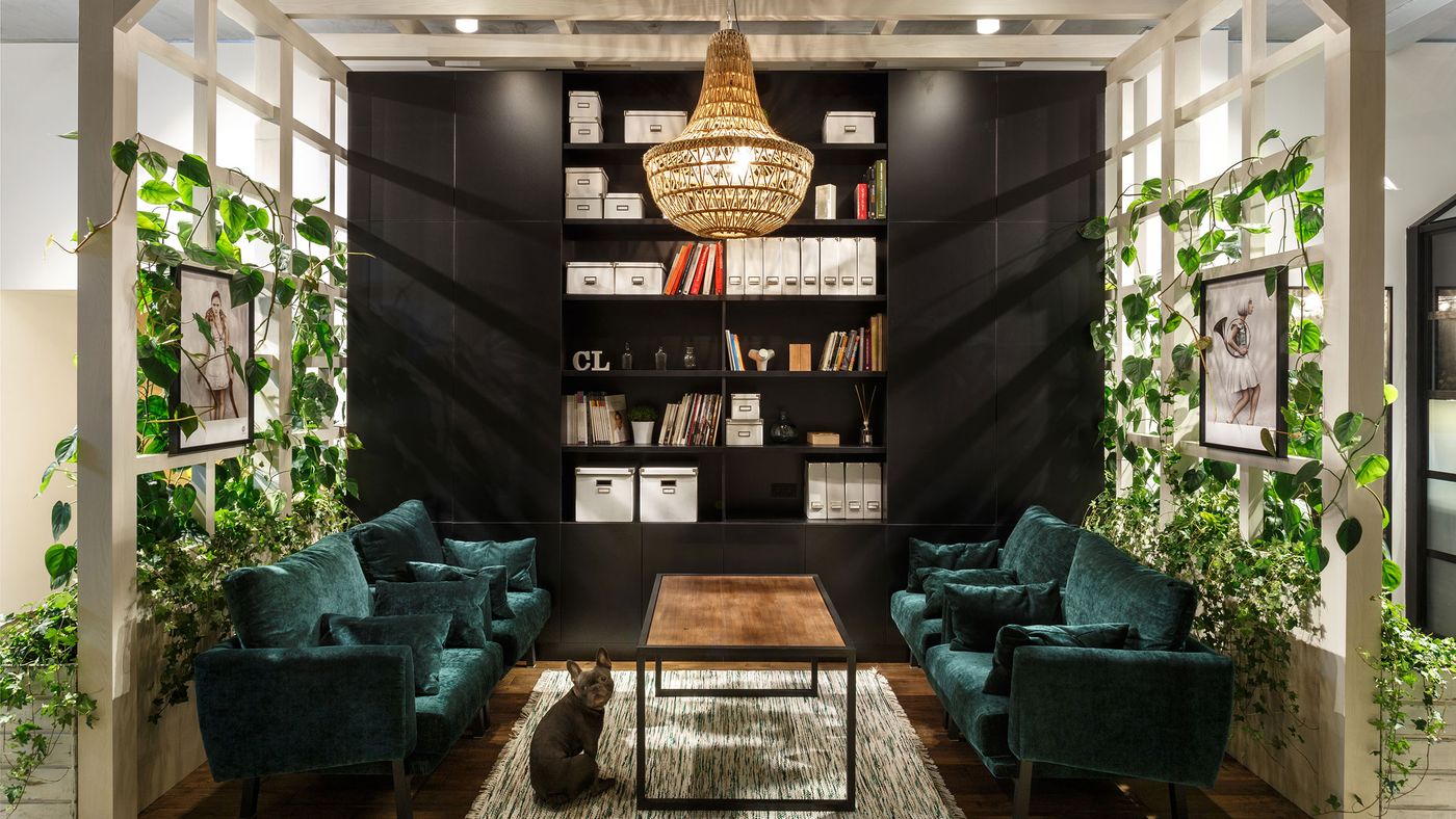
Photo © Circle Line Interiors.
The site’s high ceilings and high-level windows initially posed a challenge in regard to the distribution of natural light solved by the construction of a mezzanine level on the studio’s perimeter, thus raising working desks on the windows’ level and maximising the use of the site’s sparing volume. A continuous, communal worktable wraps around the mezzanine abutting these windows was then added, allowing the designers and architects to look out over the rooflines of the surrounding neighbourhood.
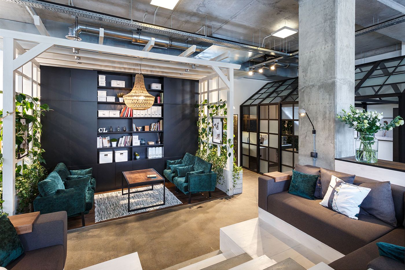
Photo © Circle Line Interiors.
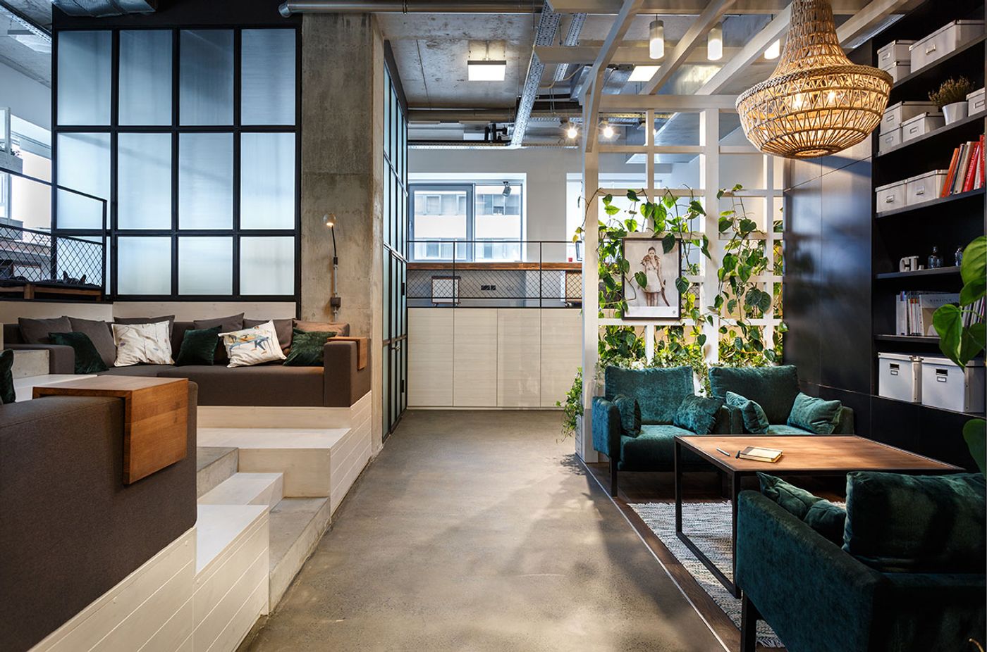
Photo © Circle Line Interiors.
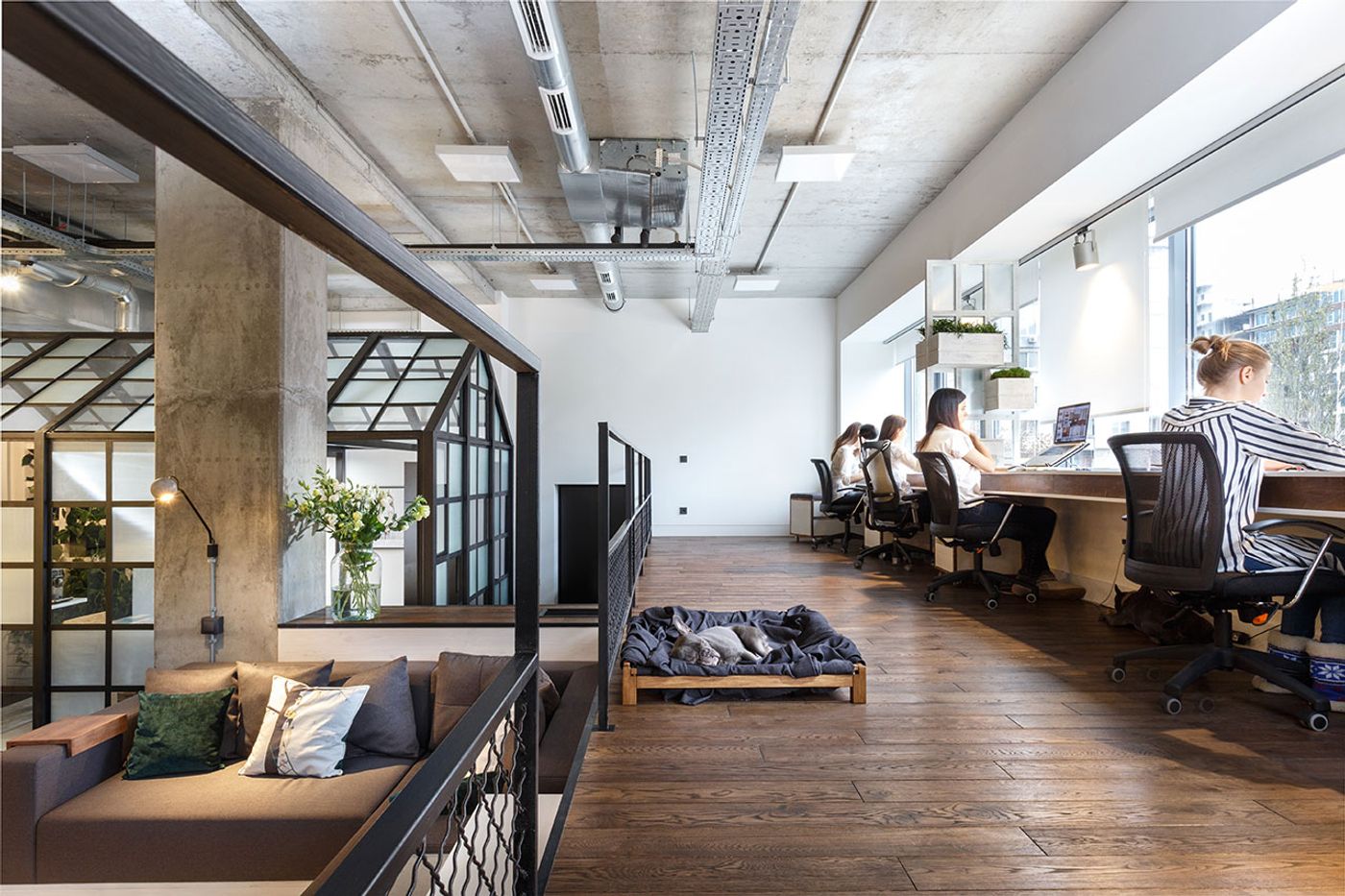
Photo © Circle Line Interiors.
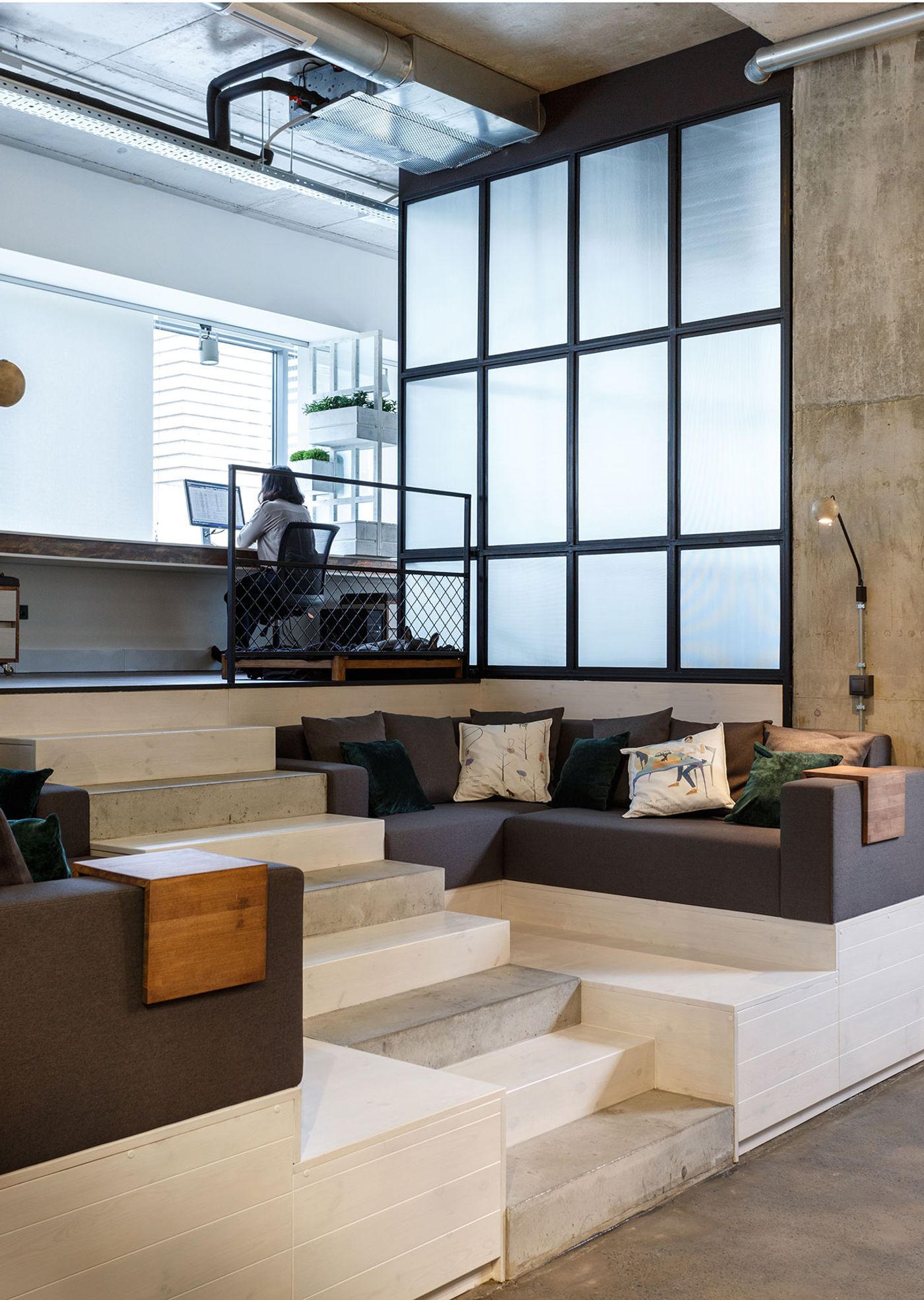
Photo © Circle Line Interiors.
The space’s open-plan design expresses clear zoning, from traditional desk-style settings to formal and informal lounge areas; a flexibility that provides for an open and dynamic space as well as for incidental and informal moments of collaboration amongst the team. Custom joinery under the mezzanine was used to create an efficient and discrete library for storing the vast quantity of products and samples (as is often the case with design studios) along with standing desks which discretely pull out of the custom-designed joinery that can be tucked away when not in use.
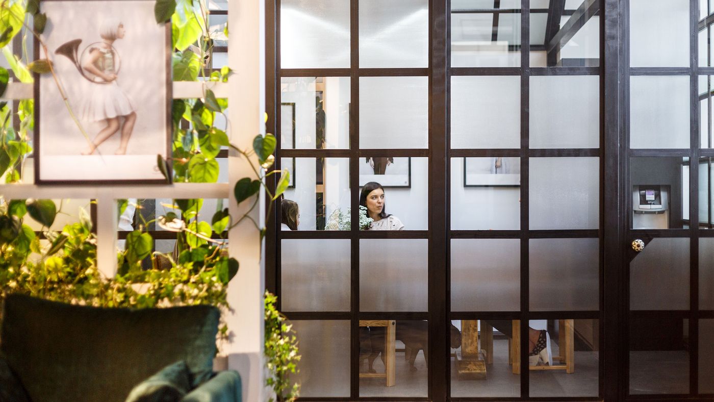
Photo © Circle Line Interiors.
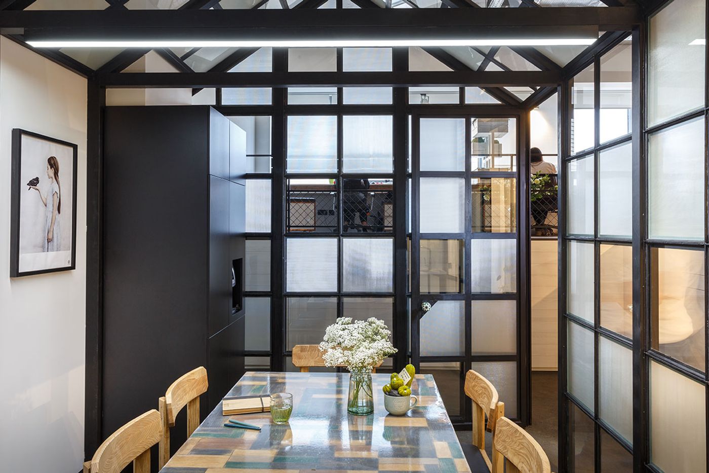
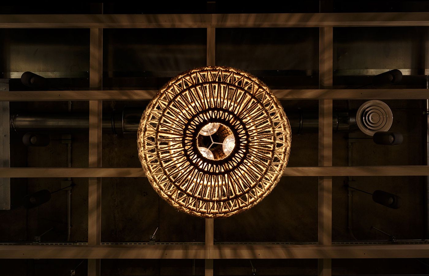
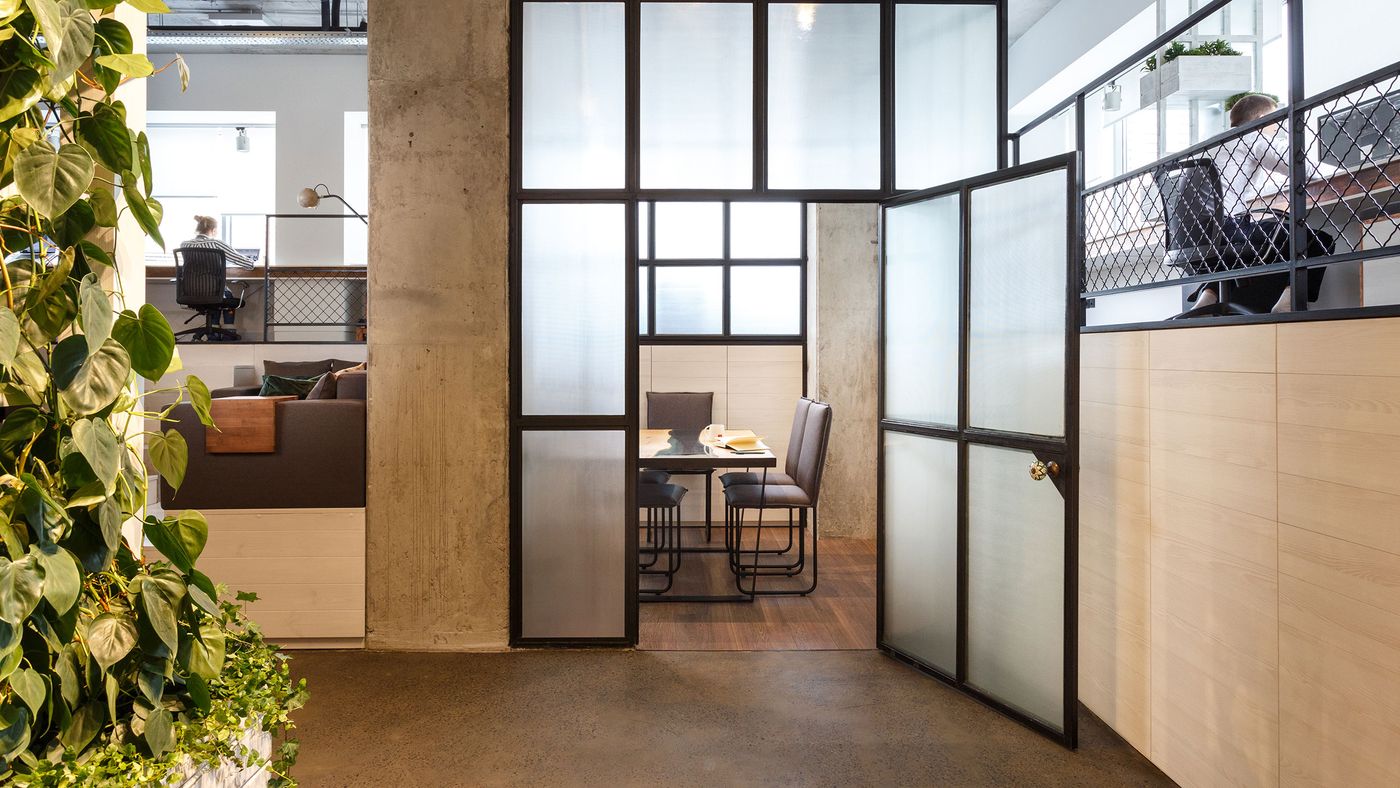
Encouraged by the site’s high ceilings, the studio’s founder Kate Kuzmenko and the rest of the team played with the concept of constructing ‘rooms within rooms’: a greenhouse structure, complete with a pitched roof, houses the kitchen, while also acting as a separator between the other spaces. In a similar way, the grid-framed walls of the enclosed meeting room borrow and filter light via their textured and clear glazing. A commanding white pergola structure frames the formal lounge area, which is softened by the luscious green planting vining through the grids and breathes a sense of the outdoors into the space. Behind the lounge area, the hallway leading to the bathroom is filled with a bespoke lighting installation that floods the ceiling in what deceptively appears to be hundreds of filament globes: thanks to the infinite reflection of the stunning distressed mirror-clad walls, this otherwise “dead area” that would normally be hidden from sight is imbued with a touch of theatricality and glamour.
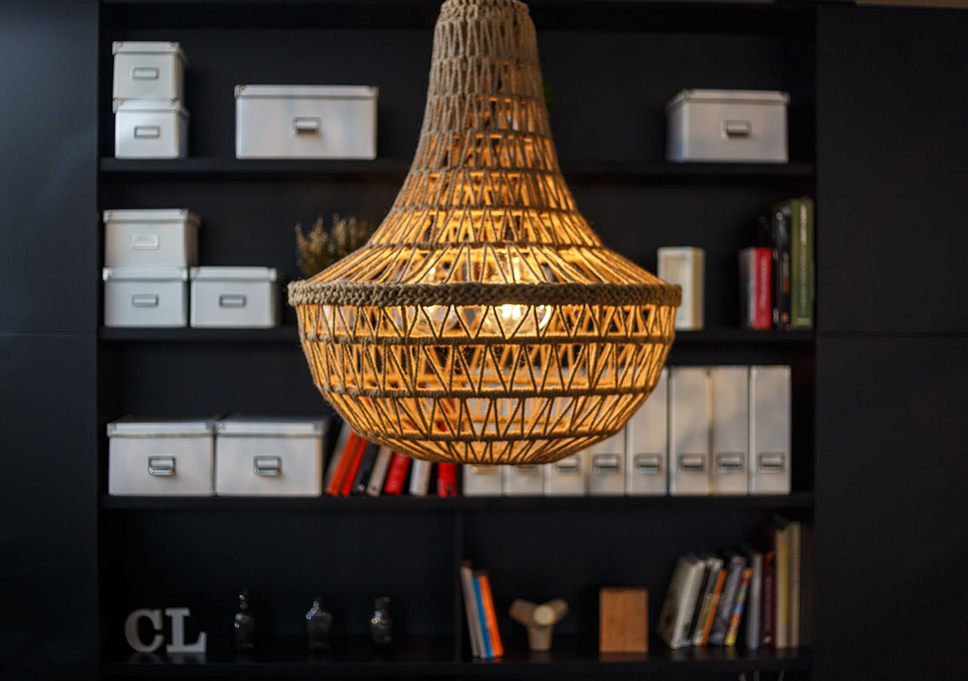
Photo © Circle Line Interiors.
Circle Line’s talents and attention to detail are also showcased through the carefully curated selection of building materials and design details used in the space such as exposed concrete columns and soffit, partly-painted stairs, black painted steel balustrading with cyclone fence details, timber flooring and whitewashed timber joinery. Meanwhile, the rich, earth-toned selection of materials and fabrics seen in the soft furnishings, including the jute macramé pendant light suspended in the studio lounge area, provide a warmth and tactility to the space reminiscent of domestic environments.
Fabulously efficient, carefully considered, playful and aesthetically beautiful, ultimately Circle Line Interiors’ new headquarters perfectly showcases its designers’ creative talents, design-thinking and ingenuity in what is a wonderful studio space that is a pleasure to work in.
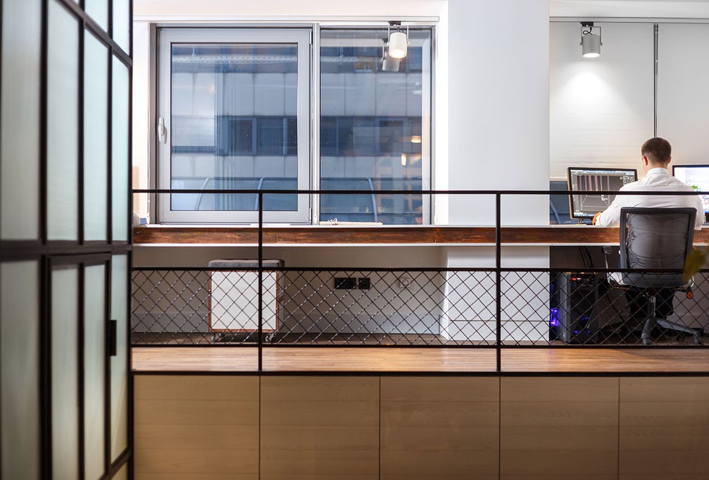
Photo © Circle Line Interiors.
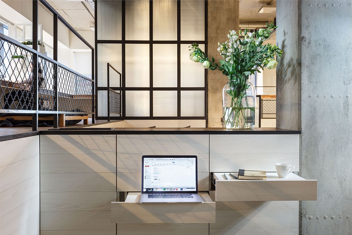
Photo © Circle Line Interiors.
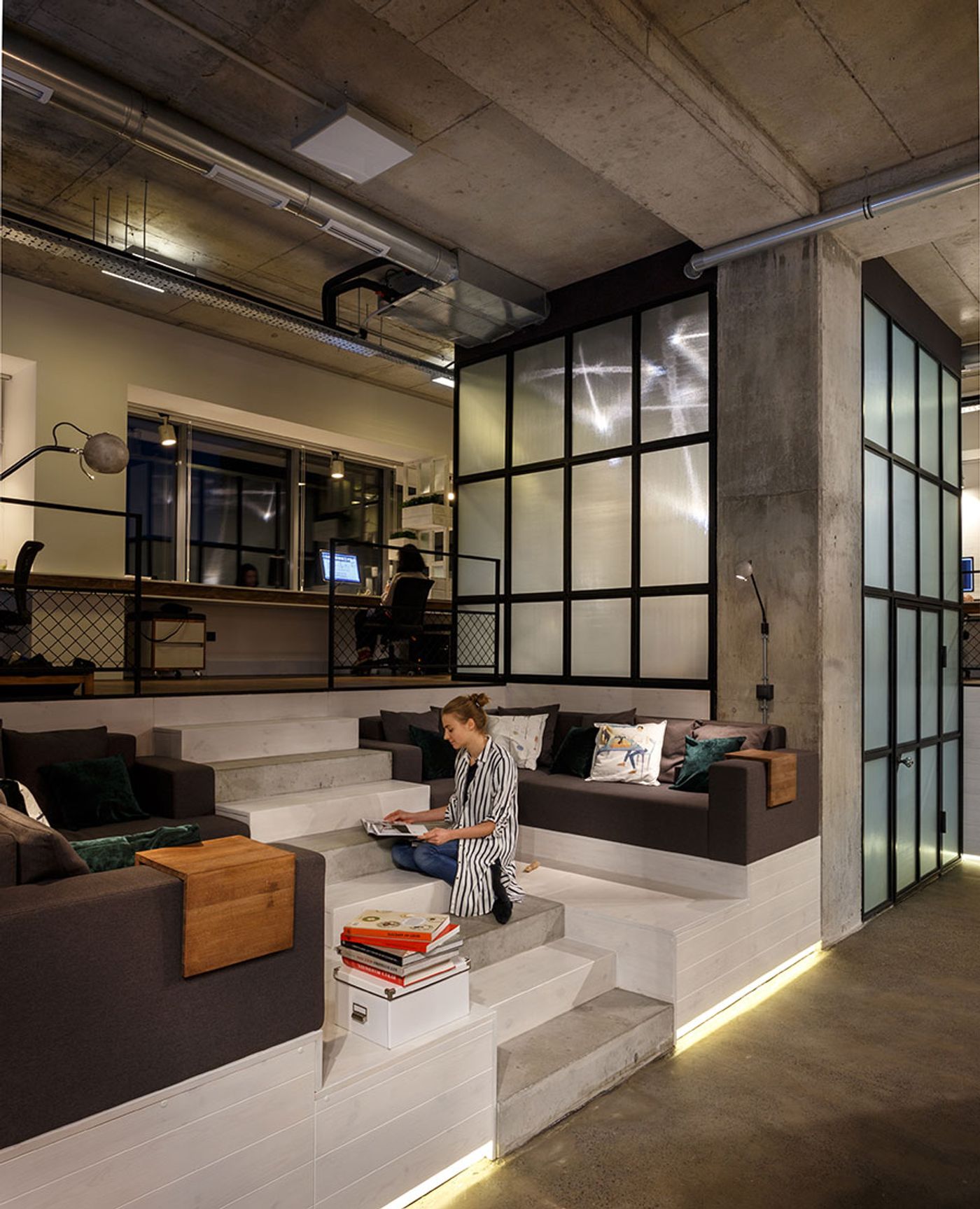
Photo © Circle Line Interiors.
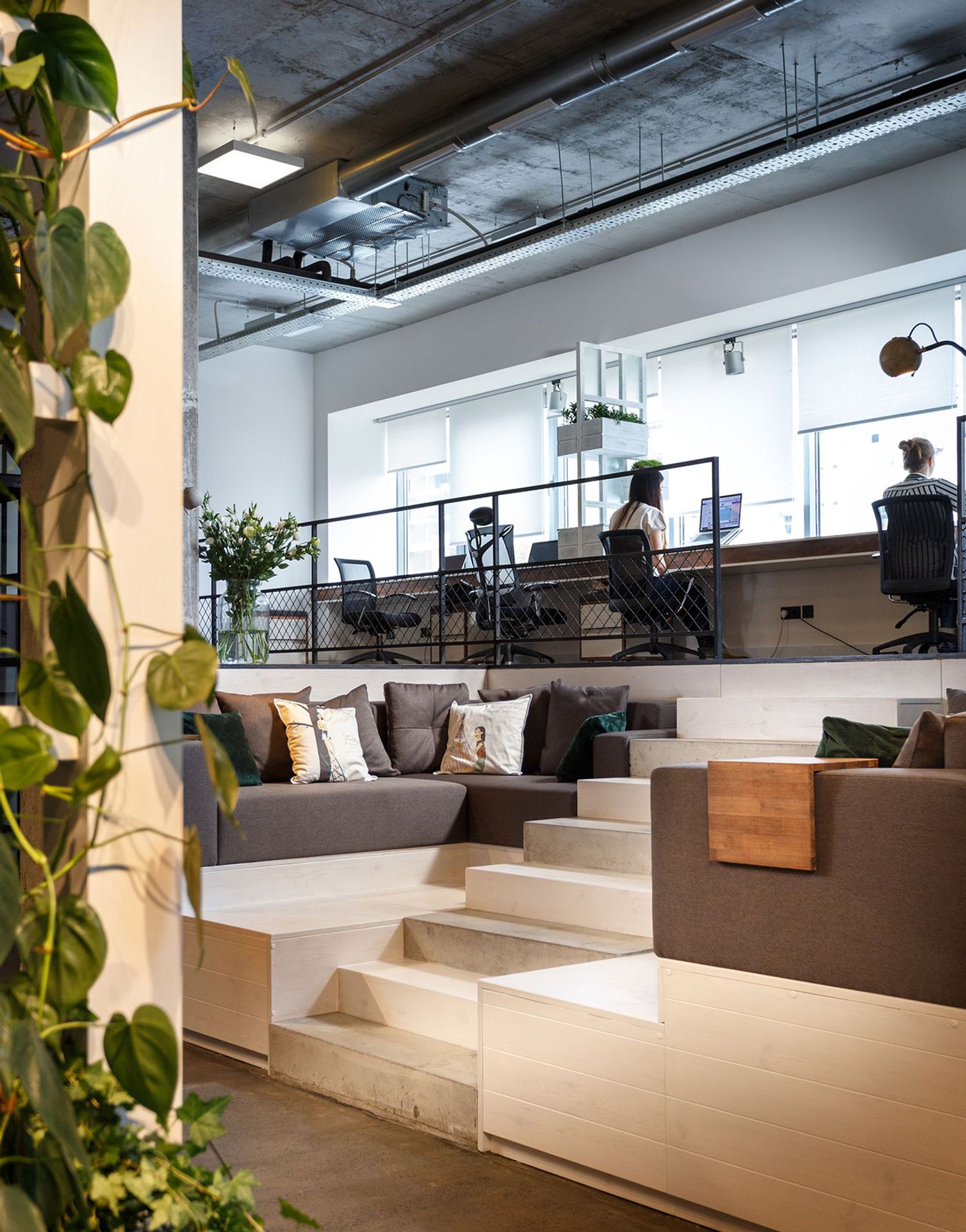
Photo © Circle Line Interiors.
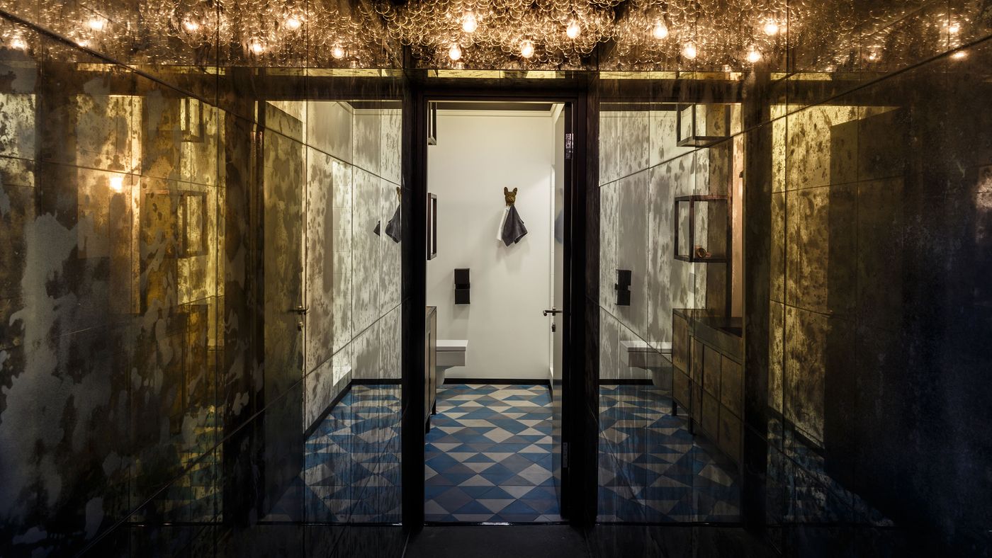
Photo © Circle Line Interiors.
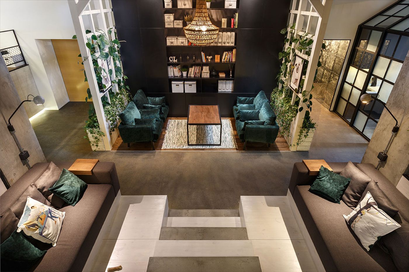
Photo © Circle Line Interiors.

