An Interview with Italian Design Duo Calvi Brambilla
Words by Eric David
Location
An Interview with Italian Design Duo Calvi Brambilla
Words by Eric David
Milan-based design studio Calvi Brambilla is one of those rare partnerships that have effortlessly combined the professional with the personal. Formed in 2006 by Fabio Calvi and Paolo Brambilla, the practice, which combines architecture, interior design and product design, is sustained by their shared love for design as well as each other. The pair has forged a reputation in Italy’s retail design scene by having collaborated with many esteemed brands, designing their showrooms, fair booths, and even some of their products. Recent projects include Zanotta’s fair booth at Milan’s Salone del Mobile which featured graphic walls of colourful motifs and disassembled armchairs on the walls, Antonio Lupi’s Milan showroom whose irregular architectural vaults were inspired by the 16th century Kılıç Ali Paşa baths in Istanbul, and Barovier & Toso’s majestic new Venetian showroom.
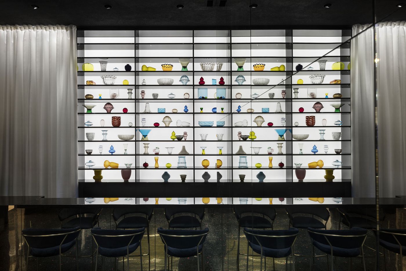
Taking up an entire three-storey palazzo in Murano, the latter is also one of the Studio’s largest and most dazzling projects to date. Playfully appropriating the architectural language of historic palazzos, filtered through contemporary sense of minimalist elegance and subdued a luxuriance, Calvi Brambilla have designed a series of evocative rooms that literally and figuratively reflect Barovier & Toso’s opulent glass-blown chandeliers, and harmoniously encapsulate both the company’s 700 year-old history and its modern aspirations. Paolo and Fabio recently talked to Yatzer about their studio practice, their recent projects and the challenges in designing for famous design brands.
(Answers have been condensed and edited for clarity)
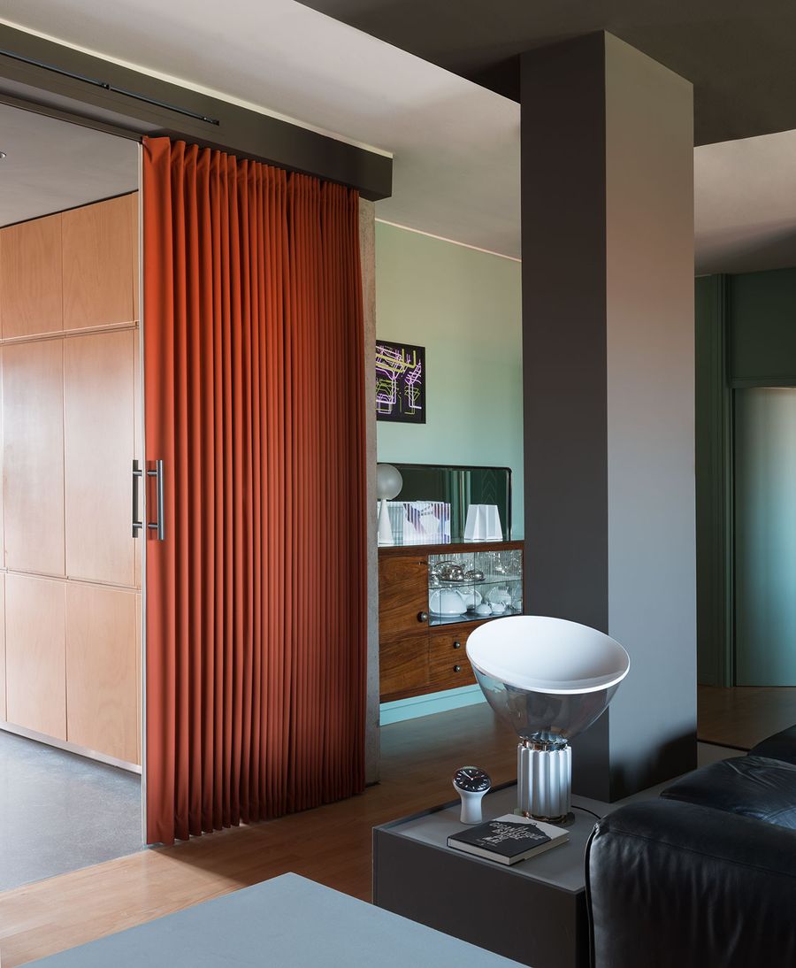
Calvi Brambilla apartment. Photo by Denise Bonenti.
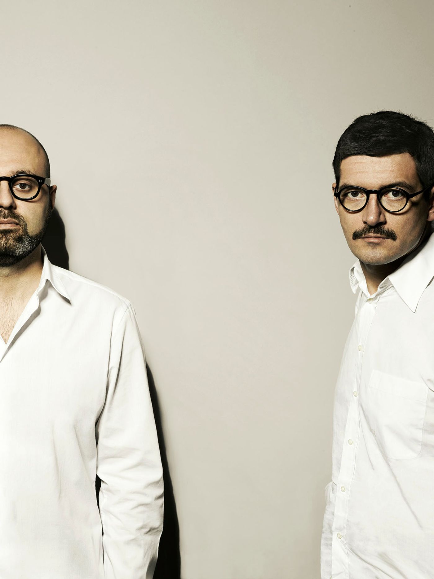
Fabio Calvi (right) and Paolo Brambilla (left). Photo by Tommaso Sartori.
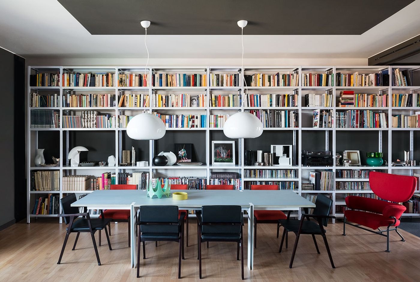
Calvi Brambilla apartment. Photo by Denise Bonenti.
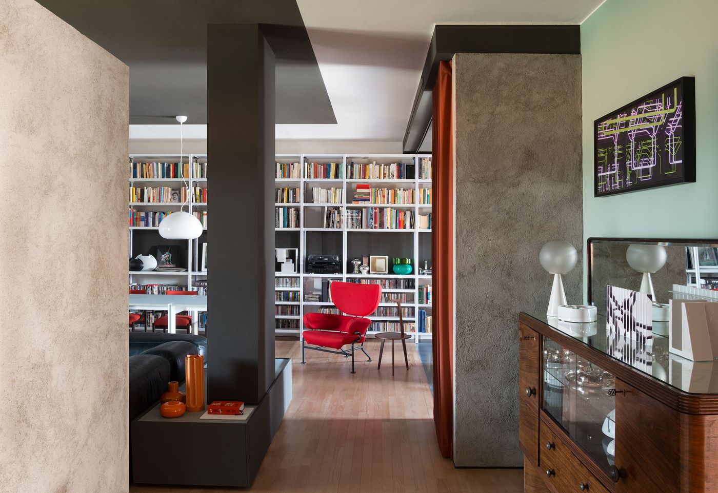
Calvi Brambilla apartment. Photo by Denise Bonenti.
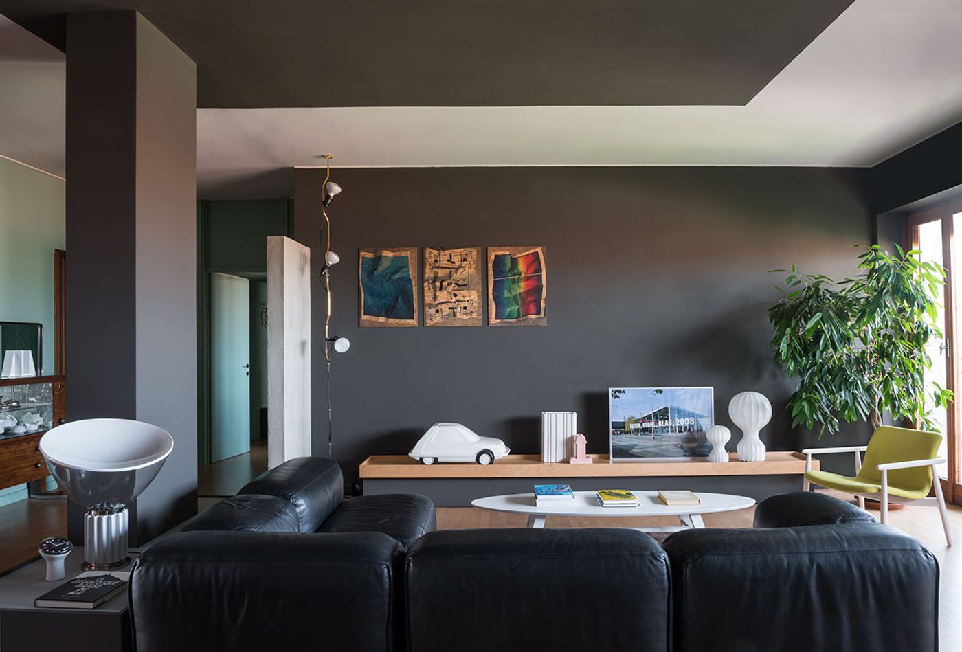
Calvi Brambilla apartment. Varaschin, 'Poggiano' coffee table, 2010 and Varaschin, 'Lapis family' indoor furniture collection chair, 2011 by Calvi Brambilla. Photo by Denise Bonenti.
How did your partnership come about? How does your personal relationship affect your professional collaboration?
Paolo Brambilla: Fabio used to work on his own, but after just one year he got the chance to concurrently work at Flos [as the company’s art director] so he asked me to help him. The first time I said no, because I was afraid that combining my private life with work could be a mistake. At that time I was working for a big architecture practice, and I wasn’t ready to jump right in yet. The second time he asked me I accepted the bet, and twelve years have passed since then. Being partners in work and life means never having a break, but I think this applies to many creative works.
If you had to describe your design aesthetic in a few sentences, what would it be? Who or what are your inspirations?
PB: We don’t have a specific style, because our projects are made-to-measure according to the specific needs and style of the client; this allows us to work with many different partners at the same time. However, we are known for two specific features: on the one hand, a certain irony, which is always present, even in the most challenging projects, and on the other hand, our architectural approach to every project, even temporary installations.
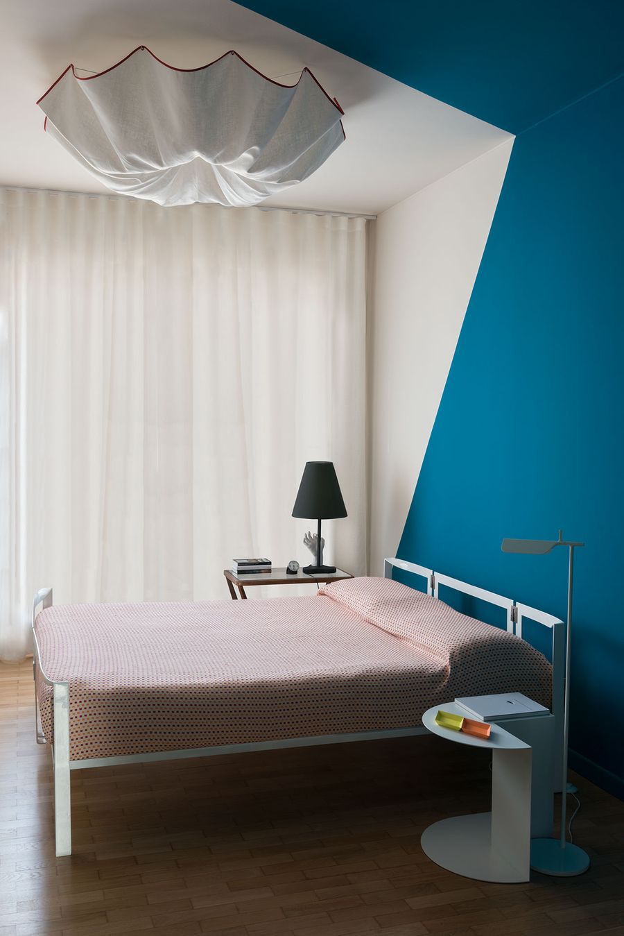
Calvi Brambilla apartment. Varaschin, 'Knot' side table 2013 by Calvi Brambilla. Photo by Denise Bonenti.
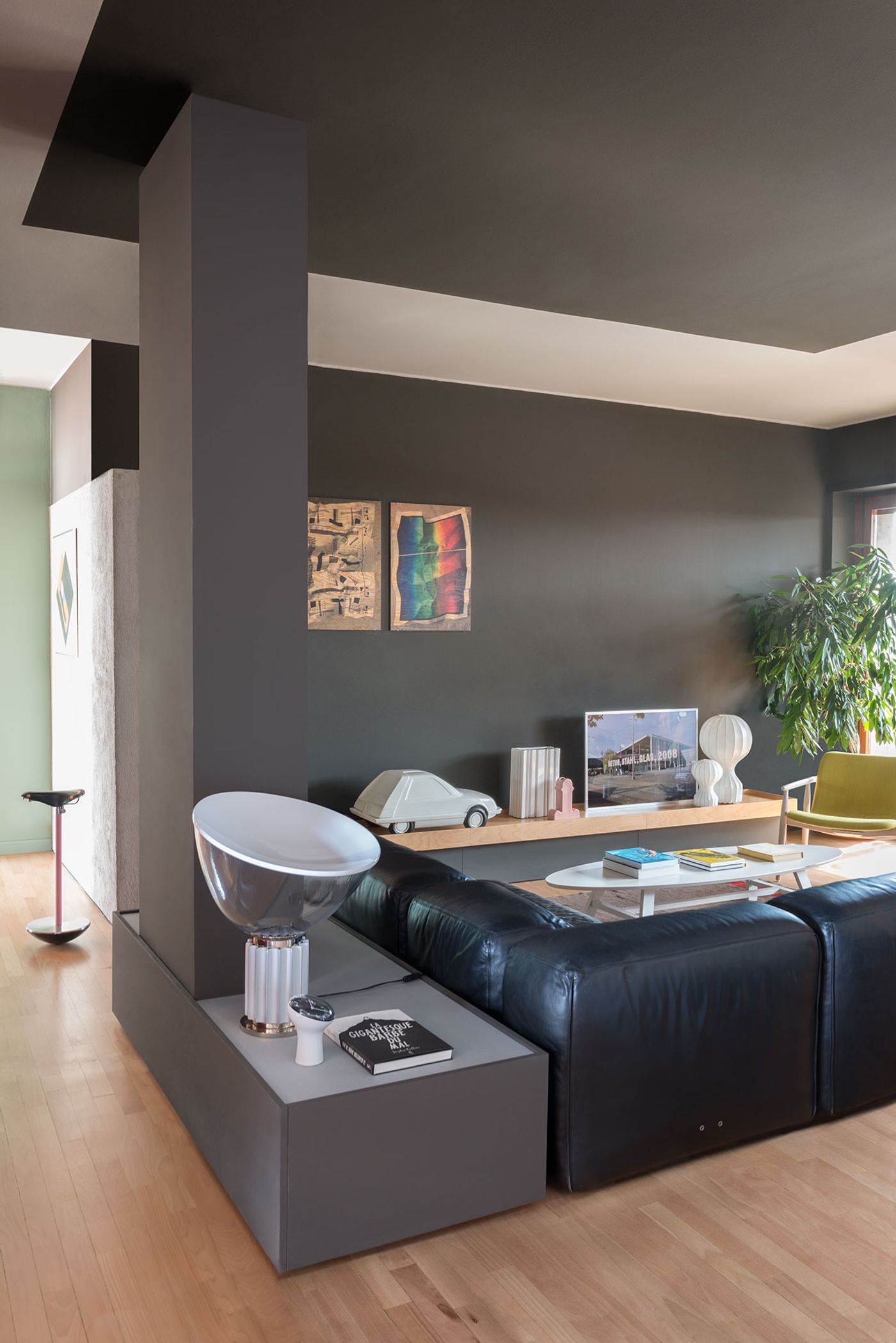
Calvi Brambilla apartment. Photo by Denise Bonenti.
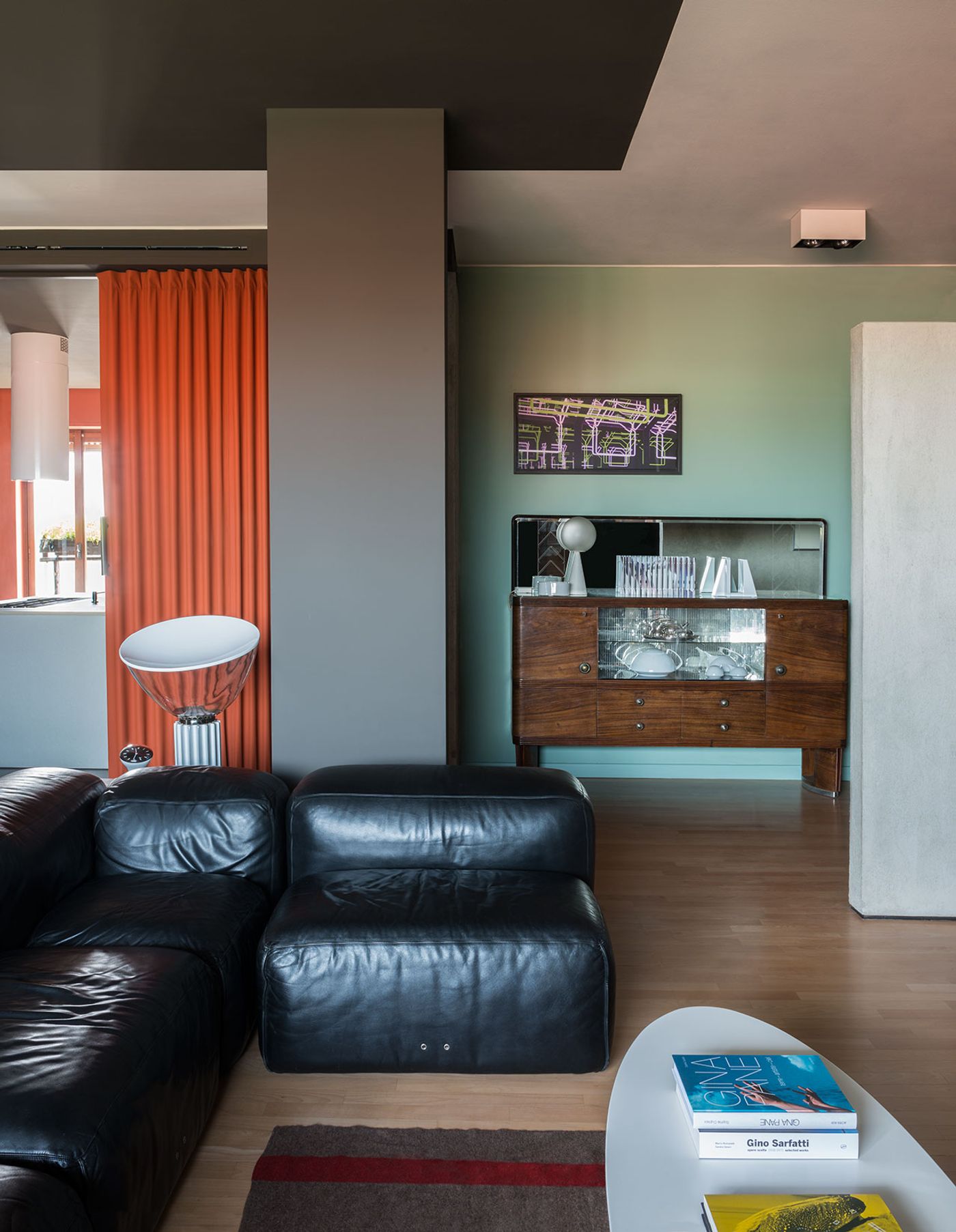
Calvi Brambilla apartment. Varaschin, 'Poggiano' coffee table, 2010 by Calvi Brambilla. Photo by Denise Bonenti.
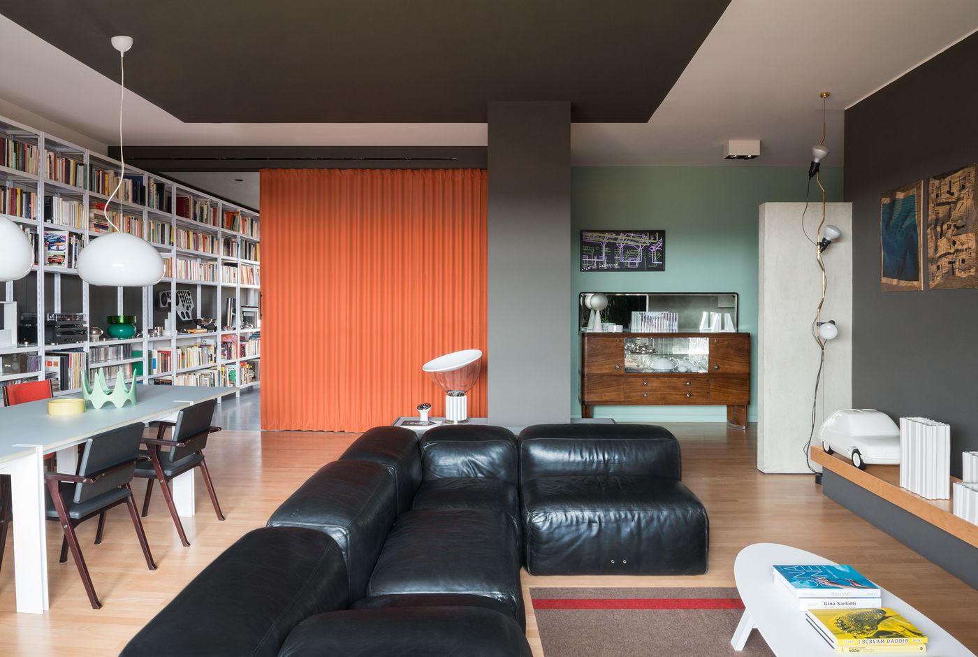
Calvi Brambilla apartment. Varaschin, 'Poggiano' coffee table, 2010 by Calvi Brambilla. Photo by Denise Bonenti.
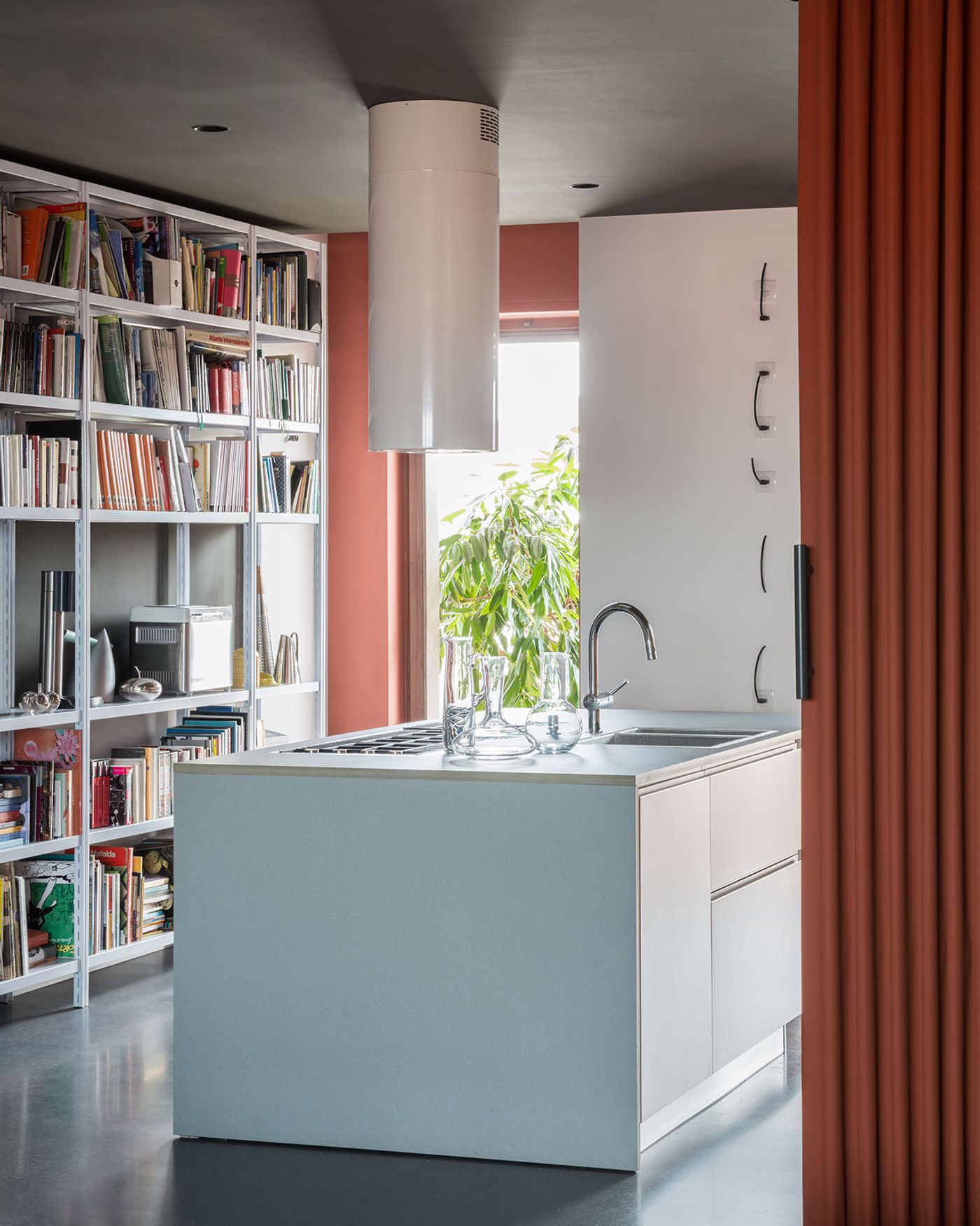
Calvi Brambilla apartment. Photo by Denise Bonenti.
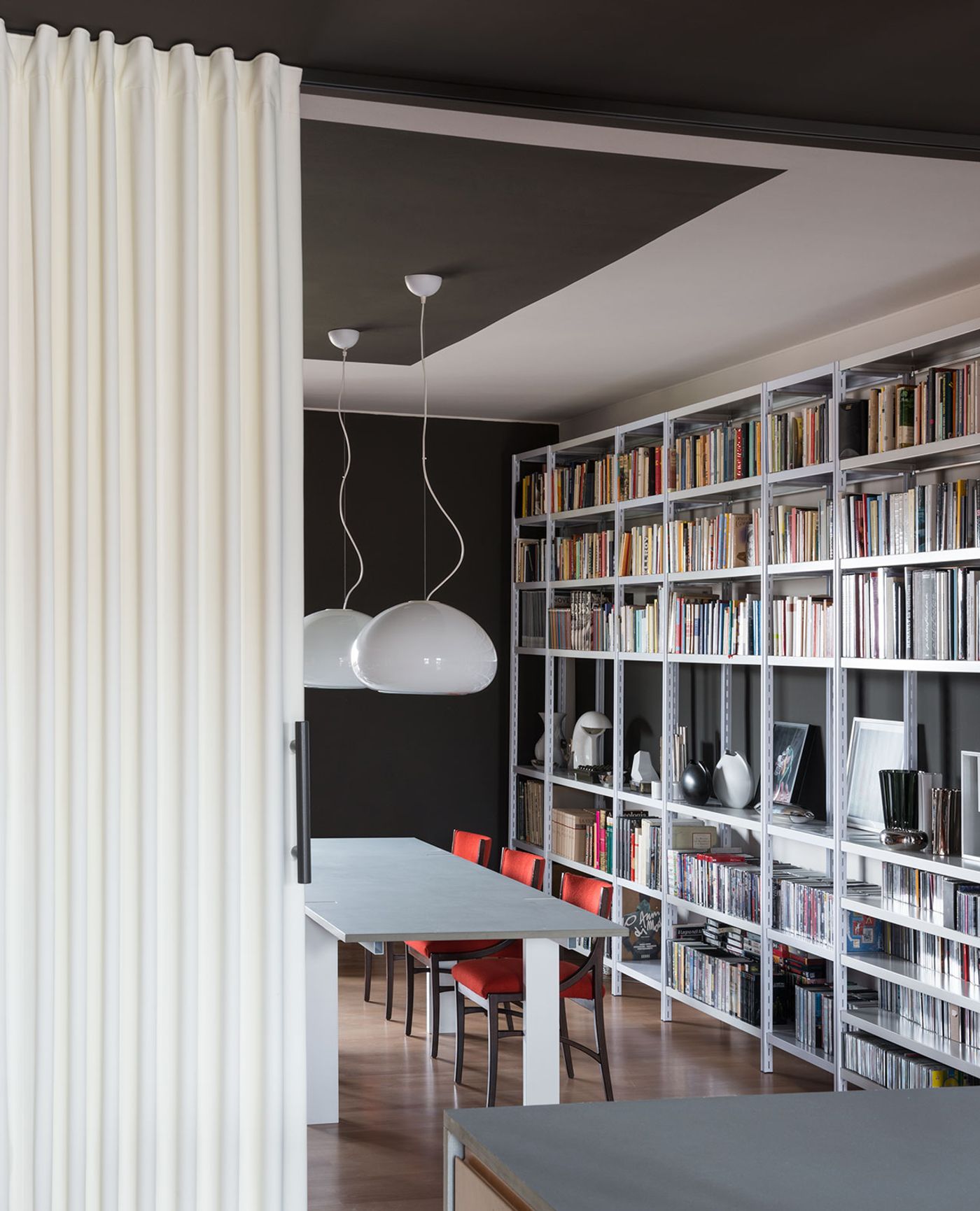
Calvi Brambilla apartment. Photo by Denise Bonenti.
How different are you as designers? How do your resolve any creative differences that arise during the design process?
Fabio Calvi: Paolo has a more analytical and rational mind, while I am more intuitive and instinctive. The combination of our two personalities makes us a complete designer.
You have excelled in exhibition design with several awards to prove it. How different are these kind of temporary projects from interior and architectural commissions?
PB: Probably the main reason why we had some success in the specific field of exhibition design is that we tried to introduce new solutions inspired by the world of architecture and contemporary art. While the approach at the fairs is often strictly commercial, we manage to combine commercial needs with some more unexpected solutions.
FC: On the one hand, temporary installations can give great satisfaction to the designer because the ideas come true in a few months. On the other hand, it is regrettable that what remains of such great effort is only a handful of photographs.
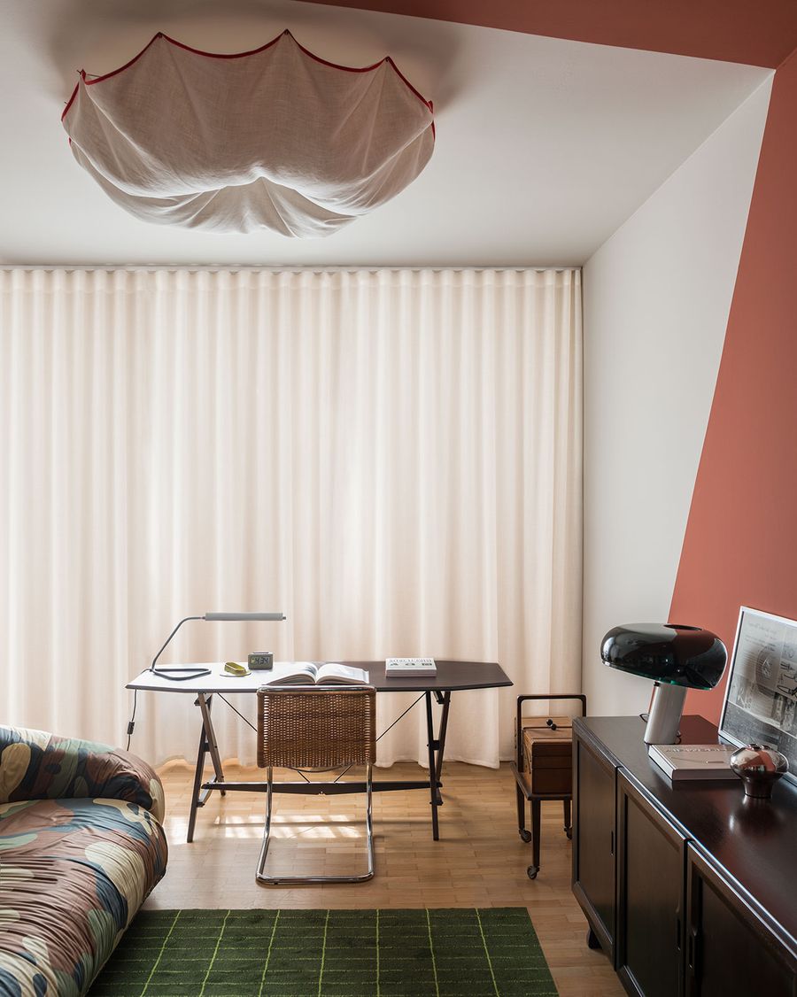
Calvi Brambilla apartment. Photo by Denise Bonenti.
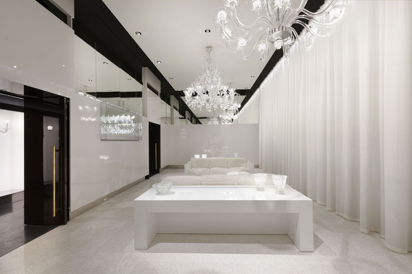
Palazzo Barovier & Toso in Murano, Venice. Interior design by Calvi Brambilla.
Photo courtesy of Barovier & Toso.
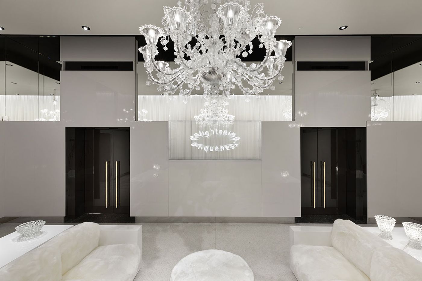
Palazzo Barovier & Toso in Murano, Venice. Interior design by Calvi Brambilla.
Photo courtesy of Barovier & Toso.
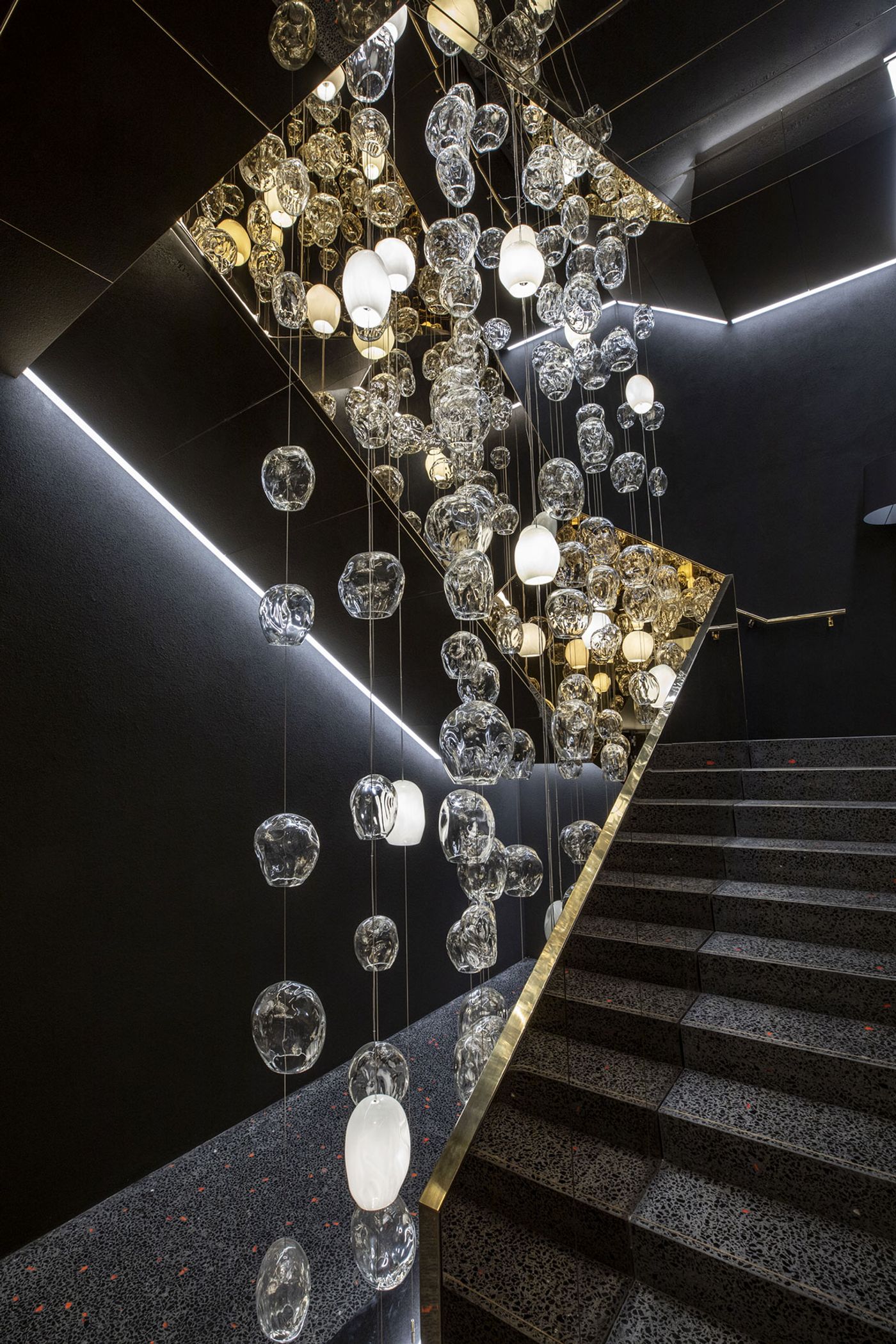
Palazzo Barovier & Toso in Murano, Venice. Interior design by Calvi Brambilla.
Photo courtesy of Barovier & Toso.
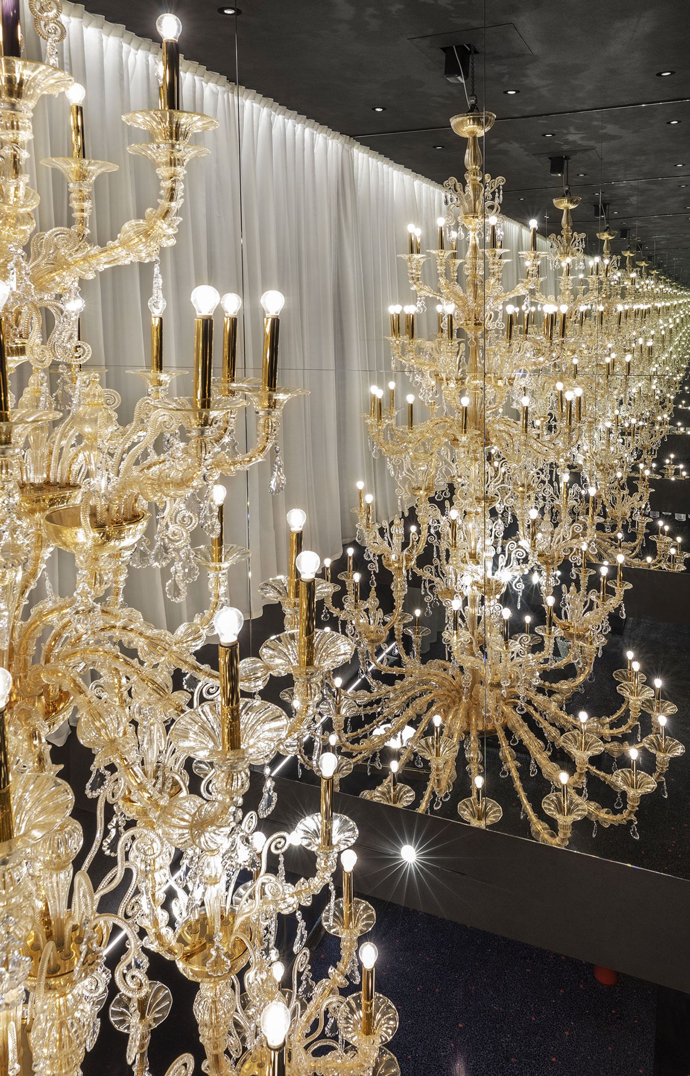
Palazzo Barovier & Toso in Murano, Venice. Interior design by Calvi Brambilla.
Photo courtesy of Barovier & Toso.
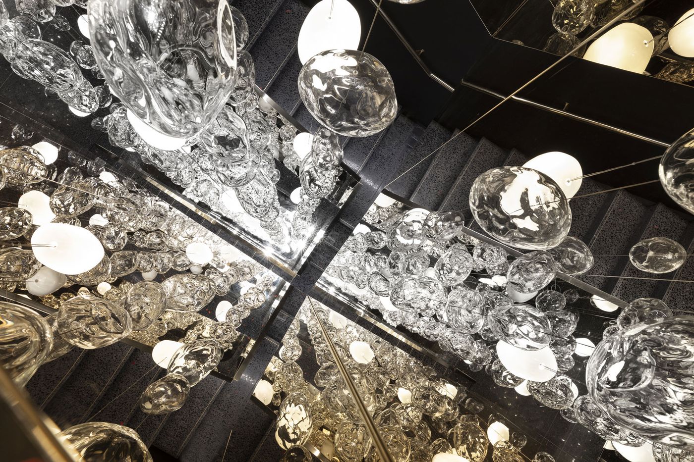
Palazzo Barovier & Toso in Murano, Venice. Interior design by Calvi Brambilla.
Photo courtesy of Barovier & Toso.
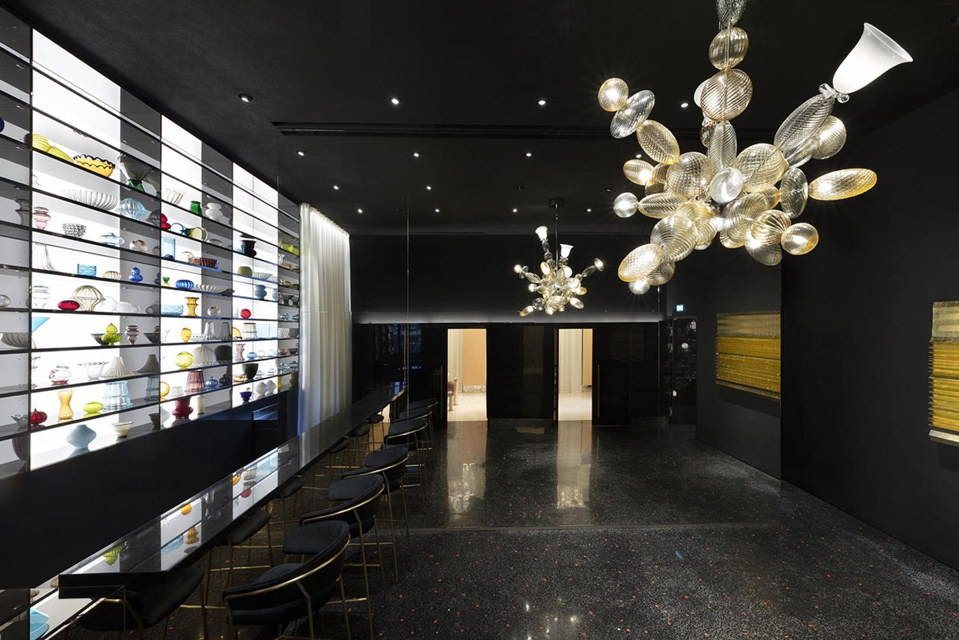
Palazzo Barovier & Toso in Murano, Venice. Interior design by Calvi Brambilla.
Photo courtesy of Barovier & Toso.
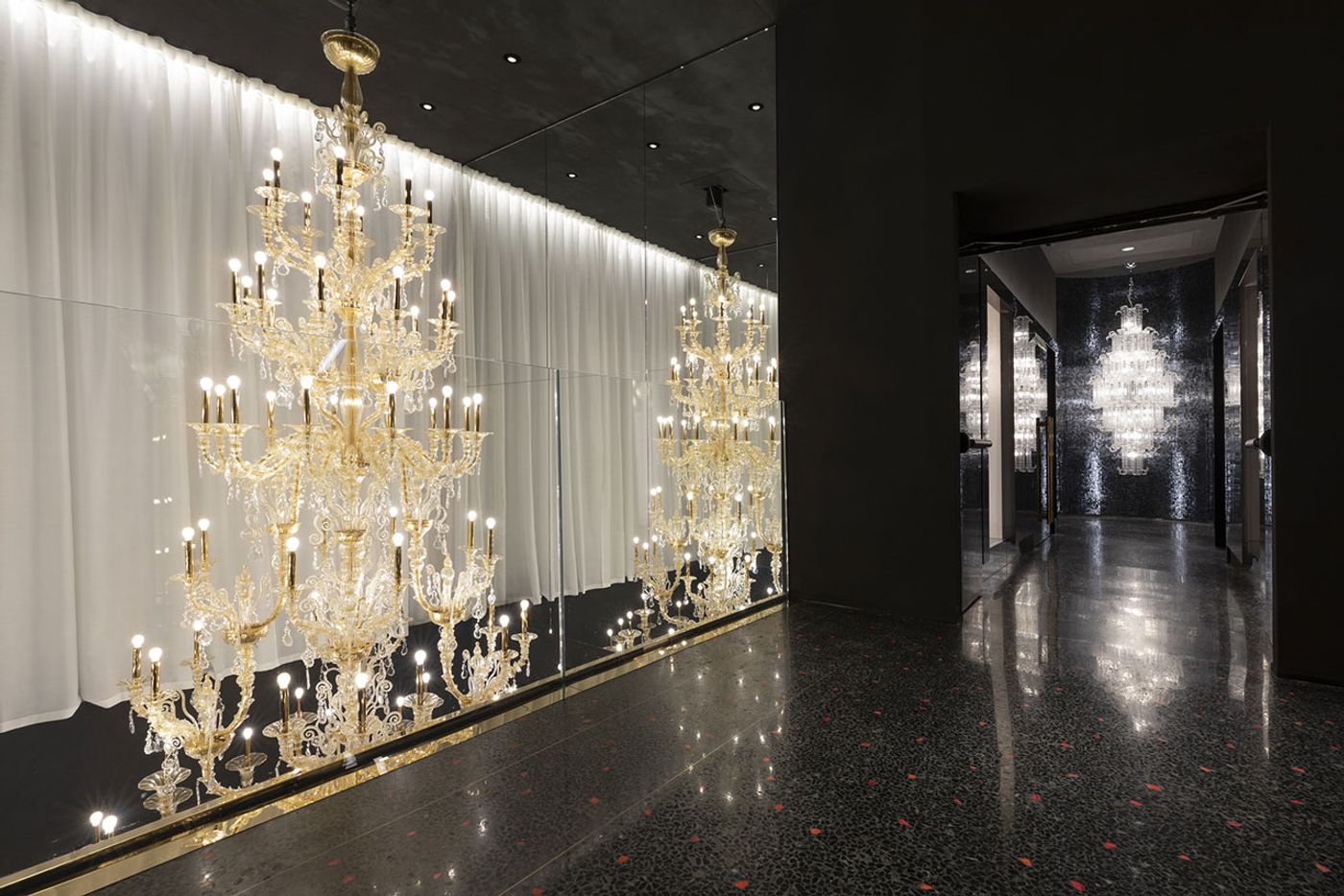
Palazzo Barovier & Toso in Murano, Venice. Interior design by Calvi Brambilla.
Photo courtesy of Barovier & Toso.
How did you approach the renovation of such a historic venue as Murano’s Palazzo Barovier & Toso? How did the idea of monochrome rooms come about?
FC: Barovier & Toso is one of the oldest companies in the world, founded in Murano seven centuries ago and registered in the Guinness Book of Records. Designing for such a company is a great responsibility so to avoid being overwhelmed by the weight of the company’s heritage we faced the project with a certain irony.
PB: We did not want to make a fictitious reconstruction of a classical style interior, but at the same time we liked the idea of making certain references to the past: the terrazzo floor, the wall panelling and so on. The idea of the monochromatic rooms came to mind because often in the noble residences different halls are distinguished by different colours. We chose white, black, blue and gold because they are the most characteristic colours used for Barovier & Toso products, even though the company offers a very wide range of colours.
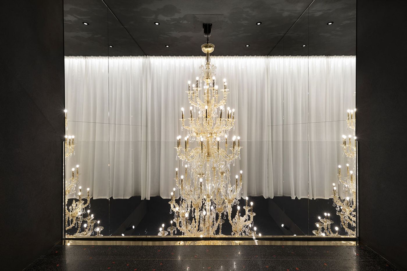
Palazzo Barovier & Toso in Murano, Venice. Interior design by Calvi Brambilla.
Photo courtesy of Barovier & Toso.
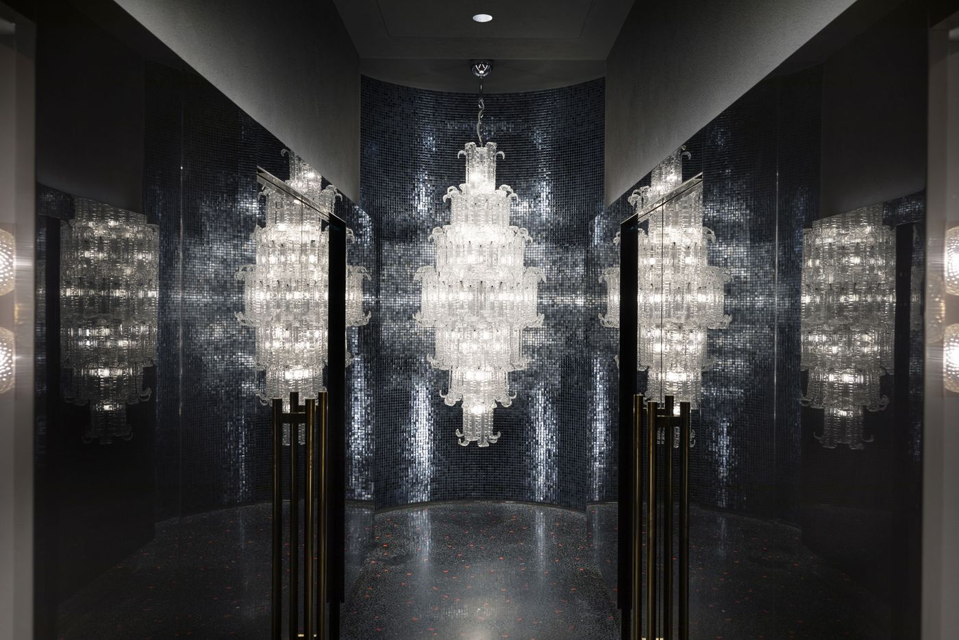
Palazzo Barovier & Toso in Murano, Venice. Interior design by Calvi Brambilla.
Photo courtesy of Barovier & Toso.
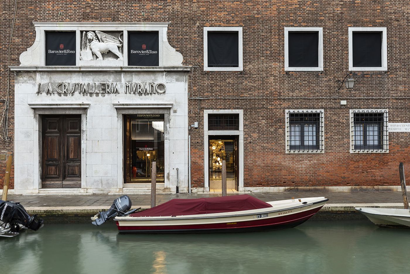
Palazzo Barovier & Toso in Murano, Venice. Interior design by Calvi Brambilla.
Photo courtesy of Barovier & Toso.
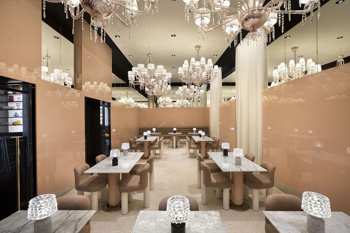
Palazzo Barovier & Toso in Murano, Venice. Interior design by Calvi Brambilla.
Photo courtesy of Barovier & Toso.
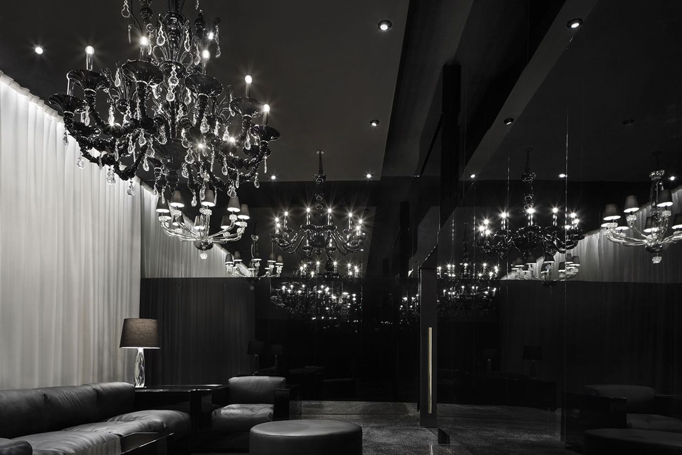
Palazzo Barovier & Toso in Murano, Venice. Interior design by Calvi Brambilla.
Photo courtesy of Barovier & Toso.
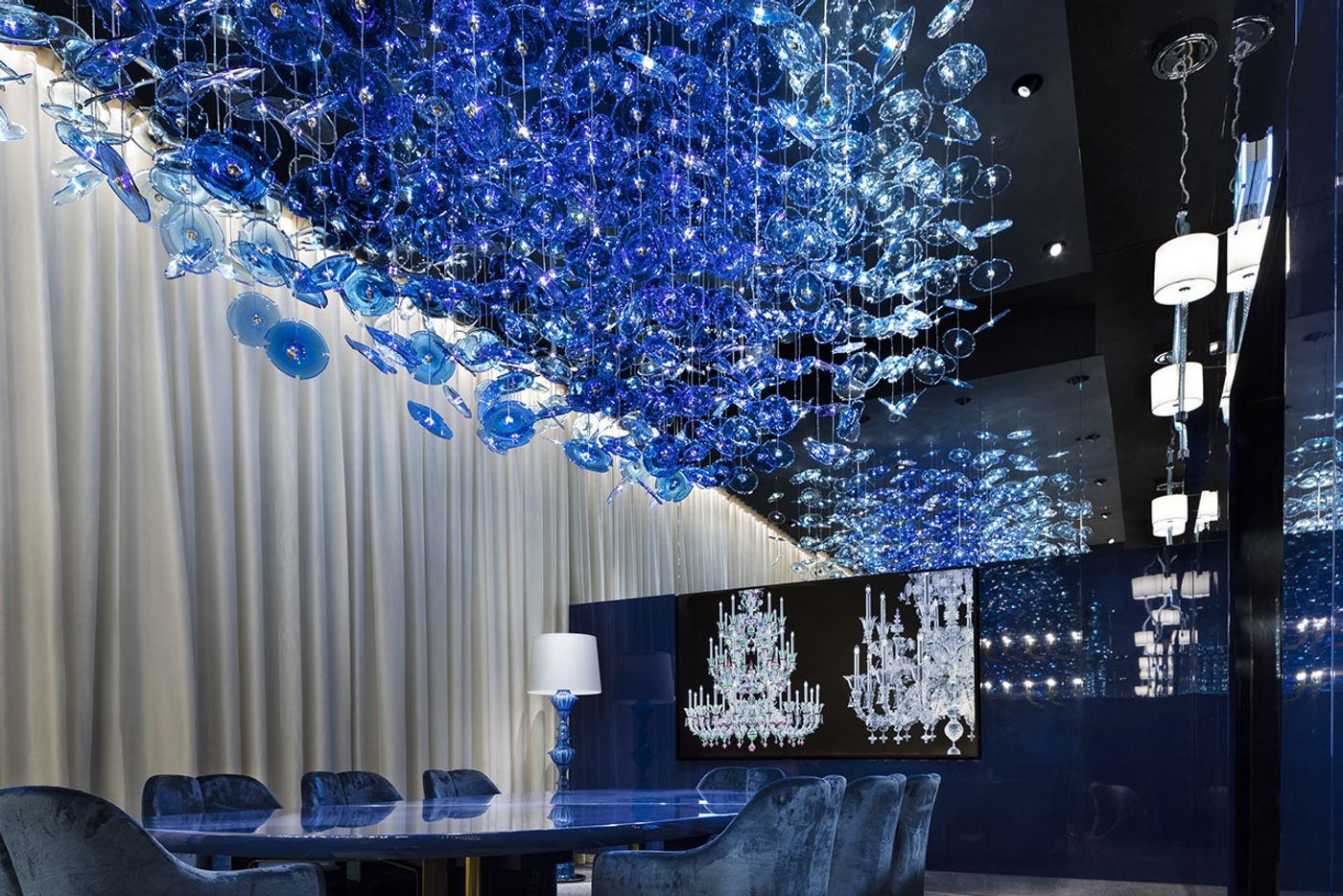
Palazzo Barovier & Toso in Murano, Venice. Interior design by Calvi Brambilla.
Photo courtesy of Barovier & Toso.
Your portfolio includes many showrooms and fair booth for famous design brands. What are the challenges in designing for a brand whose aesthetic is different from yours?
FC: For every single company we develop a specific marketing strategy and a unique project; in some way we play a role very similar to a media agency. The exhibition design must always be perfectly consistent with what it contains, or with the brand it represents. Those projects where the author's personal touch prevails could be failures. On the other hand, if the product is not interesting, even though the set design is well done, the result will be weak.
You have collaborated with many lighting manufacturers for whom you’ve designed their showrooms and exhibition booths as well as new light fittings. Why are you so fascinated with light? Did your interest originate from Fabio’s work experience as FLOS’ art director?
As we mentioned before, we are both obsessed with design and light fittings in particular. Fabio’s collaboration with Flos was the result rather than the root of this passion.
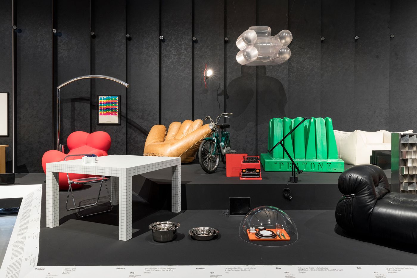
"Storie. Il design italiano" at La Triennale di Milano, 2018. Exhibition design by Calvi Brambilla. Photo by Gianluca Di Ioia.
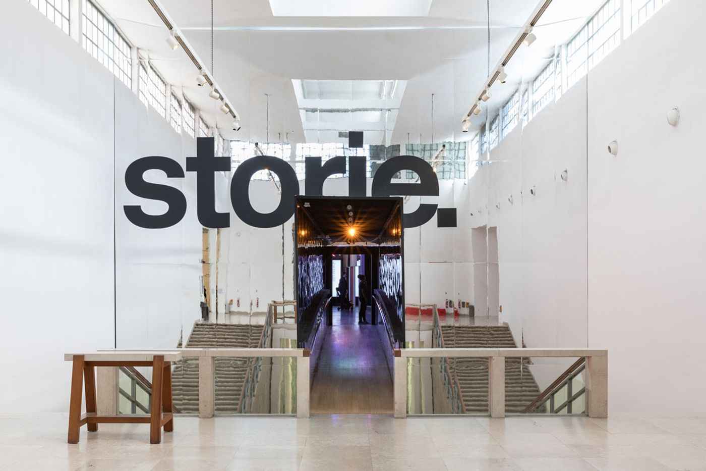
"Storie. Il design italiano" at La Triennale di Milano, 2018. Exhibition design by Calvi Brambilla. Photo by Gianluca Di Ioia.
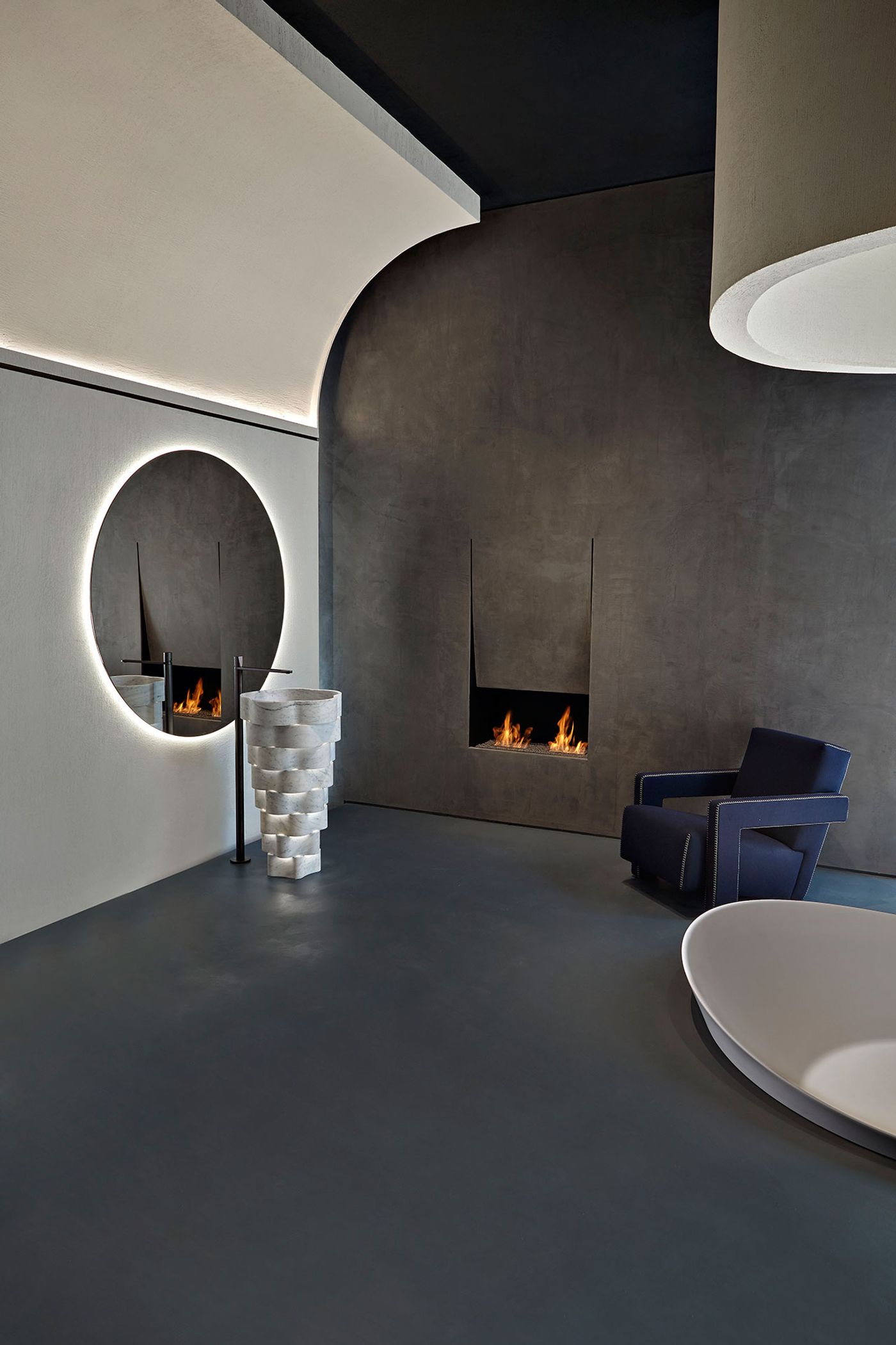
Antoniolupi Showroom in Milano, 2018. Interior design by Calvi Brambilla. Photo by Camilla Maria Santini.
How did you get involved in product design considering you both have an architectural background?
It happened by chance. As most of our clients are furniture or lighting companies, at some point they proposed that we design products. Not so strange especially when you consider that in the golden age of design almost all professionals were product designers, interior decorators, architects and city planners at the same time. We also have to say that even though we have studied architecture, in Milan product design is “in the air”, so it was only natural that we familiarized ourselves with it by just breathing.
Which is your favourite product from those that you have designed so far and why?
The "Superficie" lamp designed for Foscarini, which is a tribute to the "Spazialista" art of the Fifties and Sixties. In Carlo and Matteo Urbinati, the company’s founders, we found the same love for contemporary art and the same desire to bring art into everyday objects.
What are you working on right now? Do you have plans for next year’s Salone del Mobile?
First of all we’re working on the revamping of the Flos flagship shop in Milan. For the next Salone we’ll design fair booths for Zanotta, Ceccotti, Olivari, Pedrali and other brands that we cannot mention at the moment. Stay tuned!
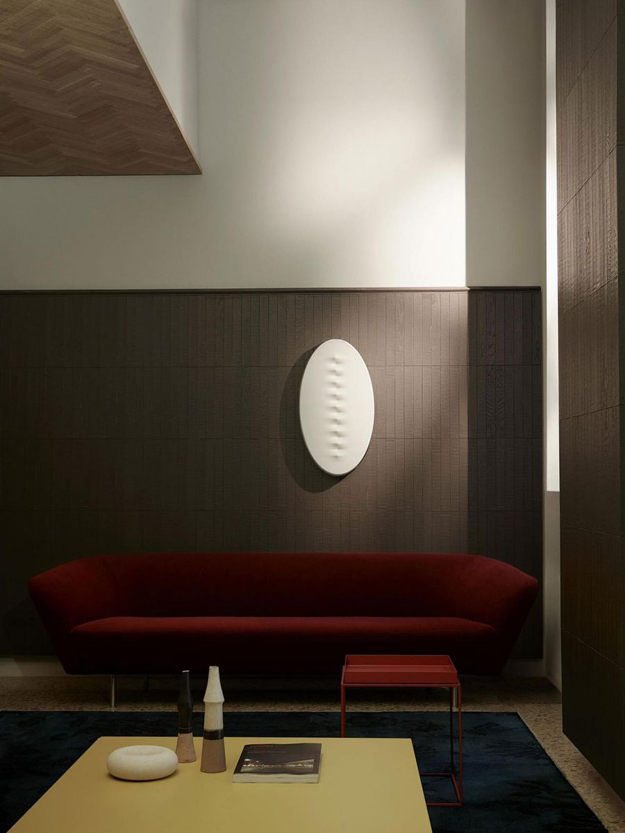
Foscarini, 'Superficie' Wall lamp, 2017, designed by Calvi Brambilla. Photo © Calvi Brambilla.
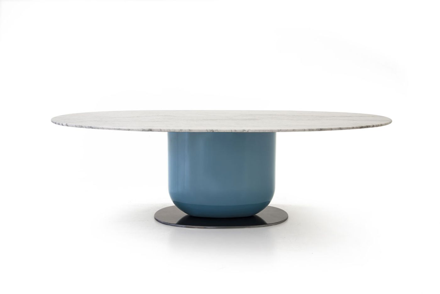
Pianca, 'Ettore' Table, 2017-2018, designed by Calvi Brambilla. Photo © Calvi Brambilla.
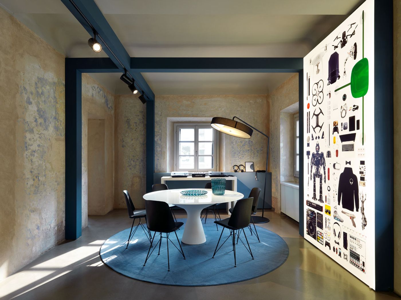
'Zanotta: Stories', exhibition in Milan, 2017-2018, in partnership with Tecno. Exhibition design by Calvi Brambilla. Photo Andrea Martiradonna. Courtesy of Zanotta.
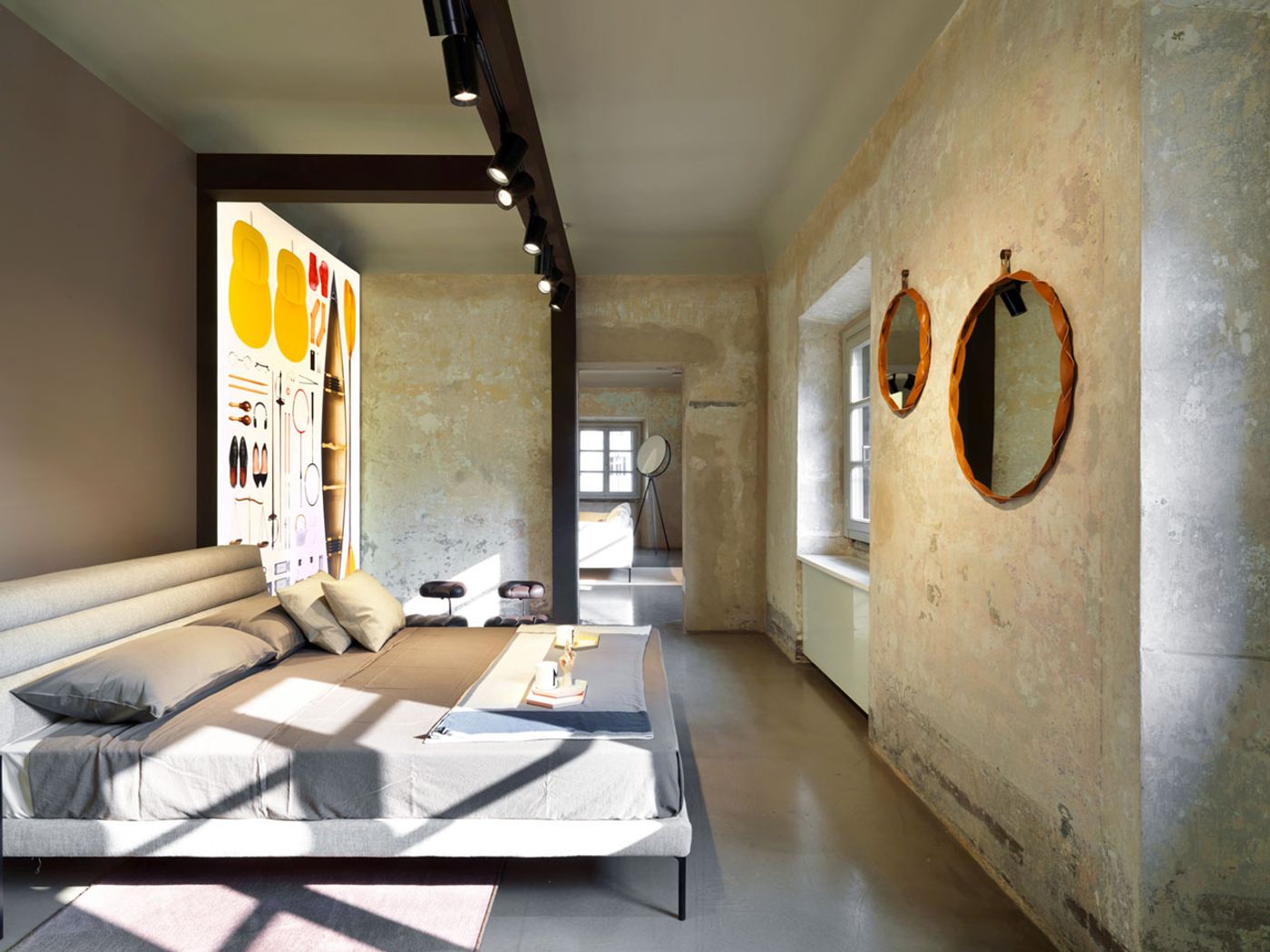
'Zanotta: Stories', exhibition in Milan, 2017-2018, in partnership with Tecno. Exhibition design by Calvi Brambilla. Photo Andrea Martiradonna. Courtesy of Zanotta.
