
Róisín Lafferty Uses Bold Colours and Graphic Patterns to Soulfully Revamp a Victorian House in Dublin
Words by Yatzer
Location
Dublin, Ireland
Róisín Lafferty Uses Bold Colours and Graphic Patterns to Soulfully Revamp a Victorian House in Dublin
Words by Yatzer
Dublin, Ireland
Dublin, Ireland
Location
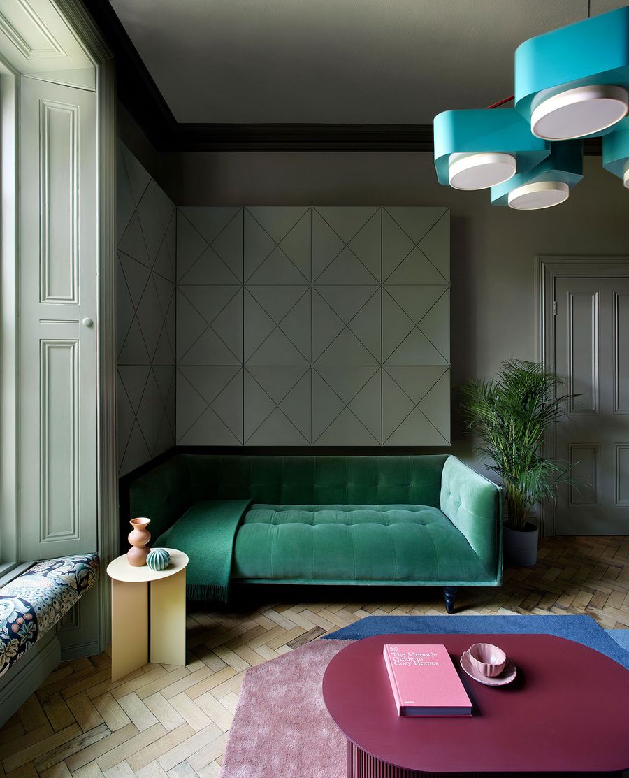
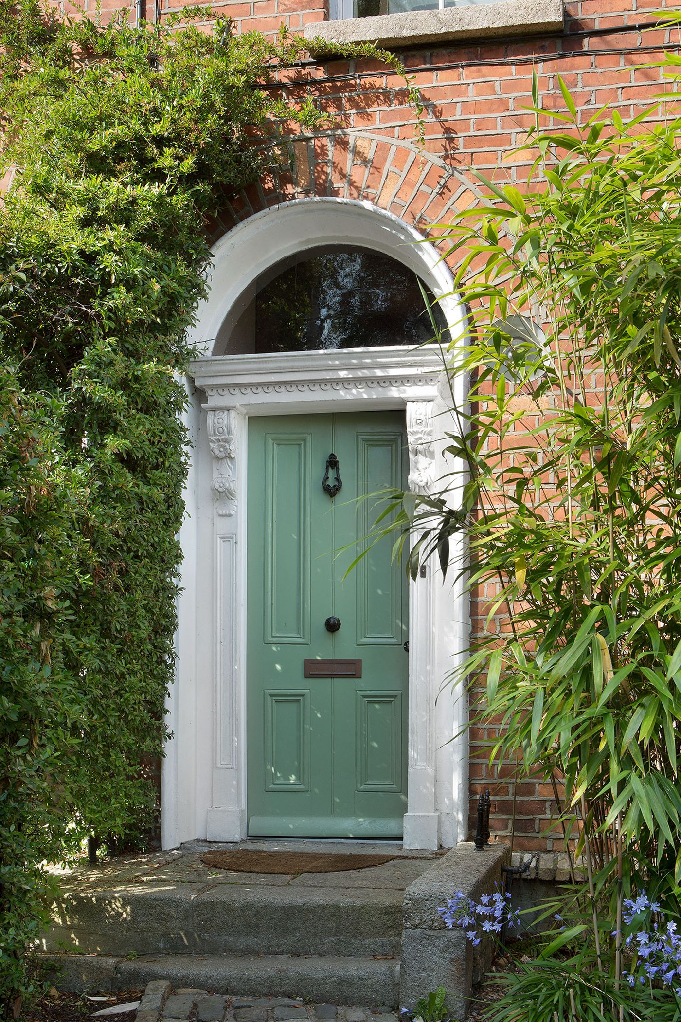
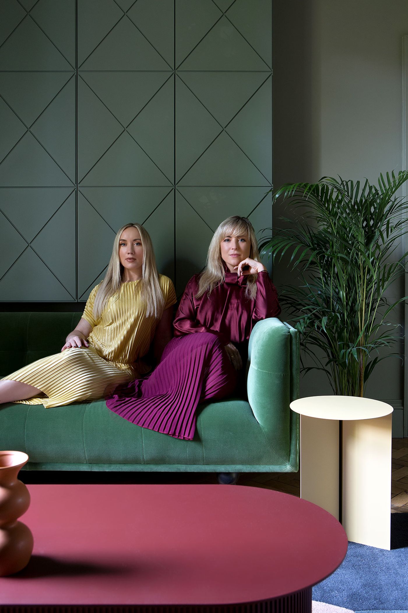
Commissioned by a young couple to imbue their Victorian terrace house in the suburbs of Dublin with a sense of imagination and playfulness, award-winning Irish designer Róisín Lafferty of Kingston Lafferty Design (KLD) boldly applied a soulful colour palette to revamp the period interiors. In combination with a graphic language of elegant geometric patterns and shapes inspired by the contemporary extension by Noji architects, Lafferty’s creative approach not only enhances the quirky charm of the historic building and harmoniously blends the older and newer sections but also reflects the owners’ convivial personalities and exuberant art collection.
Photography by Barbara Corsico.
Photography by Barbara Corsico.
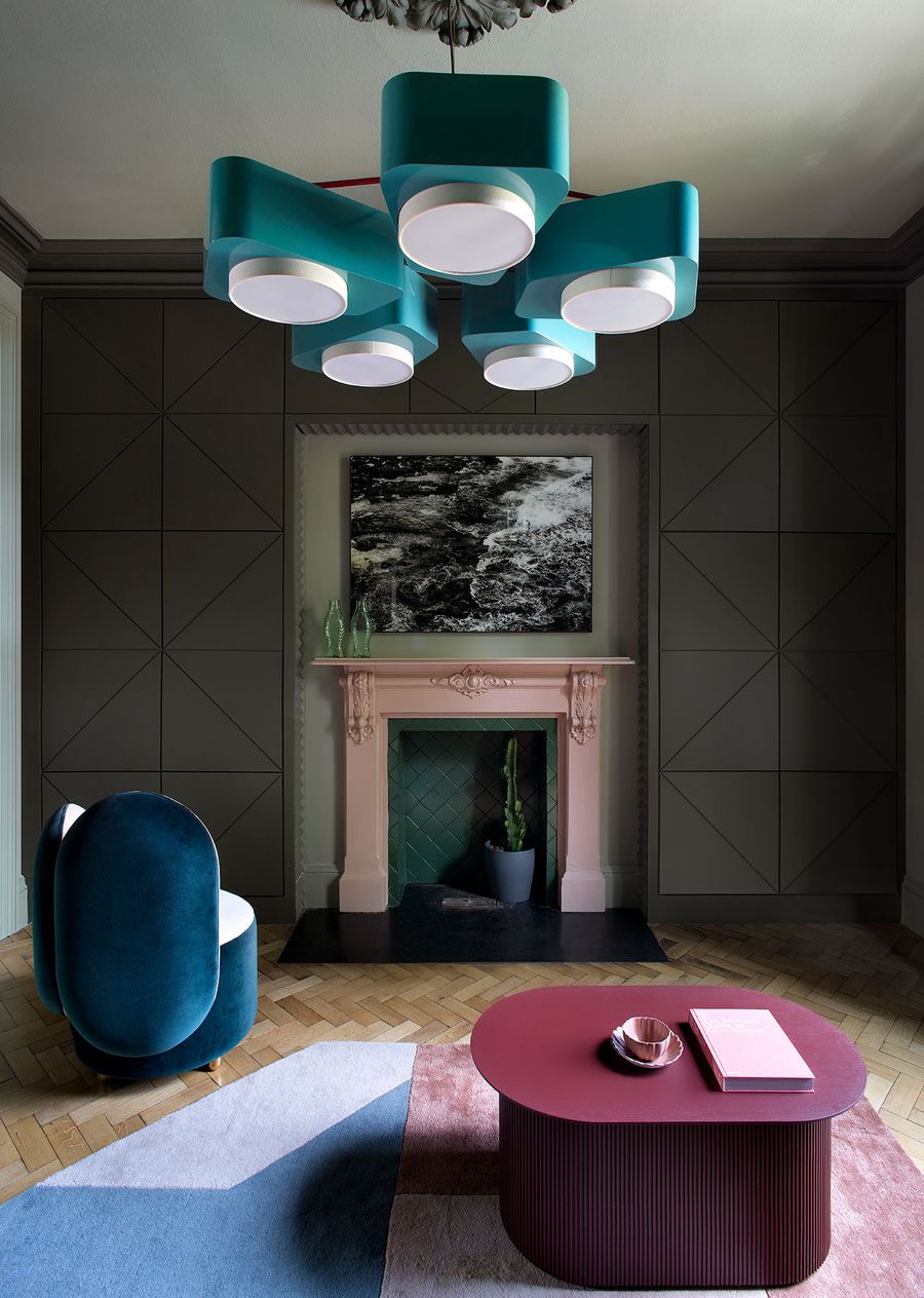
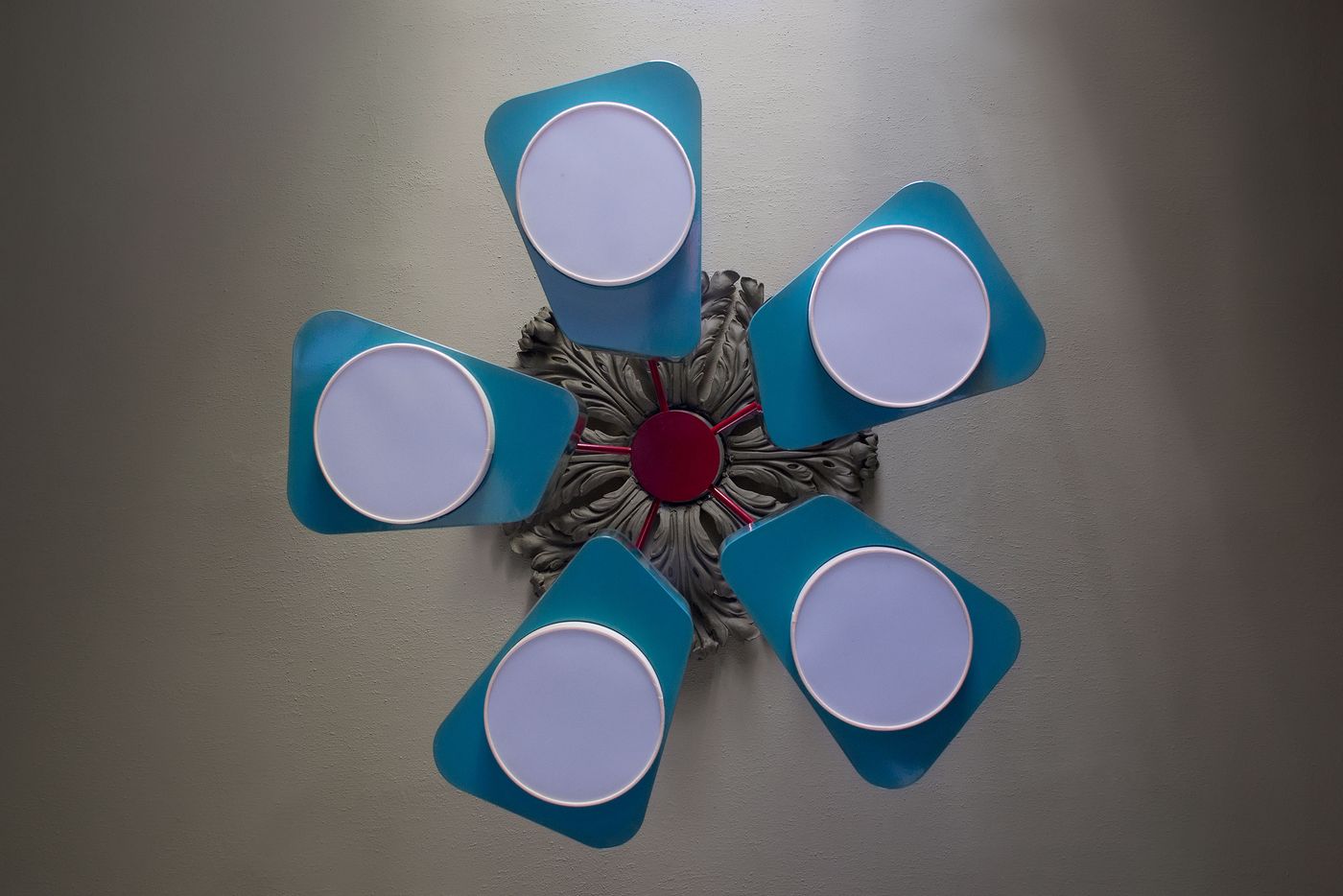
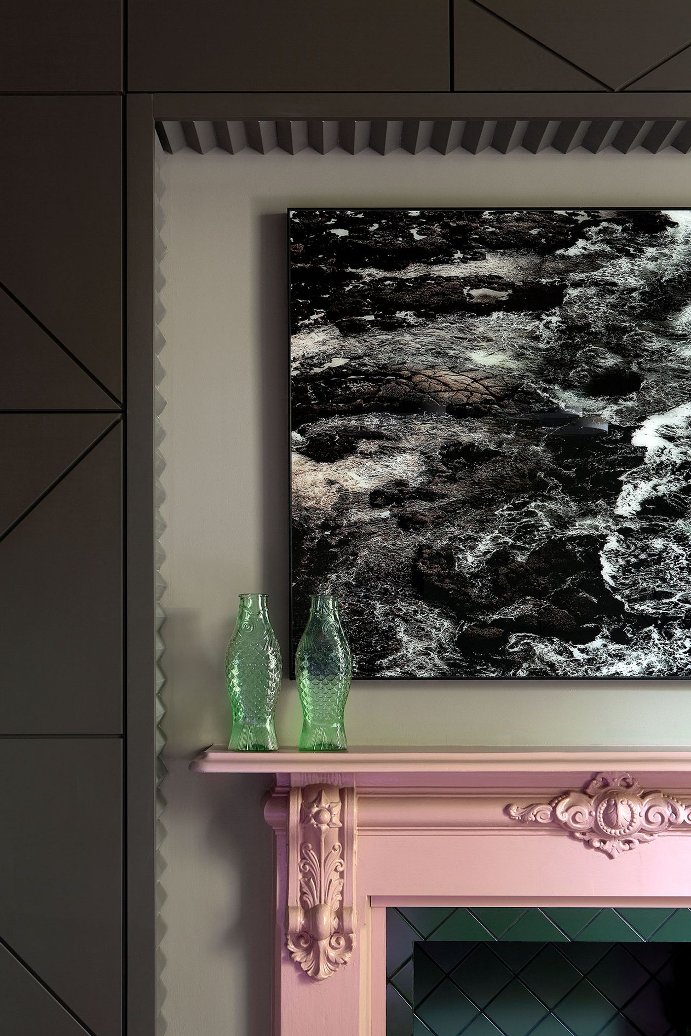
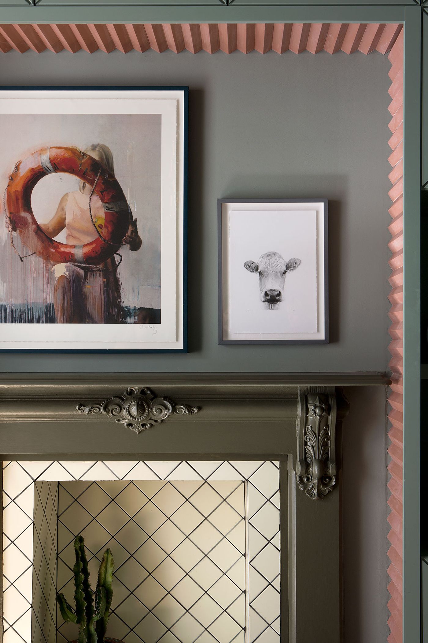
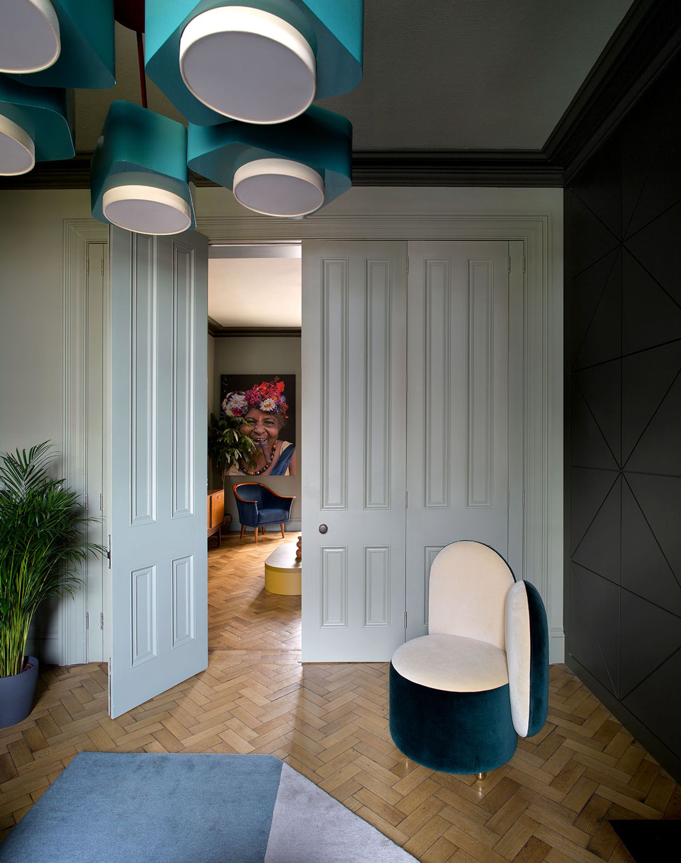
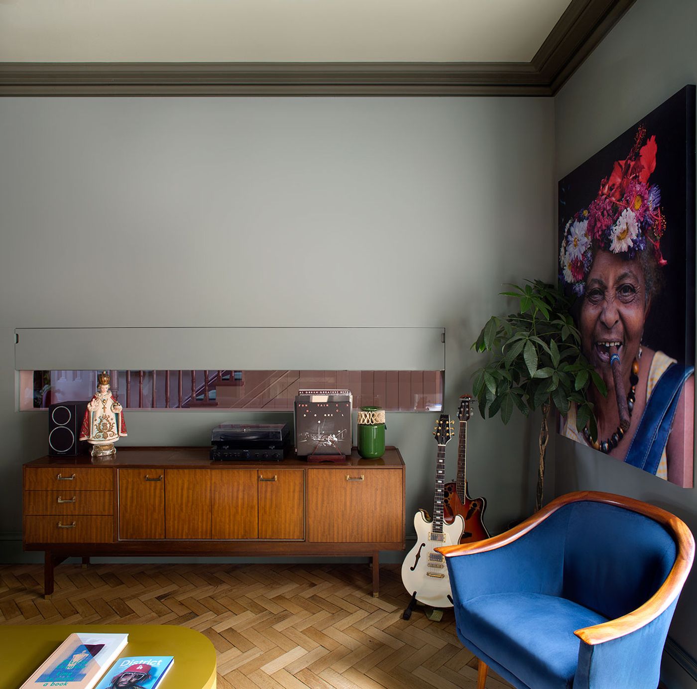
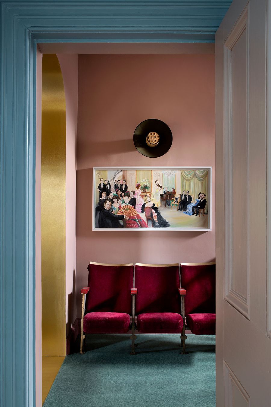
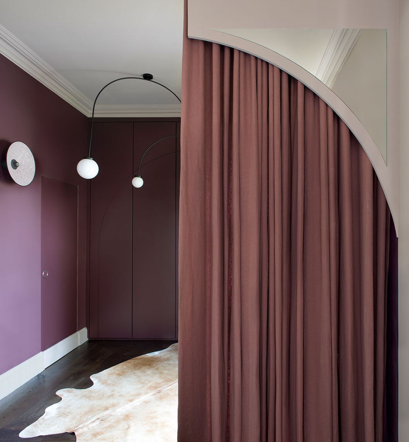
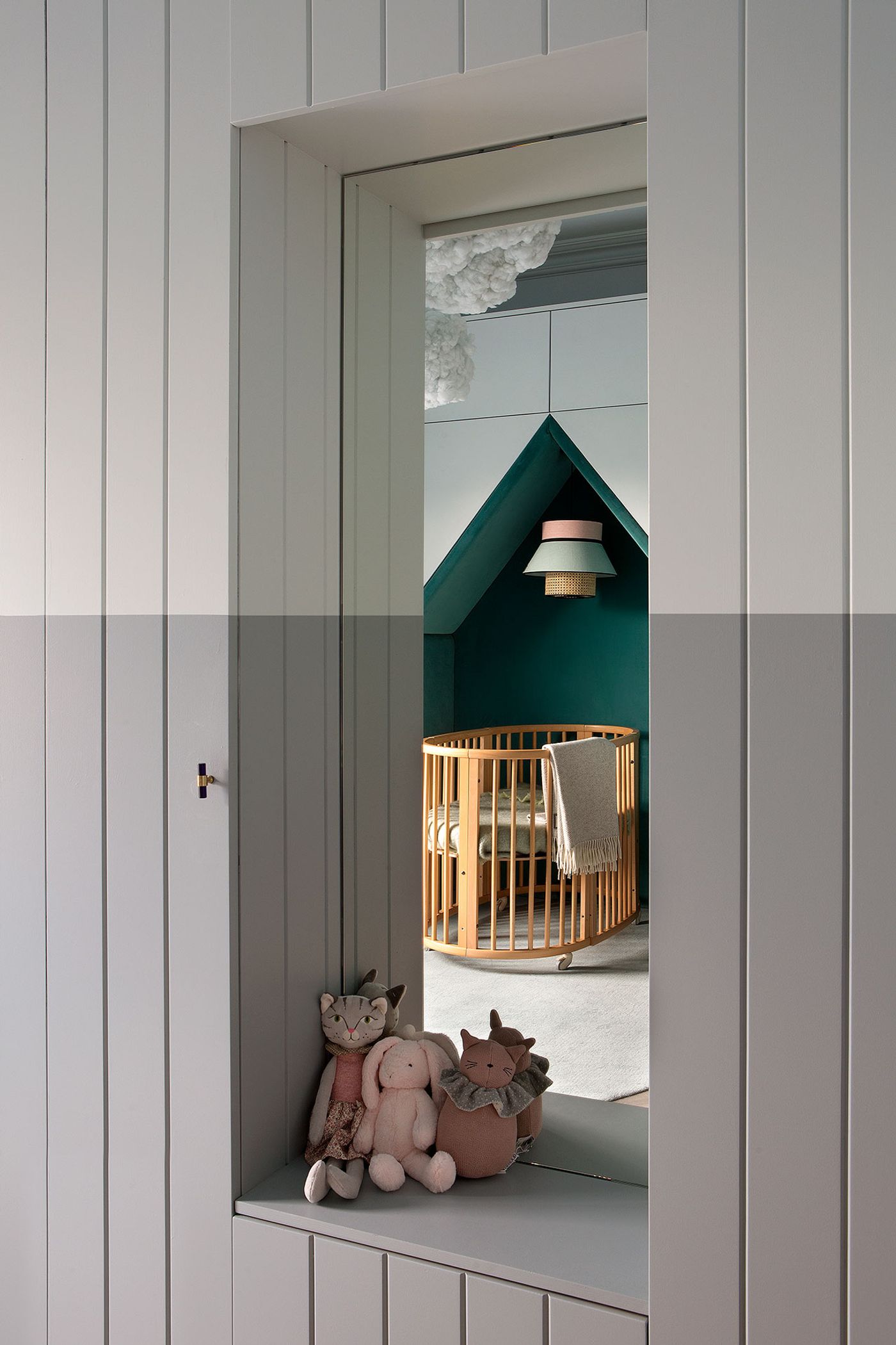
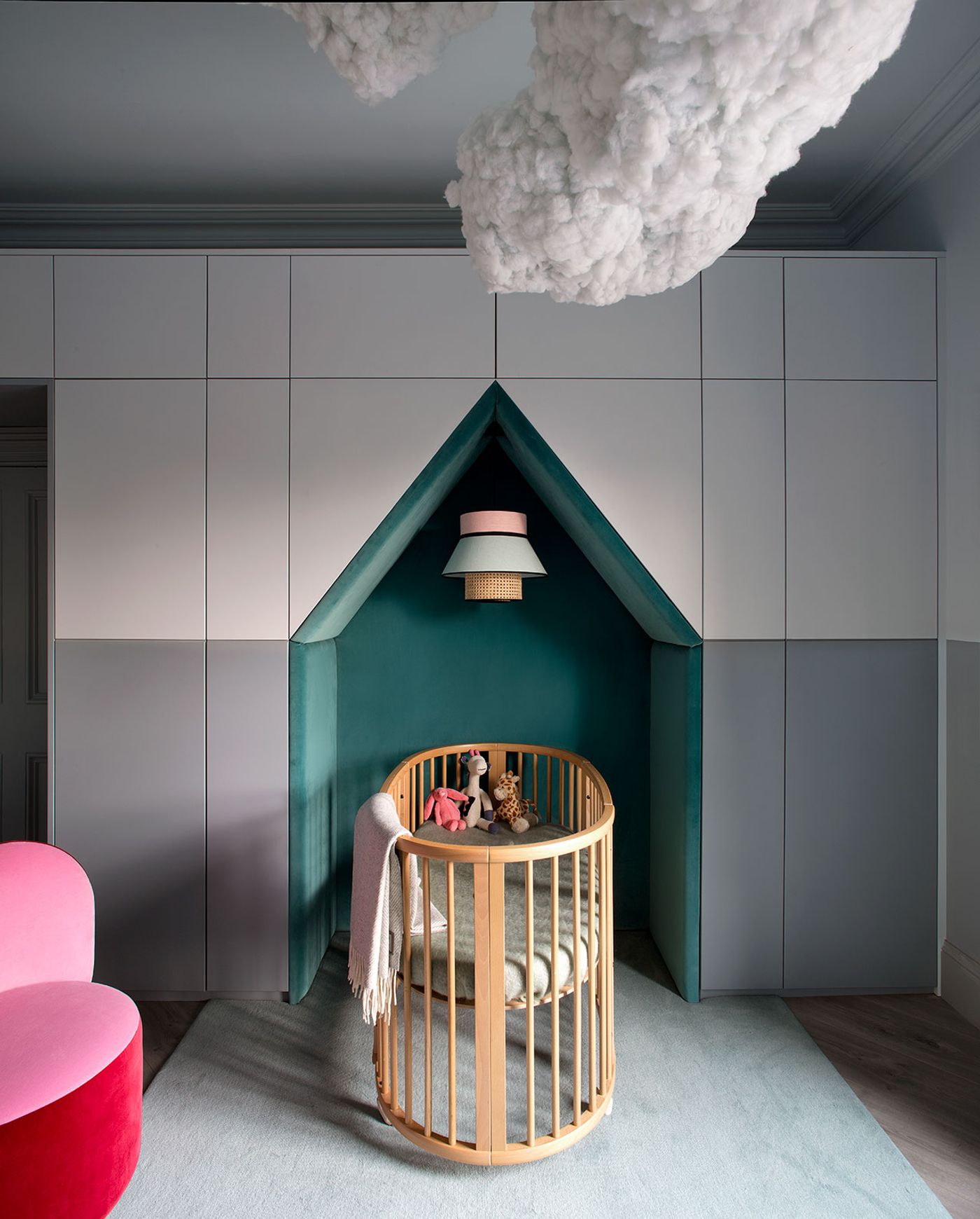
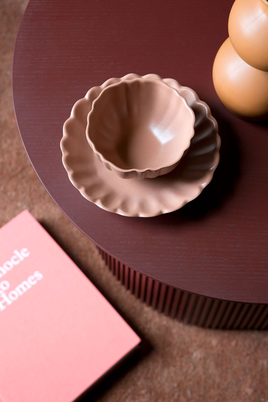
Built in 1913, the Victorian mid-terrace boasts beautiful decorative elements such as arch mouldings, ceiling roses and skirtings, which Lafferty has highlighted, oftentimes by painting them in unexpected colours. “Being brave with colour means needing to really understand colour”, the designer says, and brave she is. From candy hues, to dark pastels, to brooding teal and slate grey, each space is accentuated by different colours depending on the mood she wanted to convey and the sensations she wished to awaken. “Getting the tone right”, she explains, “is the most important thing to control the overall atmosphere and feeling”, and indeed, the eclectic sequence of colours – extending from walls, to timber joinery and plaster cornices, to carpets and curtains, to an eclectic selection of furniture – forms a cohesive visual narrative. It’s no coincidence that whilst working on this project, Lafferty created 2020 Vogue Collection, her first colour palette for Fleetwood Paints inspired from her travels in Ireland and abroad.
Photography by Barbara Corsico.
Photography by Barbara Corsico.
Photography by Barbara Corsico.
Photography by Barbara Corsico.
Photography by Barbara Corsico.
Photography by Barbara Corsico.
Photography by Barbara Corsico.
Photography by Barbara Corsico.
Photography by Barbara Corsico.
Photography by Barbara Corsico.
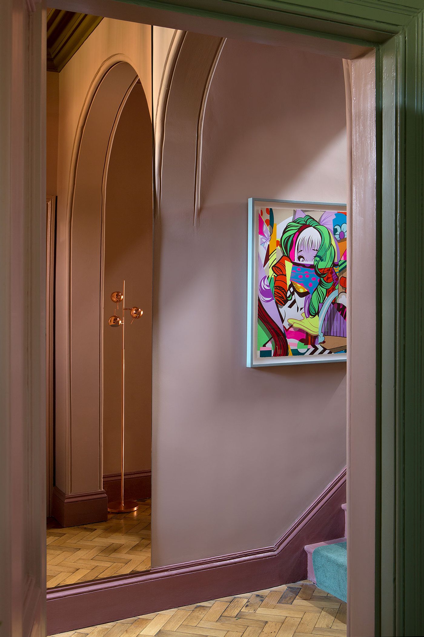
Photography by Barbara Corsico.
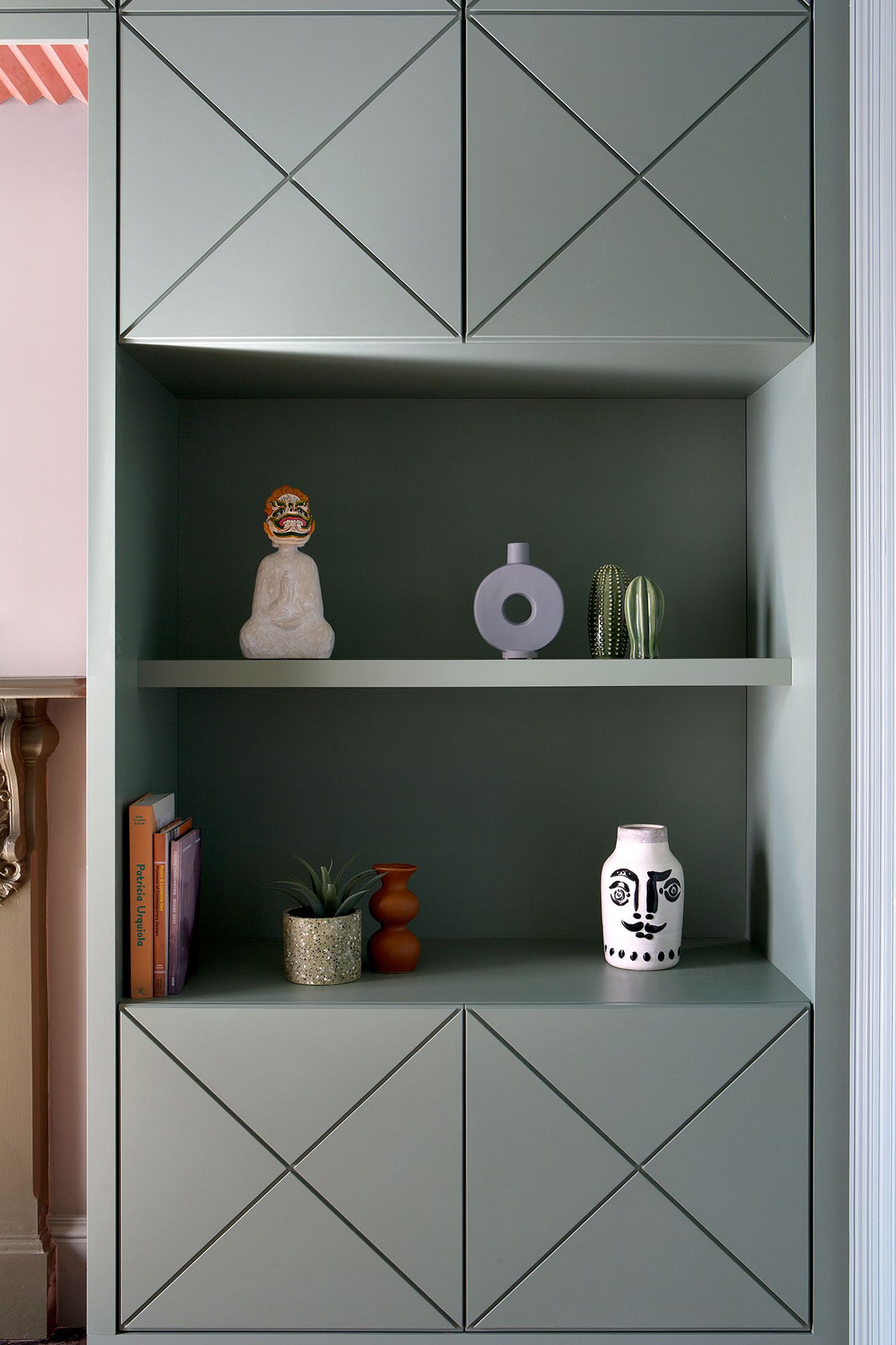
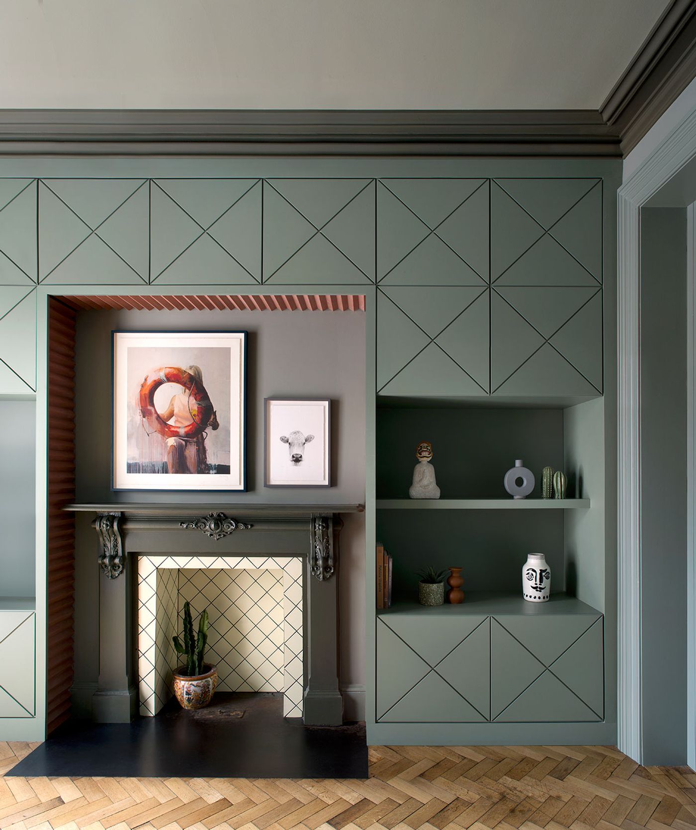
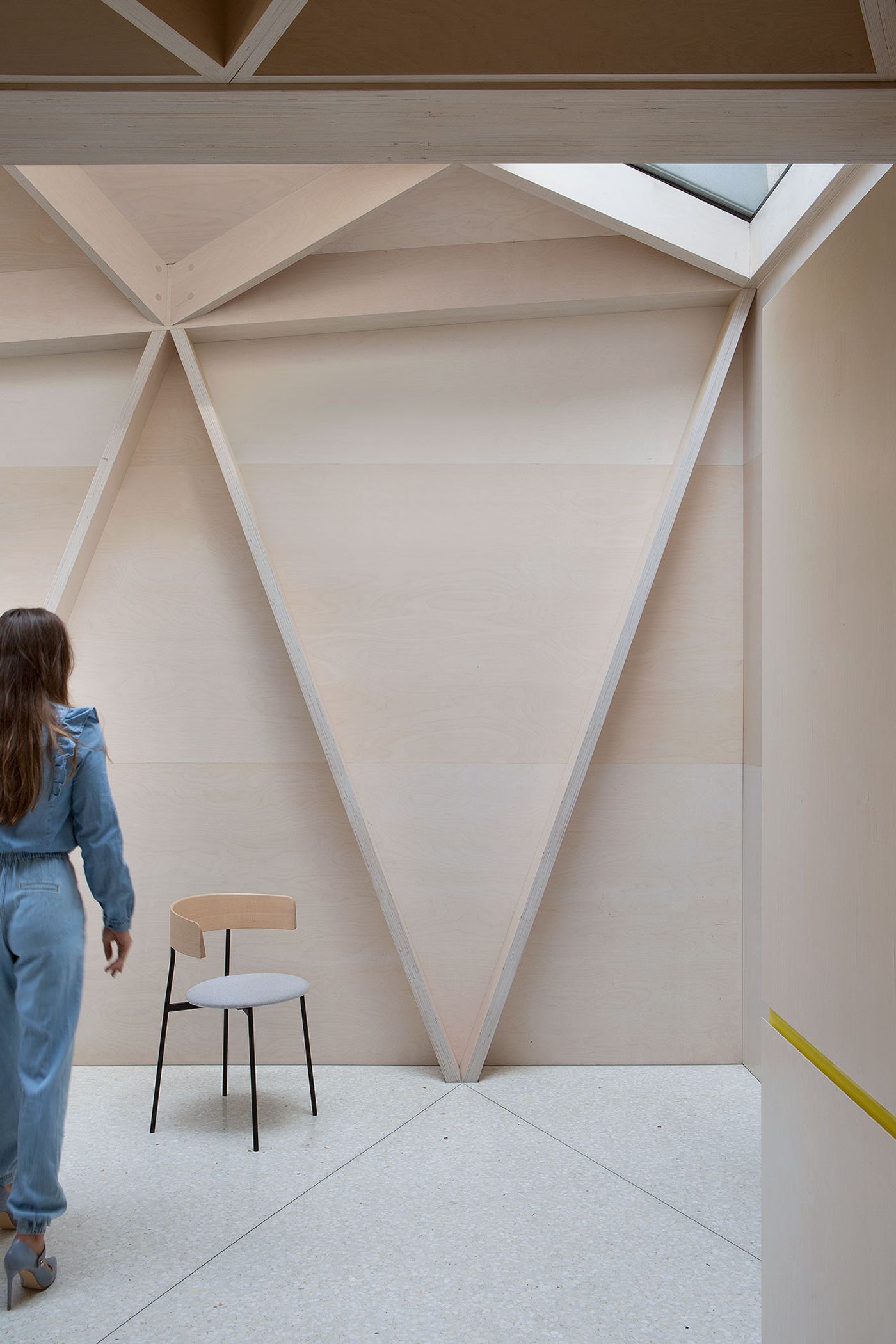
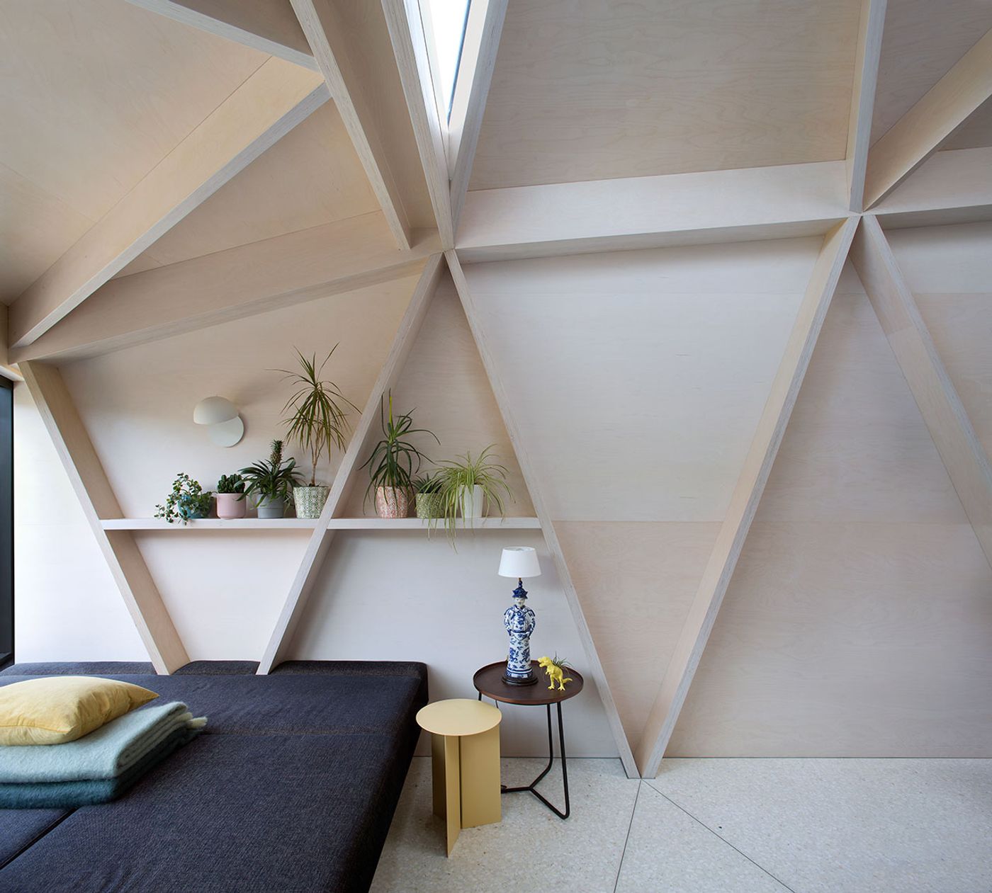
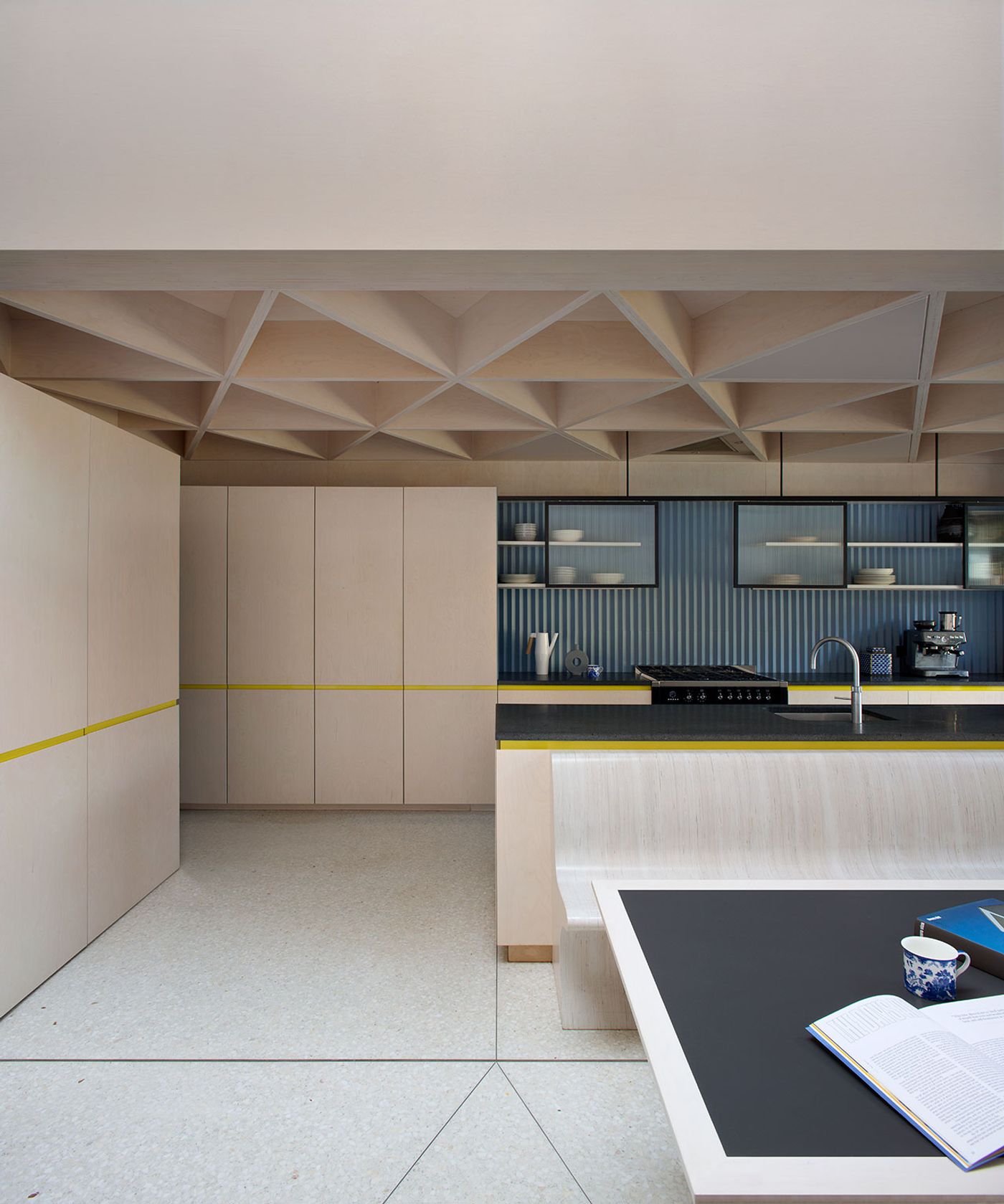
In juxtaposition to the decorative flourishes and classical elegance of the original building, the extension that Noji architects have designed is minimal and modern. Housing the kitchen and dining area, it has been constructed out of plywood in geometric playfulness. In order to bridge the aesthetic dichotomy between the period interiors and contemporary extension, Lafferty’s has developed a series of geometric patterns inspired by triangular forms of the latter which can be found throughout the rooms of the house.
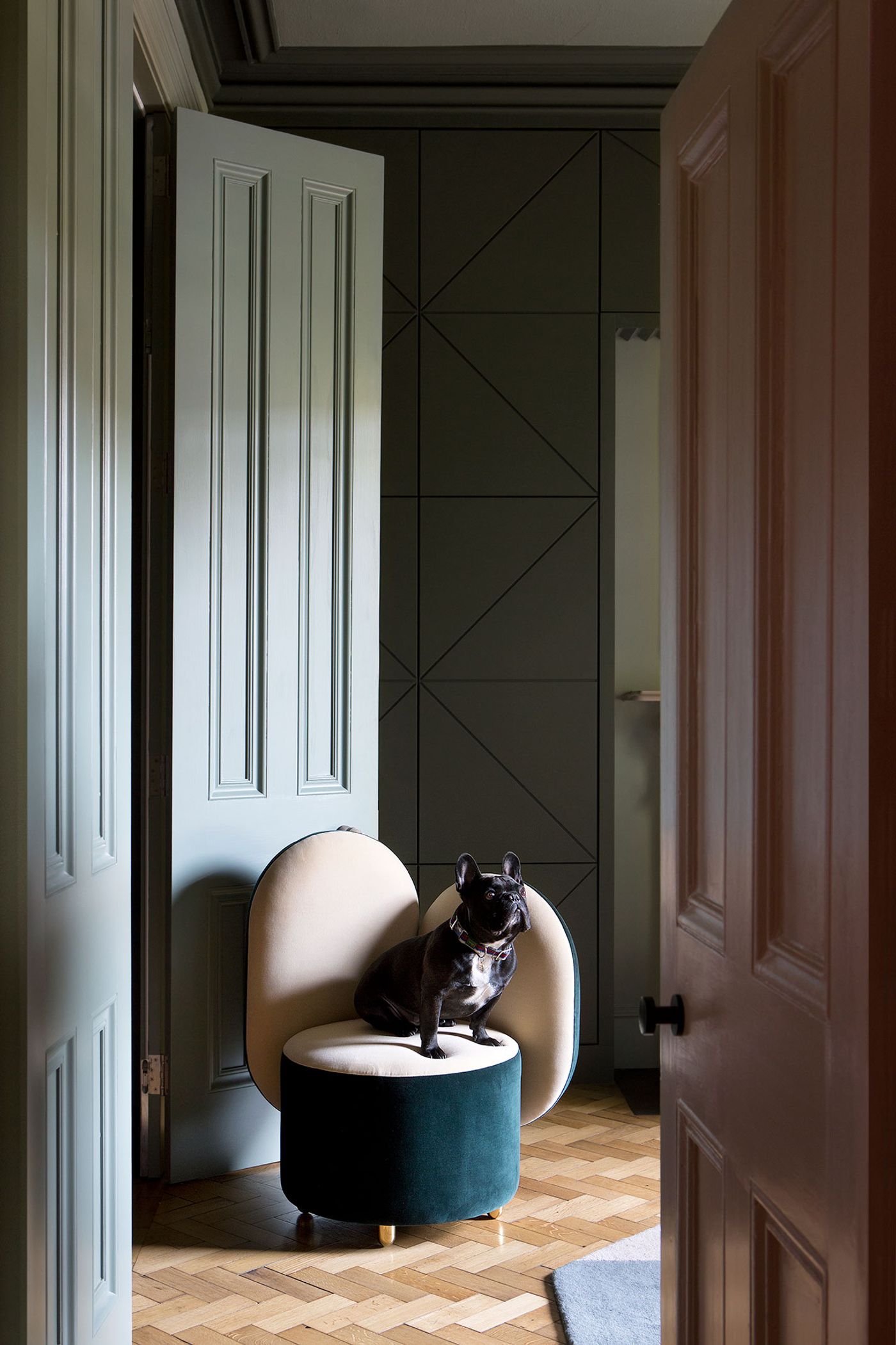
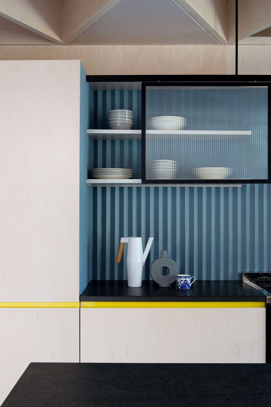
The geometric patterns have been etched on wall panels that are both decorative and functional: incorporating shelving niches and hidden storage (storage was at the forefront of the owners’ requirements), forming headboards and framing fireplaces. Such elaborate features were a challenge to construct, more so in a historic building with no square angles and straight walls, but definitely worth the hassle as they add depth and detail in every space, as does the use of the three-dimensional tiles which have been used both in drawing rooms and the kitchen extension, while plush upholstery, curtains and carpets add softness and texture.
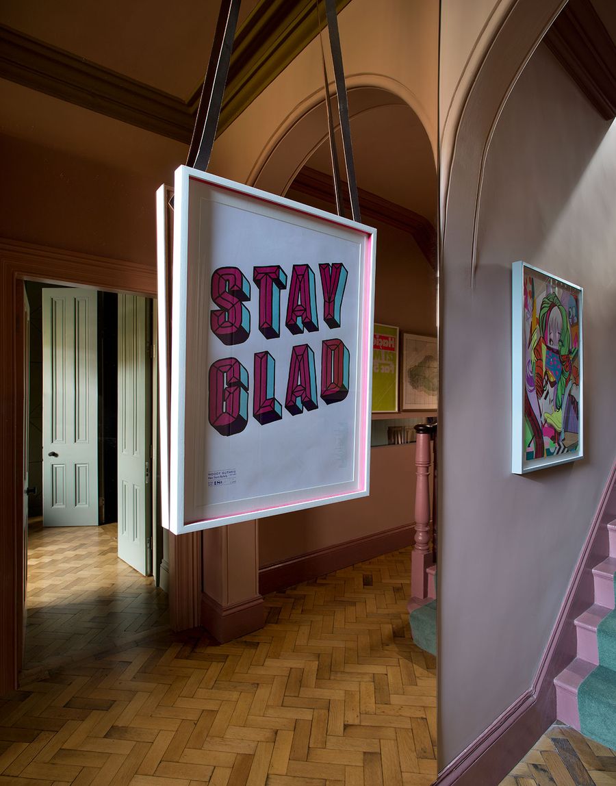
Photography by Barbara Corsico.
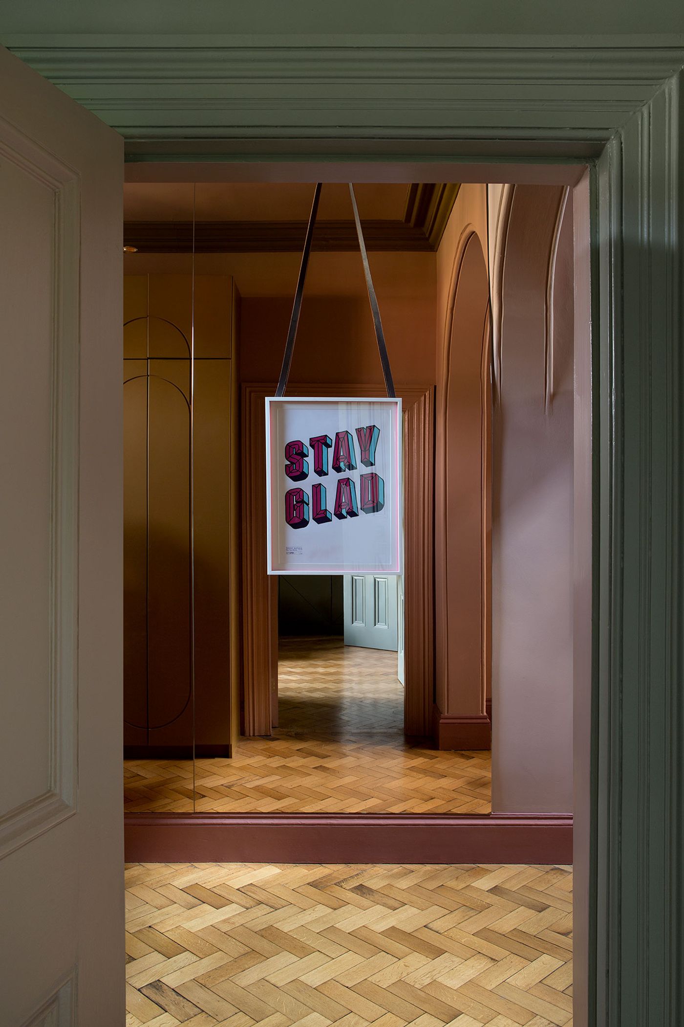
Photography by Barbara Corsico.
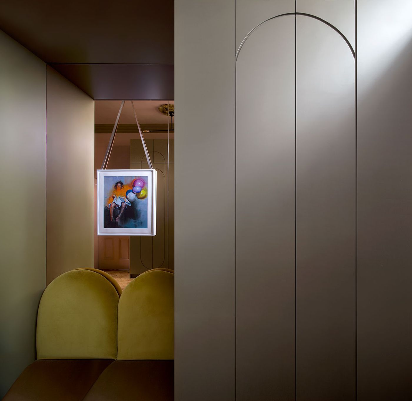
Photography by Barbara Corsico.
Photography by Barbara Corsico.
Photography by Barbara Corsico.
Photography by Barbara Corsico.
Photography by Barbara Corsico.
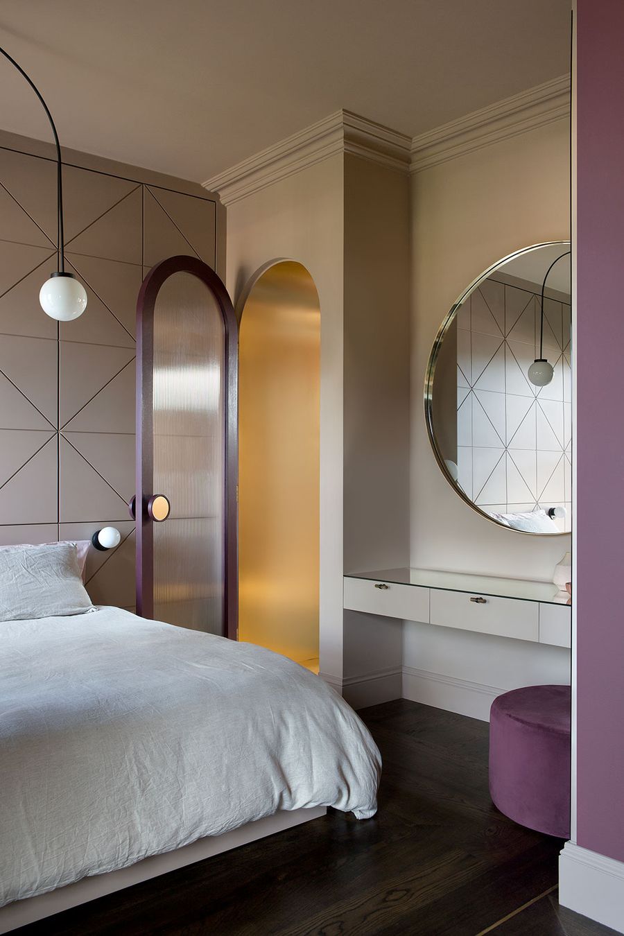
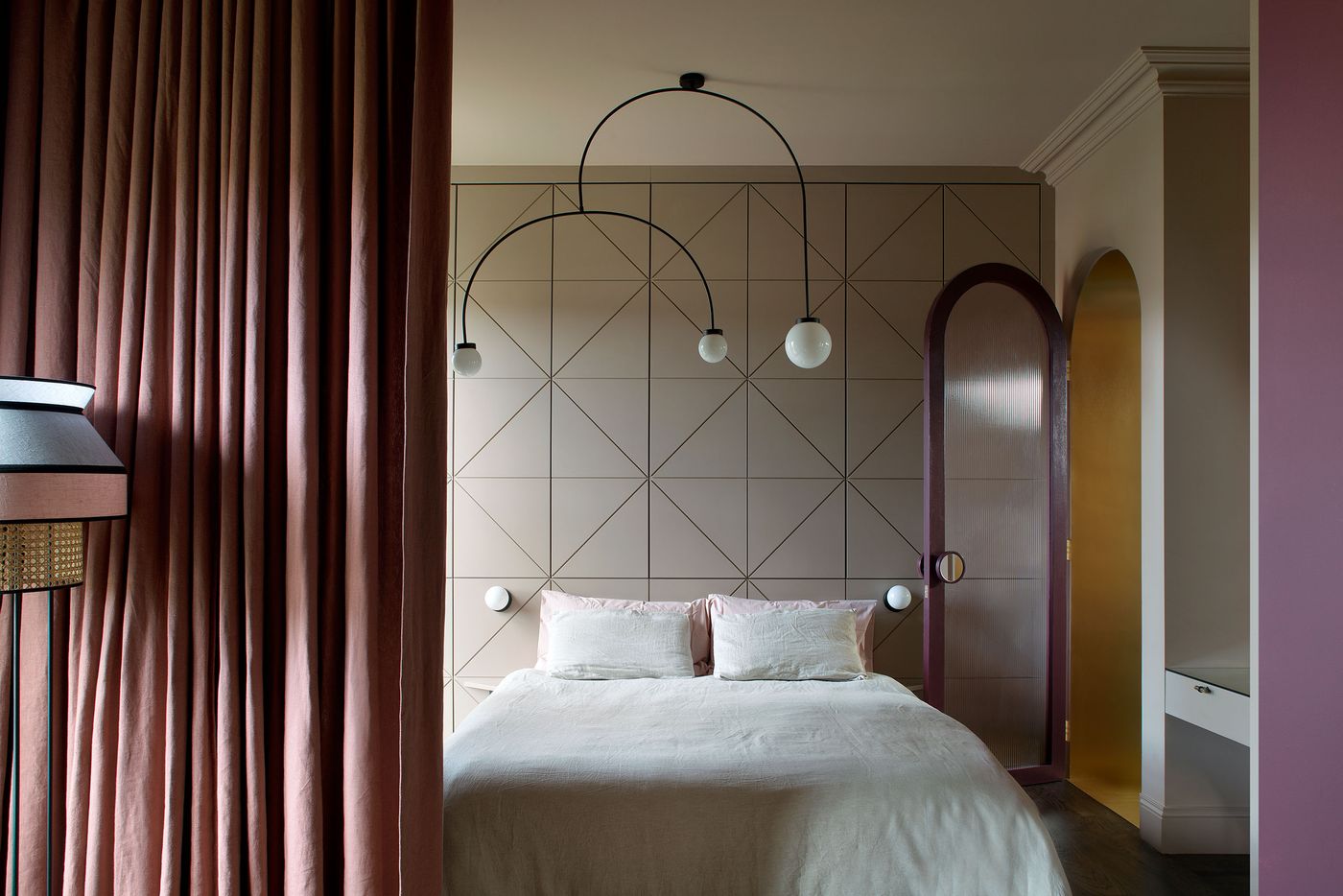
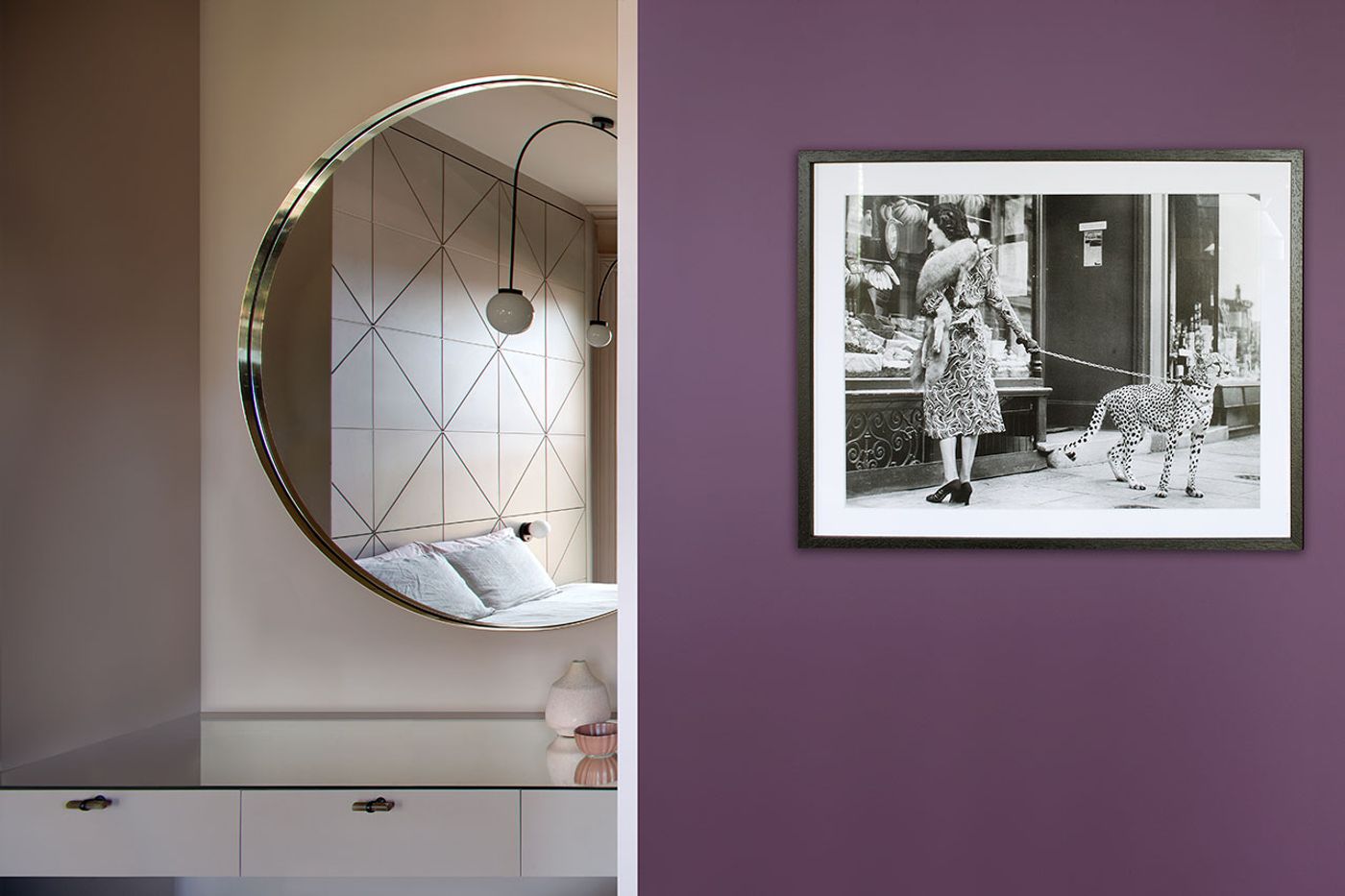
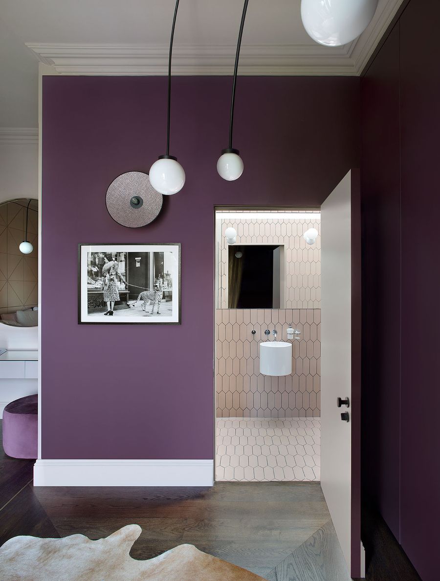
The ubiquitous geometric patterns are complemented by a series of curves, arches and circles that further enhance the playfulness and charm of the interior design while imbuing the home with a feminine, sinuous sensibility. Such forms are most pronounced in the first-floor master bedroom, a space that emerged by merging two small rooms and a landing. A brass-clad archway with a custom arched door makes for a dramatic entrance, its curves picked up by the arched ceiling lights, sphere and disk-shaped sconces, and bespoke circular mirror. A combination of light beige and dark violet hues evoke sweetness and mystery while brass floor insets subtly demarcate the sleeping from the dressing area with the help of a curtain. With such richness in forms and colours in this and the other rooms, you can’t help but experience the house through rose-tinted glasses, which is exactly what Lafferty intended.
Photography by Barbara Corsico.
Photography by Barbara Corsico.
Photography by Barbara Corsico.
Photography by Barbara Corsico.
Photography by Barbara Corsico.
Photography by Barbara Corsico.
Photography by Barbara Corsico.
Photography by Barbara Corsico.
Photography by Barbara Corsico.