Innovation Meets Craftsmanship in the Rhythmic Architecture of Bureau de Change
Words by Eric David
Location
London, United Kingdom
Innovation Meets Craftsmanship in the Rhythmic Architecture of Bureau de Change
Words by Eric David
London, United Kingdom
London, United Kingdom
Location
Helmed by Katerina Dionysopoulou and Billy Mavropoulos, Bureau de Change is a dynamic, London-based architectural practice that works on both small and large scale projects, from private residences, to exhibition set-ups, to furniture design. Driven by a desire to innovate, and underpinned by a hands-on approach involving prototyping and testing, the practice’s work is characterised by sculptural sophistication and geometric playfulness. From the undulating texture of a building façade, to the faceted shape of a ceiling, to the repetitive pattern of a woven surface, their work often features prismatic forms and polygonal shapes that form rhythmic compositions.
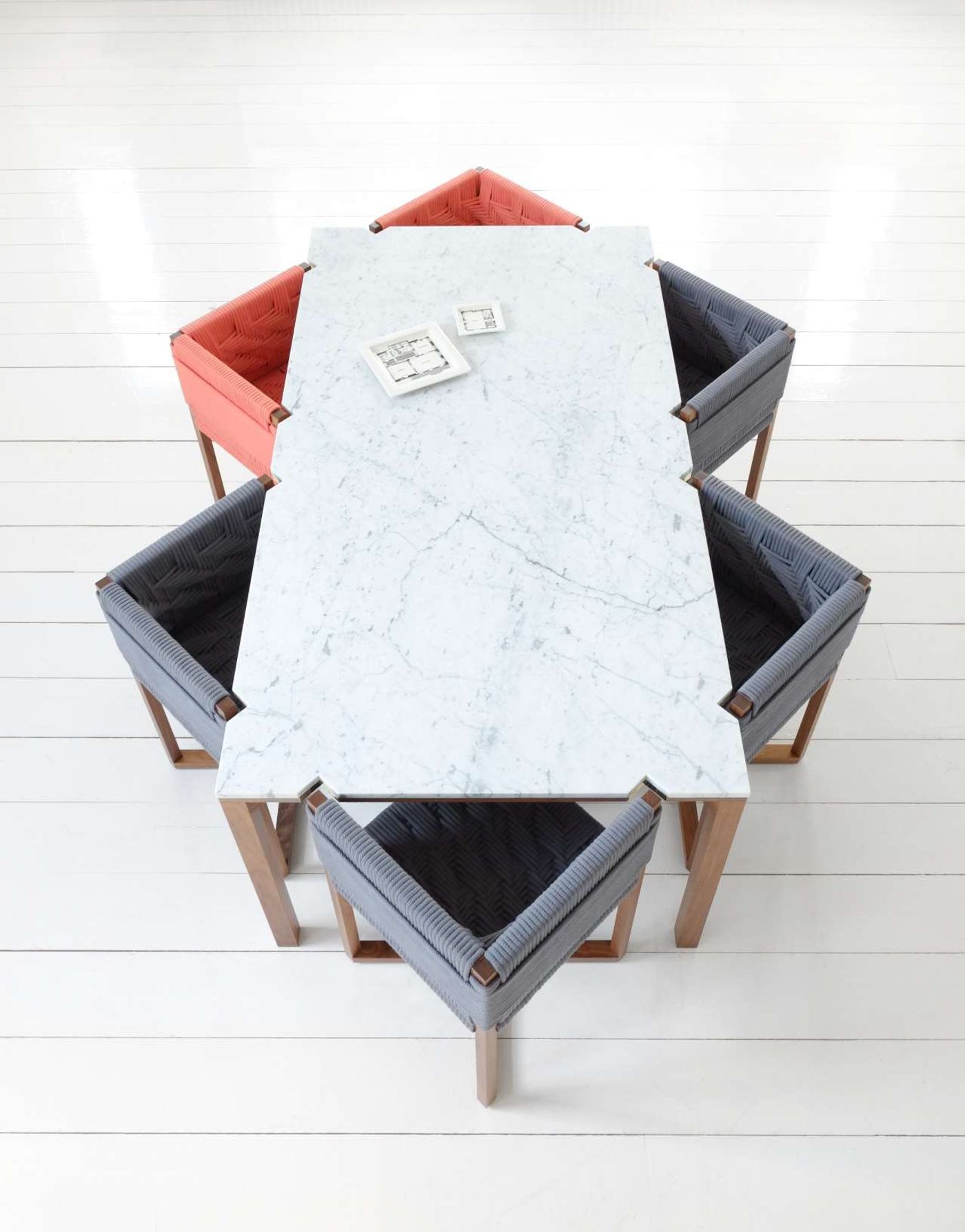
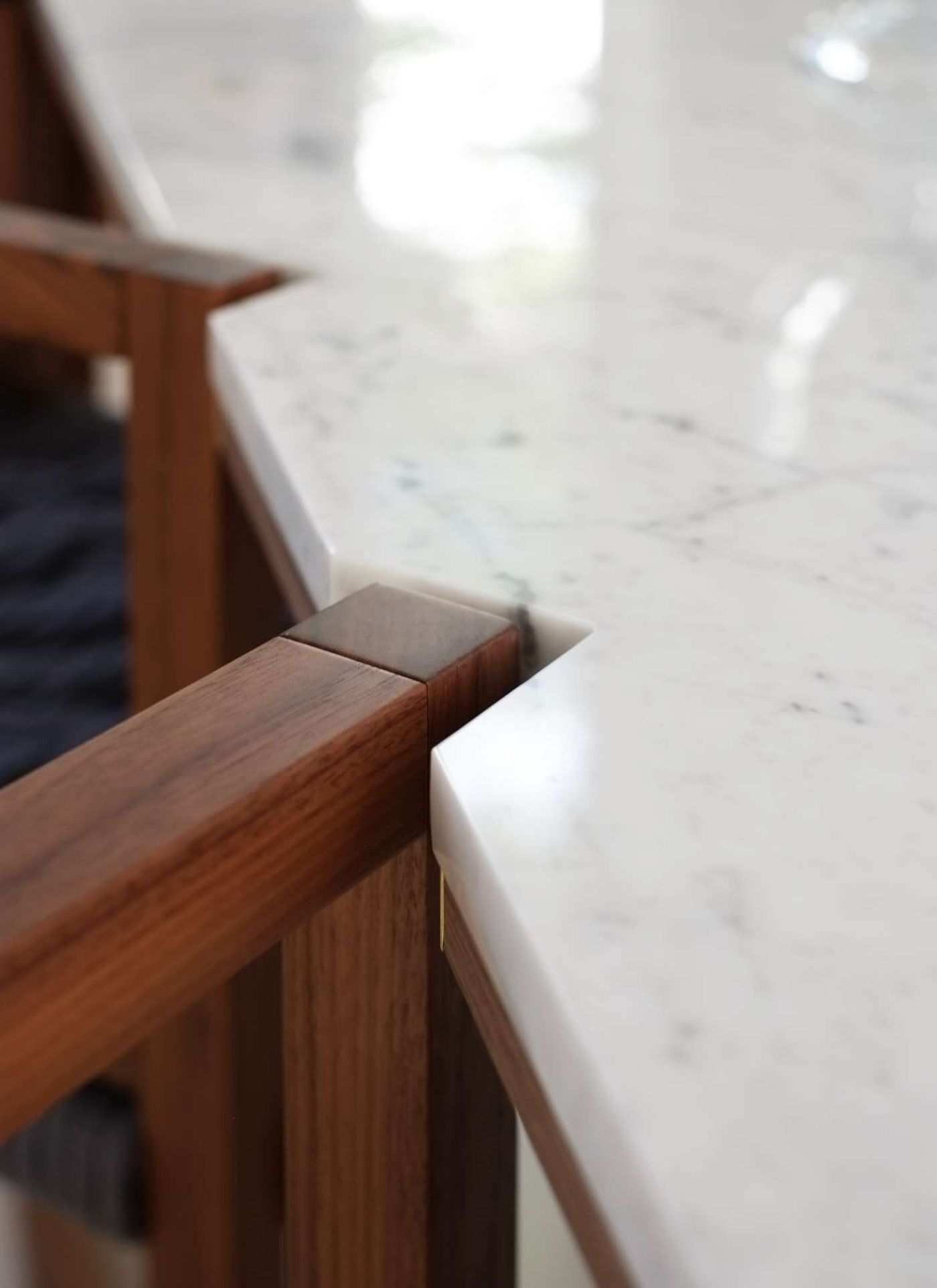
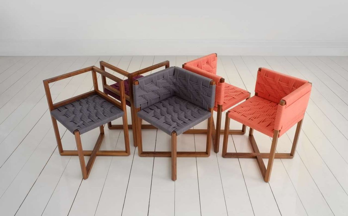
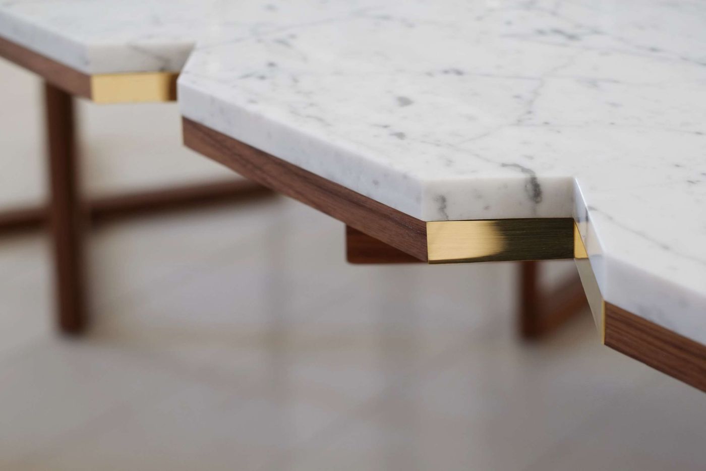
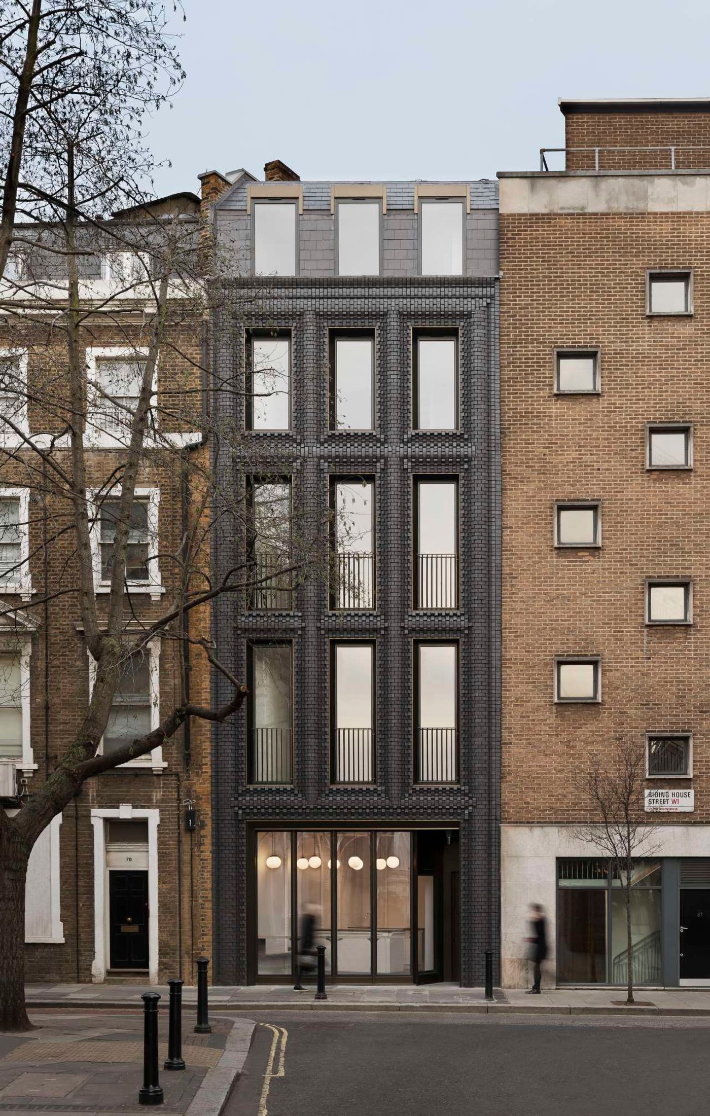
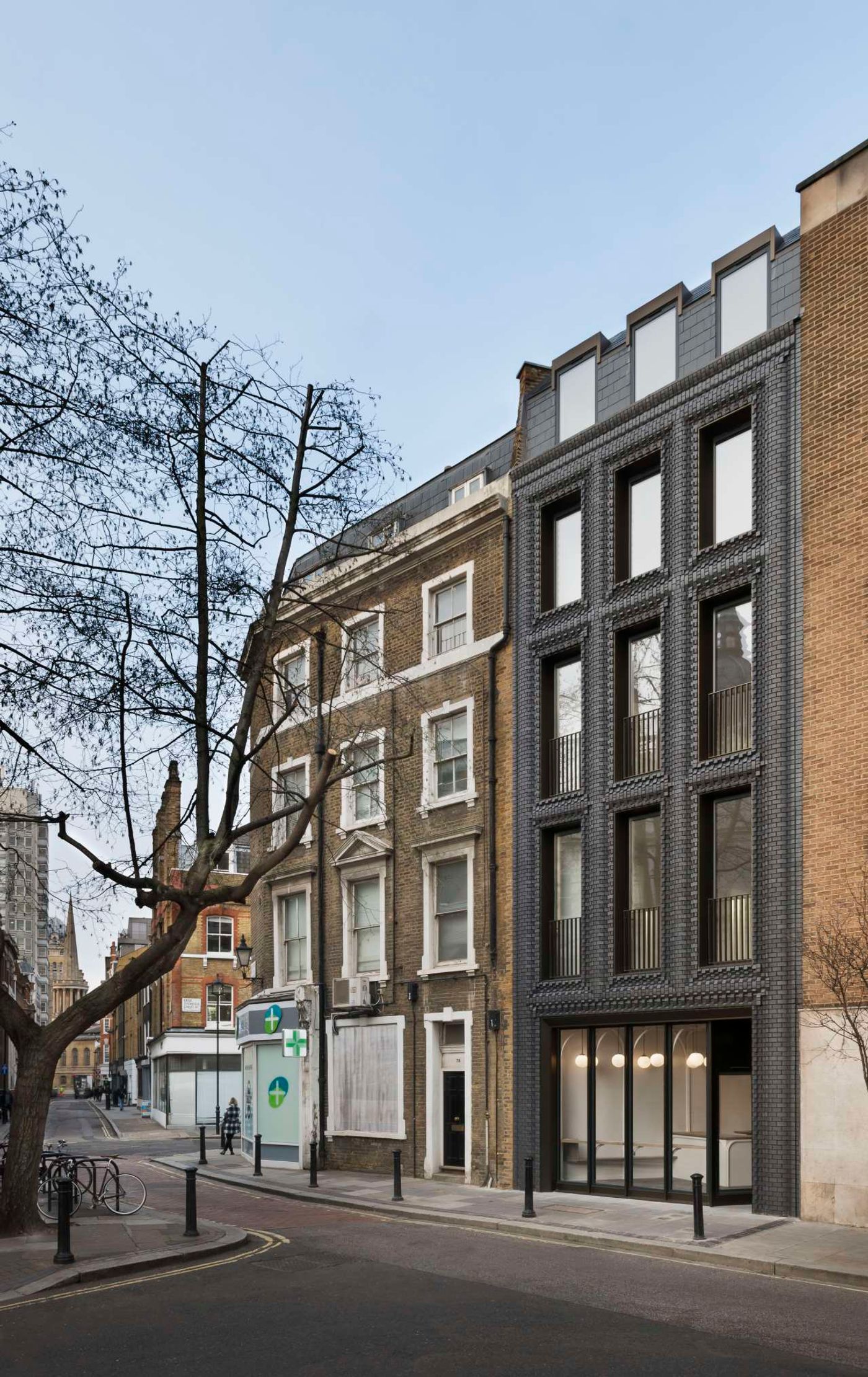
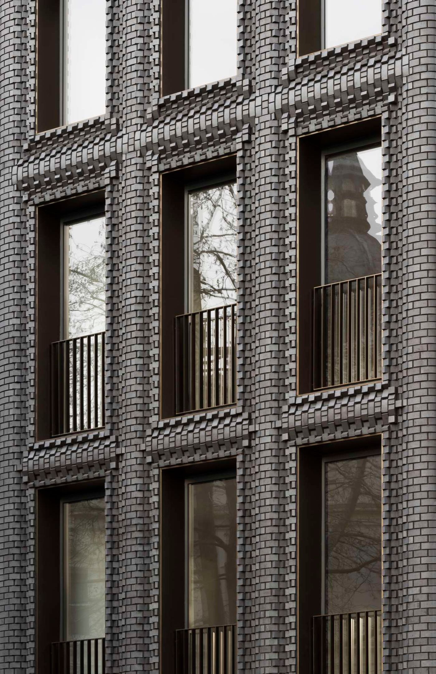
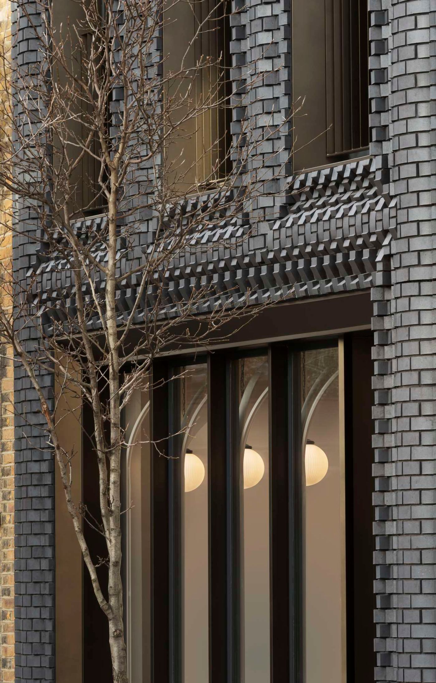
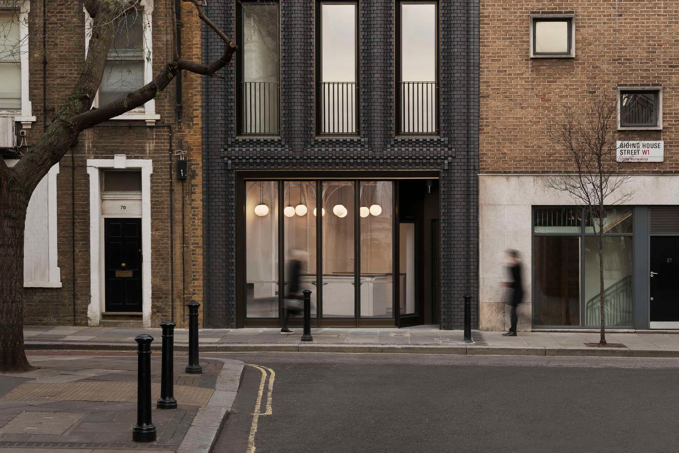
The duo has also developed a unique talent in using humble, natural materials in innovative ways by seamlessly combining traditional crafting techniques with ground-breaking technologies. Take for example ‘The Interlock’, a new build five-storey mixed-use development in London whose façade is a sculptural composition of bespoke marl clay bricks designed with the help of 3D modelling but fabricated in hand-crafted steel moulds, or the duo’s first furniture line for UK furniture brand Efasma for which they have enhanced the durability of organic cotton rope with the use of nanotechnology. Yatzer recently caught up with Katerina and Billy to chat about their burgeoning practice, their creative relationship and the importance of rhythm.
(Answers have been condensed and edited for clarity.)
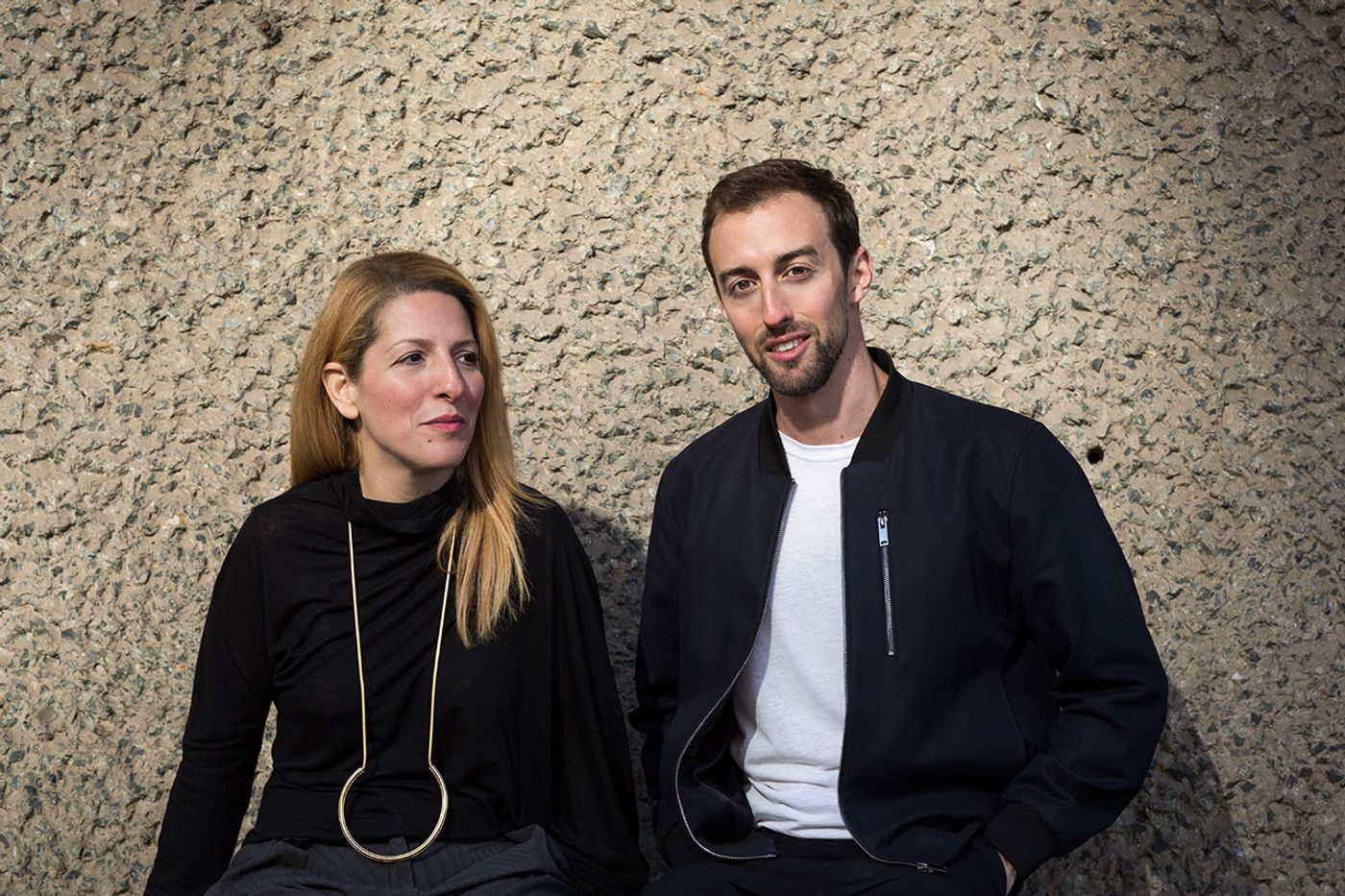
Katerina Dionysopoulou and Billy Mavropoulos. Photo by Ben Blossom.
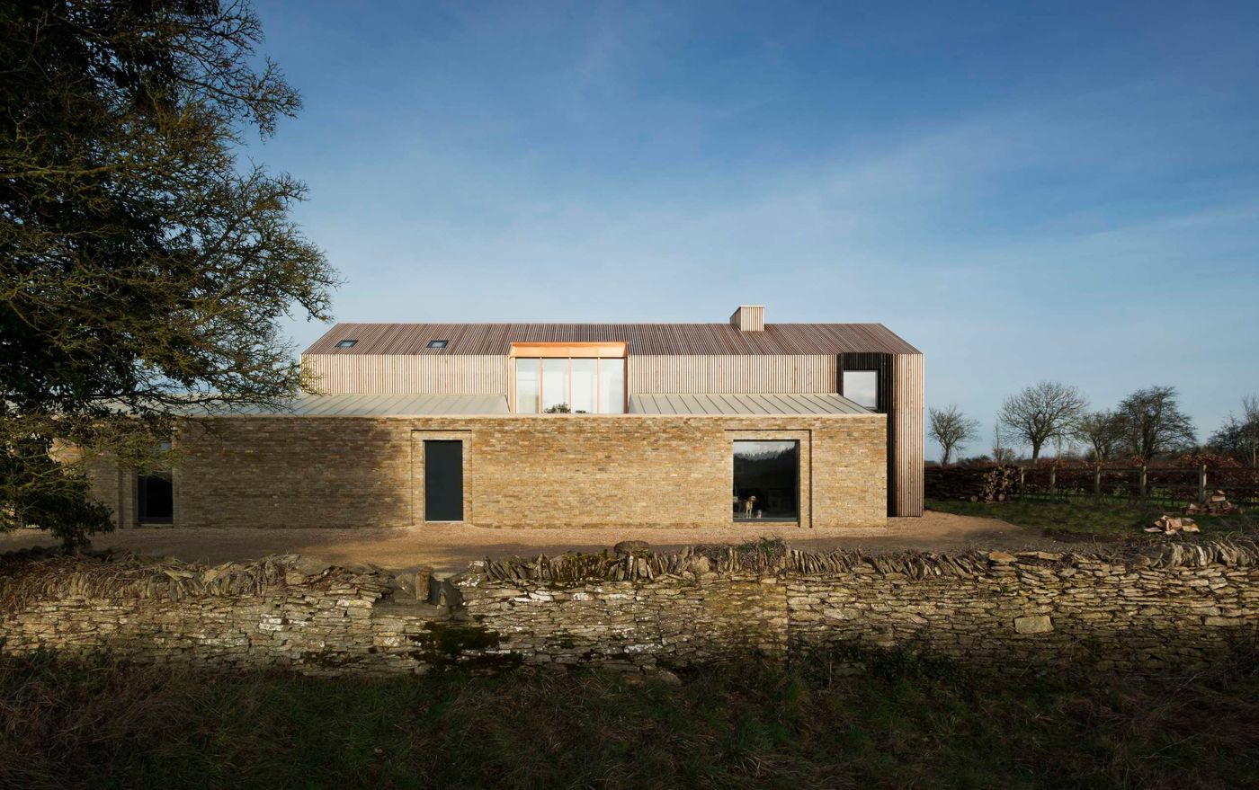
Bureau de Change, Long House. Photo by Gilbert McCarragher.
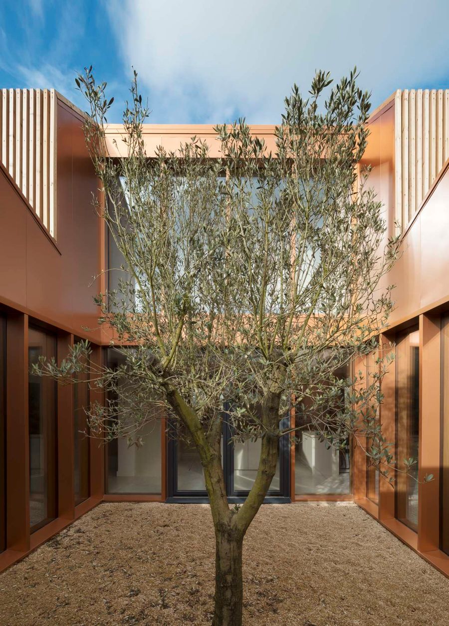
Bureau de Change, Long House. Photo by Gilbert McCarragher.
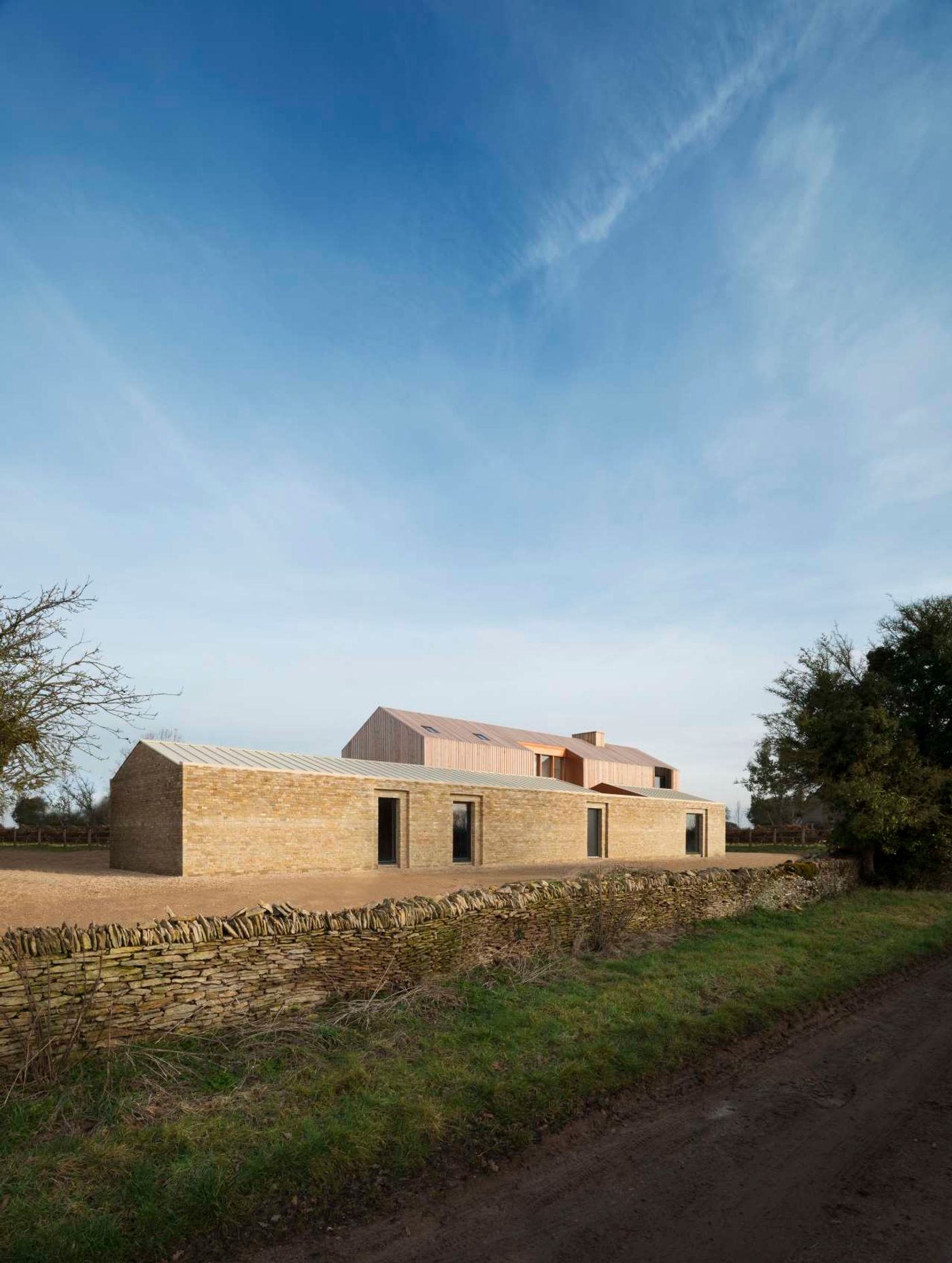
Bureau de Change, Long House. Photo by Gilbert McCarragher.
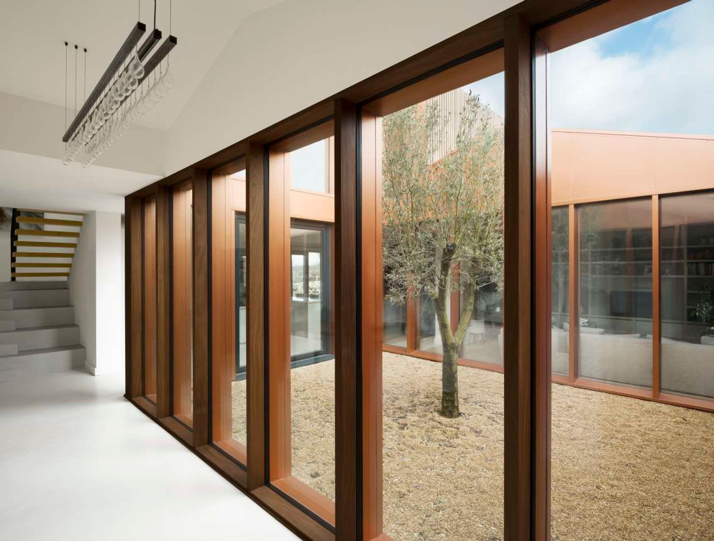
Bureau de Change, Long House. Photo by Gilbert McCarragher.
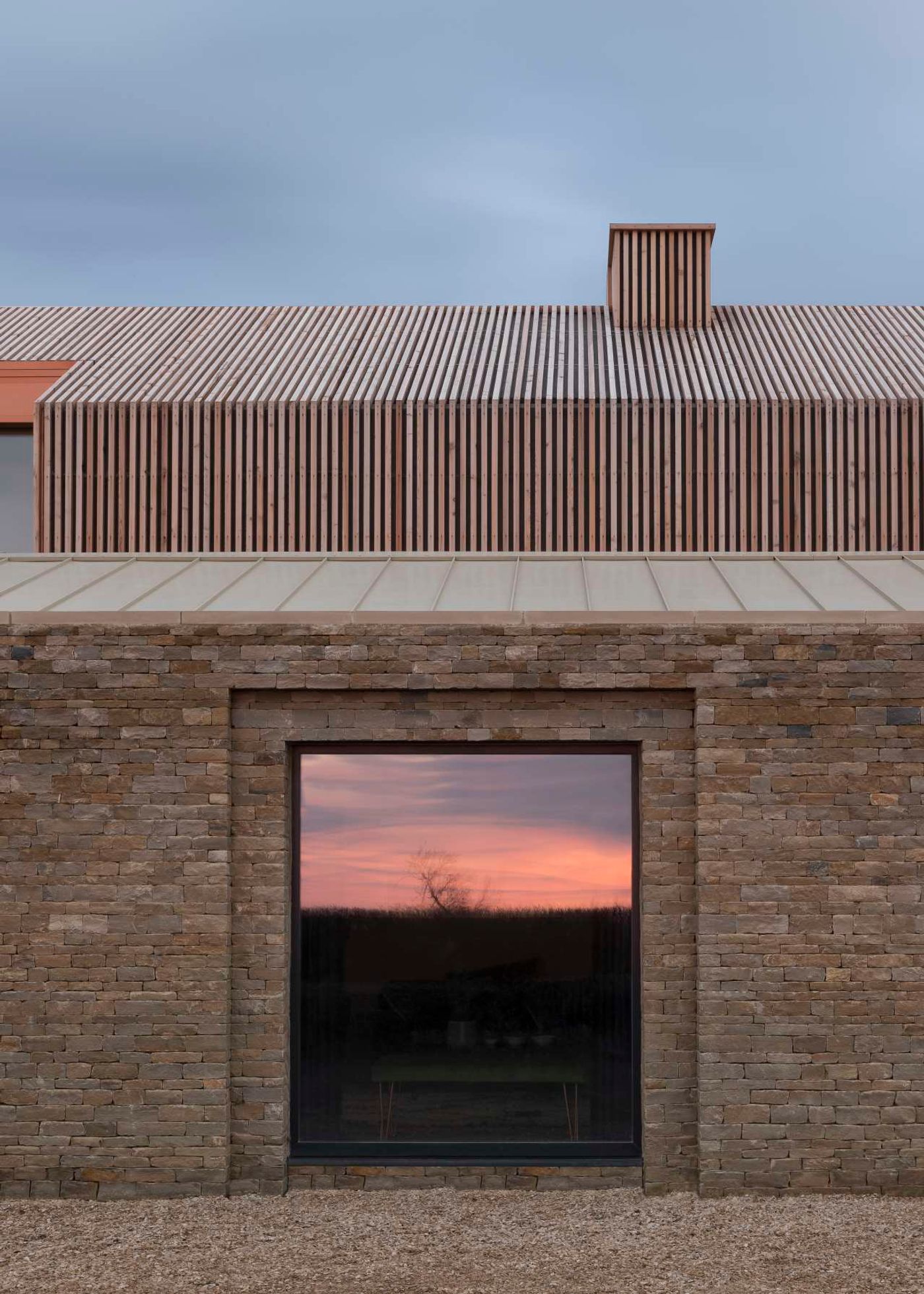
Bureau de Change, Long House. Photo by Gilbert McCarragher.
Tell us a bit about the origins of your practice. How did your partnership come about?
Billy: We met many years ago when we both worked for Norman Foster. After both leaving, we somehow found ourselves in Shanghai for the World Expo 2010 at the same time – Kat was responsible for the British Pavilion by Heatherwick Studio and I was involved in the London Pavilion - and that’s when we started discussing and toying with the idea of setting up a studio.
Katerina: A couple of years later we were given a project in New York for the Brooklyn Academy of Music and a residential project in London and we set up the studio off the back of those two projects. We’ve been up and running now for 6 years but it really feels like yesterday!
How would you describe your architectural style? Is there an underlying aesthetic or conceptual framework that you adhere to or do you embark on each project with a clean slate?
B: I would say we don’t have a particular style. We tend to respond to every project and client differently – always trying to approach the brief we are given with a fresh eye and a sense of discovery. That’s why all of our projects are different – we don’t tend to repeat ideas, we like to challenge what’s expected and do something different that’s unique for every project.
K: In lieu of a style, what we adopt is a process that is common throughout our projects regardless of scale. We do quite extensive research into each project, whether it is a house, an office or a piece of furniture, etc. We explore the heritage, craft, materials and particularities of each and twist or exploit them to uncover something unexpected and innovative along the way. Making and craft processes play big roles in all of our projects.
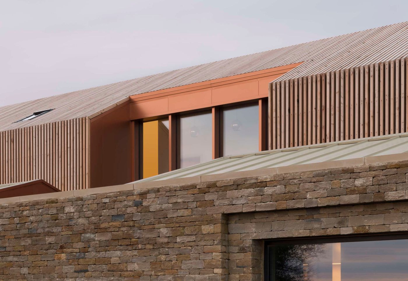
Bureau de Change, Long House. Photo by Gilbert McCarragher.
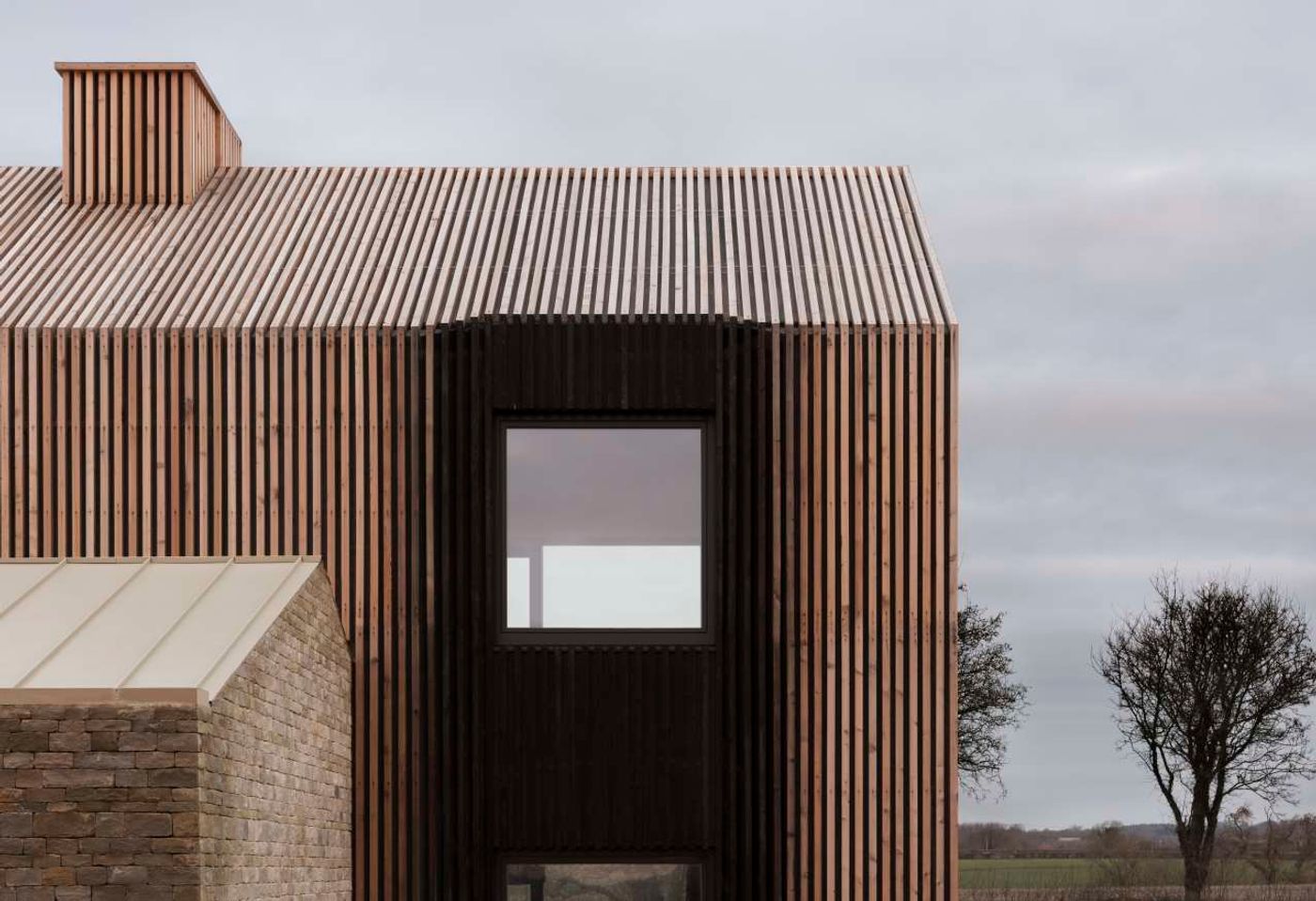
Bureau de Change, Long House. Photo by Gilbert McCarragher.
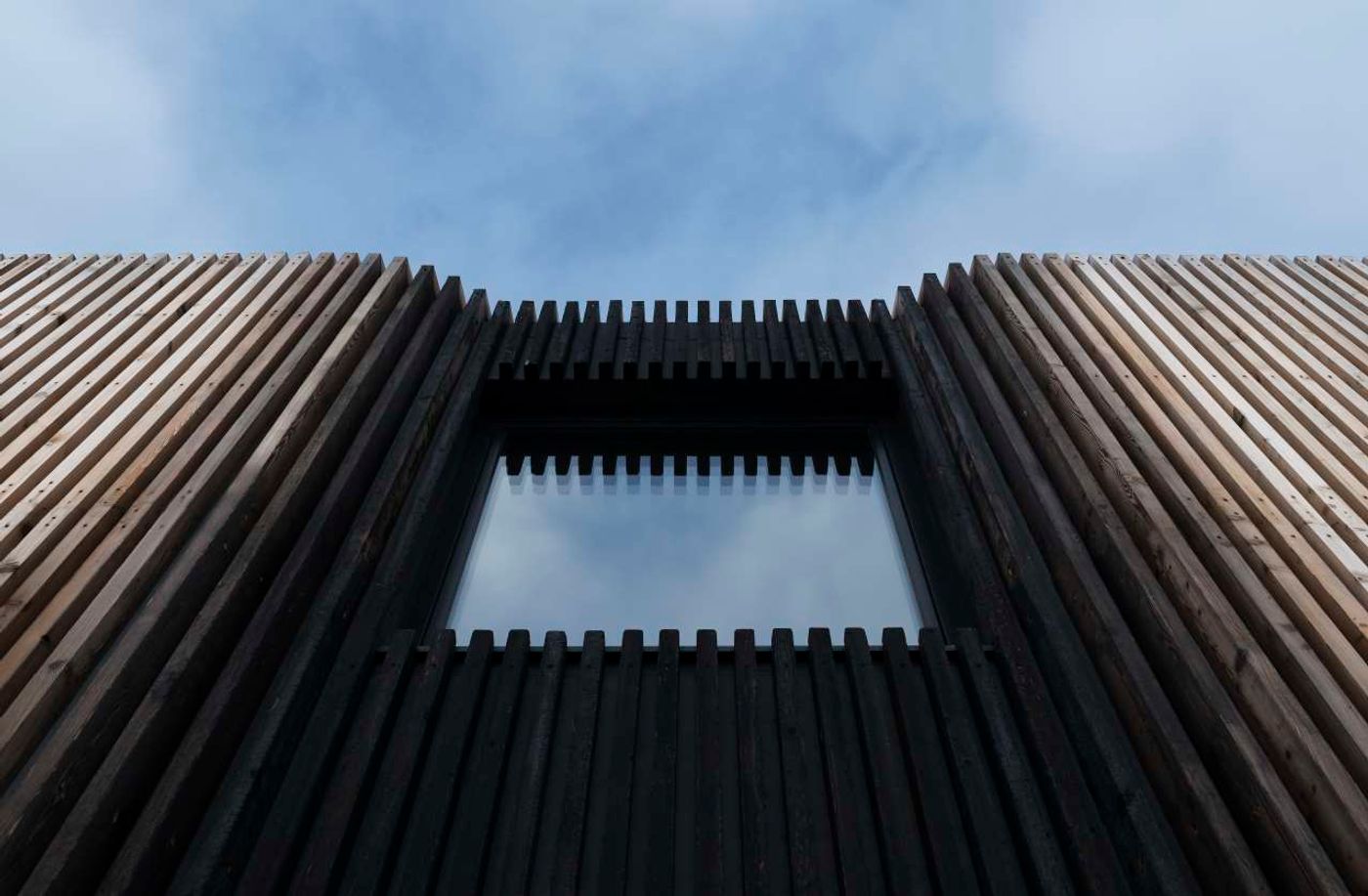
Bureau de Change, Long House. Photo by Gilbert McCarragher.
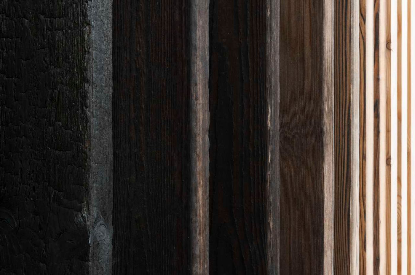
Bureau de Change, Long House. Photo by Gilbert McCarragher.
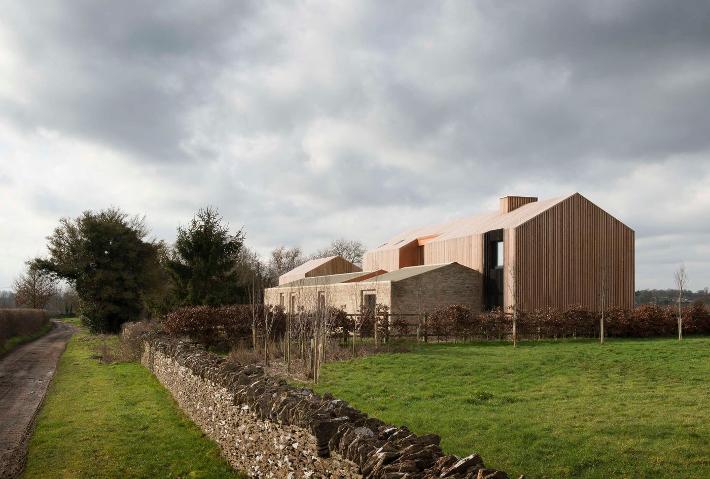
Bureau de Change, Long House. Photo by Gilbert McCarragher.
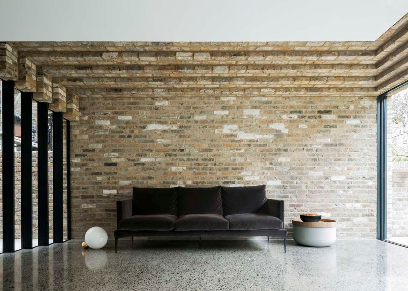
Bureau de Change, Step House. Photo by Ben Blossom.
How different are you as designers?
B: Weirdly enough we’re quite similar. When I left Fosters I went to the Royal College of Art where I understood the strength in collaborating with the other design disciplines. Architects tend to be introverts and I wanted to break that mould. That informed the work I did that followed in retail design, product design, curating and branding. I always worked with other designers, artists, media and marketing people etc. within art and retail establishments like the Tate or Selfridges.
K: Similarly for me after Fosters I went to work for Thomas Heatherwick and the projects I was involved in were far from stereotypical architecture. I delivered, among others, the aforementioned UK Pavilion, the cauldron for the London Olympics 2012 and the distillery for Bombay Sapphire in the UK. The studio culture there had a focus on making and human experience which resonated with me. So, somehow even though Billy and I took slightly different paths we ended up with a design approach that’s very much aligned.
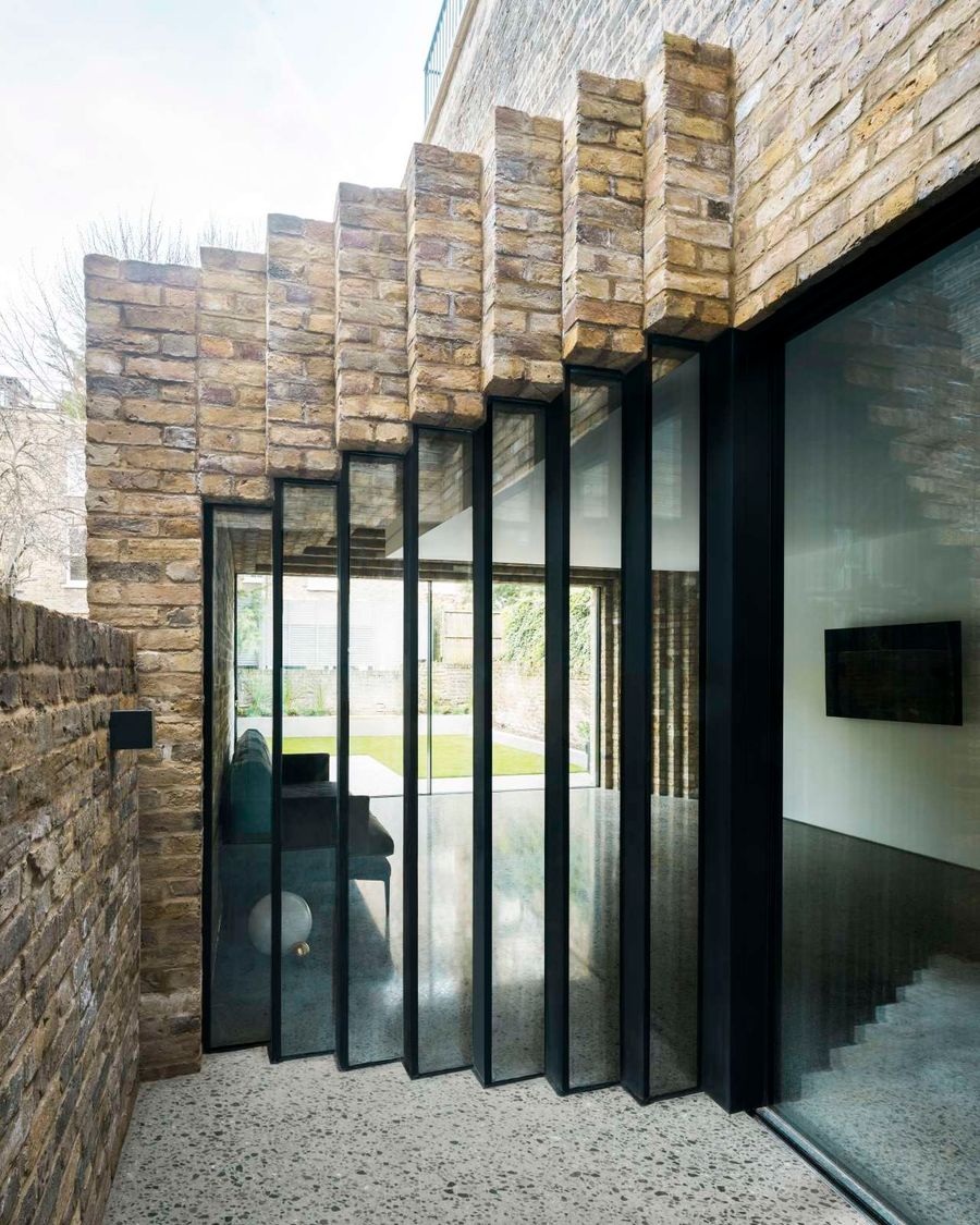
Bureau de Change, Step House. Photo by Ben Blossom.
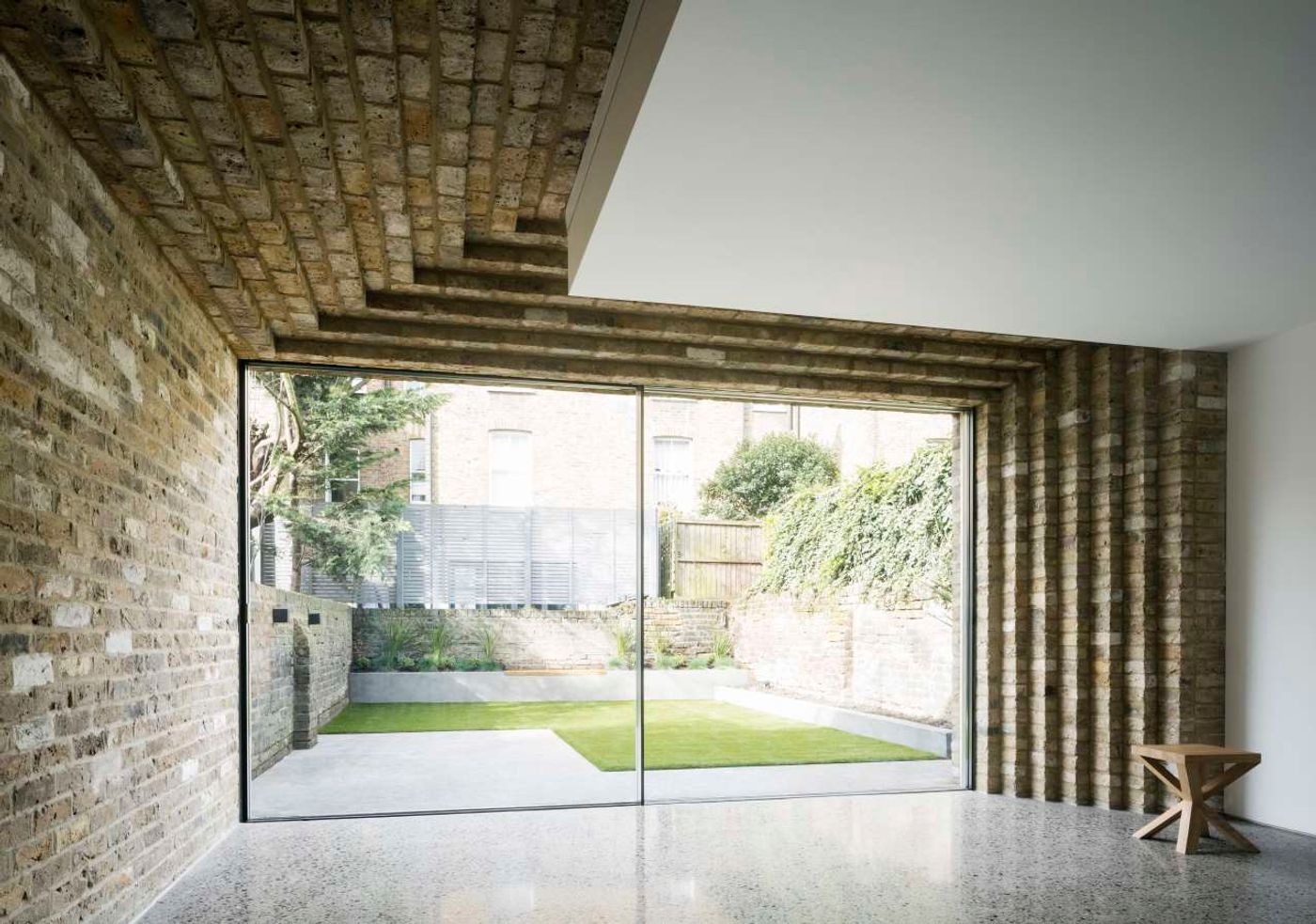
Bureau de Change, Step House. Photo by Ben Blossom.
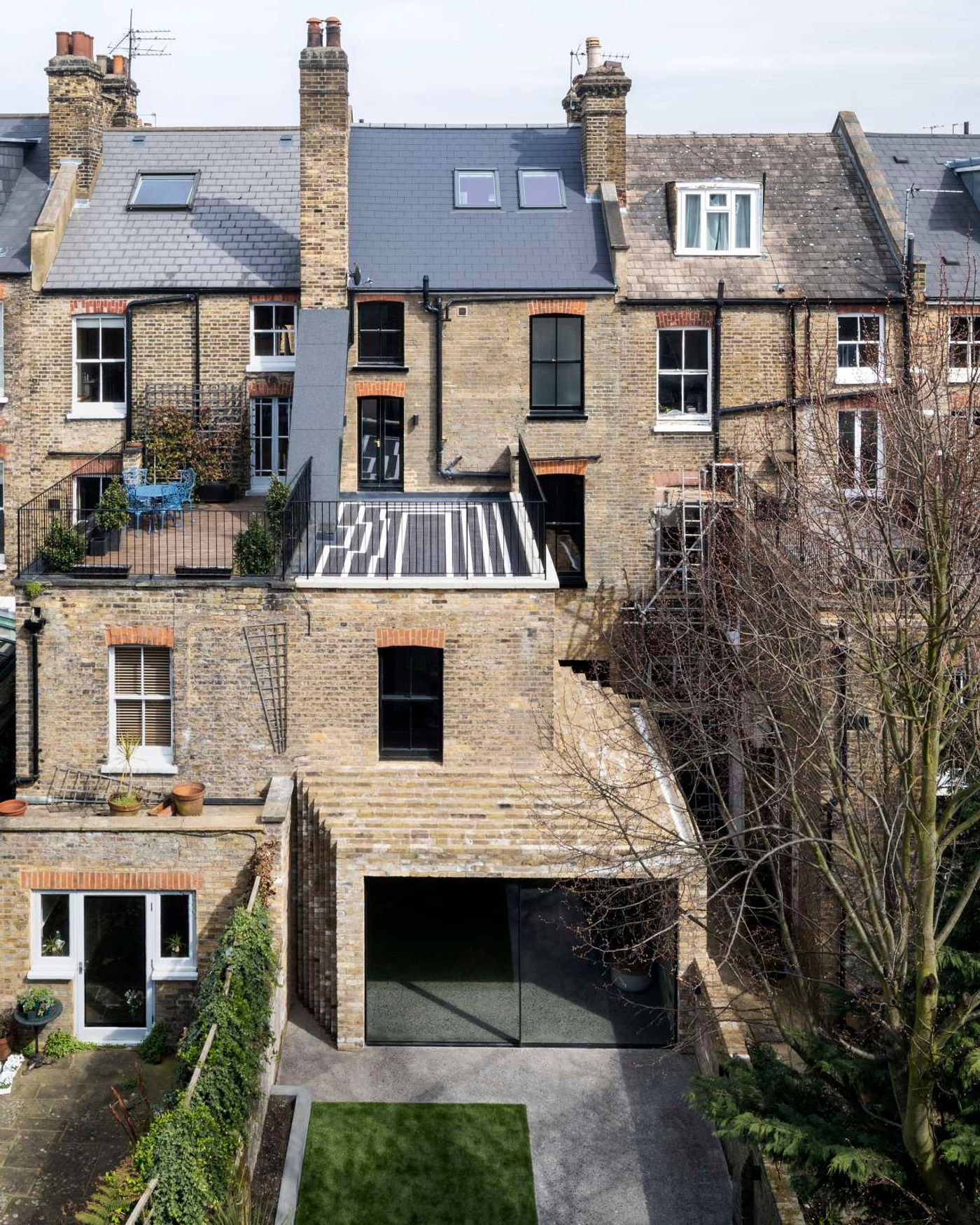
Bureau de Change, Step House. Photo by Ben Blossom.
Do you have distinct roles in your creative relationship? How do your resolve creative differences that may arise during the design process?
B: We always work on the design together and with our team in the office. There is a lot of creative freedom and we assess the designs collectively, test them, shape them and refine them. There are times where there are differences and those are actually the most fun!
K: When we don’t agree on something we just know it’s not right so we talk and sketch through it, we look at options and challenge our original approach. It’s through this process that we end up with better more consolidated results that feel right.
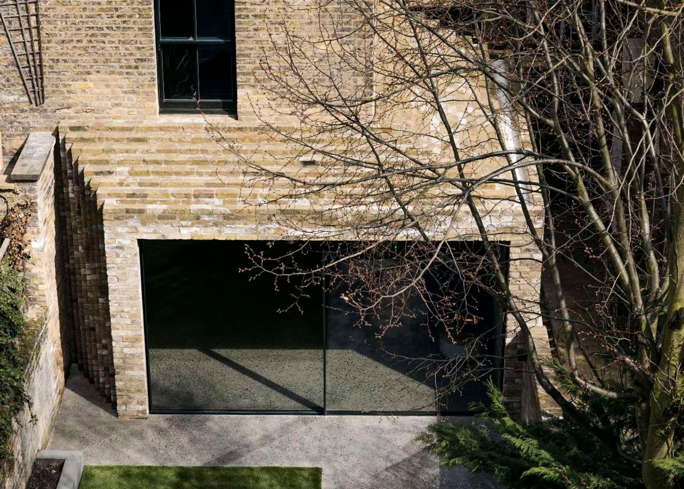
Bureau de Change, Step House. Photo by Ben Blossom.
Apart from architectural projects your practice has also been involved in exhibition and furniture design. In what ways does the design process differ in each case?
B: The process is very similar when we design exhibitions or furniture. We always focus on the ‘user’, the ‘occupier’, the ‘visitor’ in our architectural designs so when we are designing an exhibition for example, the focus is the same. It’s about the changing spatial experience, the atmosphere, the senses, what you see, touch, and ultimately feel.
K: The intricacy of how materials come together; how corners and junctions are resolved and how all that affects the way people use our spaces is something that filters down from larger architectural projects into the way we design furniture. It’s not just about the pieces themselves but also about the relationship between them and the space they create around them. There’s always a sense of discovery, of the unexpected.
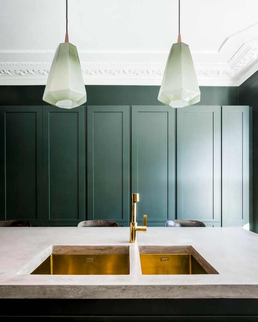
Bureau de Change, Step House. Photo by Ben Blossom.
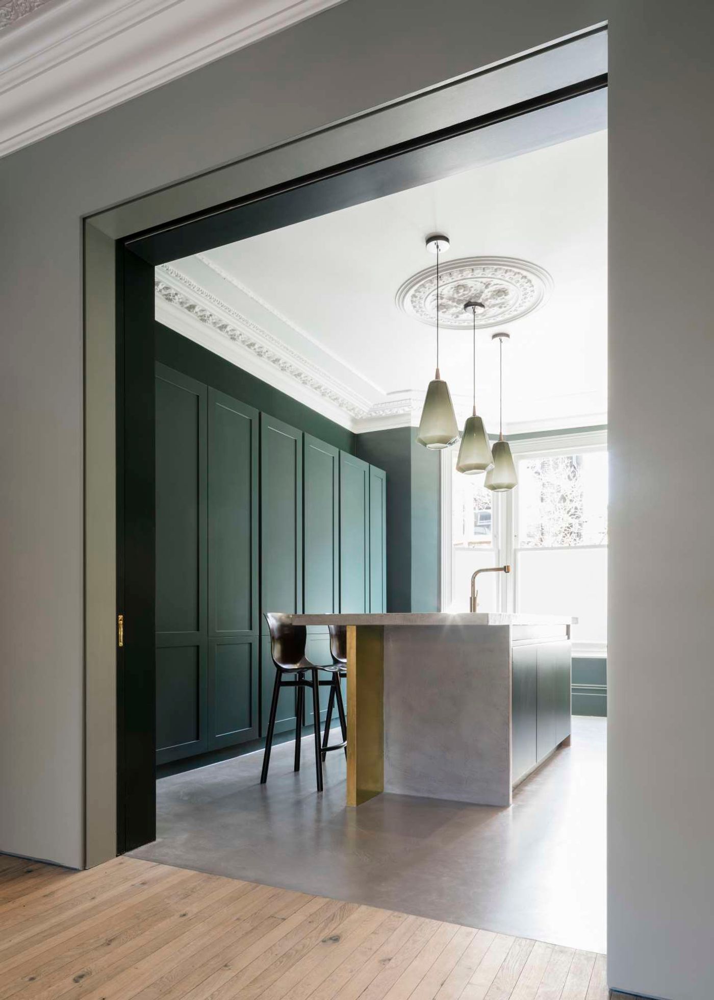
Bureau de Change, Step House. Photo by Ben Blossom.
Your work is characterized by a geometric language of prismatic forms, polygonal shapes and volumetric playfulness. How did this language evolve and how does it relate to you as designers?
B: A lot of that is a direct response to the challenges we have been set. Starting with a diagram and turning it into three dimensions has in many cases been resolved in geometrical forms. But we also try to bring a lot of tension and motion into our designs and that’s when surfaces start to fold, volumes start to twist and corners rotate.
K: We always design with three dimensionality in mind. Ceilings are as important as walls and floors to us, façades don’t need to be flat, room shapes and sizes need to vary and materials no matter how rigid can bend and curve.
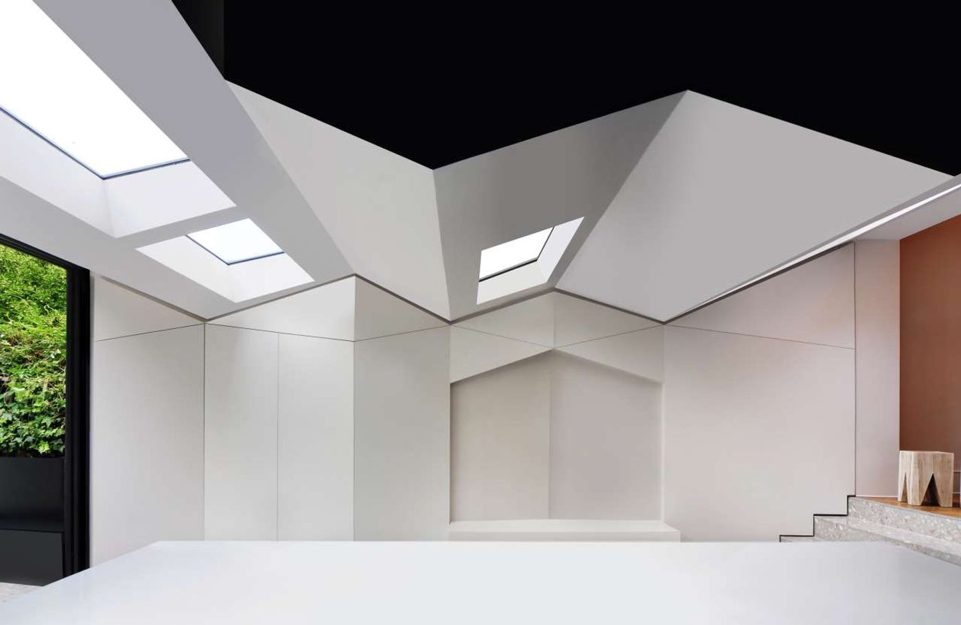
Bureau de Change, Folds house. Photo © Bureau de Change architects.
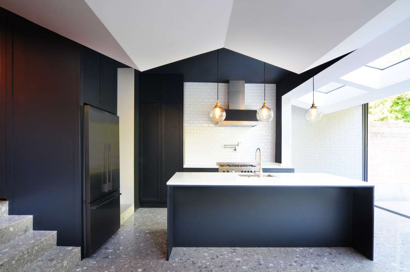
Bureau de Change, Folds house. Photo © Bureau de Change architects.
Rhythm seems to be a key feature of your designs in both large and small scale projects, be that the undulating texture of a façade, the faceted shape of a ceiling or the repetitive patterns of woven surfaces. How important is rhythm in your work and why?
B: It’s key for us. Architecture shouldn’t be static. It should move as you move around it. It should have a sense of tension where different elements or materials meet. It should be the result of motion, of suppression, collision, expansion, it should give the sense that it will change, that it will become something else.
K: It’s important for us to introduce elements that have a sense of motion, as it surprises people, makes them look twice, and makes them challenge their preconceptions, which we love doing!
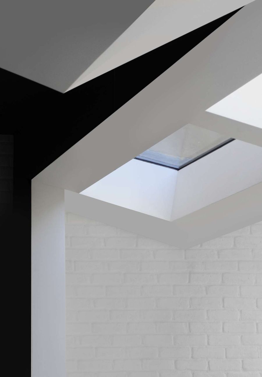
Bureau de Change, Folds house. Photo © Bureau de Change architects.
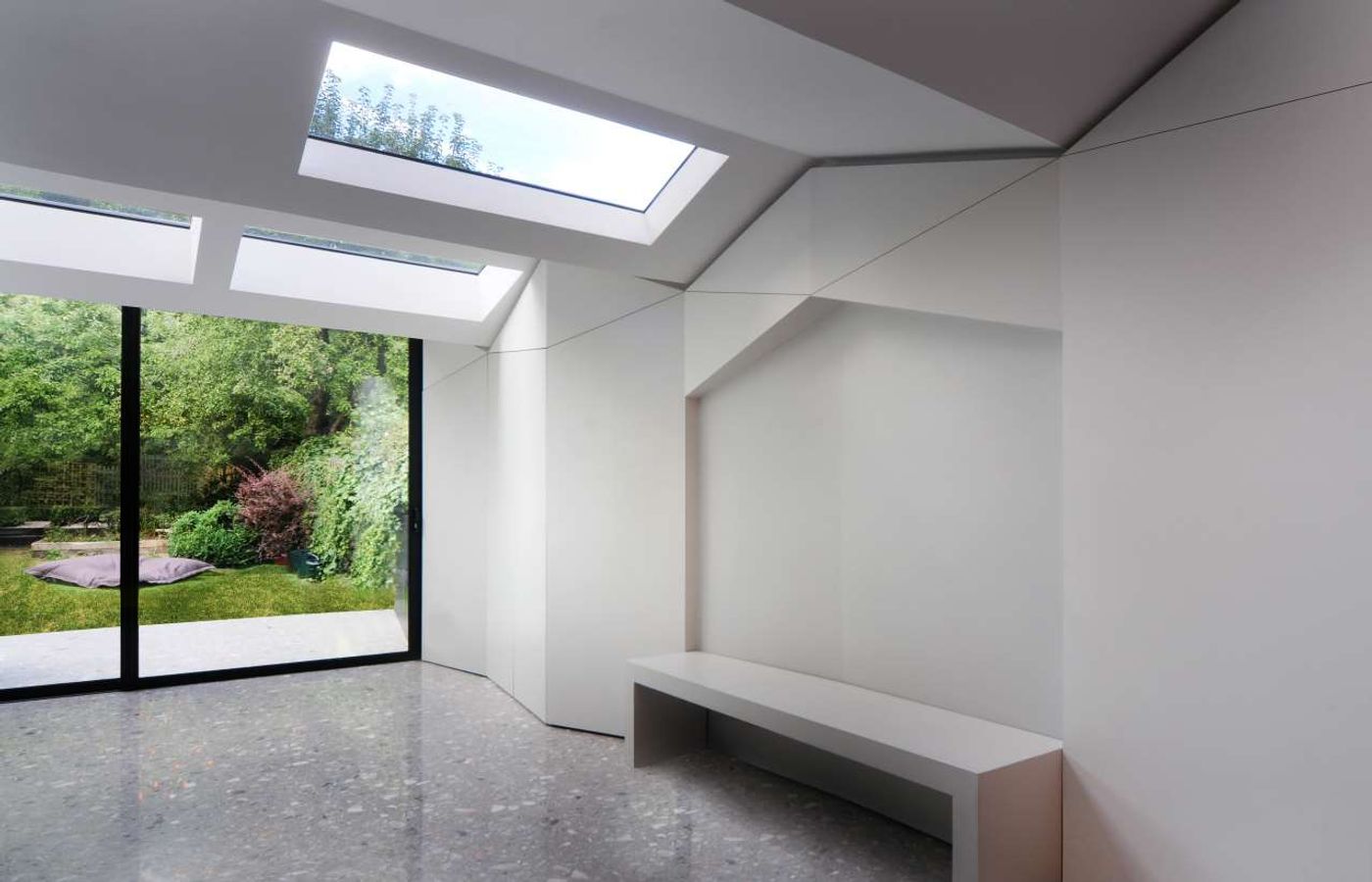
Bureau de Change, Folds house. Photo © Bureau de Change architects.
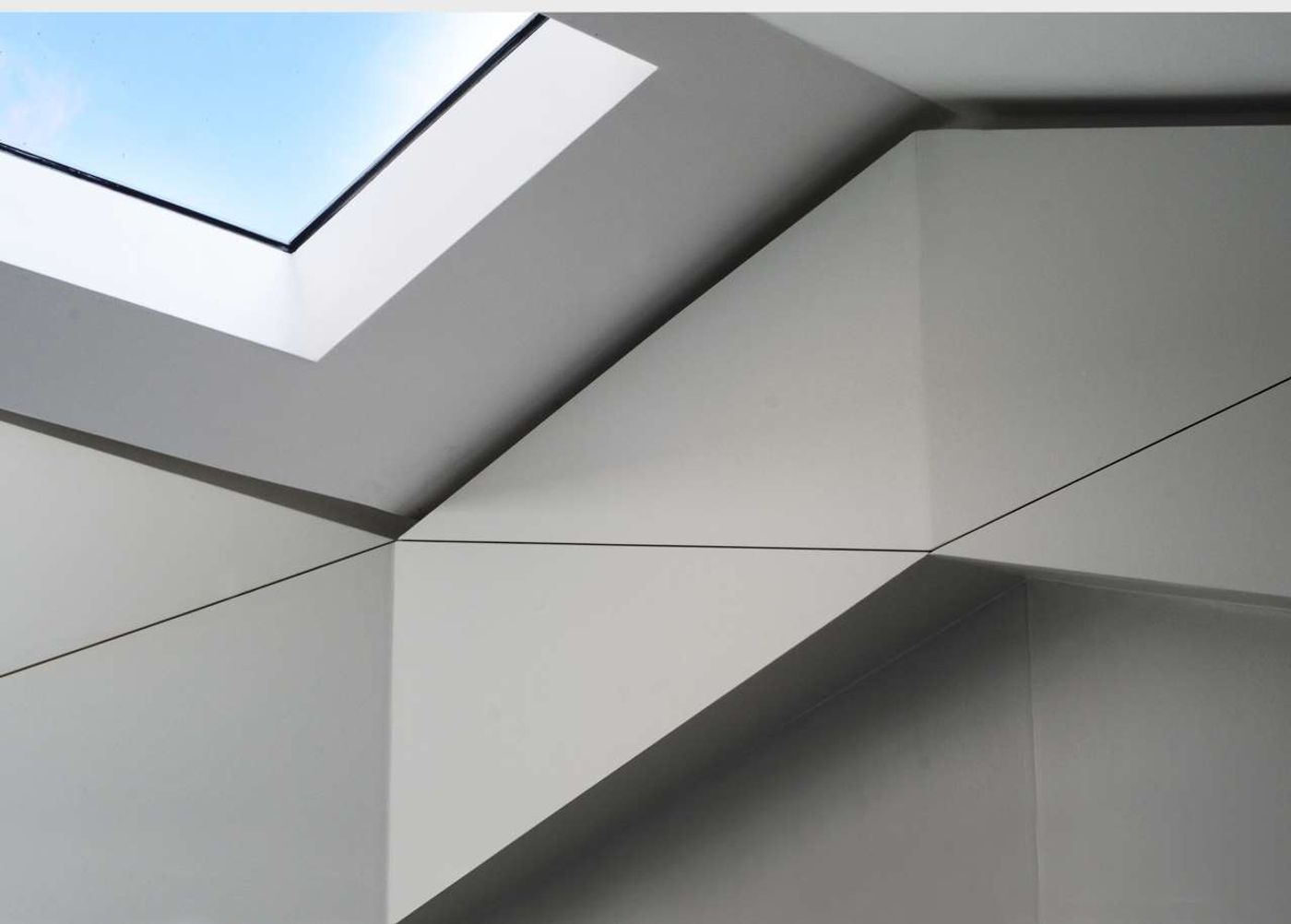
Bureau de Change, Folds house. Photo © Bureau de Change architects.
In your work you masterfully combine traditional craftsmanship with innovative technologies, often using humble or natural materials in novel ways. How hard is it to harmoniously marry such disparate techniques? How important is prototyping?
B: There’s a lot to be said about how things used to be made. How important hand-crafting is and the involvement of the specialist craftsperson involved. The quality it brings to the end result, the knowledge and expertise that goes into it. And at the same time technology allows you to do things that weren’t possible before, that the human hand can’t achieve. So, we always try to mix both as that gives you a more informed and unique product in the end.
K: We research traditional techniques and we learn from them. We meet with craftsmen, visit factories, workshops and learn about the different processes whether they are hand or machine driven. We don’t see digital fabrication techniques solely as the finished end product, but part of the process that allows for the further exploitation of traditional techniques. Digital informs the physical and vice versa.
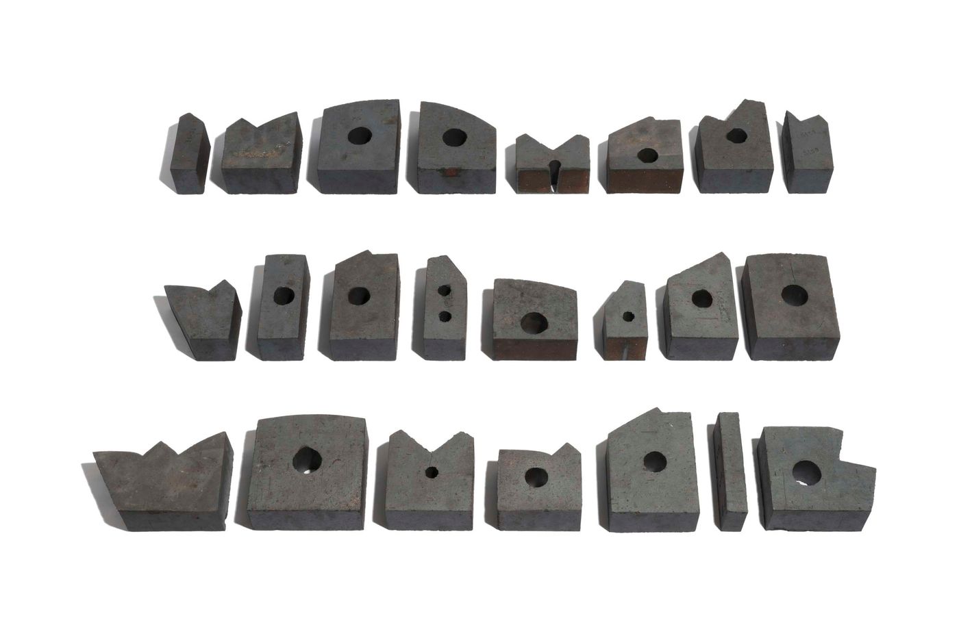
Bureau de Change, The Interlock (a collection of 44 misshapen and seemingly un-stackable clay blocks developed for the building's facade). Photo by Gilbert McCarragher.
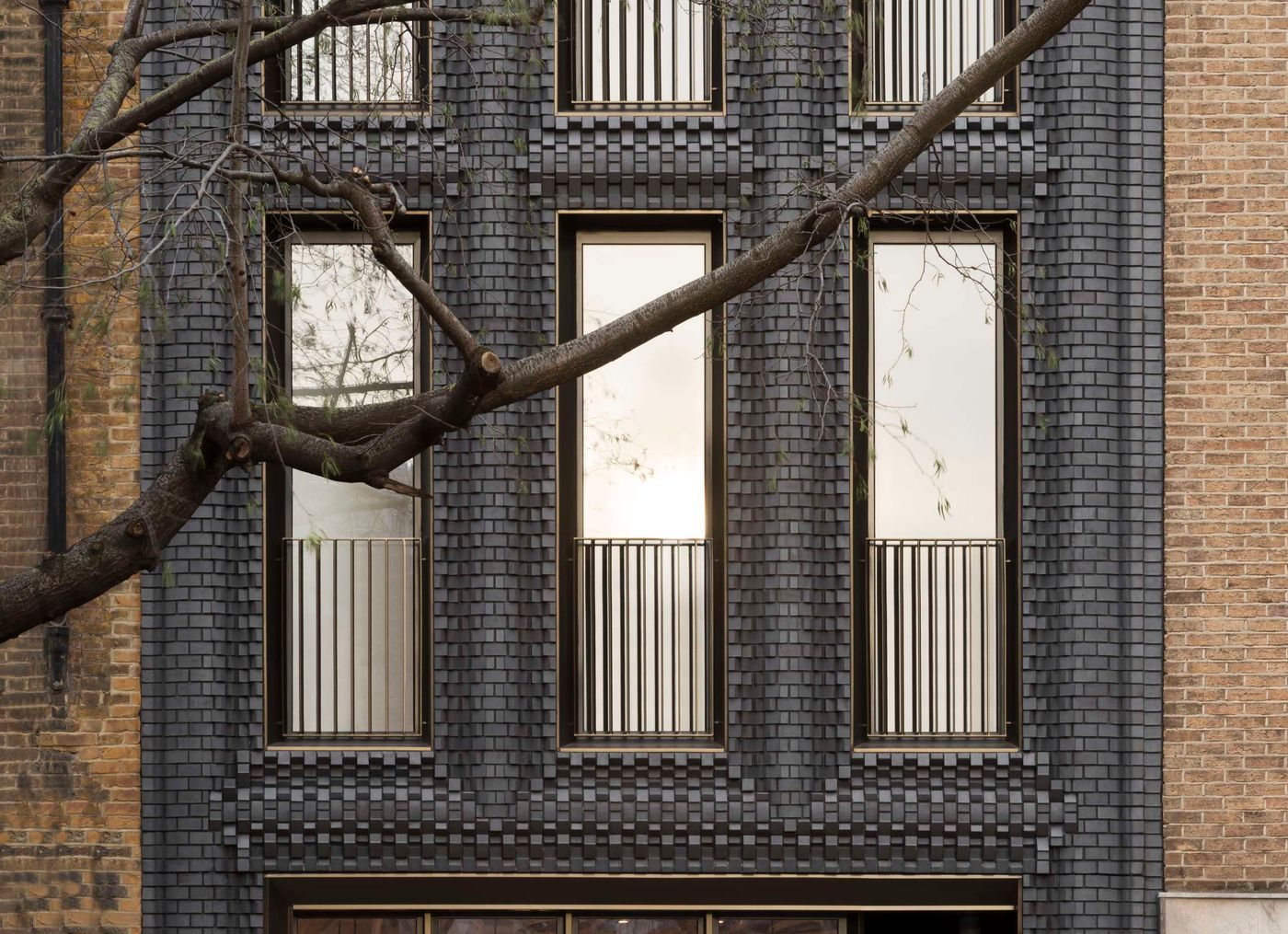
Bureau de Change, The Interlock. Photo by Gilbert McCarragher.
What kind of projects are you working on right now?
B: We’re currently finishing a large commercial project in central London where amongst everything else we have designed an art deco inspired three-dimensional bronze core that spans four floors. We’re also working on a few houses, one of them looks like a museum display case while the other looks like a Victorian conservatory but clad in compressed woven stainless-steel mesh. We’re also designing a new boat for Regent’s canal.
K: We’re designing London’s new fashion district in Hackney – encompassing eleven buildings with studios for fashion designers, a member’s area, bar, café, catwalk space and other facilities. We’re on site with a new-build house in South London for which we’re casting parts of a 1930’s façade in concrete – which we’re very excited about- we’re currently doing mock-ups of the concrete on site. And we’re about to embark on the concept of two new projects, one in Athens and one in New York.
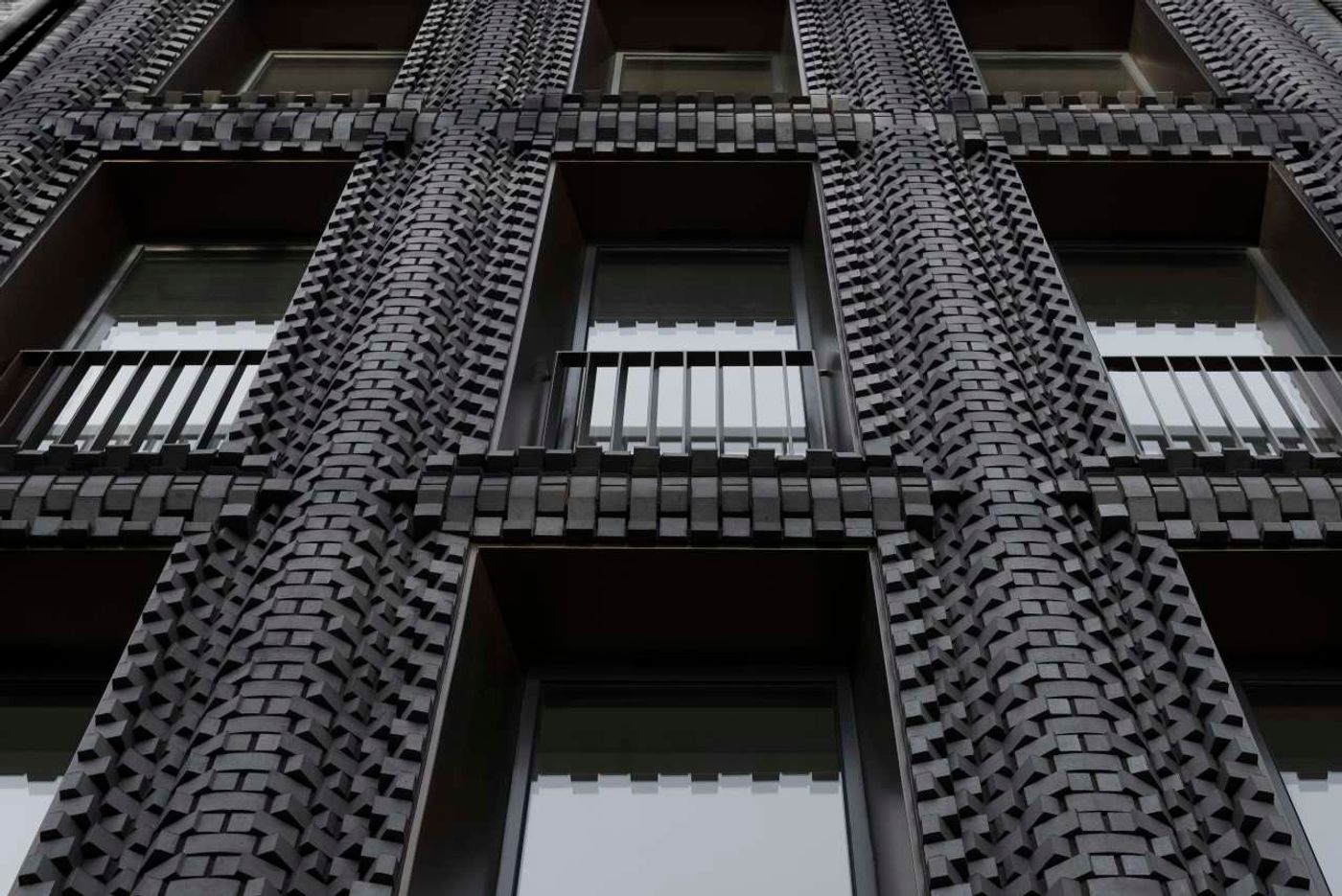
Bureau de Change, The Interlock. Photo by Gilbert McCarragher.
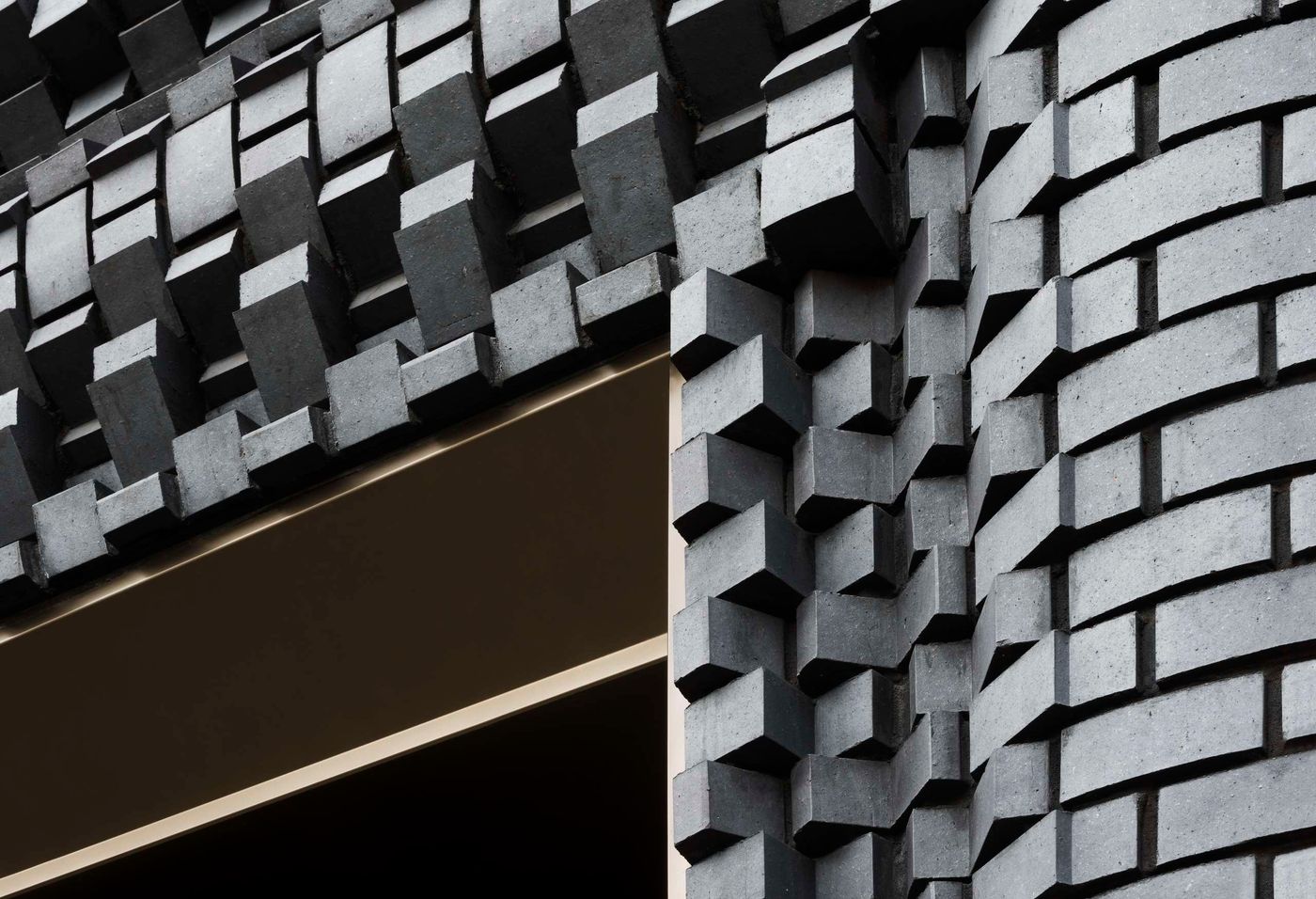
Bureau de Change, The Interlock. Photo by Gilbert McCarragher.
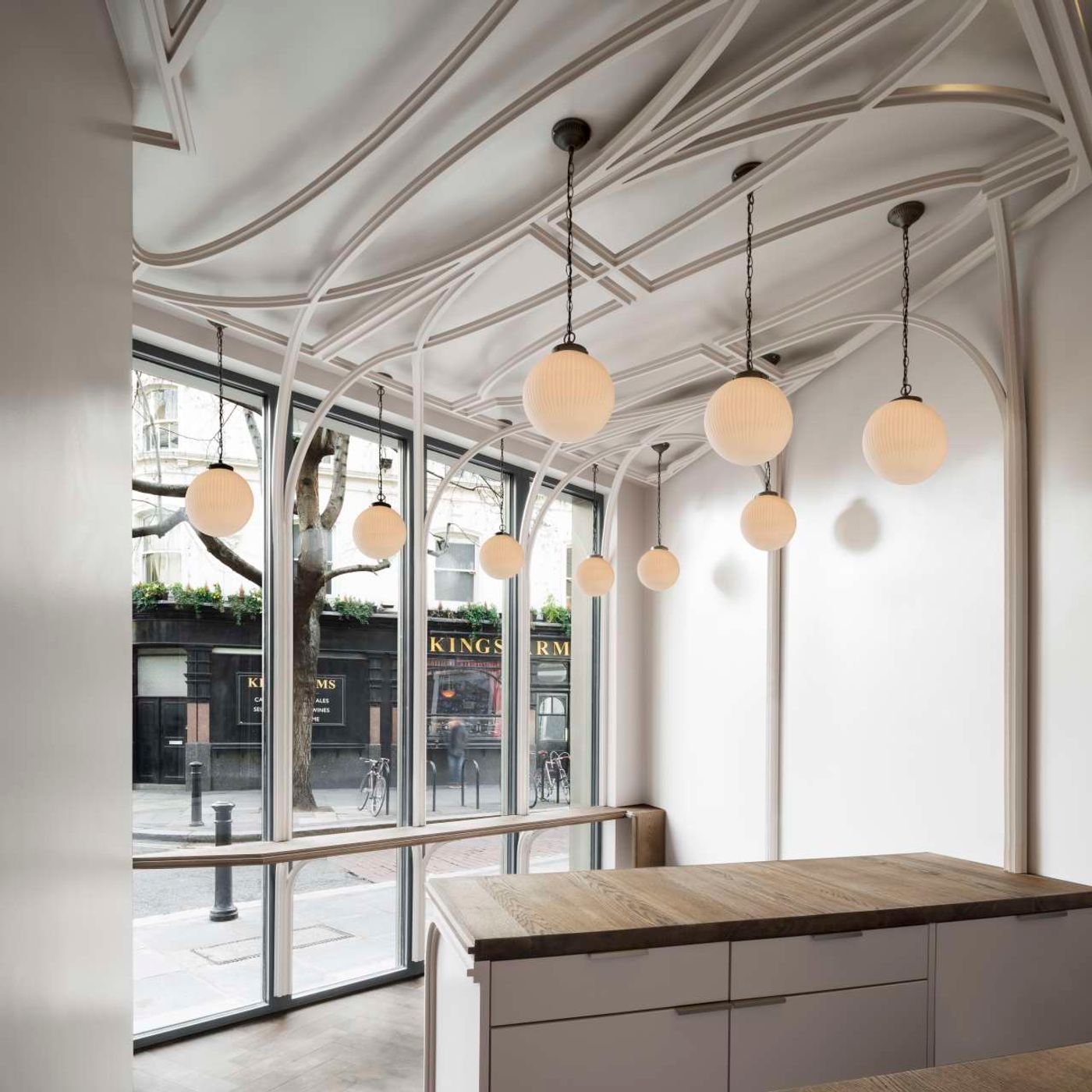
Bureau de Change, The Interlock (interior views of the café on the ground floor). Photo by Gilbert McCarragher.
