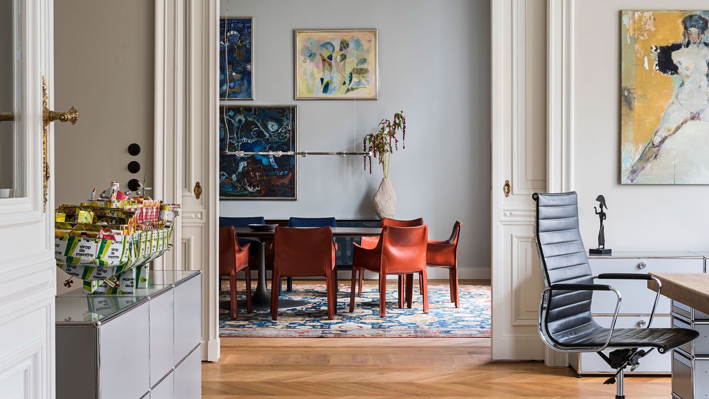
Gisbert Pöppler Masterfully Balances Tradition & Modernity in a Period Apartment in Berlin
Words by Yatzer
Location
Berlin, Germany
Gisbert Pöppler Masterfully Balances Tradition & Modernity in a Period Apartment in Berlin
Words by Yatzer
Berlin, Germany
Berlin, Germany
Location
When it comes to renovating historic buildings, most architects approach the task either as restorers or modernizers; not Berlin based architect Gisbert Pöppler, whose talent for masterfully balancing tradition and modernity enables him to seamlessly bridge past and present, both conceptually and architecturally. Pöppler’s astute approach is exemplified in “Berliner Zimmer”, a recently renovated apartment in the elegant neighbourhood of Charlottenburg in Berlin that lavishly channels the building’s architectural heritage while reveling in contemporary finesse. Meticulously detailed and exquisitely crafted, the apartment is a treasure trove of intricate interventions and bespoke furnishings whose understated sophistication belies a focus on functionality and a passion for the fine art of design, all the while reflecting the owners’ taste and sensibility.
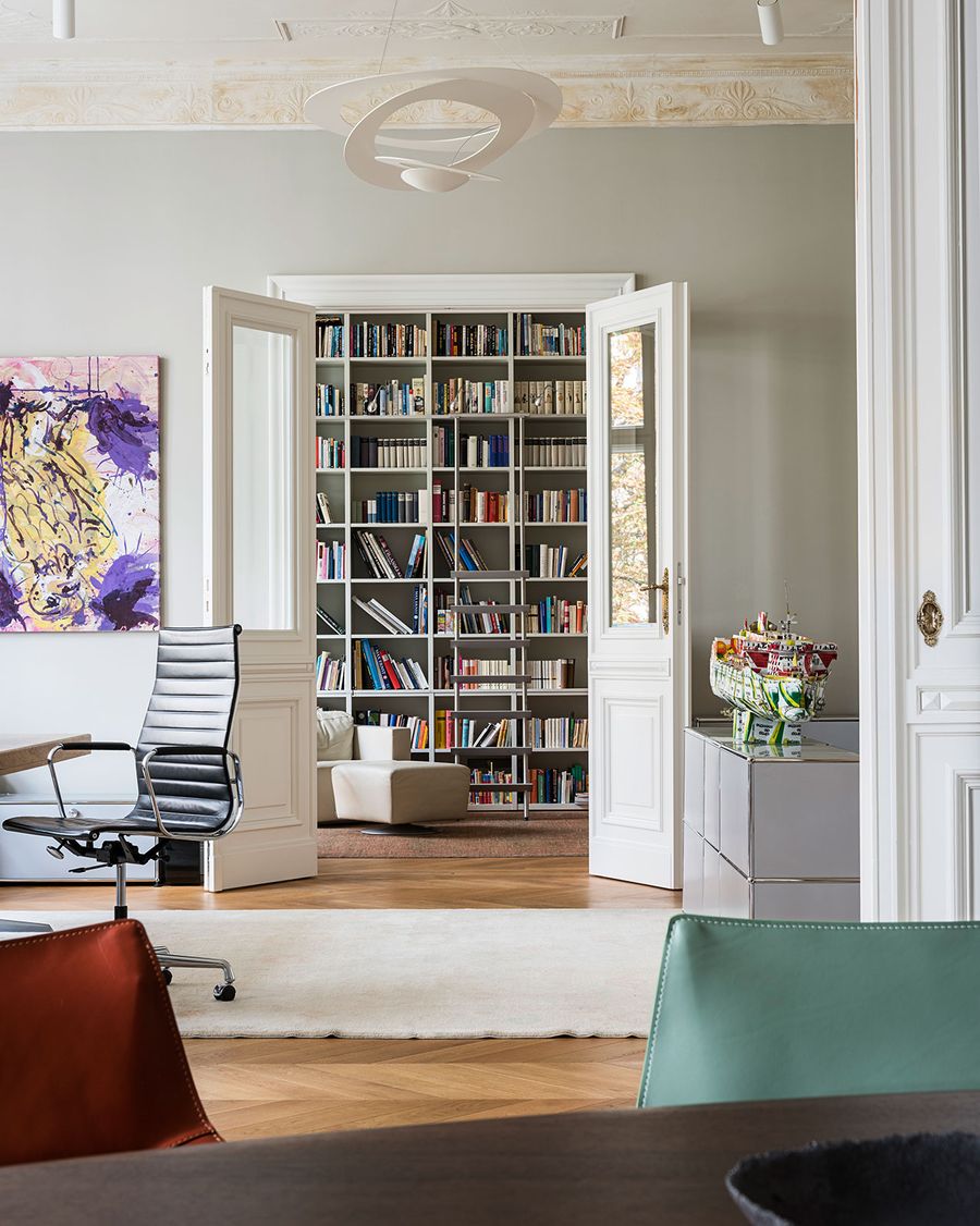
Berliner Zimmer by Gisbert Pöppler Architecture in Berlin-Charlottenburg.Photography by Wolfgang Stahr, Andreas Meichsner.
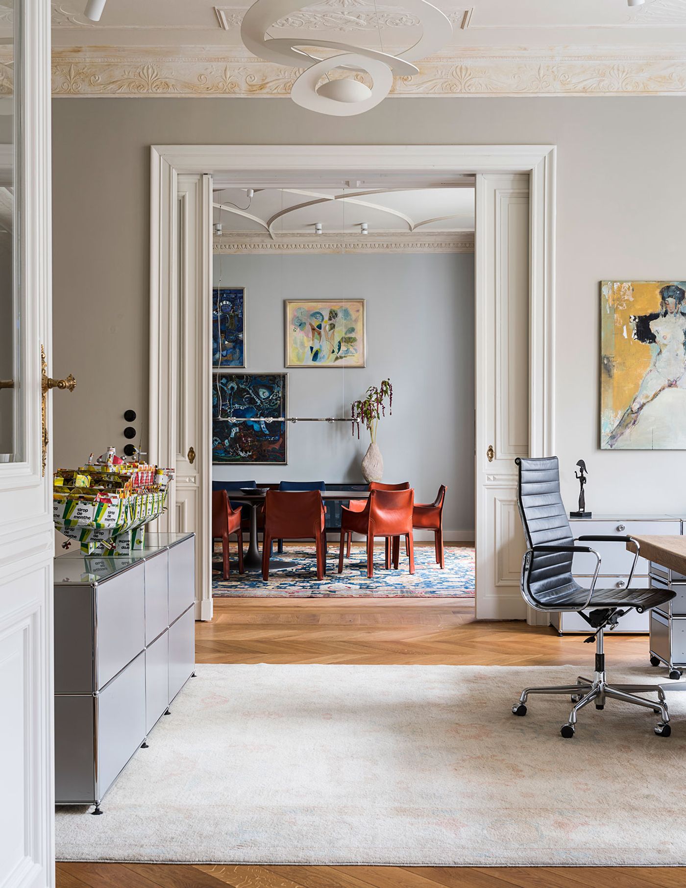
Berliner Zimmer by Gisbert Pöppler Architecture in Berlin-Charlottenburg.Photography by Wolfgang Stahr, Andreas Meichsner.
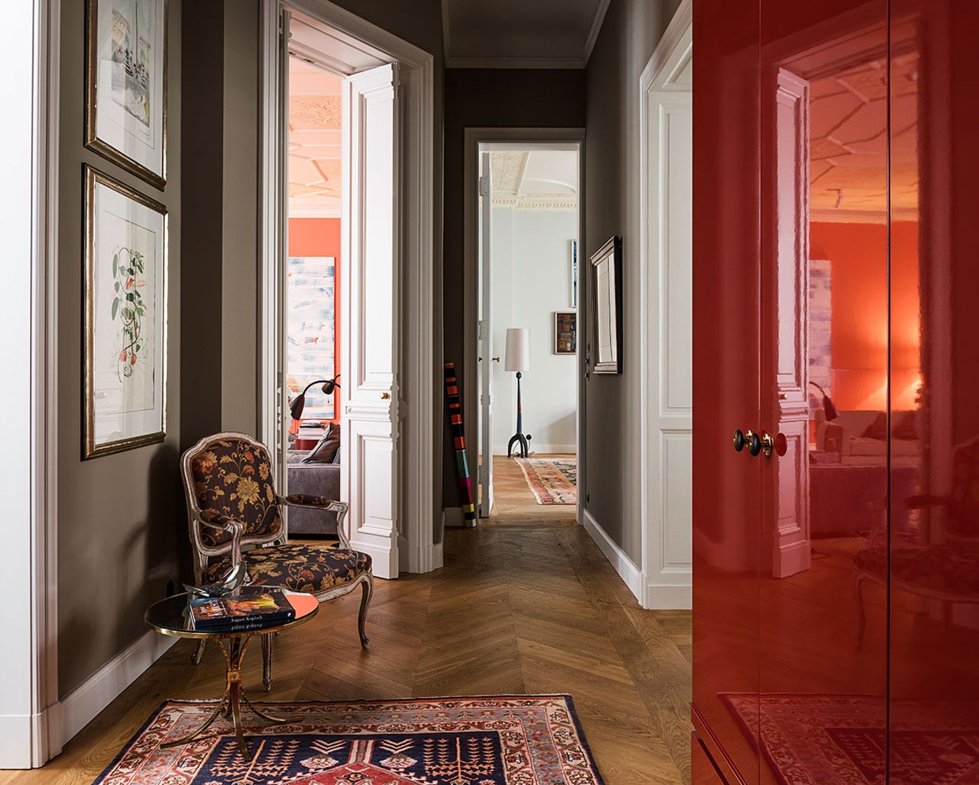
Berliner Zimmer by Gisbert Pöppler Architecture in Berlin-Charlottenburg.Photography by Wolfgang Stahr, Andreas Meichsner.
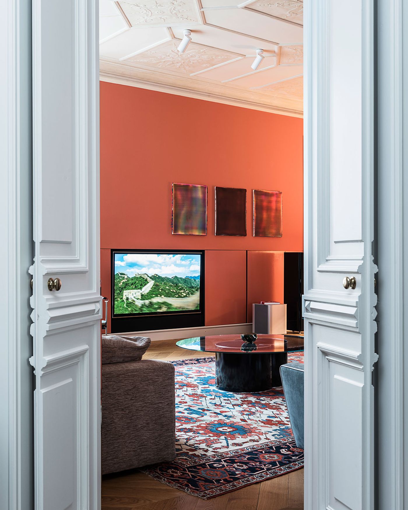
Berliner Zimmer by Gisbert Pöppler Architecture in Berlin-Charlottenburg.Photography by Wolfgang Stahr, Andreas Meichsner.
The project’s name, Berliner Zimmer, refers to a common feature in the city’s 19th and early 20th century’s apartments, a large room that connects the front building with a side wing in the back, typically used as a lounge area. Despite its size, this type of room only has one small window, as is the case in this apartment, which didn’t bode well with the Israeli owners who are used to abundant daylight. Pöppler’s solution was to enlarge the opening that connects the berliner zimmer with the adjacent dining room, thereby increasing any available daylight flooding in from the front of the apartment.
Besides the wish for increased daylight, another way the owners informed the design of the berliner zimmer was their request to include a large, colourful carpet they had fallen in love with, which profoundly influenced the room’s décor, including the choice of wall paint, a bespoke red-orange hue borne from a long process of trying out different colour samples. The wall colour in turn was a decisive factor in the selection of artwork from the owners’ extensive collection – in actual fact, after the architect’s recommendation, the placement of artwork throughout the apartment is the work of a professional curator. Complemented by blue and beige tones, with glossy accents provided by glass and metal furnishings, and swathed in soft textures, courtesy of lush sofas and armchairs, the spacious room is both vibrant and calming, inviting guests to relax in an environment of subdued opulence.
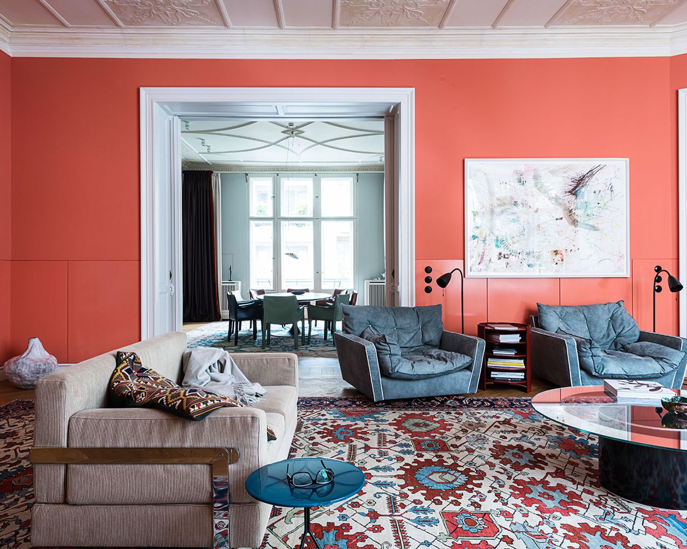
Berliner Zimmer by Gisbert Pöppler Architecture in Berlin-Charlottenburg.Photography by Wolfgang Stahr, Andreas Meichsner.
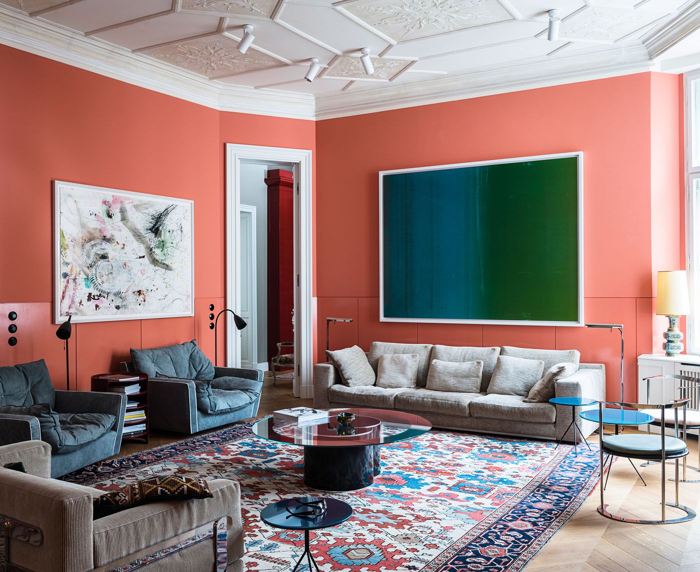
Berliner Zimmer by Gisbert Pöppler Architecture in Berlin-Charlottenburg.Photography by Wolfgang Stahr, Andreas Meichsner.
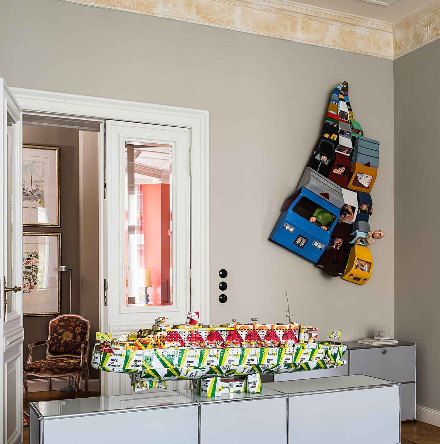
Berliner Zimmer by Gisbert Pöppler Architecture in Berlin-Charlottenburg.Photography by Wolfgang Stahr, Andreas Meichsner.
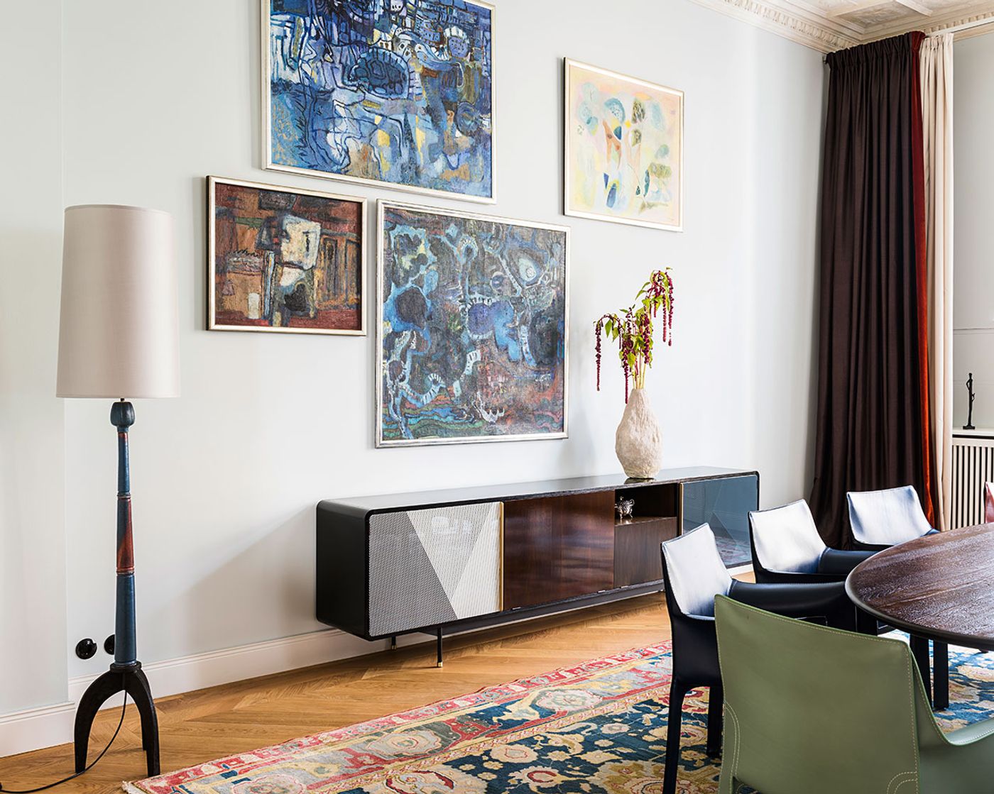
Berliner Zimmer by Gisbert Pöppler Architecture in Berlin-Charlottenburg.Photography by Wolfgang Stahr, Andreas Meichsner.
The apartment is filled with subtle, well-thought interventions, whose ingenuity lies in the fact that they are unnoticeable. Take for example the recessed wall panelling in the berliner zimmer which allowed the television to be completely inserted into the wall – and which required the decorative ceiling cornices to be moved by several centimetres to accommodate the increased wall thickness – or the removal of a wall section in the hallway to accommodate the gloosy red, semi-recessed coat closet, or the increased height of the apartment’s doorways. The list goes on and is indicative of Pöppler’s attention to detail, from the brand new parquet flooring that looks as if it has been there forever, to the design of the wall skirting whose decorative sensibility shifts from classical, to modern, to minimalist, as you walk from the living areas to the private quarters.
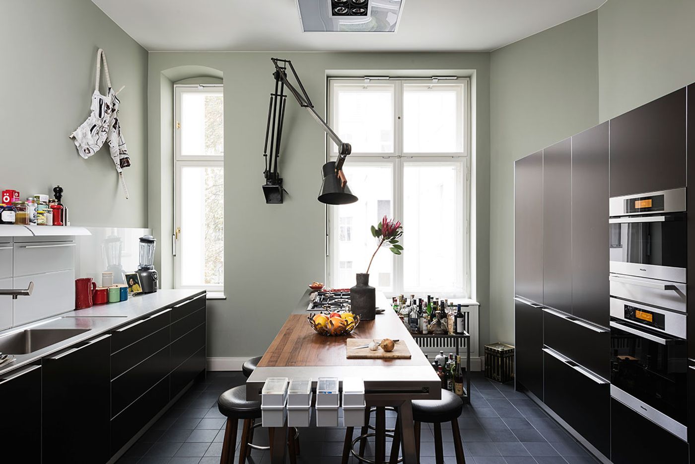
Berliner Zimmer by Gisbert Pöppler Architecture in Berlin-Charlottenburg.Photography by Wolfgang Stahr, Andreas Meichsner.
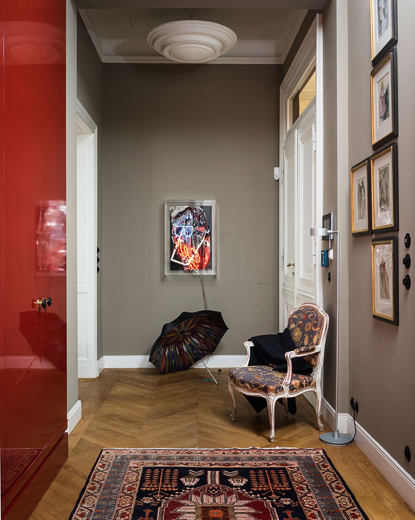
Berliner Zimmer by Gisbert Pöppler Architecture in Berlin-Charlottenburg.Photography by Wolfgang Stahr, Andreas Meichsner.
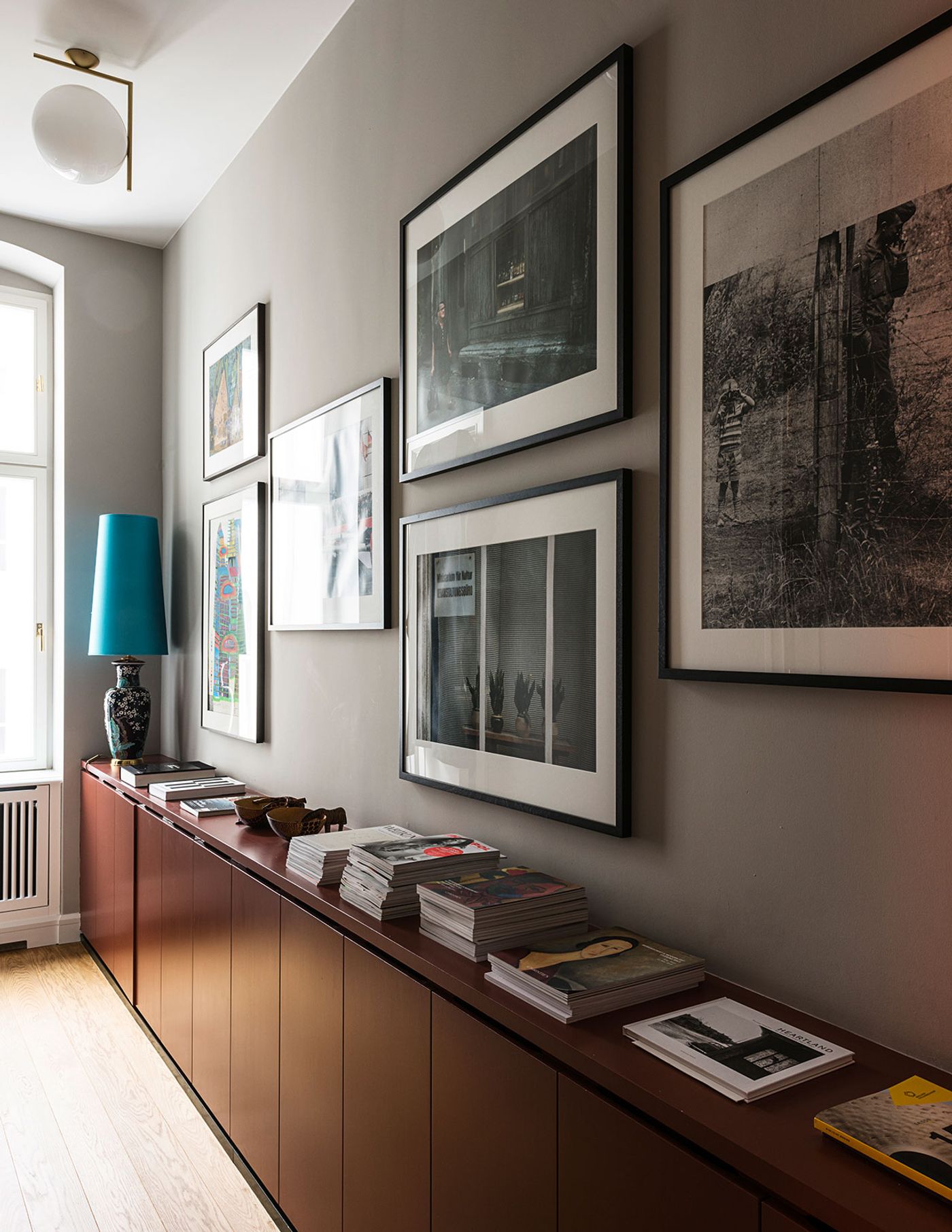
Berliner Zimmer by Gisbert Pöppler Architecture in Berlin-Charlottenburg.Photography by Wolfgang Stahr, Andreas Meichsner.
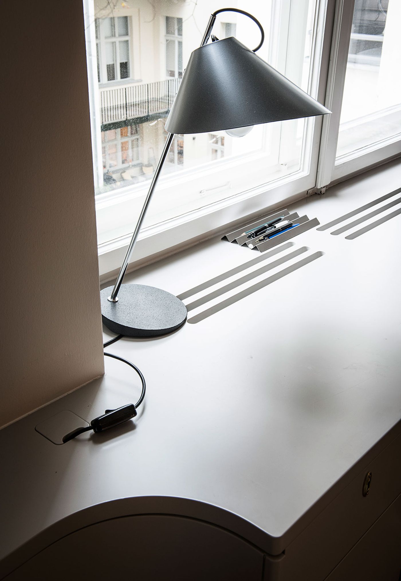
Berliner Zimmer by Gisbert Pöppler Architecture in Berlin-Charlottenburg.Photography by Wolfgang Stahr, Andreas Meichsner.
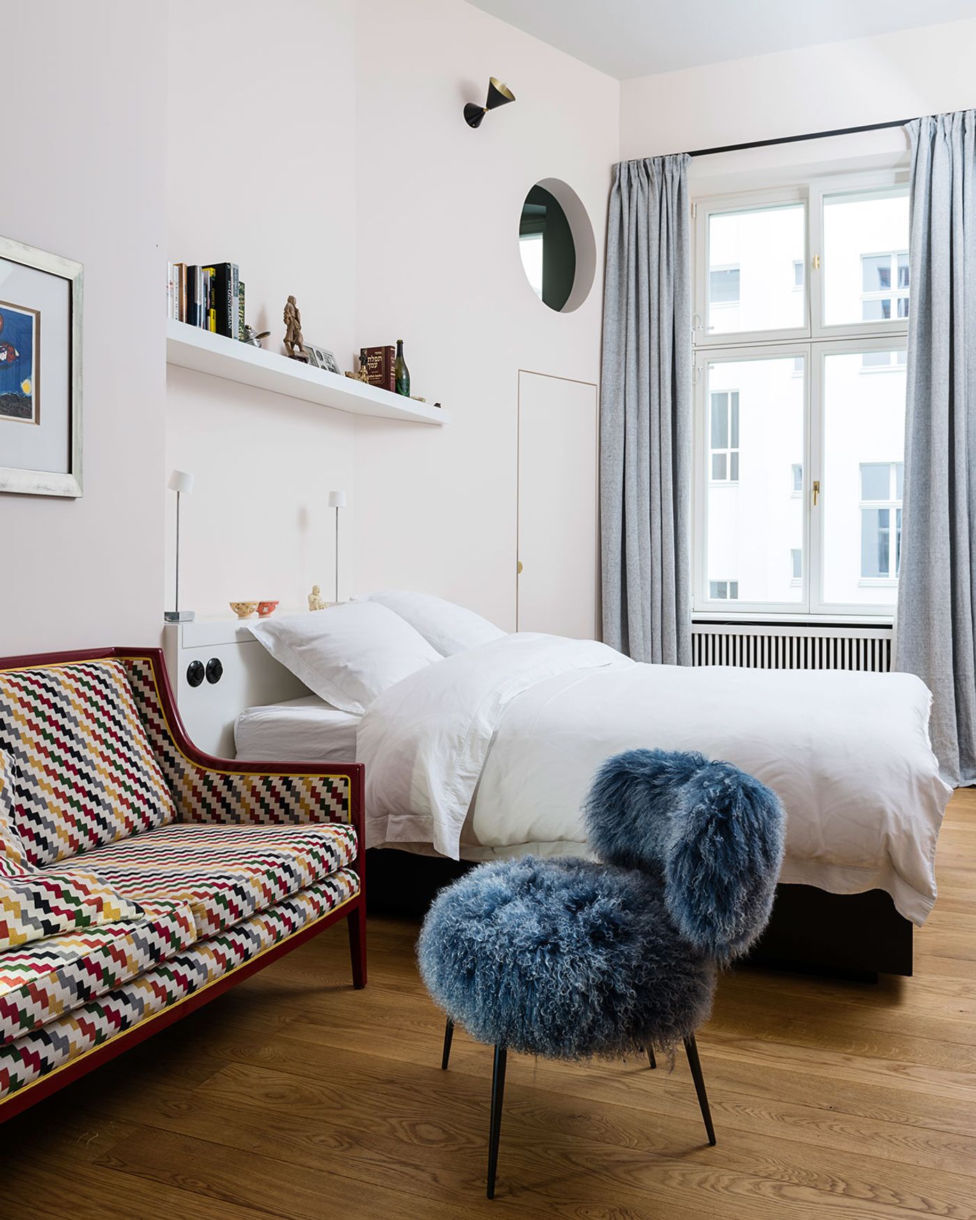
Berliner Zimmer by Gisbert Pöppler Architecture in Berlin-Charlottenburg.Photography by Wolfgang Stahr, Andreas Meichsner.
Whereas the berliner zimmer harks back to the building’s original configuration, the rest of the apartment’s floor plan has been radically reconfigured. Nowhere is this more evident than in the relocation of the master bathroom into a former bedroom – a decision which entailed the radical upending of the apartment’s plumbing, and which explains, along with the aforementioned interventions, why it took two-and-a-half years for the renovation to come to completion. Conceived as an extension of the master bedroom, the space feels more like a lounge than a bathroom, complete with a ring-like chandelier and artwork, not to mention generous views outside.
Like the rest of the apartment, the space features made-to-measure furnishings, built-in gems, and exquisite detailing such as the semi-recessed boudoir, whose curvaceous shape echoes the shape of the glazed lava stone washbasin, the free-standing bathtub and the restored radiator cover. Undoubtedly though, the focal point of the master bathroom is the circular silk carpet which was designed by Pöppler in collaboration with Tai Ping Carpets for Architectural Digest Germany‘s lounge at the HIGHILGHTS International Art Fair in Munich. Named "Midas Rug", the carpet’s design references the PRADA Men’s 2014 Fall collection, which drew from the costumes in Rainer Werner Fassbinder’s 1972 film “The Bitter Tears of Petra von Kant”, which in turn was inspired by Nicolas Poussin’s painting “Midas & Bacchus”. Whilst paying tribute to the continuity of artistic influence, the carpet is further testament to the astuteness and meticulousness of Pöppler’s overall design ethos.
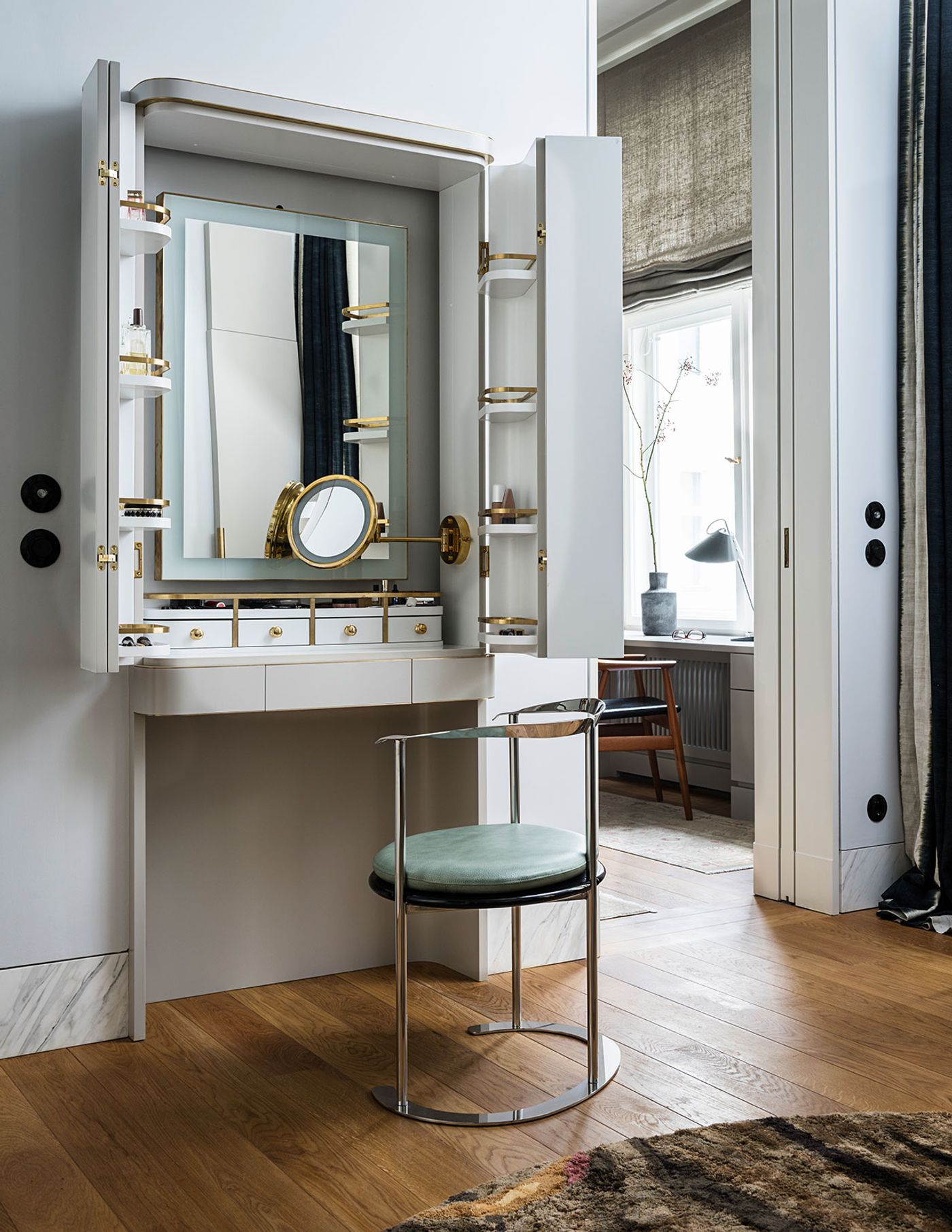
Berliner Zimmer by Gisbert Pöppler Architecture in Berlin-Charlottenburg.Photography by Wolfgang Stahr, Andreas Meichsner.
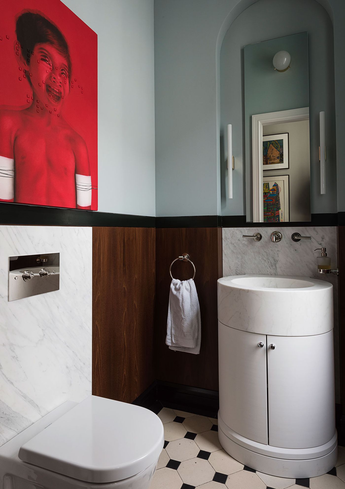
Berliner Zimmer by Gisbert Pöppler Architecture in Berlin-Charlottenburg.Photography by Wolfgang Stahr, Andreas Meichsner.
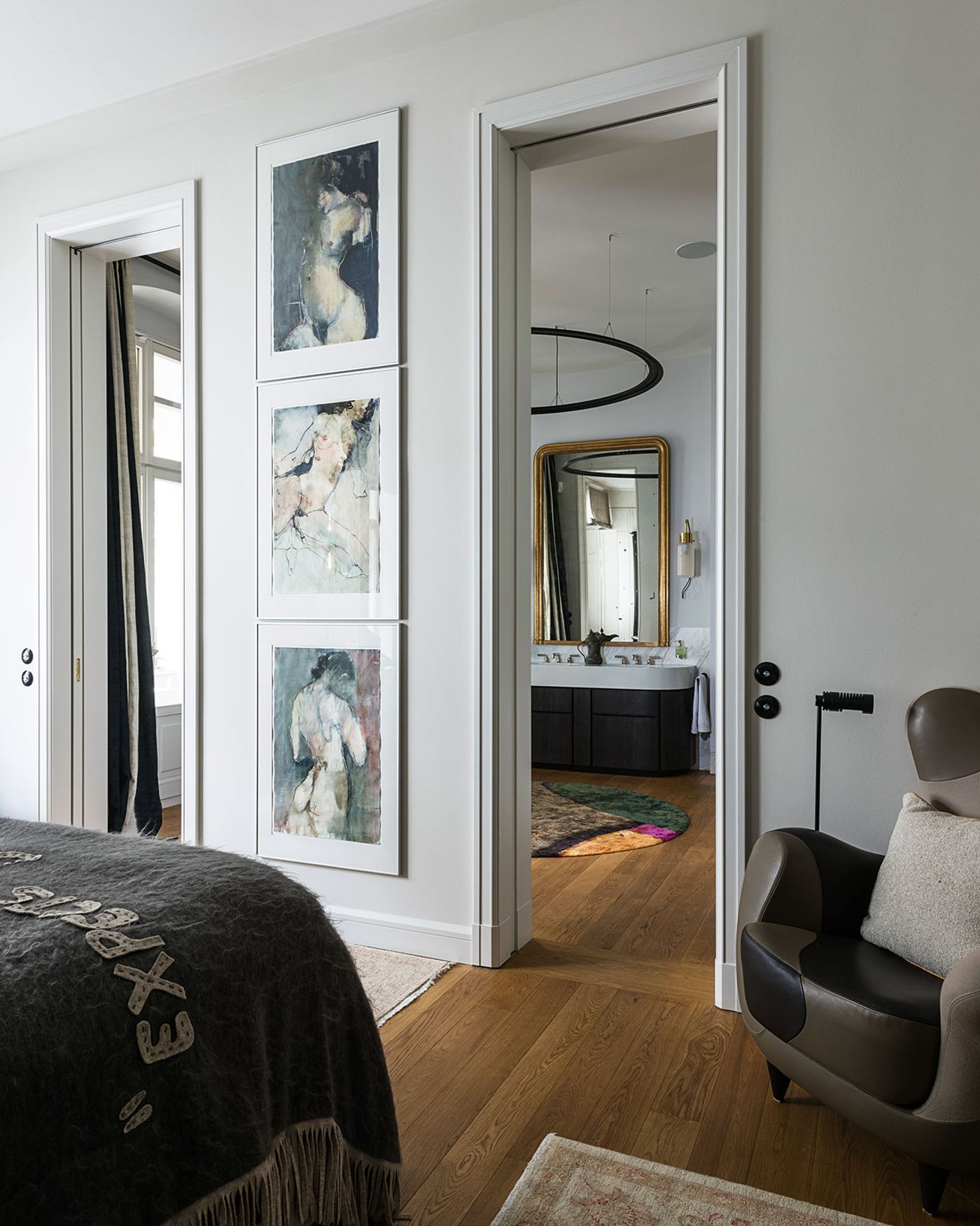
Berliner Zimmer by Gisbert Pöppler Architecture in Berlin-Charlottenburg.Photography by Wolfgang Stahr, Andreas Meichsner.
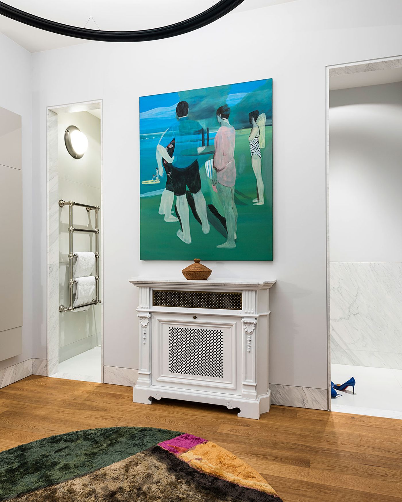
Berliner Zimmer by Gisbert Pöppler Architecture in Berlin-Charlottenburg.Photography by Wolfgang Stahr, Andreas Meichsner.