Tokyo, Japan
Location
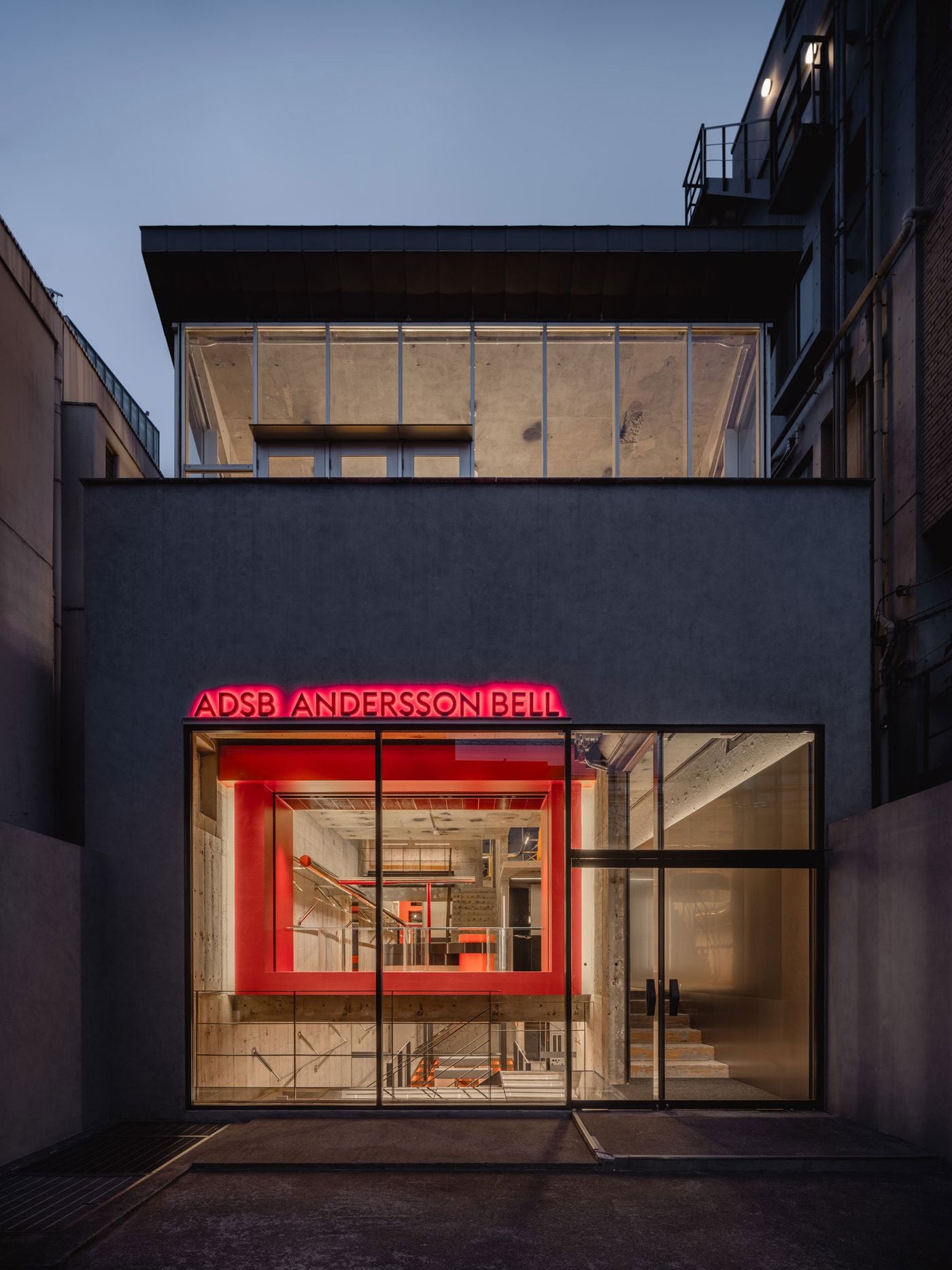
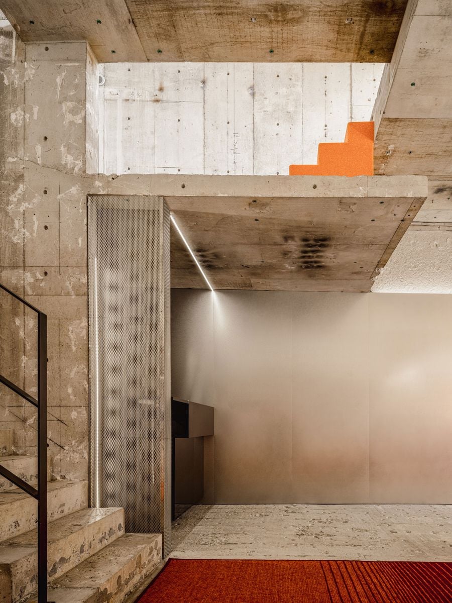
Located in Tokyo’s upscale Aoyama district, Seoul-based fashion brand Andersson Bell’s first Japanese flagship takes over a 1990s Brutalist building, turning the existing concrete shell into an immersive study in contrast. Designed by Tokyo-based studio I IN, the store is an apt architectural expression of a brand founded on the collision of different references: creative director Dohun Kim launched Andersson Bell in Seoul in 2014 by filtering Scandinavian influences through a Korean perspective, and has since broadened that premise into a wider cross-cultural vocabulary. Rather than softening the building’s roughness, I IN amplifies it, setting curvaceous forms, vivid colour and glossy surfaces against concrete marked by age and previous use.
Photography by Tomooki Kengaku.
Photography by Tomooki Kengaku.
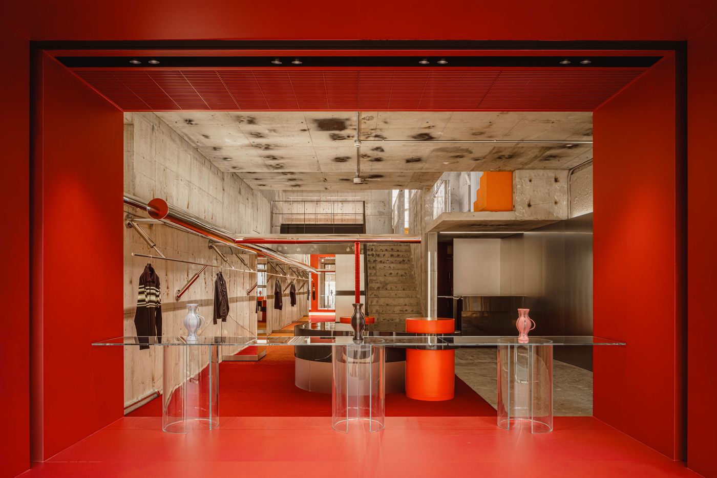
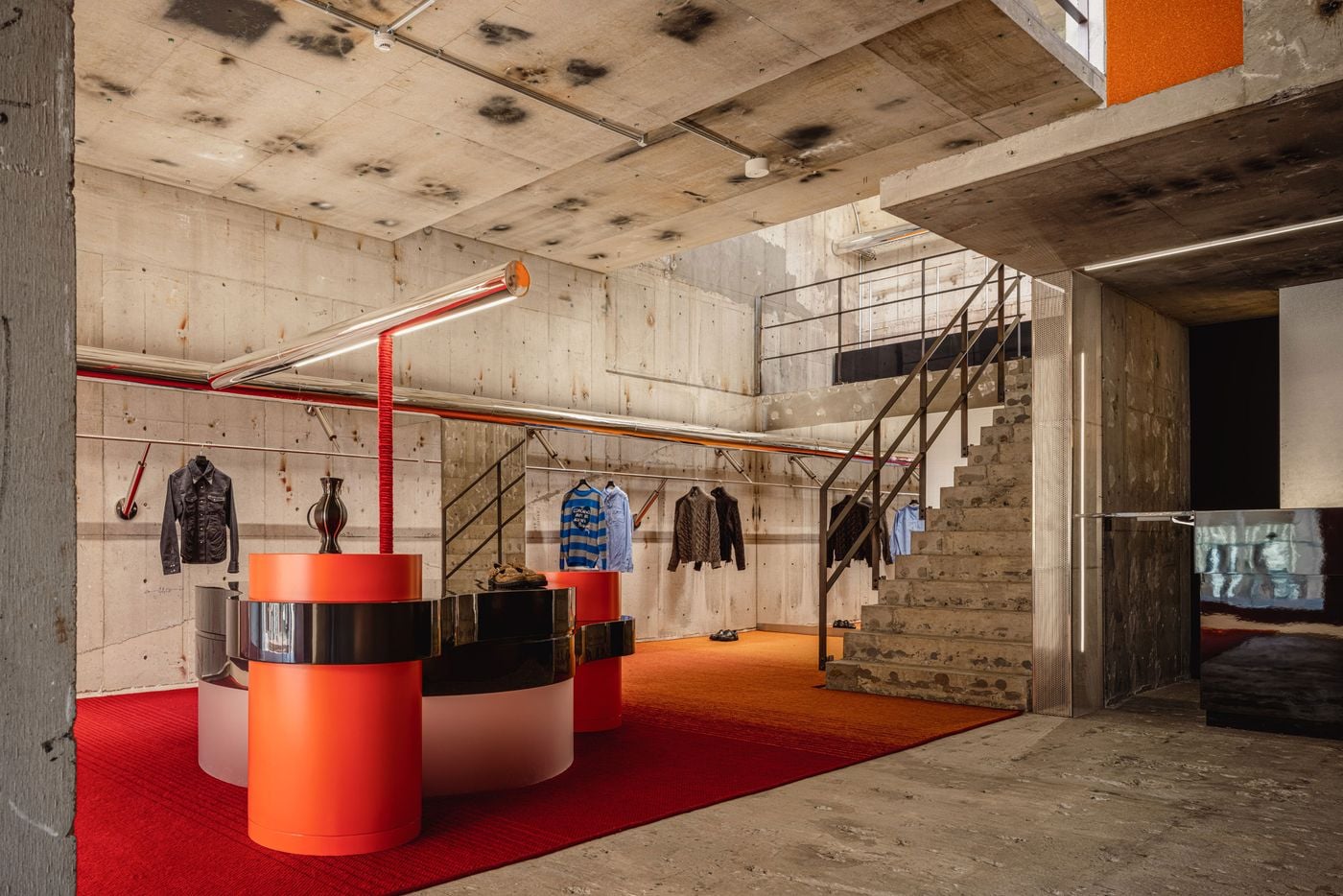
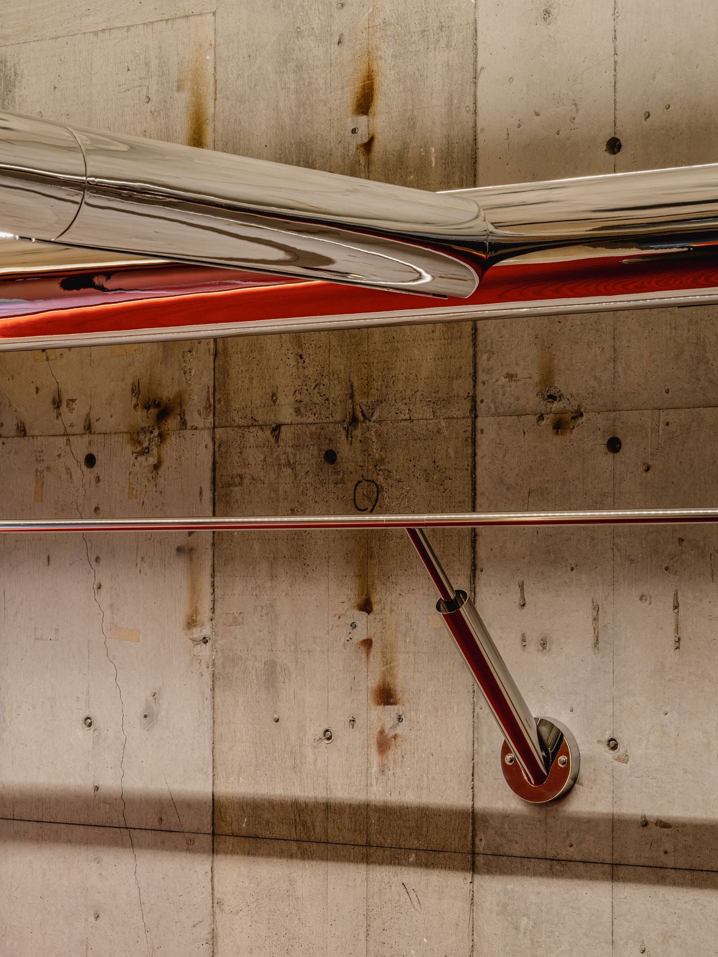
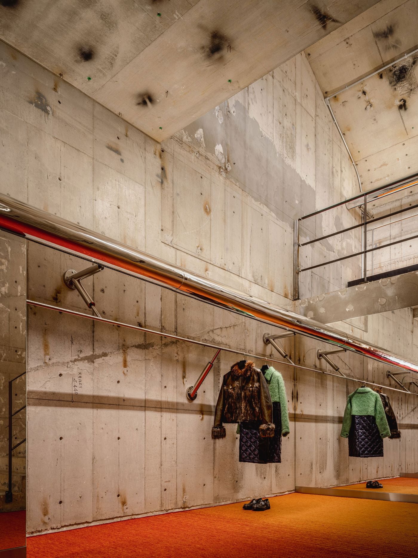
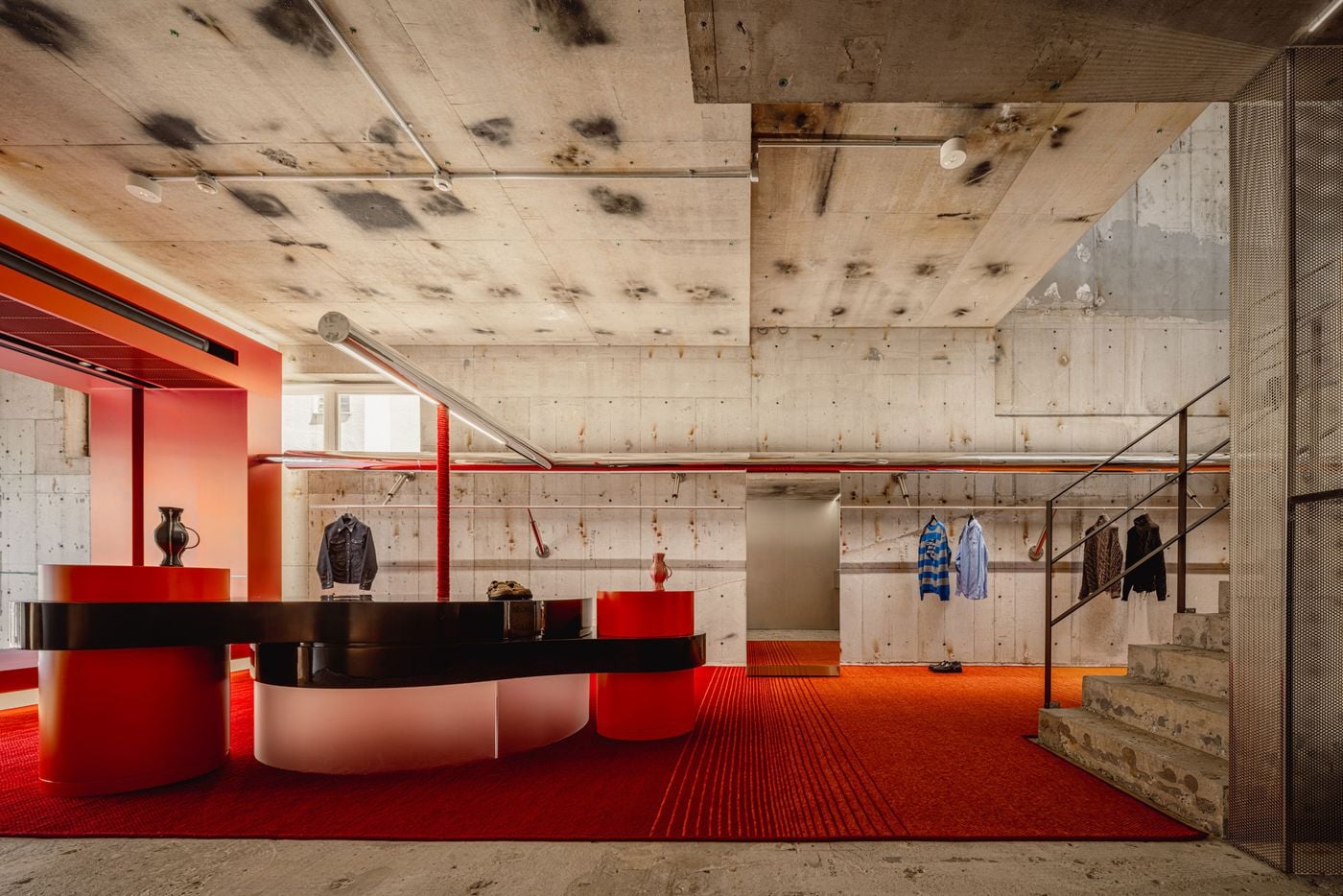
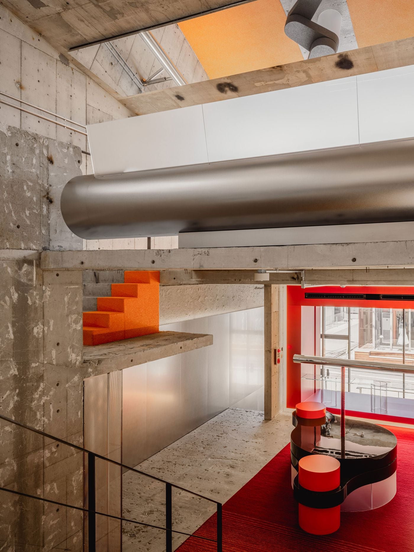
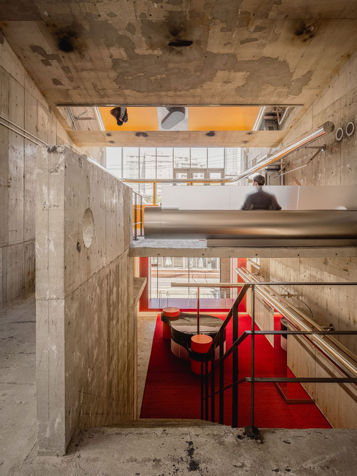
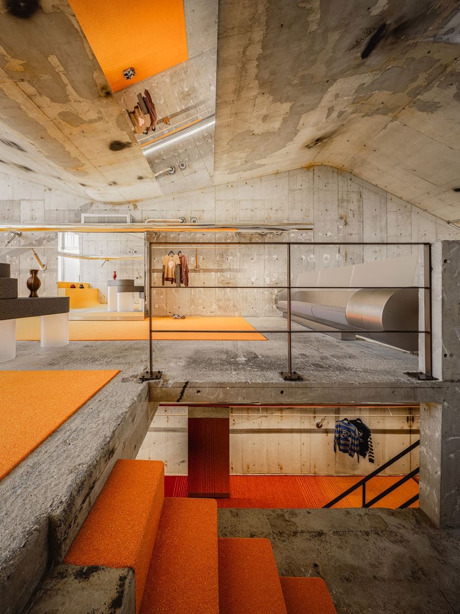
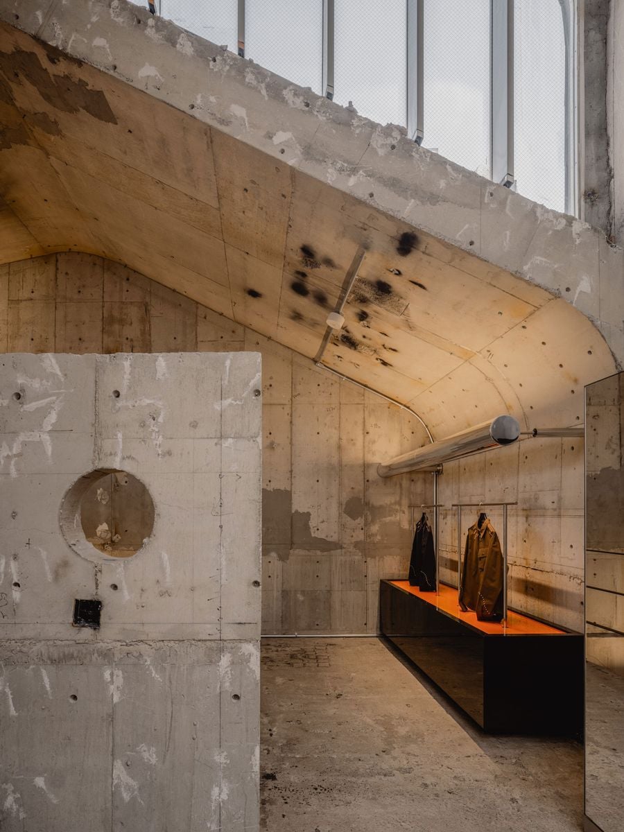
Unfolding across three levels, the store announces itself through a large glazed façade that exposes both the ground floor and the level below to passers-by, with the former dramatically framed by a vivid red portal-like threshold. Inside, the colour continues across carpet-like microcement flooring that extends deep into the ground level, set against the building’s exposed structure, where visible drill holes, stains and construction marks give the interior a deliberately unfinished character.
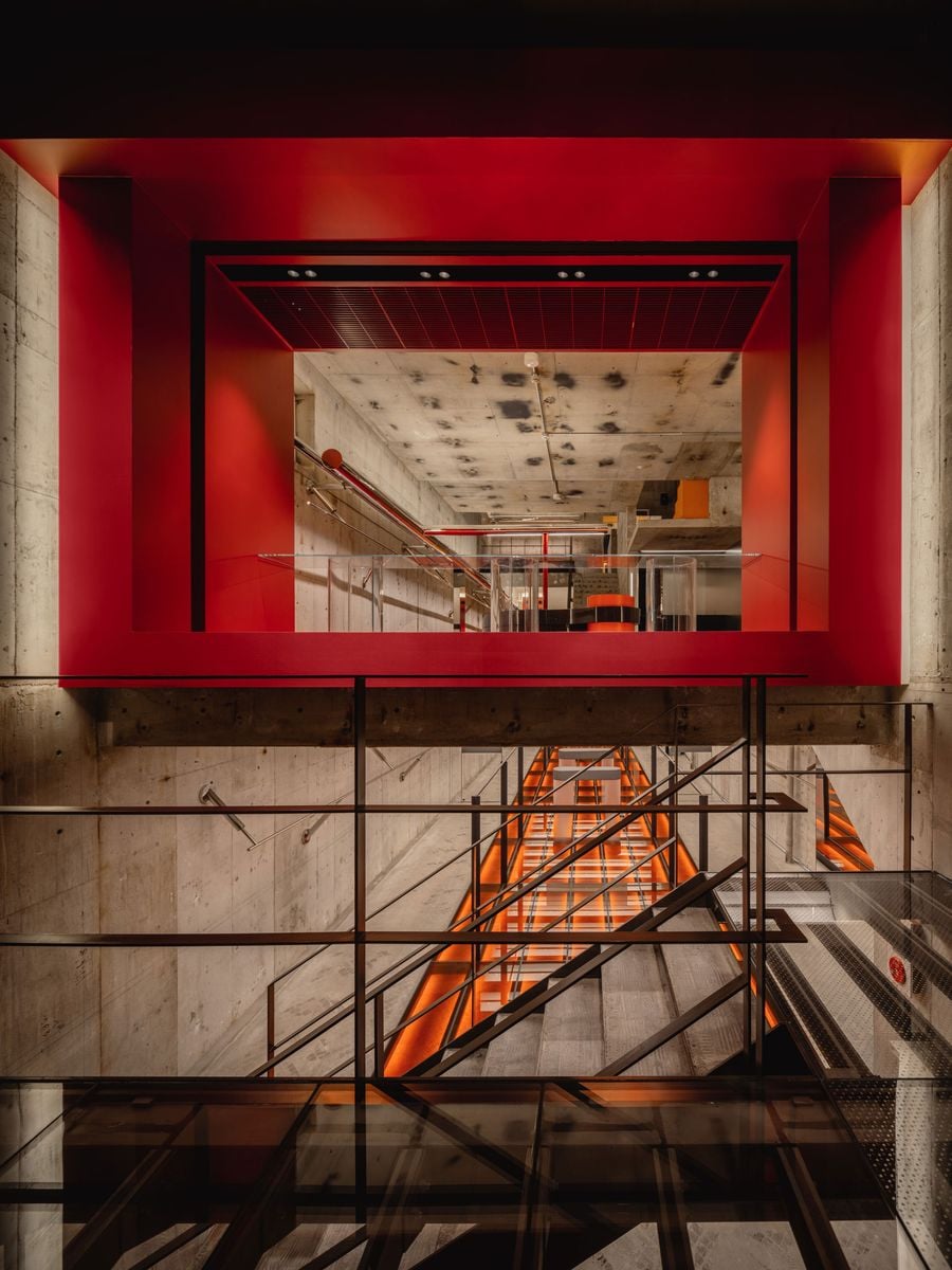
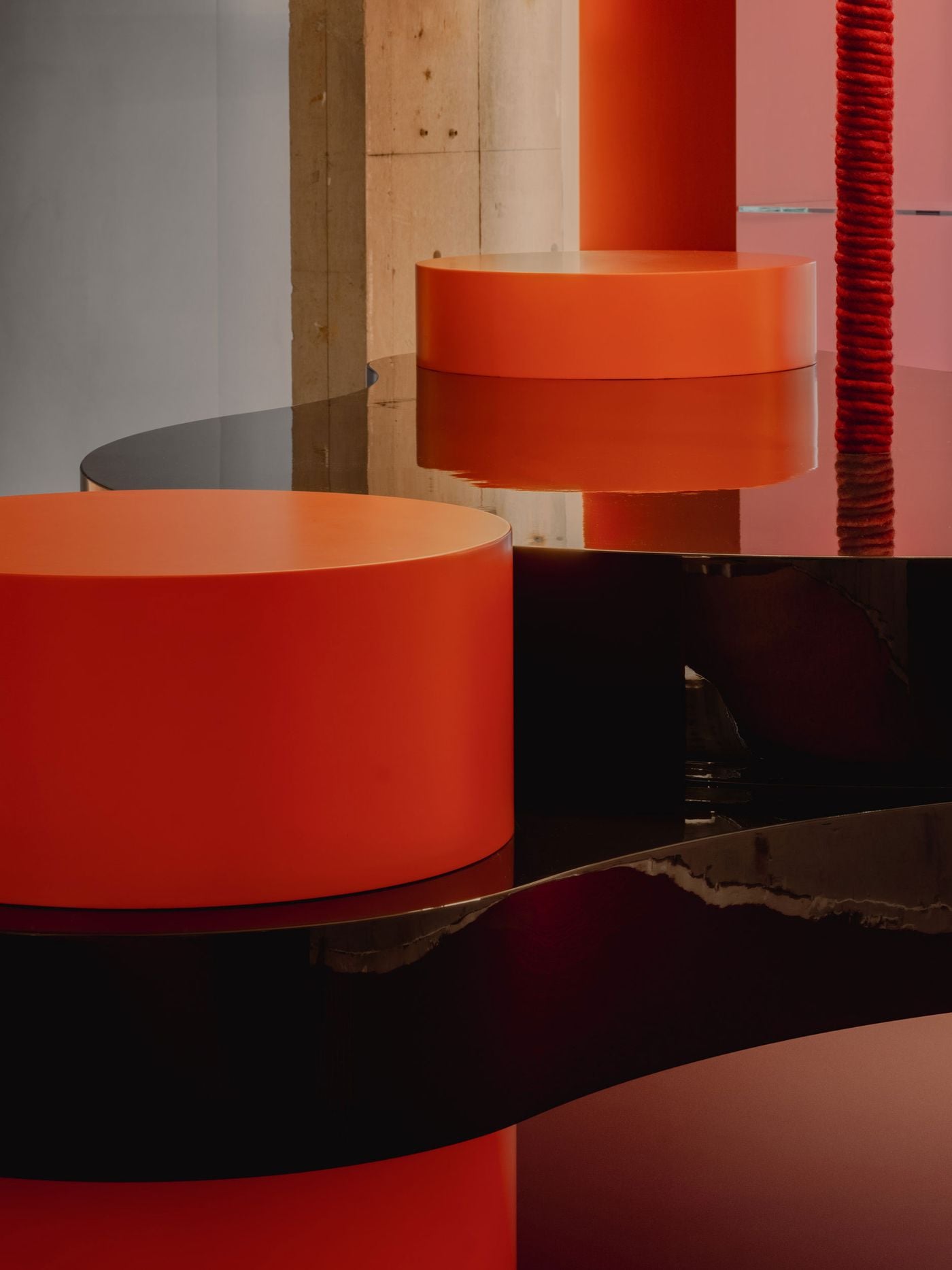
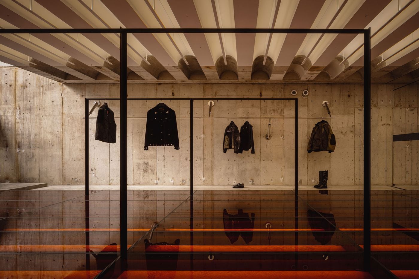
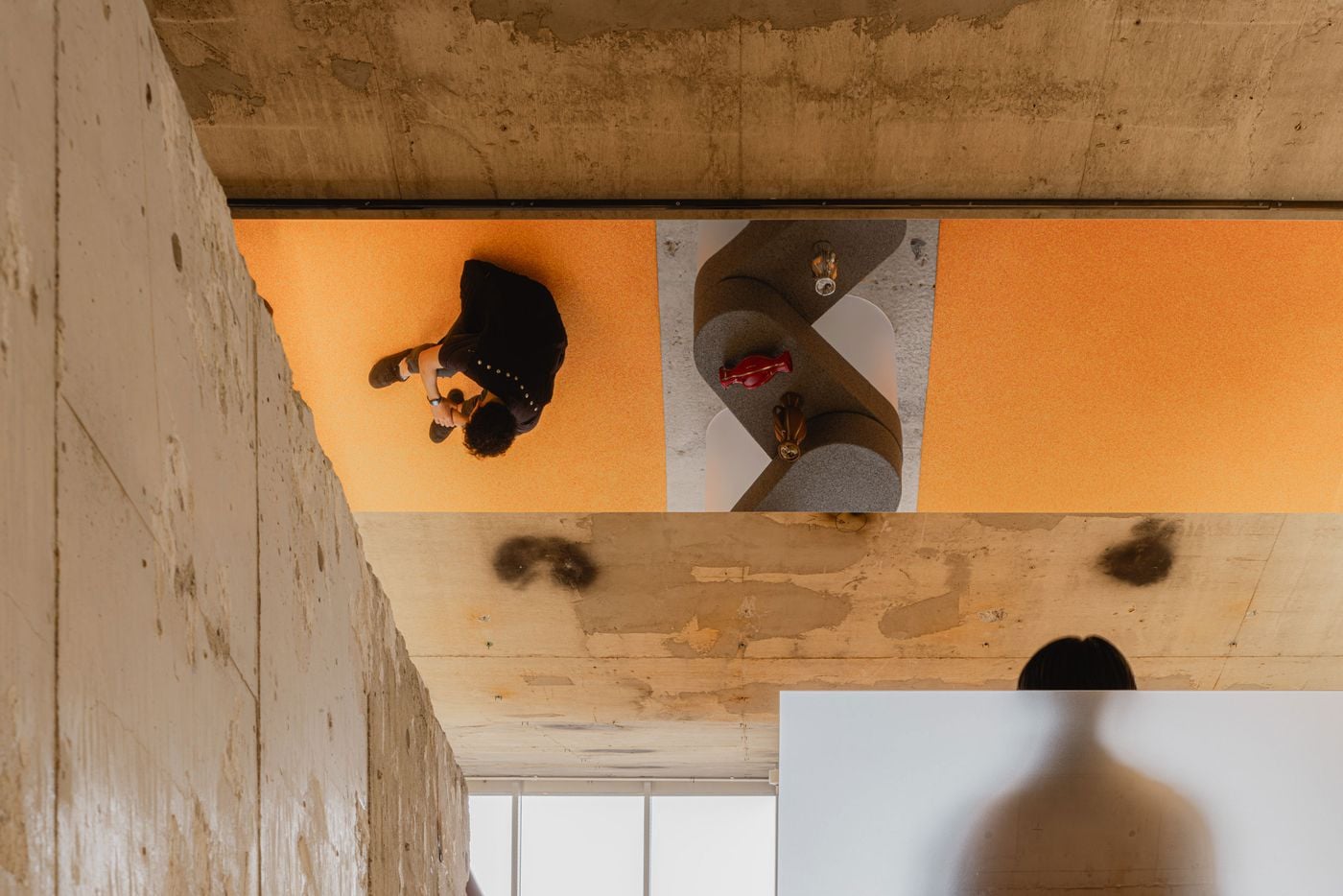
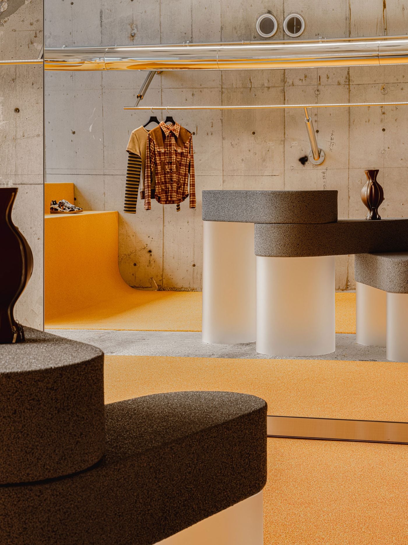
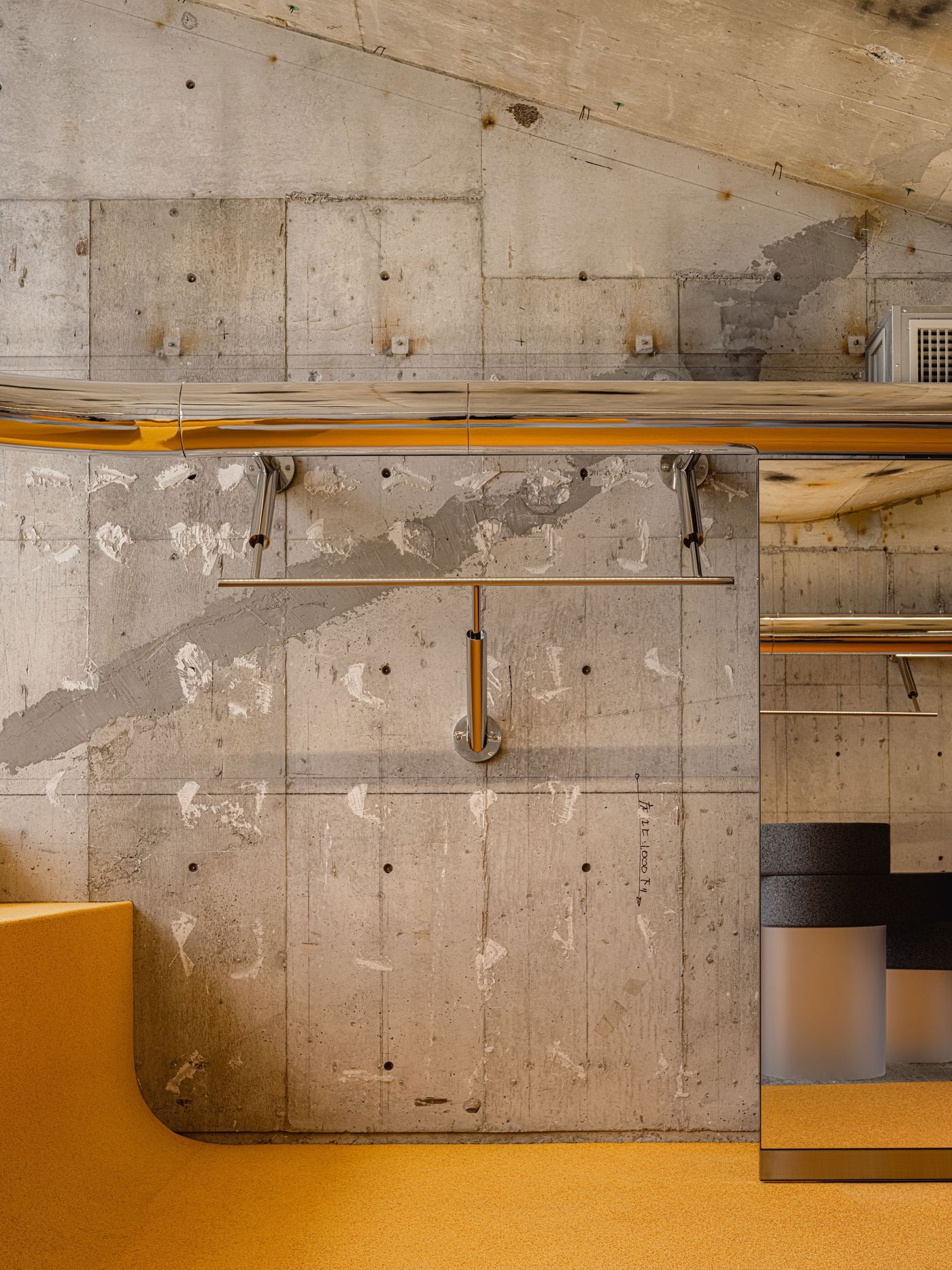
At the centre, a display counter composed of stacked, kidney-shaped volumes in glossy black and orange lacquer introduces softer geometries into the rectilinear space, as does the chrome pipework tracing the perimeter, bending around corners and doubling as lighting elements and clothing rails. Mirrored surfaces further sharpen the contrast between the existing shell and I IN’s more precise interventions, while openings through the floor create long sightlines between levels, establishing the store as a vertically continuous interior rather than three discrete floors.
Photography by Tomooki Kengaku.
Photography by Tomooki Kengaku.
Photography by Tomooki Kengaku.
Photography by Tomooki Kengaku.
Photography by Tomooki Kengaku.
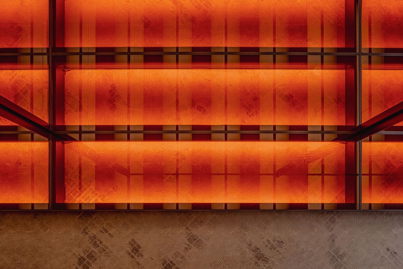
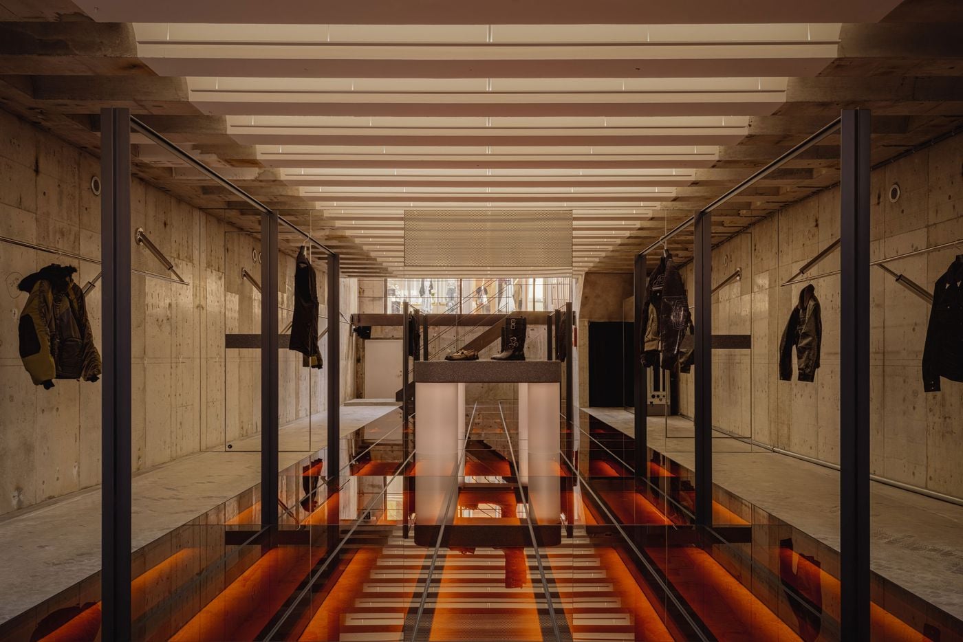
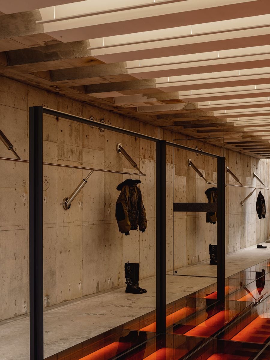
Red also animates the basement, but here it shifts from surface treatment to illumination. An expansive glass floor glowing from below transforms the central circulation route into a catwalk-like spine, flanked by dark metal railings that emphasise its linearity. Overhead, a sequence of slender illuminated barrel vaults introduces a strong horizontal rhythm, further reinforcing the sense of procession. Crucially, the basement’s red glow remains visible from the floors above, turning colour into a device for visually binding the different levels together.
Photography by Tomooki Kengaku.
Photography by Tomooki Kengaku.
Photography by Tomooki Kengaku.
Photography by Tomooki Kengaku.
Photography by Tomooki Kengaku.
Photography by Tomooki Kengaku.
Photography by Tomooki Kengaku.
Photography by Tomooki Kengaku.
Photography by Tomooki Kengaku.
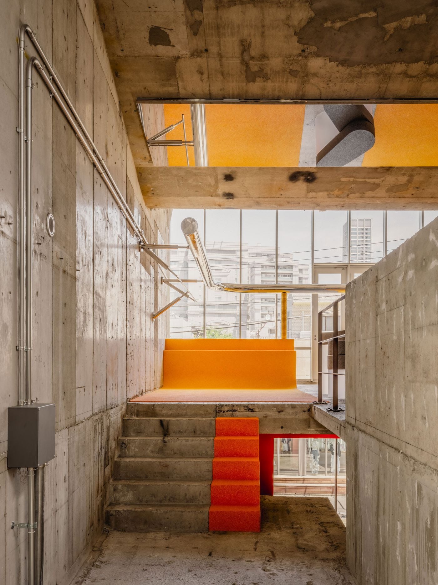
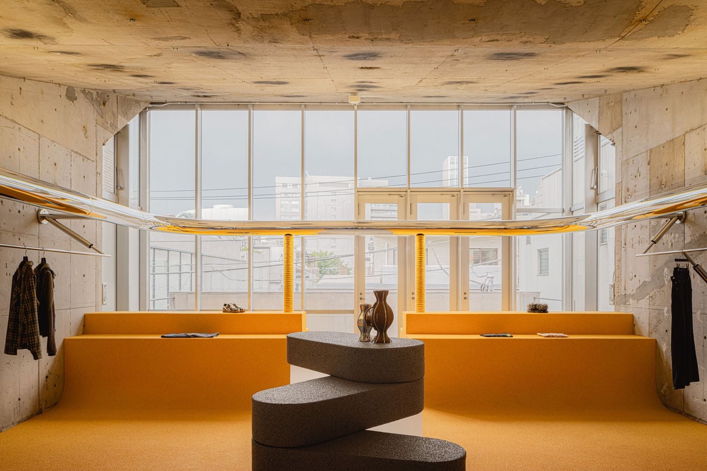
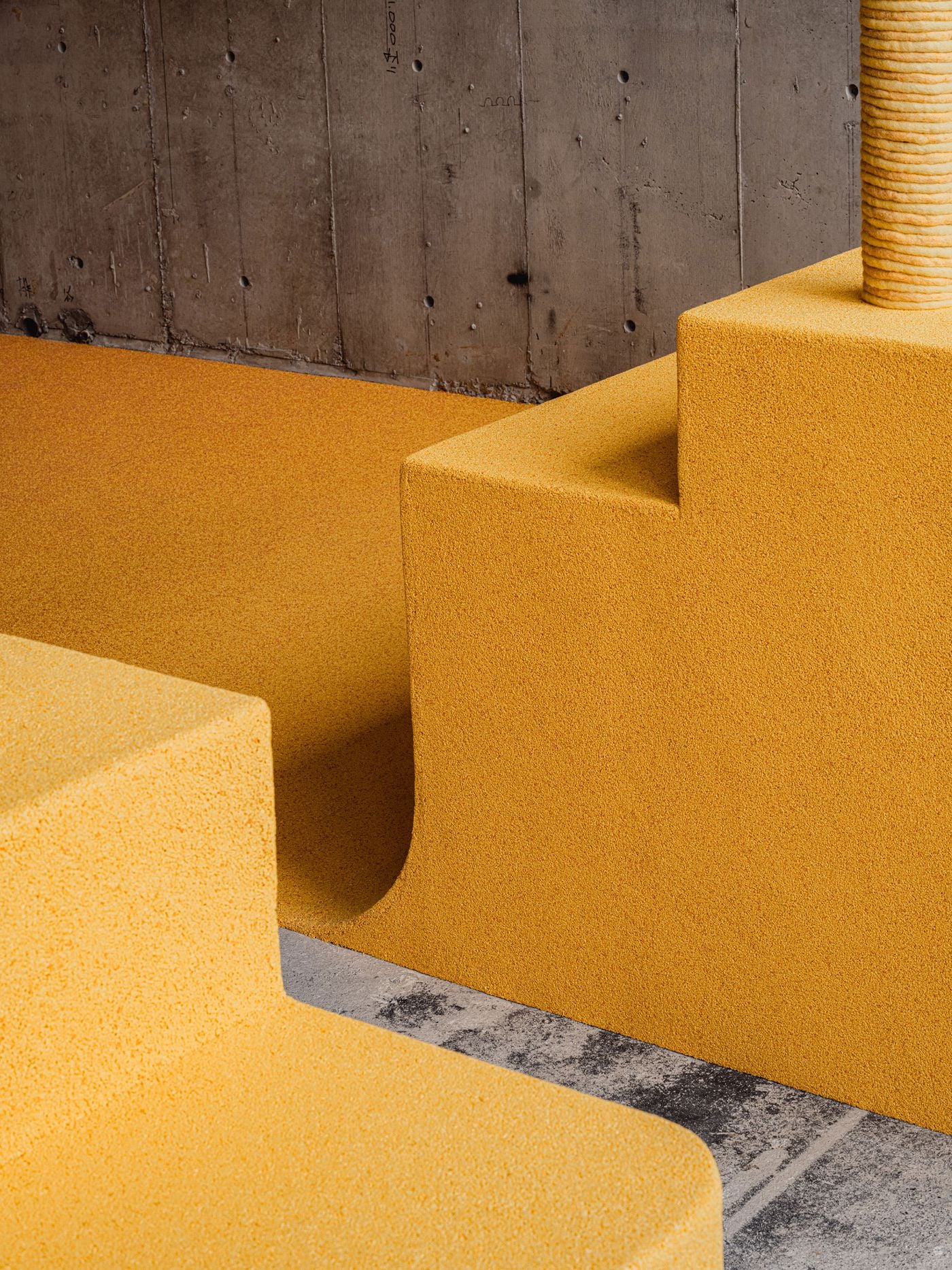
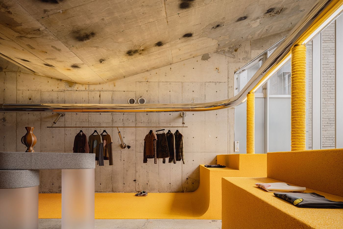
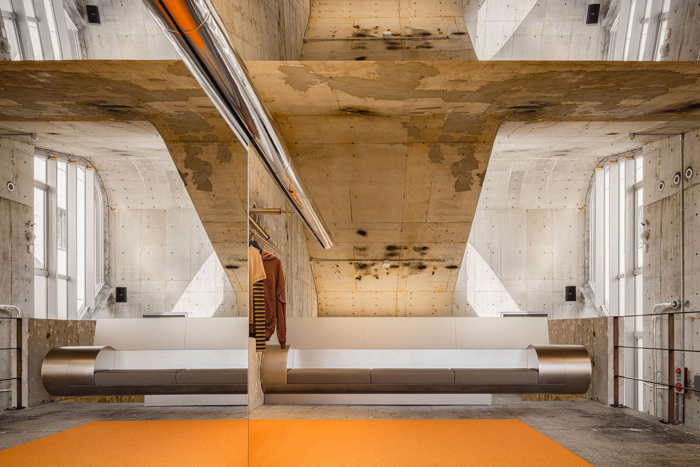
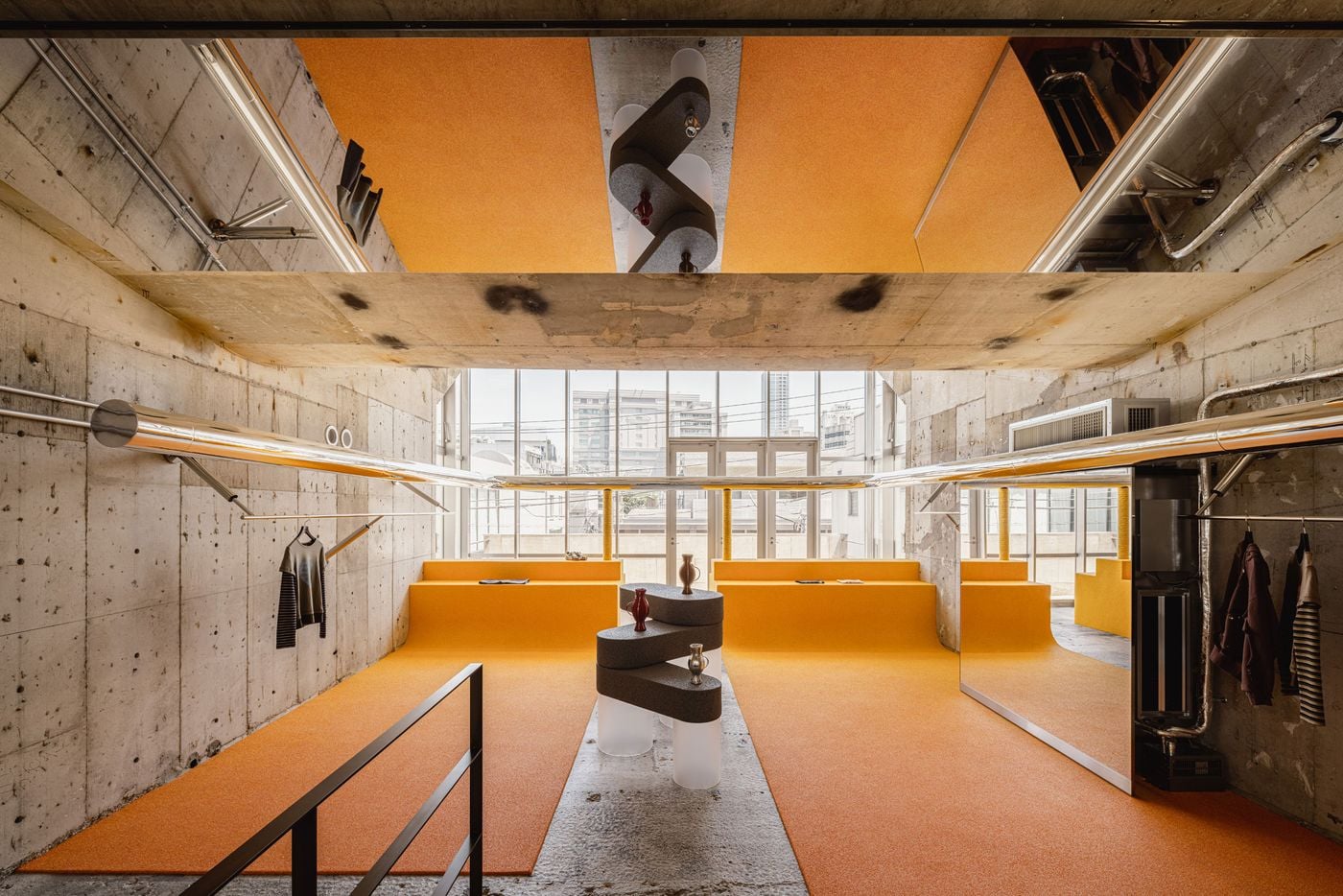
Upstairs, canary yellow replaces red, bringing a brighter, almost graphic quality to the top floor. It appears most prominently in the carpet-like microcement finish, which spreads across the floor before curling upwards to form low counters, stepped platforms and bench-like display surfaces along the windows. As on the ground floor, chrome rails round the perimeter, while a sculptural central display composed of stacked, rounded forms softens the concrete shell. Large windows and openings through the floor and ceiling draw daylight deep into the space, giving this level a noticeably lighter, more open atmosphere.
Despite the strong shifts in colour, the three levels are held together by a consistent vocabulary of exposed concrete, reflective metal, minimal detailing and carefully staged views. The designers describe the project through oppositions: “rawness and sheen, ruggedness and glamour”, a logic closely aligned with Andersson Bell’s own fascination with combining seemingly incompatible cultural and stylistic references. They also frame the store as an encounter between the cultural energy of 1990s Tokyo and the contemporary creative sensibility of Seoul. The result is a flagship that embodies the brand’s taste for productive friction while creating a spatial dialogue between the two cities.
Photography by Tomooki Kengaku.
Photography by Tomooki Kengaku.
Photography by Tomooki Kengaku.
Photography by Tomooki Kengaku.
Photography by Tomooki Kengaku.
Photography by Tomooki Kengaku.
Photography by Tomooki Kengaku.