Pantone Queen // 60 Years Of Matching Colour
Words by Ricardo Hernandez
Location
London, UK
Pantone Queen // 60 Years Of Matching Colour
Words by Ricardo Hernandez
London, UK
London, UK
Location
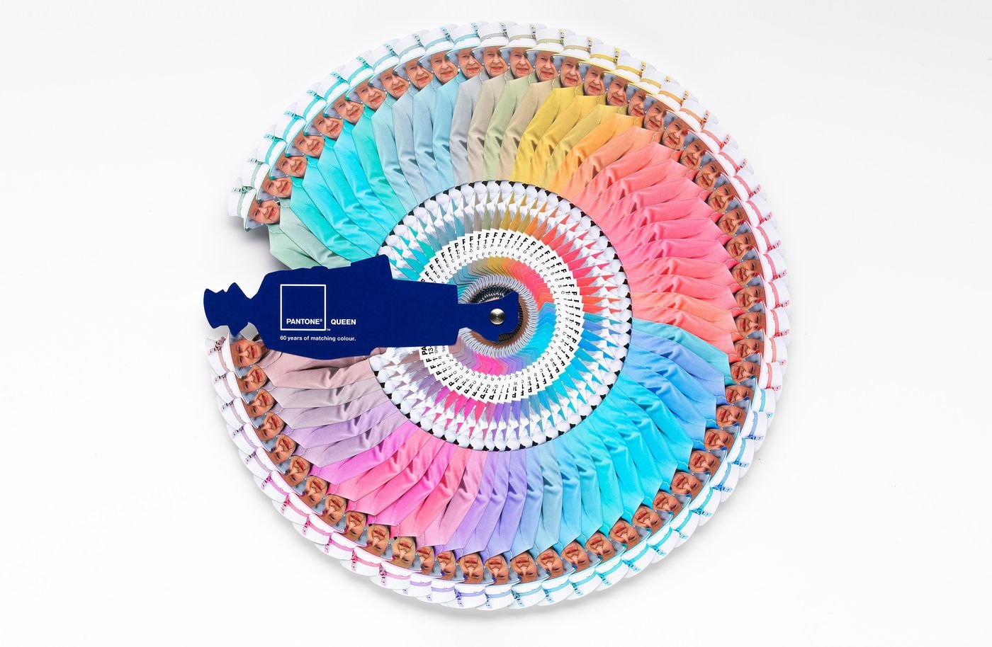
Sixty years after Queen Elizabeth II’s coronation, the Diamond Jubilee celebrations honor her remarkable reign, highlighting not only the enduring popularity of the monarchy but also the vibrant array of colours that have defined her iconic style. To mark this milestone, Pantone and Leo Burnett London have collaborated to create a limited edition Queen’s Colour Guide, a tribute to the stylish consistency of Her Majesty’s wardrobe over six decades.
This unique guide assigns PANTONE Colour references to her monochromatic ensembles, meticulously cataloging the date and location associated with each look. Whether you’re selecting colours for a design project or simply indulging your love of colour, you can now draw inspiration from the Queen’s sartorial choices, infused with purpose and symbolism.
Colour has been a powerful tool for Queen Elizabeth II, used with thoughtful intent throughout her reign. Her monochromatic outfits not only enhance her stature but also command attention, ensuring her presence is the focal point of any event. In a world where celebrities dazzle with ever-changing styles, the Queen’s consistency in wearing a single shade speaks volumes, sparking endless discussions about the significance of her choices.

photo © Pantone® and Leo Burnett London
The Power of the Palette
The Queen’s ensembles often reflect the occasion’s mood, location, or significance. Selecting feature colours from her wardrobe, Leatrice Eiseman, Executive Director of the Pantone Colour Institute®, explains the symbolism behind some of her most notable choices:
• PANTONE 13-0755 Primrose Yellow
“The Queen’s royal wedding outfit for Prince William’s 2011 wedding was Primrose Yellow. Yellow speaks to the future with hope and optimism. It was a time of national celebration, and this joyous colour was befitting the occasion—high visibility for a queen, yet not detracting from the bride.”
• PANTONE 13-4411 Crystal Blue
“Blue, a staple in the Queen’s wardrobe, communicates constancy and devotion to her people. Blue’s calming properties are often seen during challenging times, such as the serene shade she wore to a Royal Garden Party in 2010.”
• PANTONE 16-2124 Pink Carnation
“In her younger years, the Queen favored lighter pinks, softening her image and making her appear less austere. The Pink Carnation she wore to the Chelsea Garden Party in 1967 is a fine example. In recent years, she’s embraced bright, trendier pinks, defying her age and reflecting her modern, spirited outlook.”
• PANTONE 13-5414 Ice Green
“During her landmark state visit to Ireland—the first since its independence in the 1920s—Her Majesty donned a cool shade of green, symbolizing new beginnings and rejuvenation. It was a poignant choice, echoing the sentiment of reconciliation and renewal.”


The Queen’s Palette project was brought to life with meticulous attention to detail. Developed at Leo Burnett London, the project featured the creative direction of Will Thacker and Blake Waters, with photography by Andy Rudak and expert printing by Precision Printing using the advanced HP Indigo 7500 Digital Press. The 7-colour (CMYKOV) HP IndiChrome on-press PANTONE emulation allowed for exact colour matching, capturing 97% of the PANTONE Colour range.
The Queen’s Palette is more than a collection of colours; it is a vivid record of the moments that defined her reign, a celebration of her enduring influence, and a testament to the power of style. Whether it’s a bold yellow for joy, a calming blue for reassurance, or a fresh green for renewal, each shade tells a story.
So, the next time you consider a colour, think of the Queen. Let her unparalleled understanding of visual symbolism guide your choices, reminding us that colour is not just seen—it is felt, understood, and remembered.