photo © Brigida González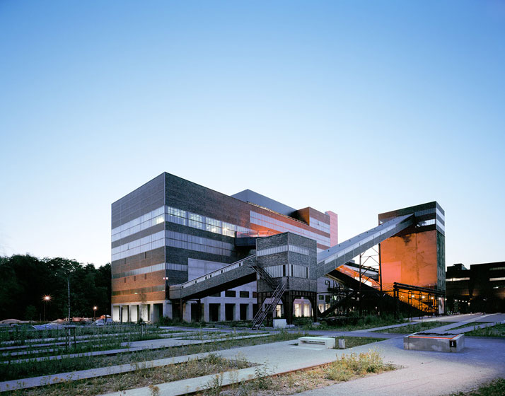
photo © Brigida González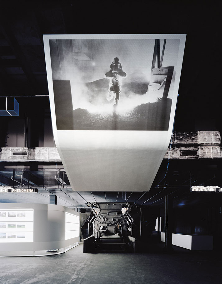
Ruhr Museum at Zeche Zollverein, Essen (Germany)
Exhibition architects
hg merz architekten museumsgestalter, Stuttgart/Berlin (Germany)
Design team
HG Merz, Markus Betz, Hannes Bierkämper, Alexander Lang, Cornelia Wehle, Felix Krönert, Stephan Becker, Patrick Wais
Construction supervision
Hannes Bierkämper
Client
Stiftung Zollverein, Essen (Germany)
Exhibition area
5000 sqm
Design phase (beginning and ending month, year)
09/2006-02/2009
Construction phase (beginning and ending month, year)
03/2009-01/2010
Graphic
L2M3 Kommunikationsdesign, Stuttgart (Germany)
Audio-visual media
jangled nerves, Stuttgart (Germany)
photo © Brigida González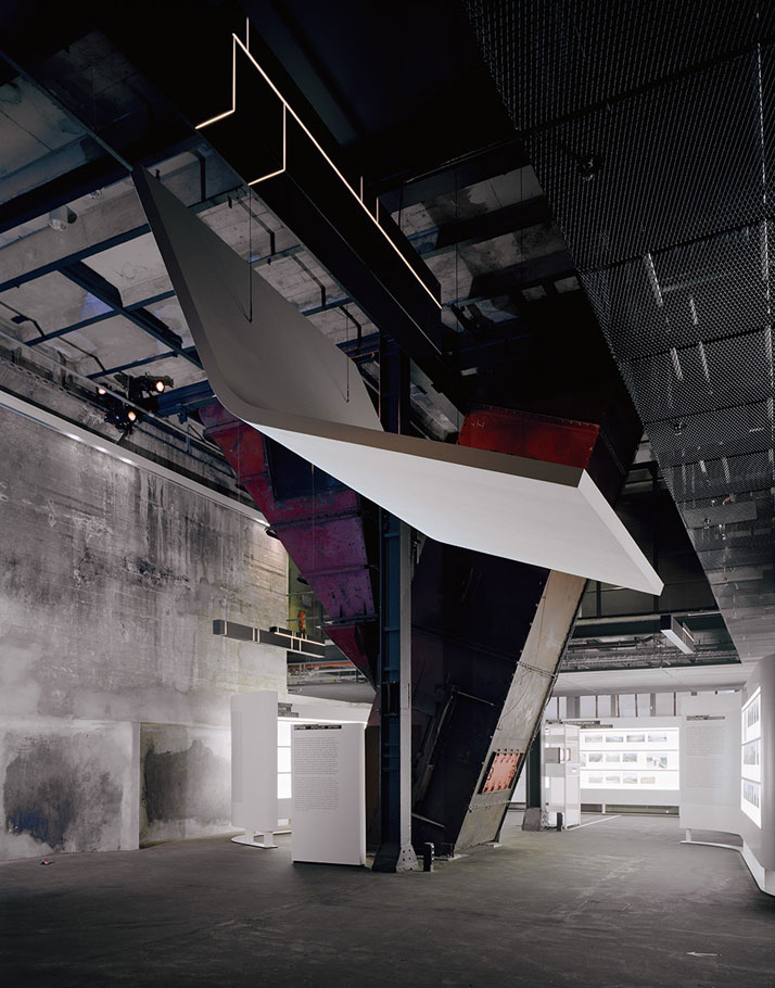
The Ruhr district or Ruhr region, is an urban area in Northwest Germany with roughly 5 million inhabitants. This amounts to the largest urban agglomeration in Germany. This area is largely known for its industrial cities bordered by the rivers Ruhr to the south, Rhine to the west and Lippe to the north. The story of the area is characterized by honest values of hard work and solidarity, largely constructed from its soaring wealth of "black gold" or coal for nearly a century. The wealth of the area is best defined by its diverse set of cultures, immigrants and religions that pursued opportunities when coal was a soaring component of this economy. Once the global era of industrialization ended in the 60's, the Ruhr region deeply suffered the consequences of high oil prices and the lower costs of coal and steel from high volume suppliers like Japan. photo © Brigida González
The decades of the 70's and 80's were rough as the economy shifted to service and technology markets, thus leaving Ruhr at a bit of a dark stage in their history. Over the last few decades, the government and its people have worked hard to push a new kind of renaissance and re-design Ruhr into the culture capital of Germany. With a vast architectural landscape of churches, old factories and industrial parks, the area needed a re-design embracing what was currently there as an instrument to tell the story of its people into this new era. 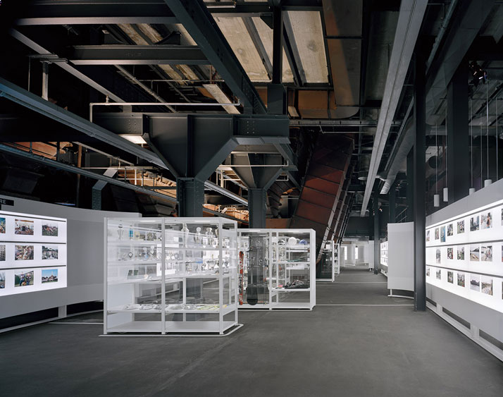
Most cities in this predicament have approached this situation in an unsustainable methodology of demolishing the old and building new. We have seen examples of cities trying to redesign themselves by doing a World Expo (Zaragoza, Spain) or hiring a starchitect to do a new museum or skycraper and failing, placing its citizens in a hole that can take a generation to recover. Ruhr approached it by embracing the old. They decided to utilize what was already there and re-design its use by embracing and integrating it as part of their new plan for its future. This plan led to a series of new projects that have shaped these old industrial structures into new purpose venues such as: Duisburg-Nord Landscape Park, Oberhausen Gasometer, the Tetrahedron, the Shurenbach Spoil Tip and Zollverein World Heritage site and many others. All these cultural landmarks have been "healed" and re-greened by designers and artists for the world to enjoy and the people of Ruhr to retake pride once again. photo © Brigida González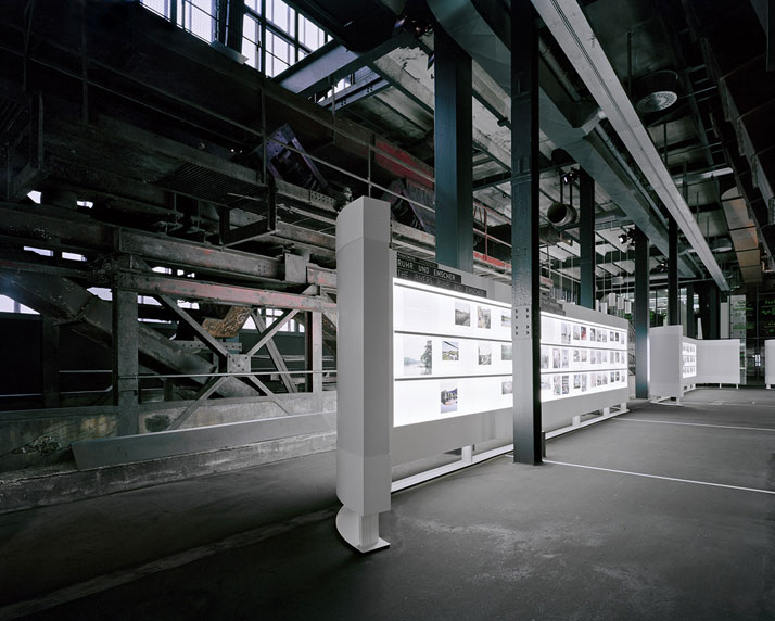
photo © Brigida González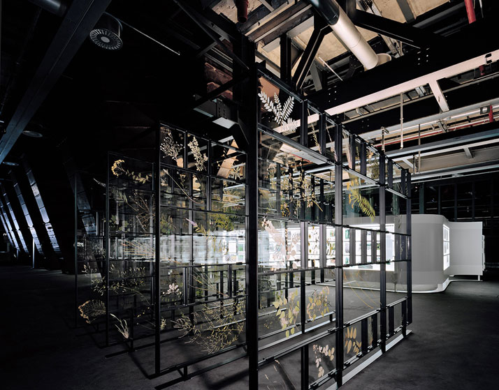
One of the many projects that unfolded through this massive redesign was the new Ruhr Museum designed by architecture firm HG Merz from Stuttgart. The Ruhr Museum is located in the old coal washing plant of Zeche Zollverein in Essen, Germany. The space is interesting and full of elements that are important to the integrity of the the plant. HG Merz did not want to loose any of it but at the same time they had to find ways to design the exhibit space with it. This demanded innovative methods and a careful process to the planning of the exhibition.
photo © Brigida González
photo © Brigida González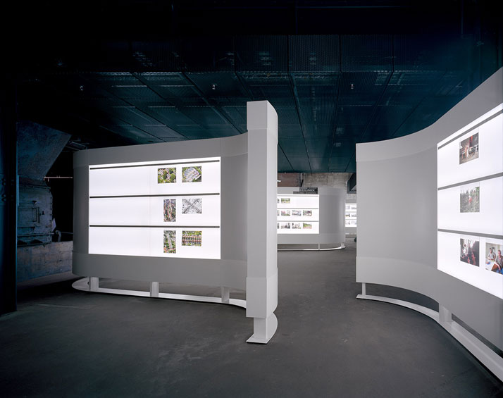
The exhibition approach does not compete with the impressive space but rather helps you move through it. In order to define the foreground and background HG Merz utilizes white as the primary color for the exhibition partitions so it visually detaches from the plant's dark color. This contrast allows the plant details to be a secondary but apparent facet of the experience without derailing the informational path of the visitor. As the plant is rich in industrial detail and contains massive and elaborate machines inside, HG Merz approached the new architectural language through white partitions, focused lighting and soft finishes in order to contrast the building. Collaborating with communication designers L2M3 and media agency Jangled Nerves, the architects created a museum that is unique as the building itself. After 4 arduous years of planning and construction, the museum opened its doors in January 2010.
photo © Brigida González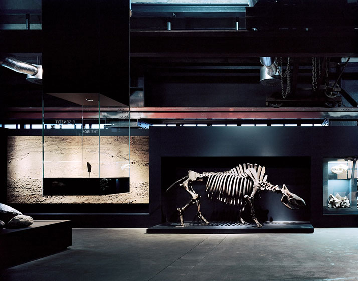
photo © Brigida González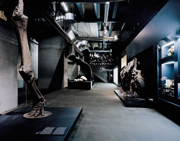
The exhibition is organized through 4 areas: "popular myths", "phenomena", "structures" and "signs of times". These encompass the cultural and natural memories of the Ruhr Area. These areas of spatially defined by the building's vertical height as it divides the journey from 24 meters into 6 meters. This compression through space leads you into the history of the Ruhr Area. Beginning in the 24 meter high space, the visitor enters the experience and notices the vastness of the building. This introductory experience defines the visual and architectural language that will lead you through the rest of the space: a dark layer (building) that acts as a backdrop and the white layer which is the exhibition architecture holding the content and artifacts of Ruhr's history. photo © Brigida González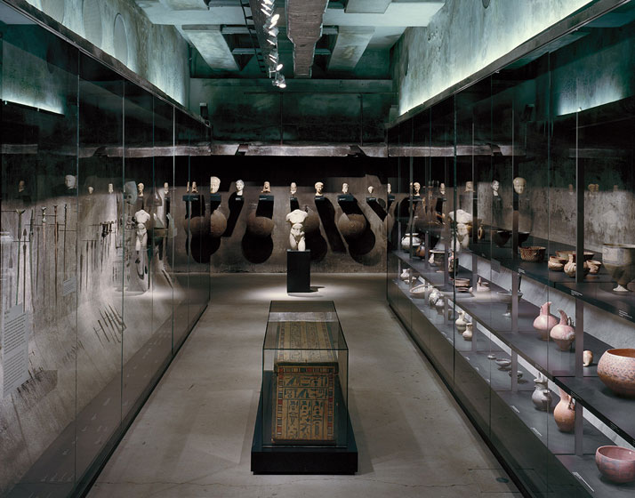
photo © Brigida González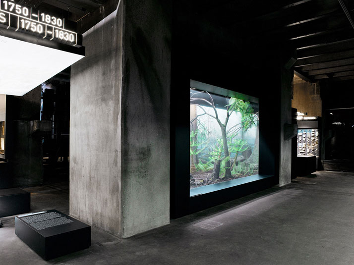
The exhibition architecture acts as an independent body from the building structure and the machines. Its clean and soft folds, contrast the transparency of the building. White partitions and suspended ceilings undulate and lead you through the space. These abstract elements contrast the building's vocabulary and reverses the formal construction principles of the building. It feels as a white ribbon continues to move and bend through the space. The white architectural language stages the exhibit and brings forward the content, leaving as a backdrop the silent building with its massive machines. The installations are elegant and engaging as the architects utilized the openness of the building and its dark backdrop to carefully stage information and highlight it with intense lighting, creating a dramatic feeling to the journey. When not following a white partition, grazed surfaces with white light carry through and act as a wayfinding tool through the space. photo © Brigida González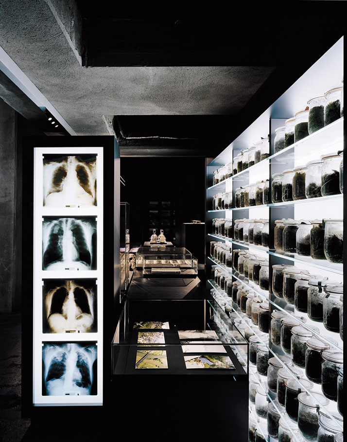
photo © Brigida González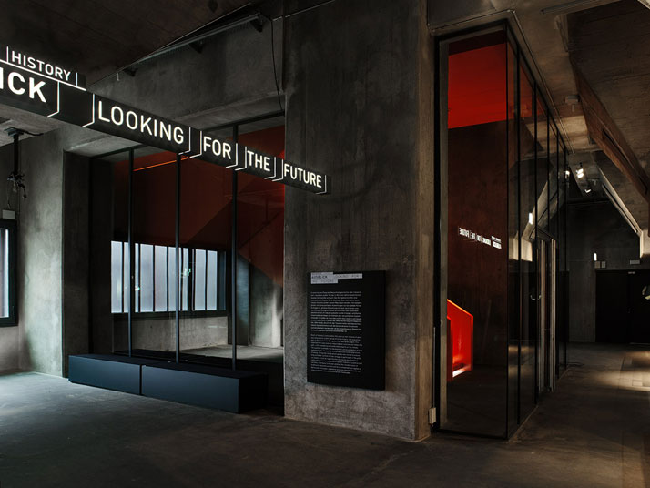
As you are compressed in space through the exhibition, you keep entering more intimate layers of Ruhr's history and memories. The careful crafting of the area's history demonstrate the intricacy and richness of its culture. A highly layered architectural and visual communication path keeps visitors engaged and focused in this experiential journey through history. Explore landscapes, traditions and structures through a careful delineation of space. Utilizing contrast to channel focus was crucial to the experience. Adding a distinct lighting strategy to encapsulate the exhibition experience was brilliant and texturizing the content with DIN font only adds more flavor to the concentrated experience of this museum in Germany. The experience is consistent and simple to follow due to the integrated collaboration of designers and communicators. A magnificent setting is embraced and revitalized through the collaboration of not only the design team but the entire community in the Ruhr area. We celebrate this project as not only the rebirth of Ruhr, but the brilliant strategy and integrity to maintaining the integrity of the area, sharing the greatness and at times its darkest moments with the rest of the world.
photo © Brigida González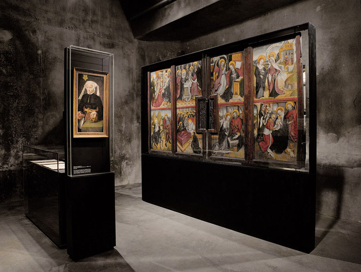
photo © Brigida González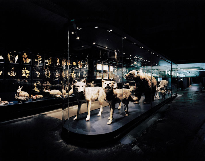
photo © Brigida González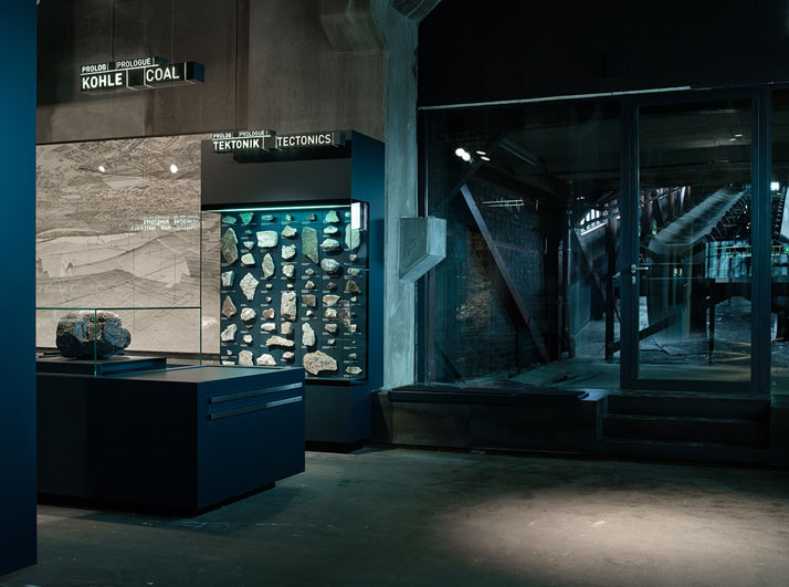
photo © Brigida González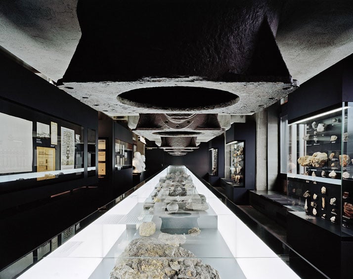
photo © Brigida González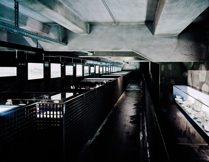
photo © Brigida González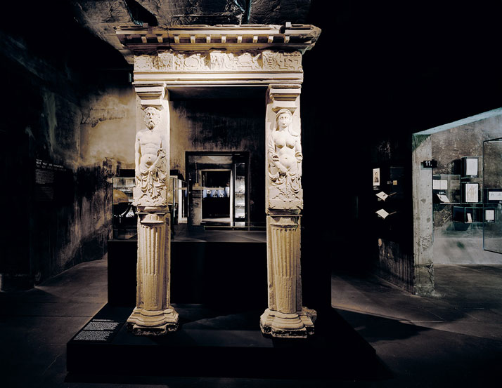
photo © Brigida González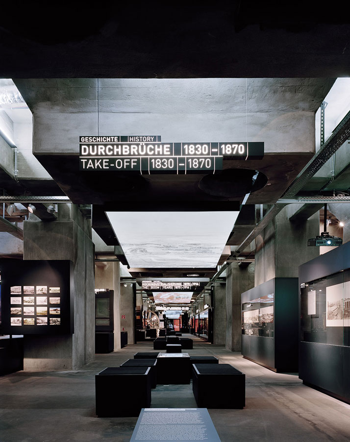
photo © Brigida González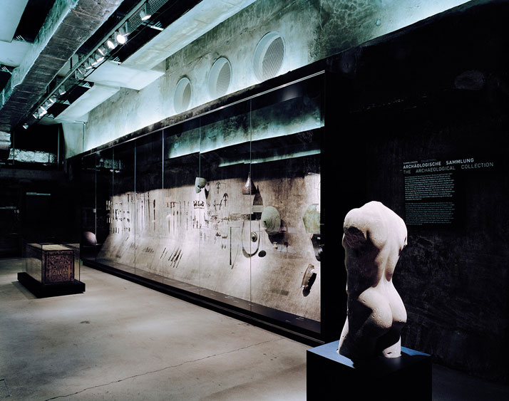
Recent Articles

Palazzo Citterio: A New Chapter in Milan’s Cultural Landscape


