A Sense of Contemporary Sophistication Transforms a Traditional Japanese House into a Modern Workplace
Words by Yatzer
Location
Nagasaki, Japan
A Sense of Contemporary Sophistication Transforms a Traditional Japanese House into a Modern Workplace
Words by Yatzer
Nagasaki, Japan
Nagasaki, Japan
Location
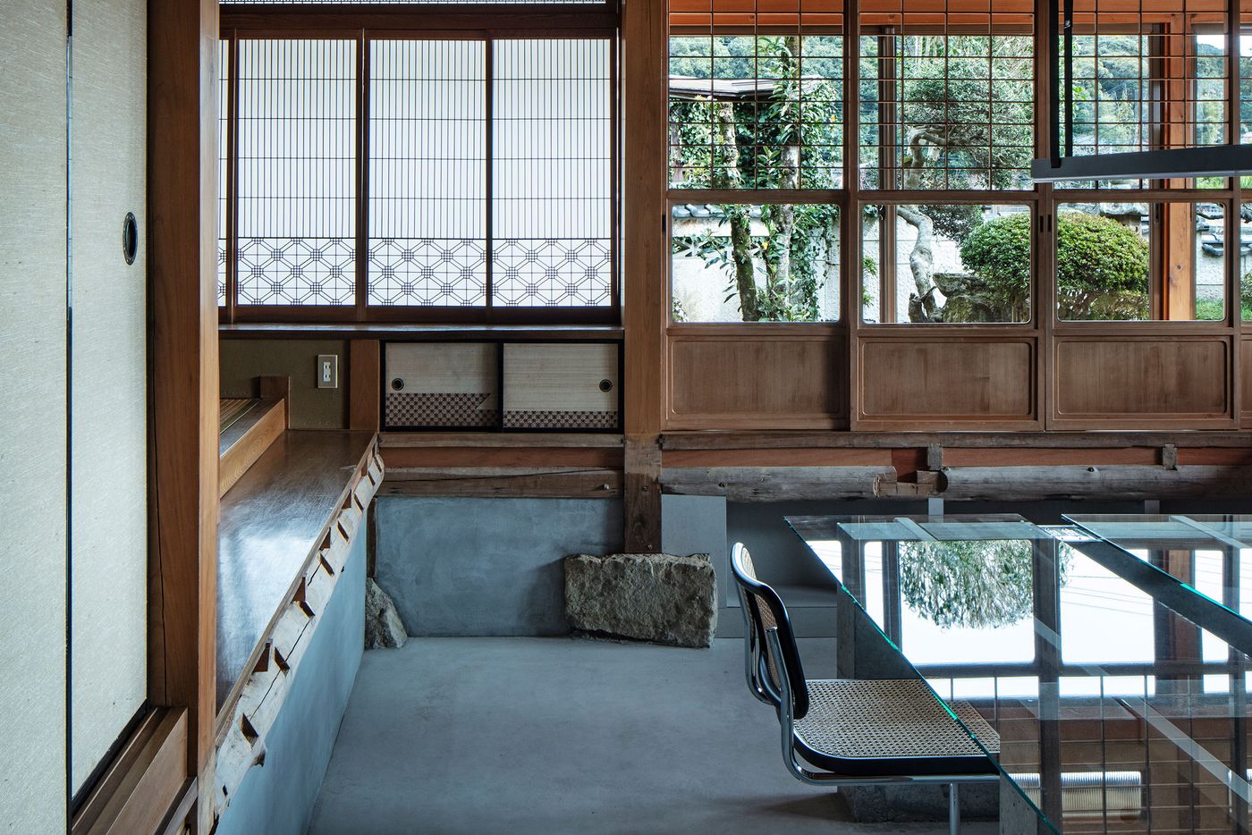
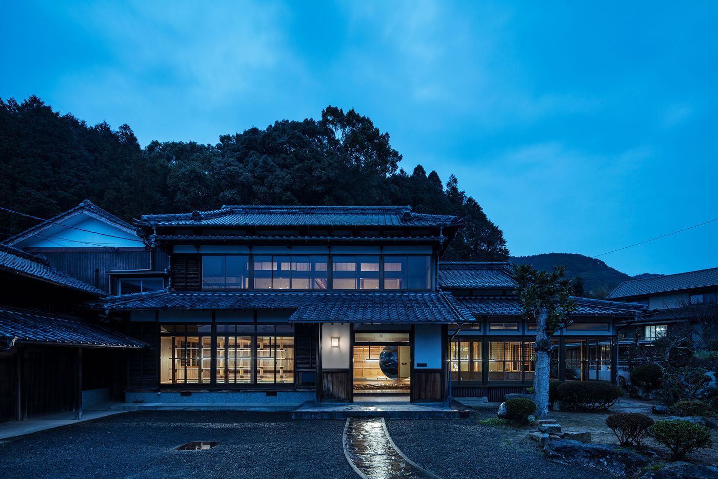
Taking over a traditional Japanese house in the historic town of Hasami in the Nagasaki Prefecture - one of Japan’s foremost pottery centres whose ceramic production dates back to the Edo period 400 years ago - the new office and showroom of pottery brand Maruhiro bridges past and present by boldly re-imagining the building’s architectural heritage through a modern lens. Tokyo-based architecture, interiors and product design practice DDAA’s discrete renovation has injected a sense of contemporary sophistication and innovative flair without detracting from the timeless elegance and Zen sensibility of the century-old structure. Located next to “Hiroppa”, a retail park currently under development at DDAA, and featuring a kitchen for making lunch boxes to eat in the park and a studio for resident artists, Maruhiro’s new premises are designed as much as a workplace as a cultural and communal hub.
Photography by Kenta Hasegawa.
Photography by Kenta Hasegawa.
Photography by Kenta Hasegawa.
Photography by Kenta Hasegawa.
Photography by Kenta Hasegawa.
Photography by Kenta Hasegawa.
Photography by Kenta Hasegawa.
Traditional Japanese wooden houses are designed with flexibility in mind so they can be easily expanded or renovated and this 86-year-old two-storey house is no exception, a quality that fitted perfectly with the architects’ goal “to create a space that is not fixed in function or concept”. Constrained by a reduced budget in response to the Covid pandemic, the team opted for a lightweight approach involving targeted interventions in order to transform the house into a modern workplace and showroom with as few modifications as possible. At the same time, their design allows the incorporation of additional functions in the future such as a pop-up store and tea room.
Photography by Kenta Hasegawa.
Photography by Kenta Hasegawa.
Photography by Kenta Hasegawa.
Photography by Kenta Hasegawa.
Photography by Kenta Hasegawa.
Photography by Kenta Hasegawa.
Photography by Kenta Hasegawa.

Photography by Kenta Hasegawa.
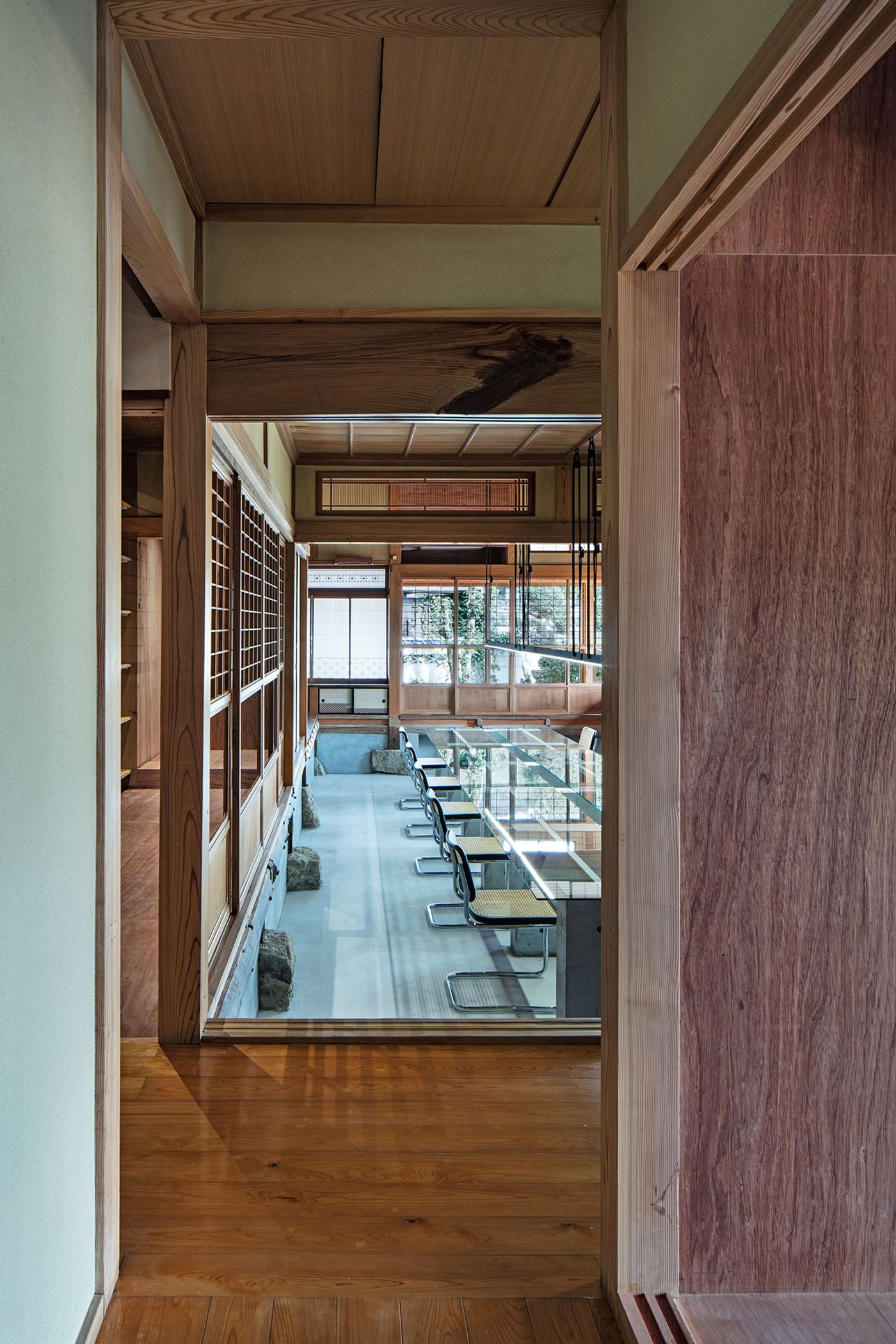
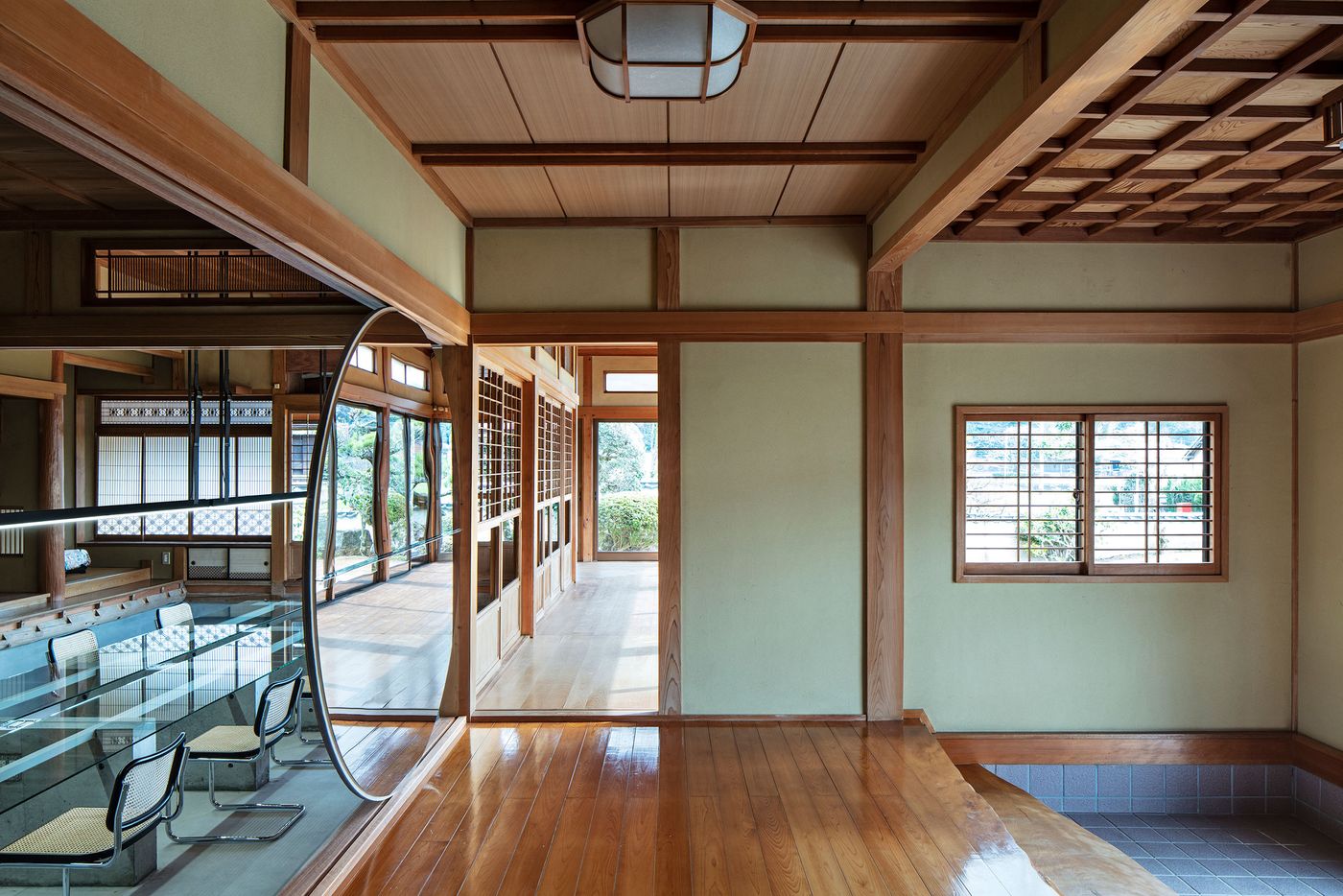
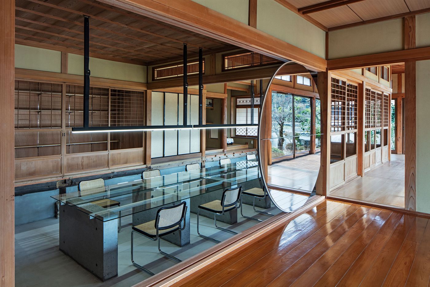
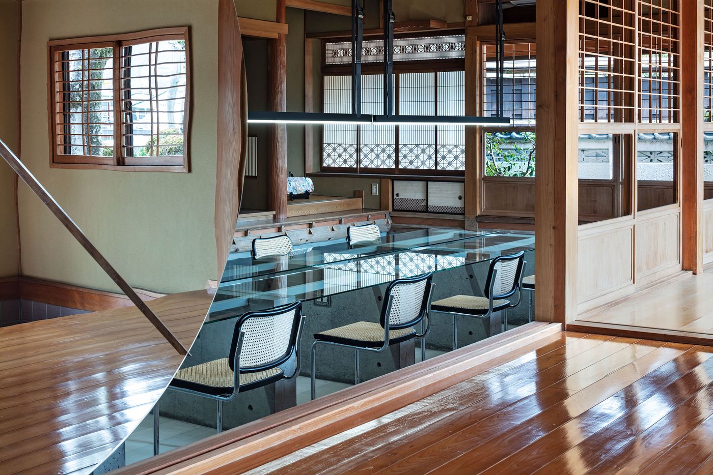
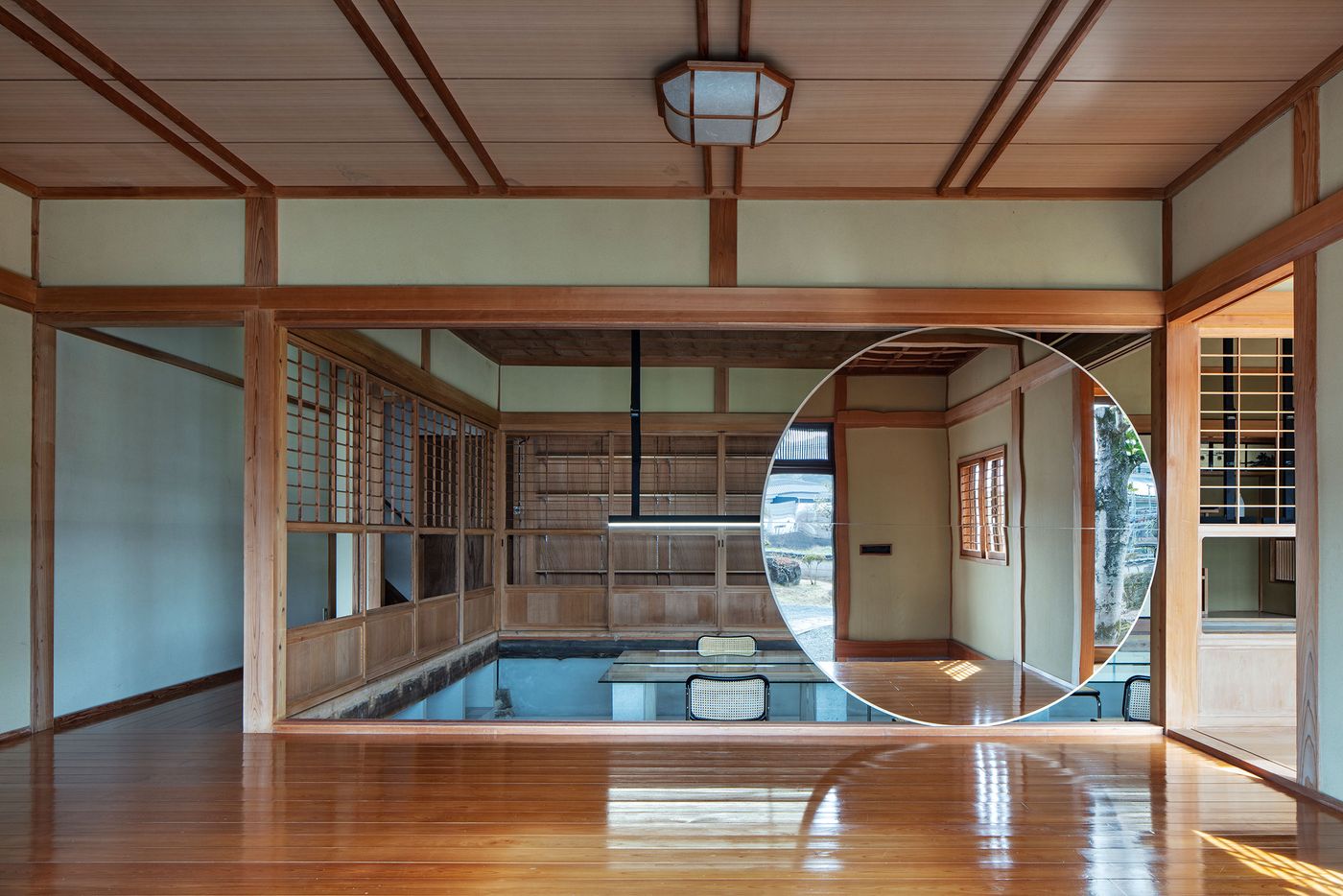
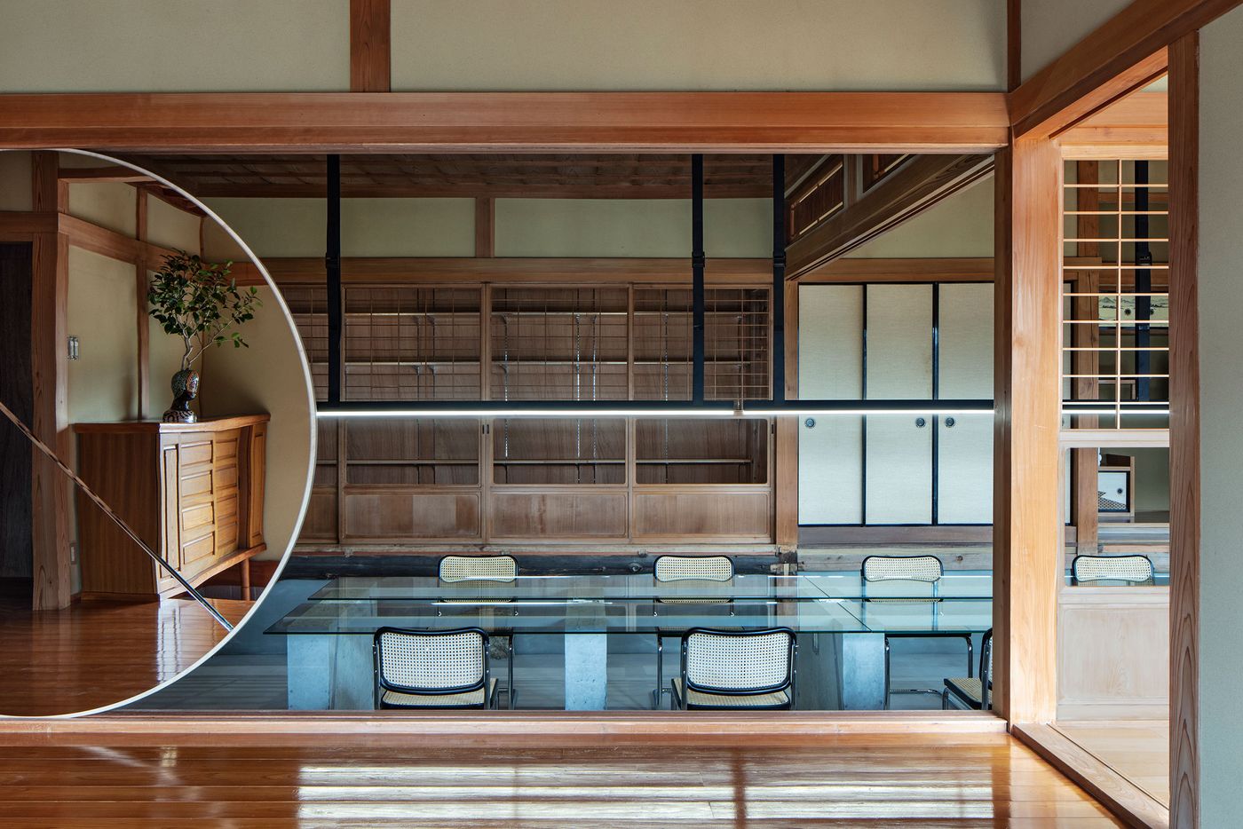
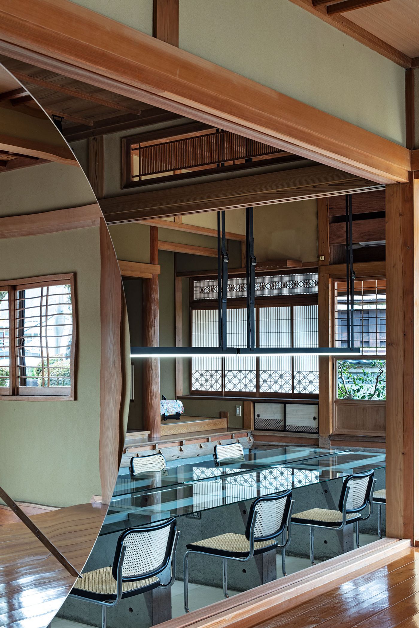
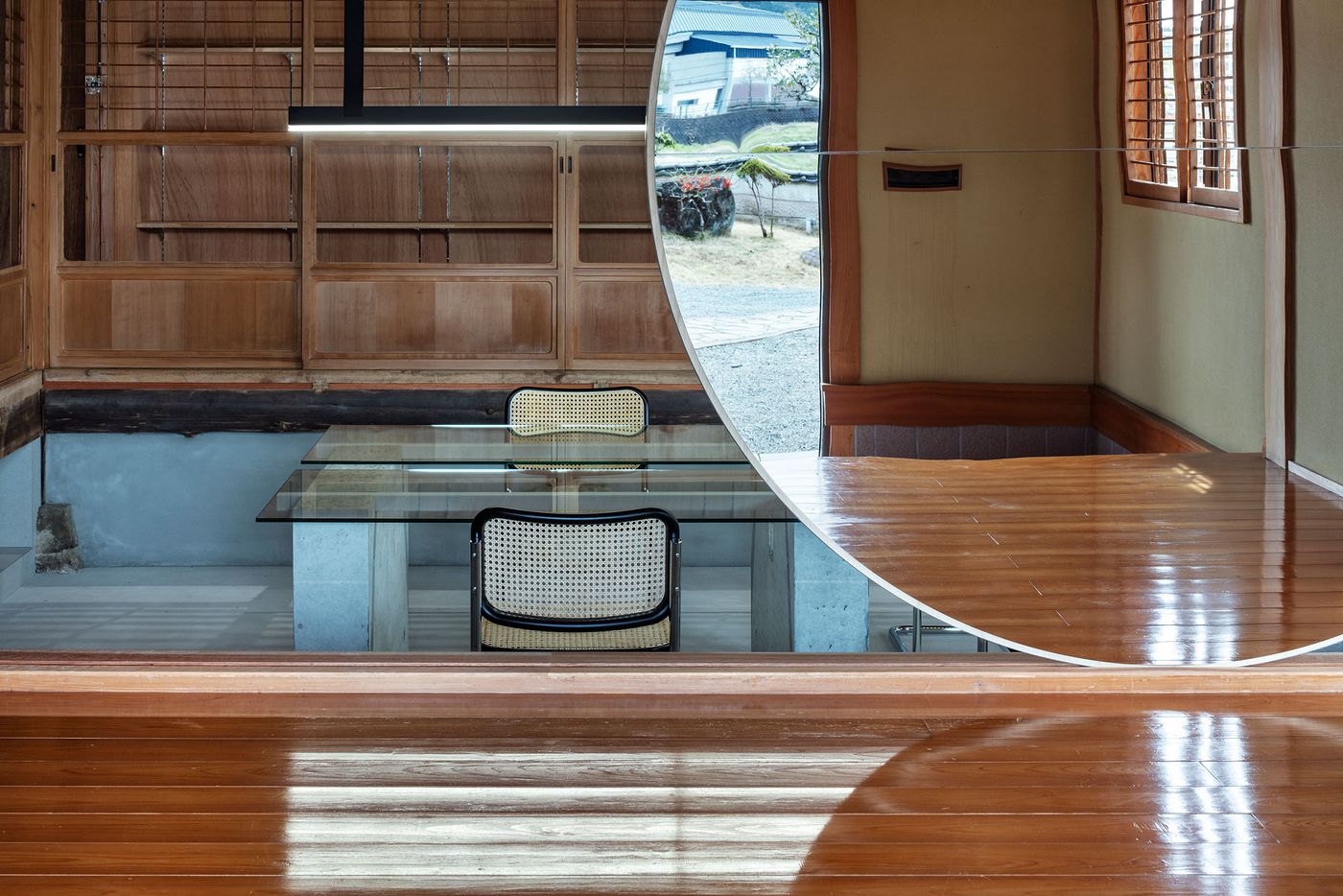
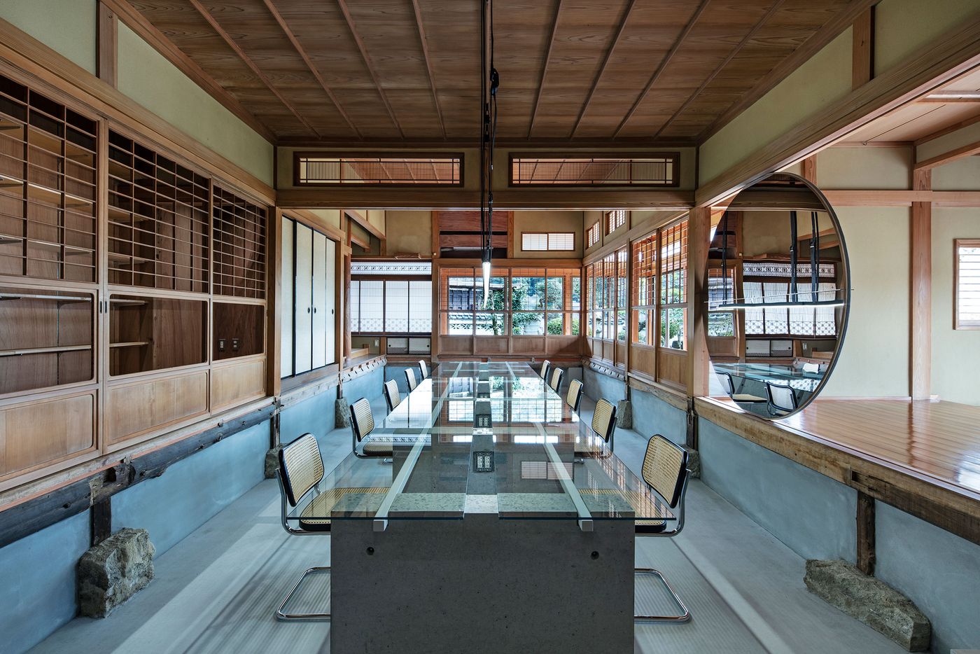
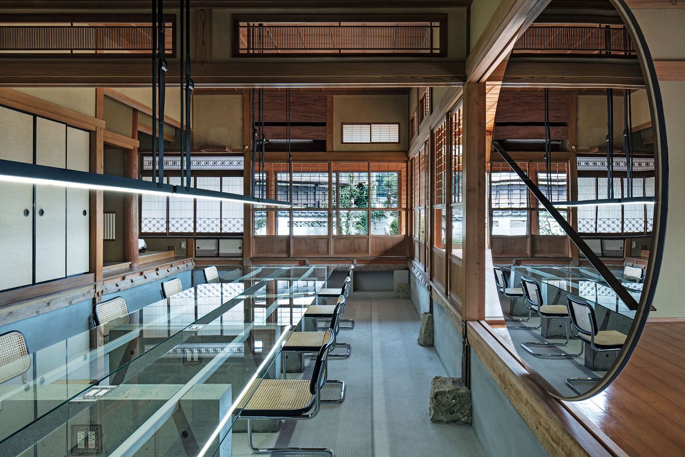
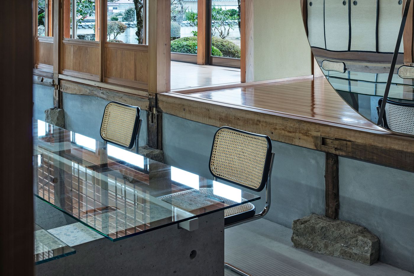
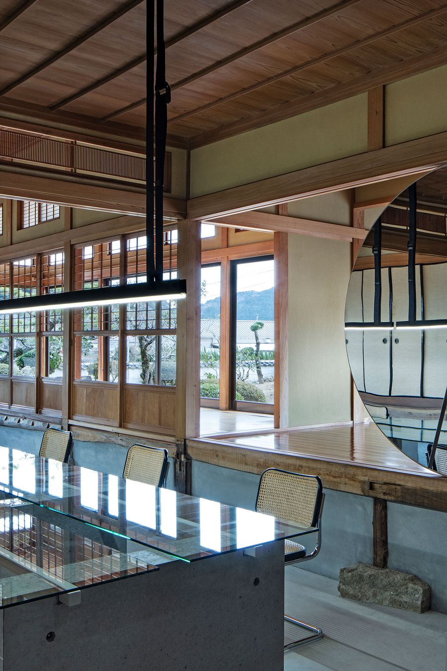
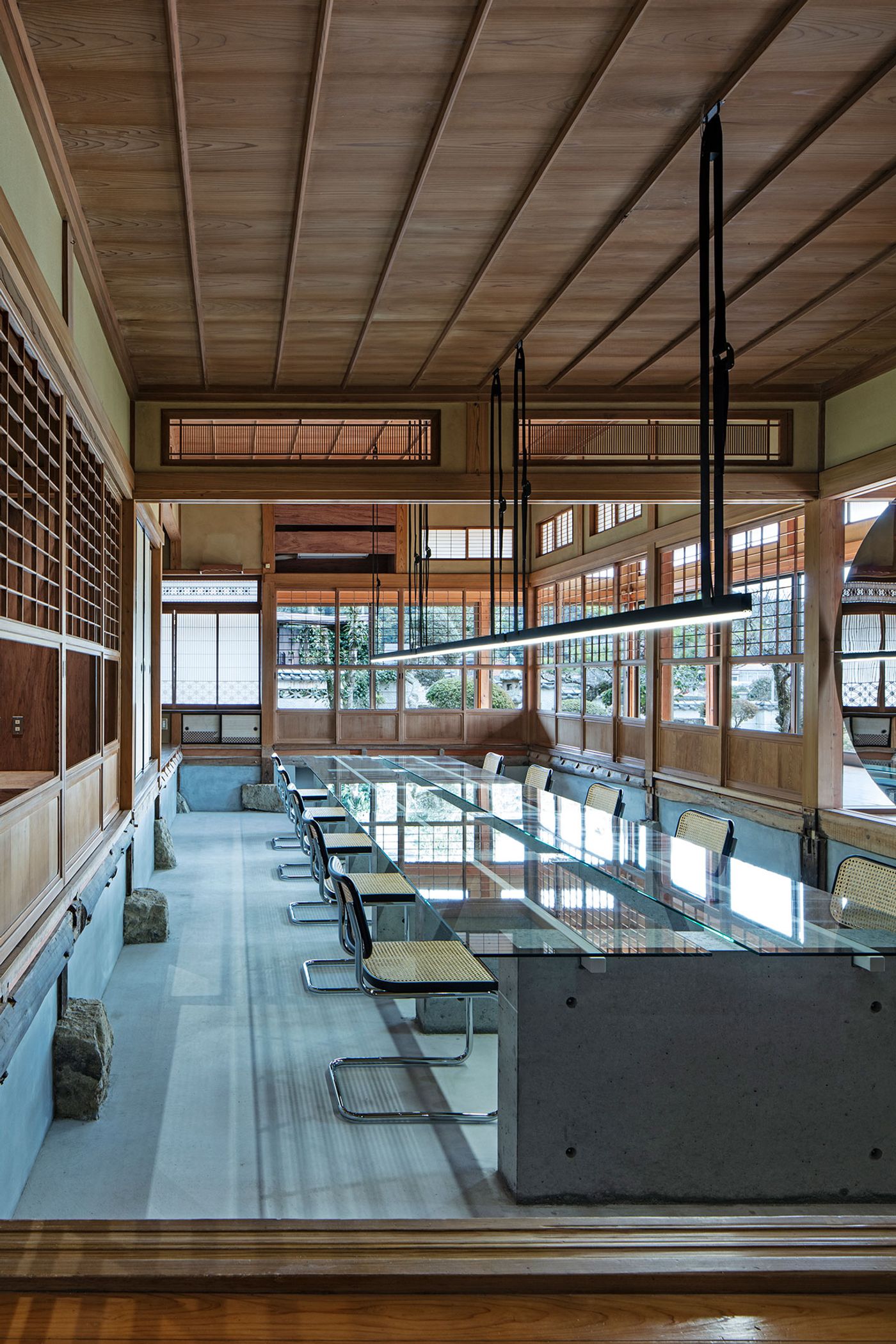
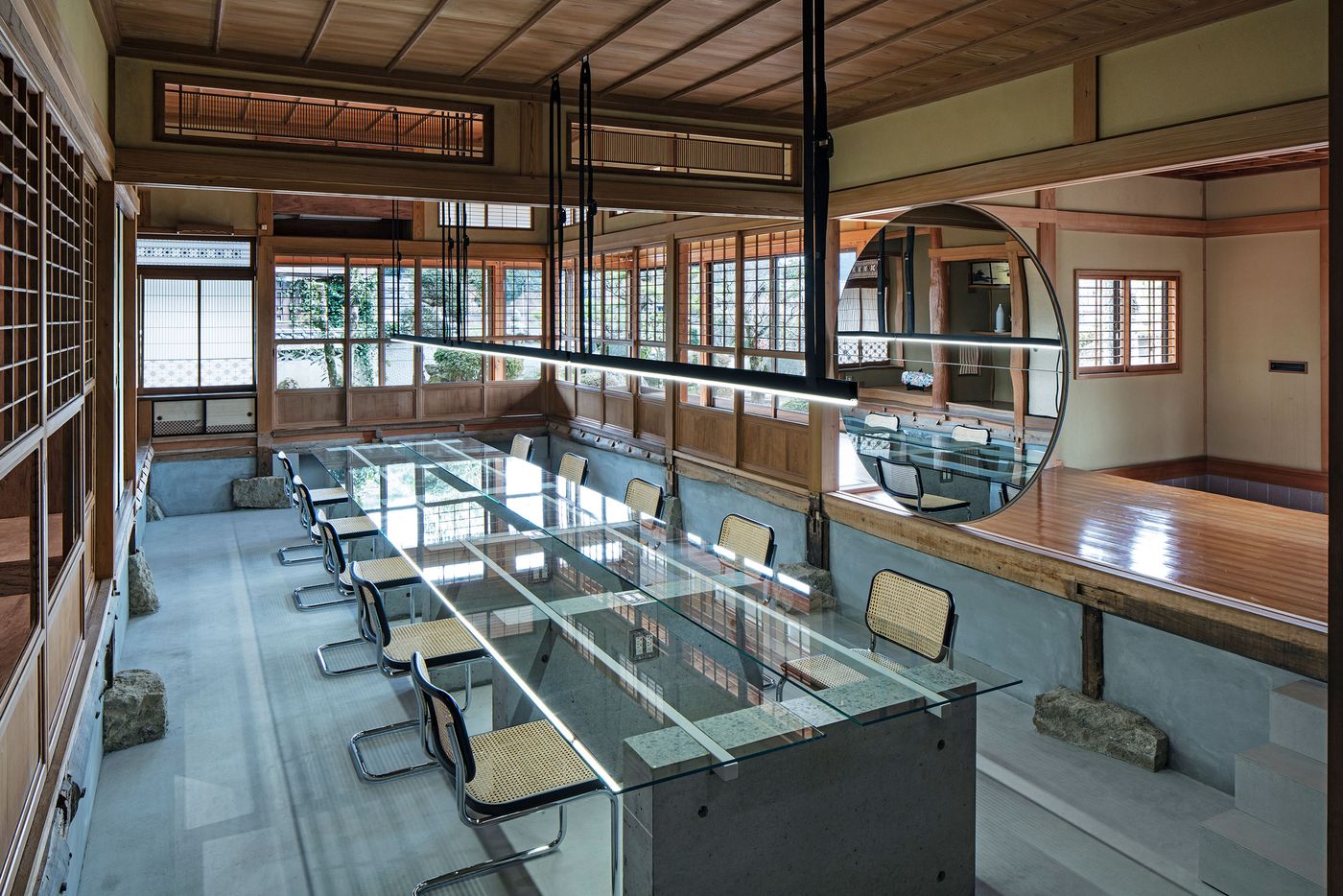
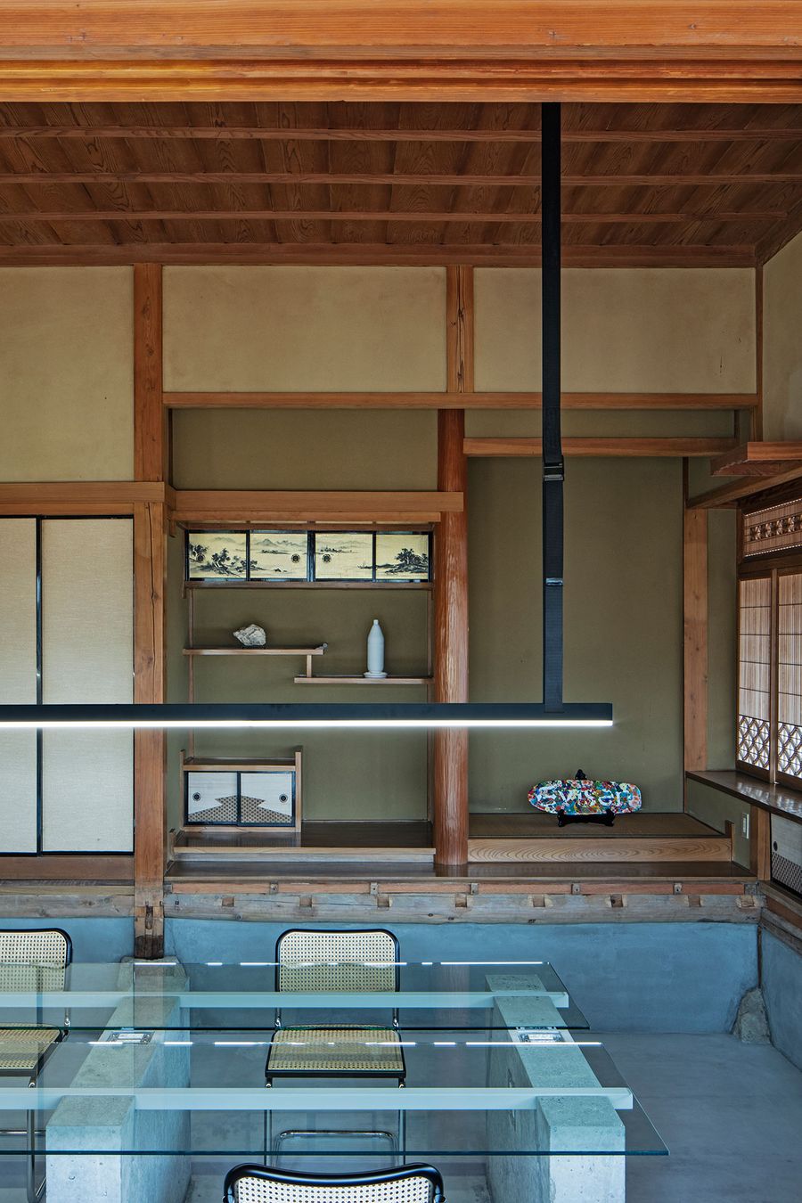
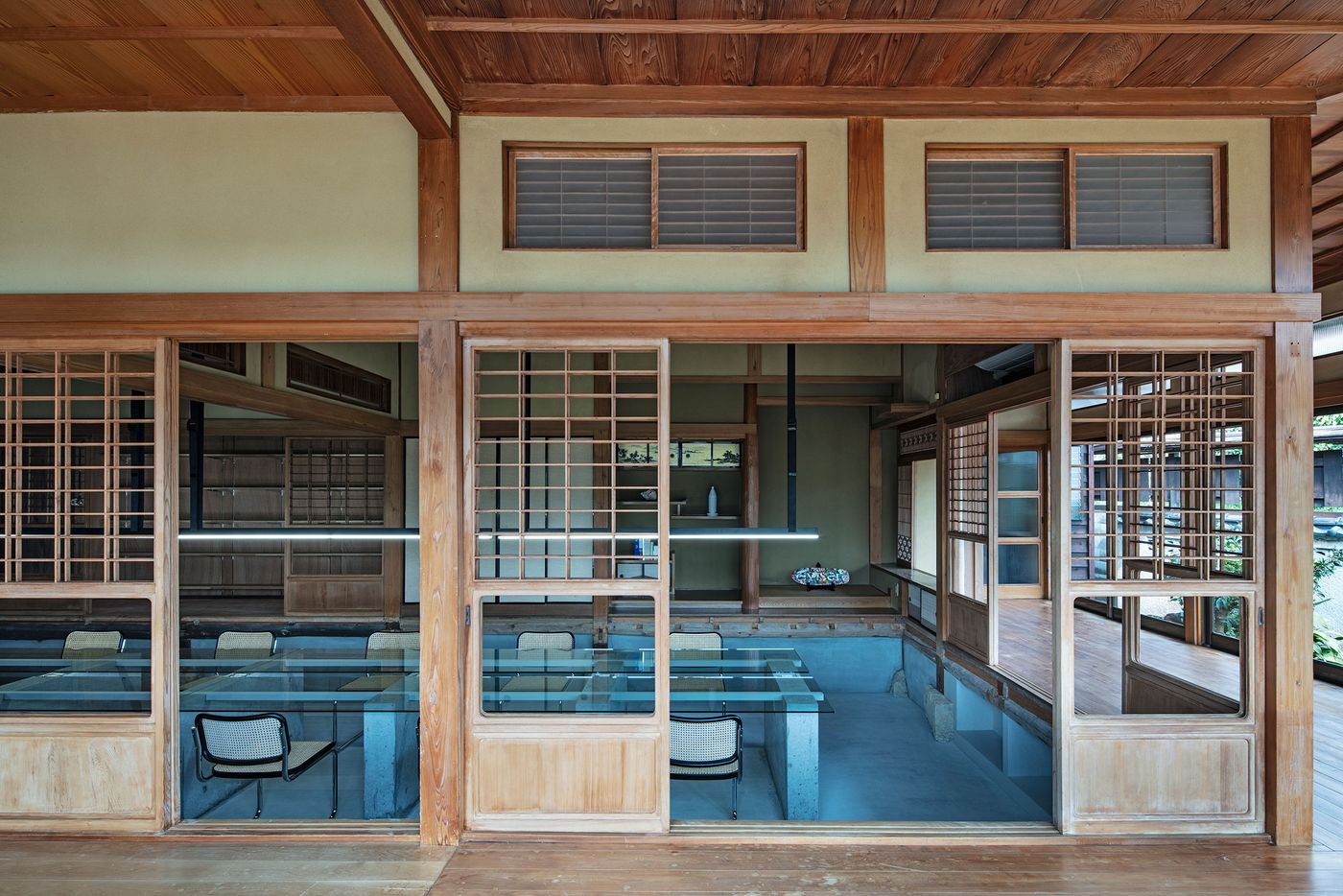
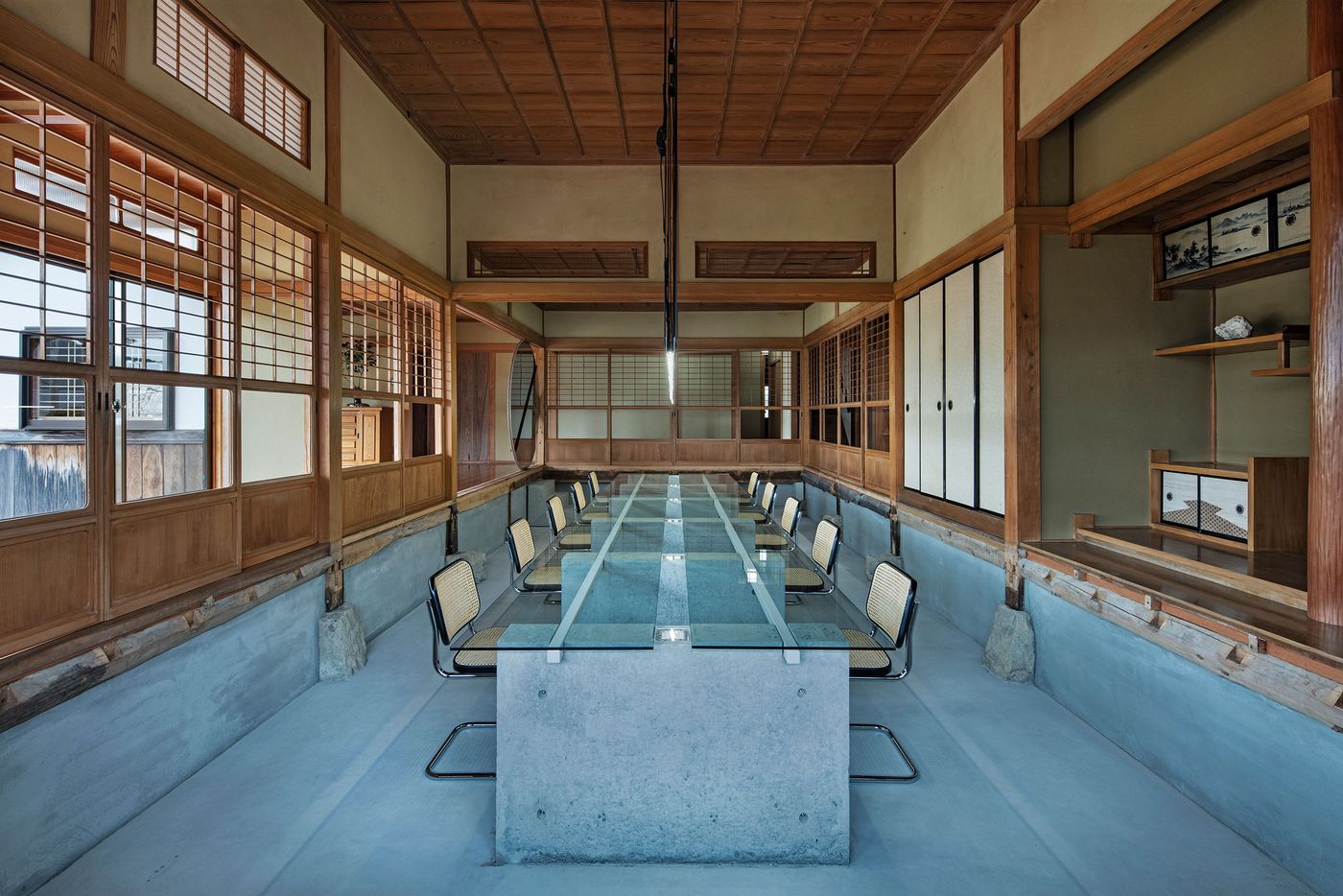
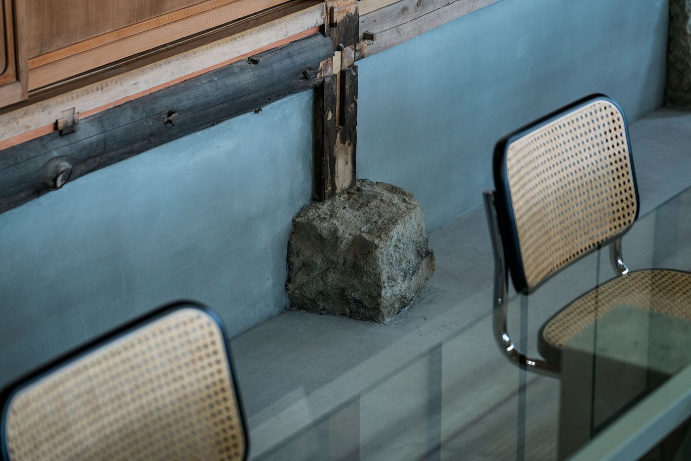
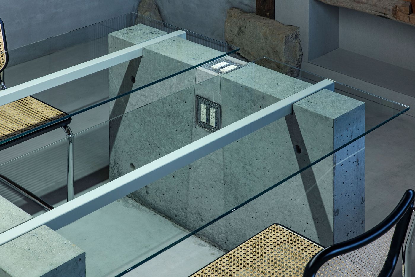
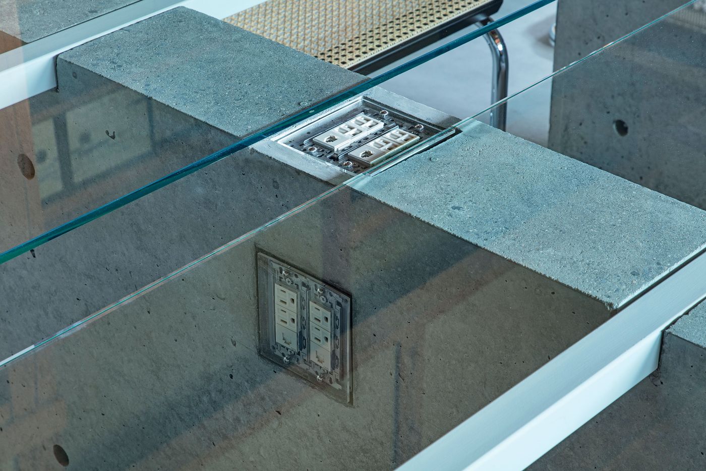
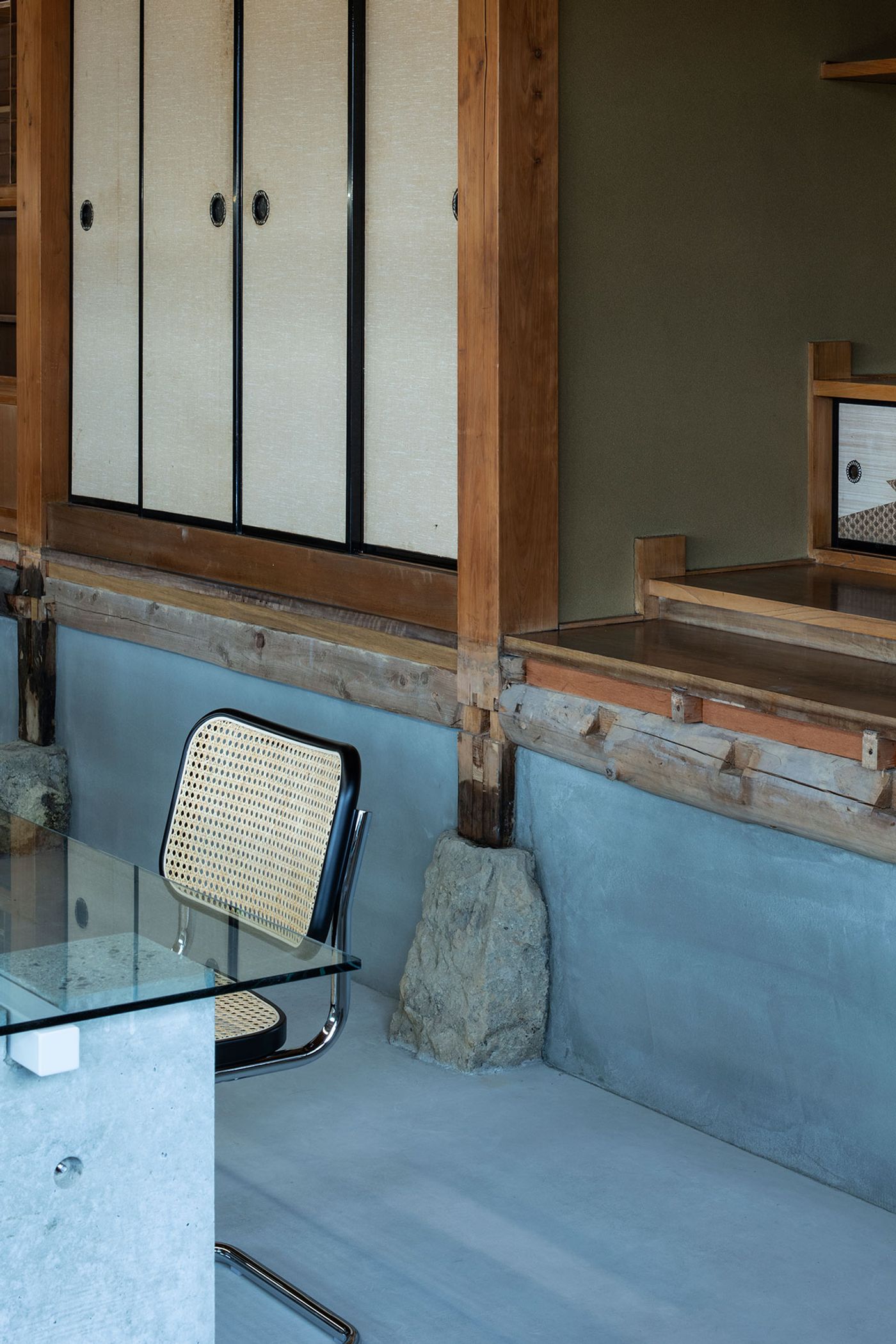
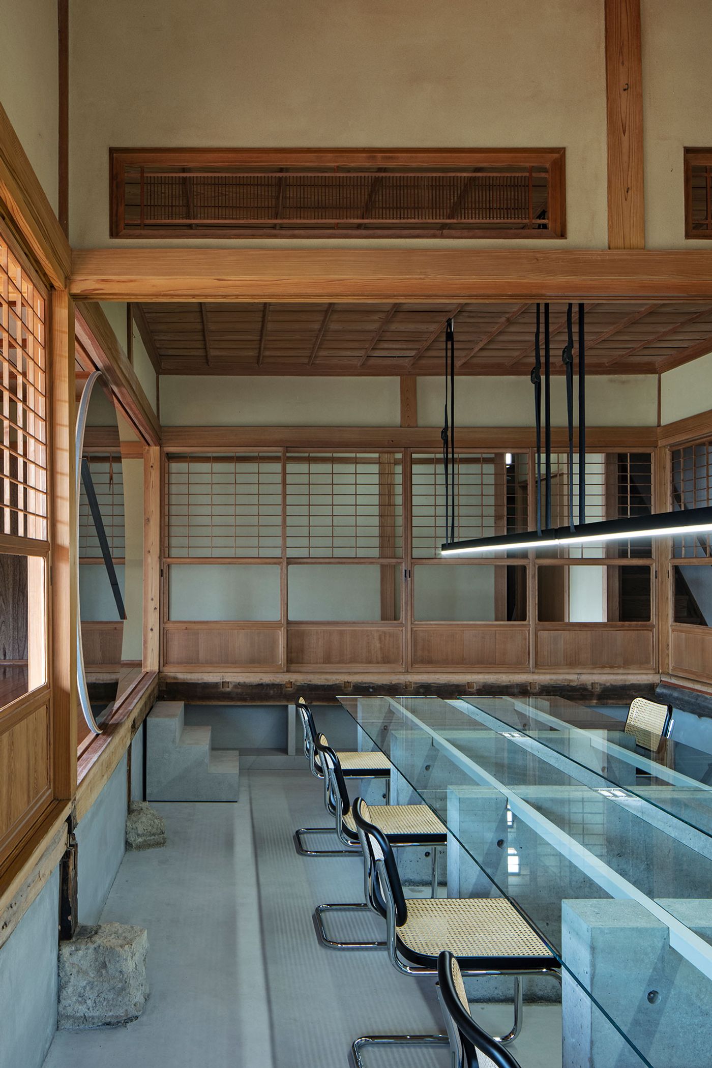
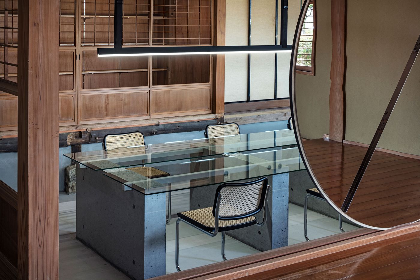
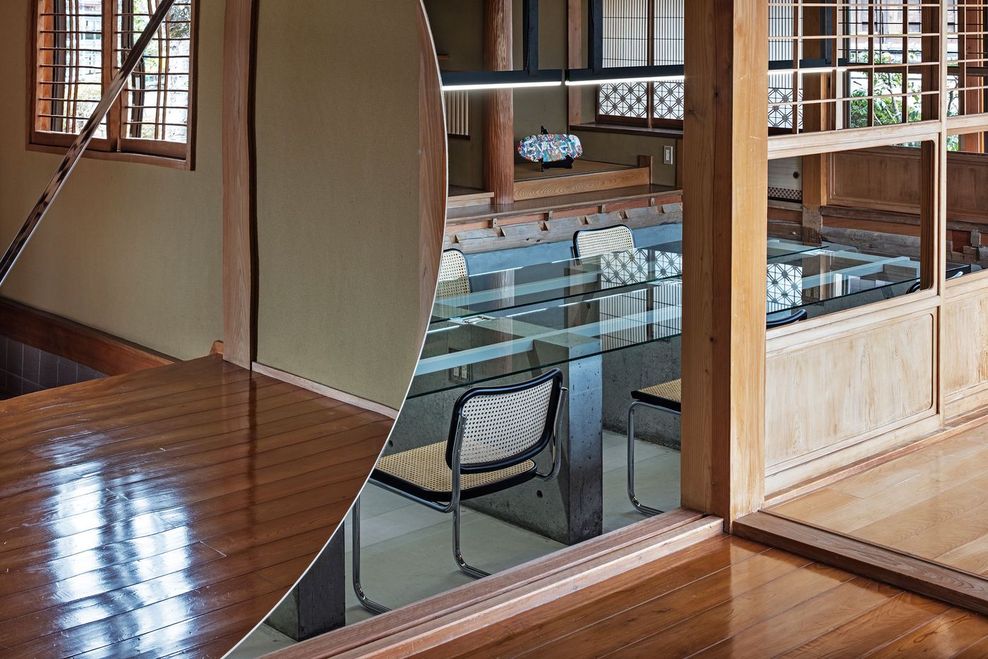
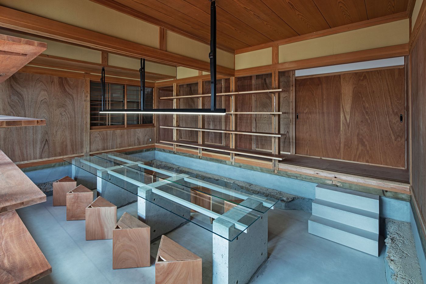
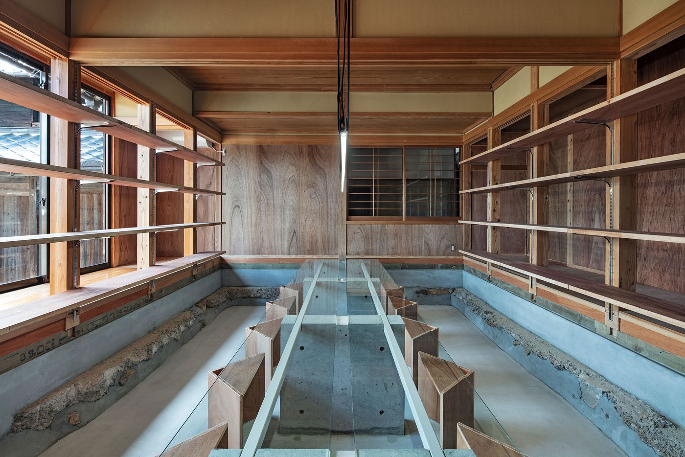
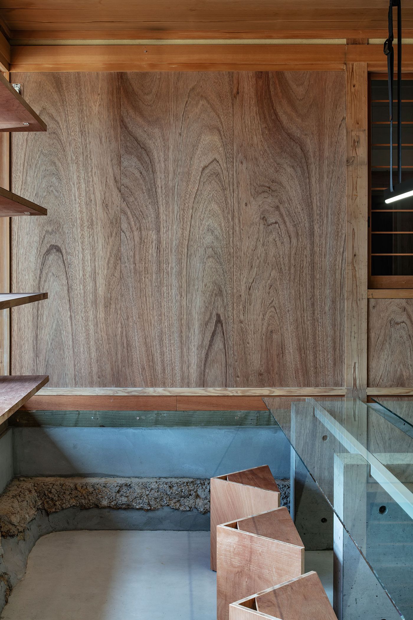
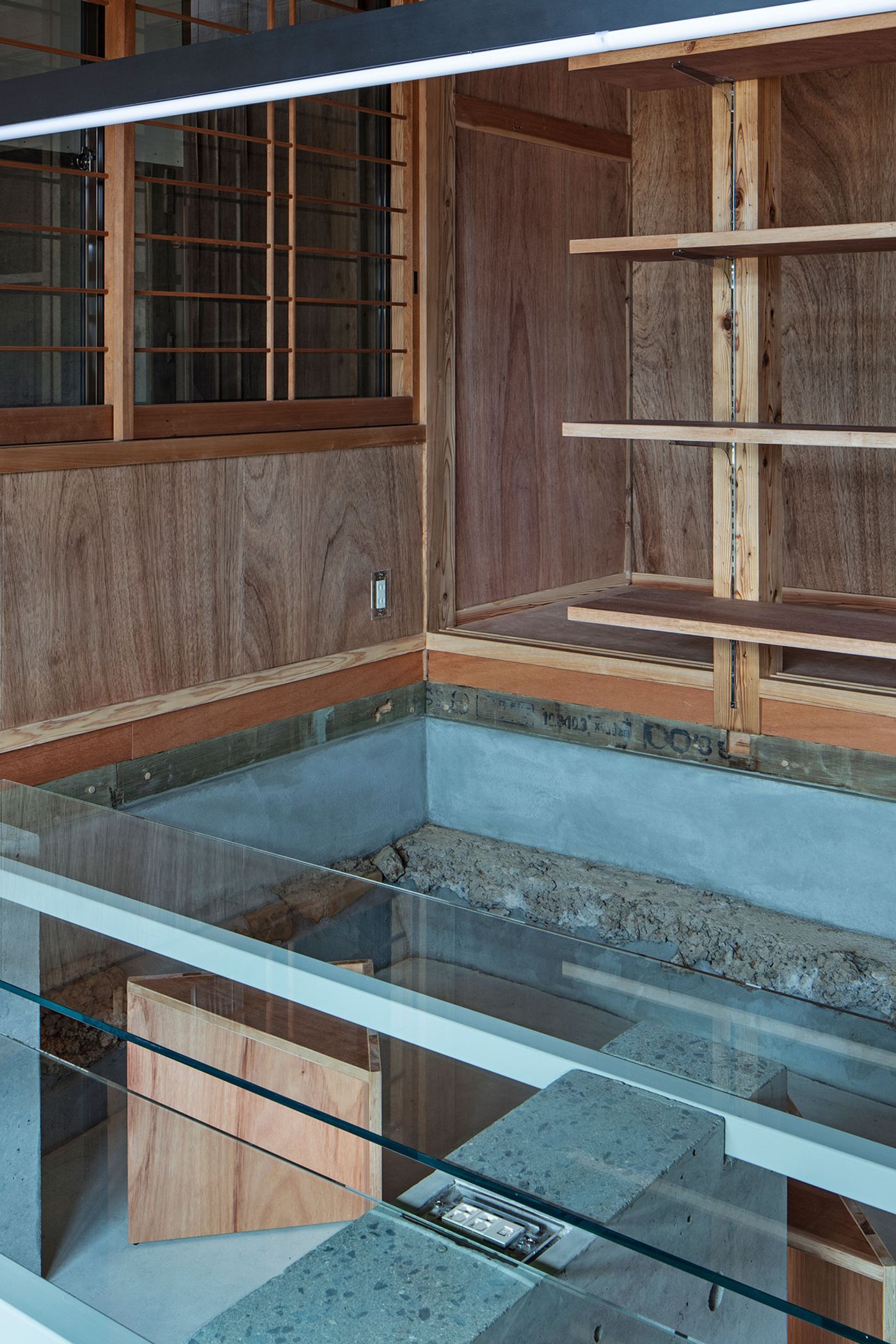
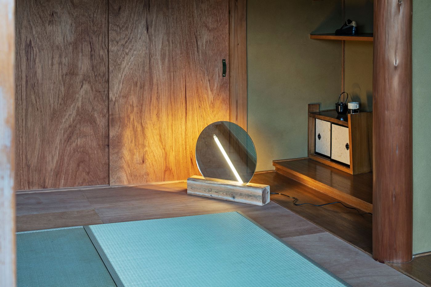
On the ground floor, the team removed the existing ‘tatami’ flooring, a traditional type of mat commonly used in Japanese houses for both living and sleeping areas which however doesn’t fare well in the context of an office area, creating a series of sunken office spaces featuring built-in concrete and glass working counters, meticulously designed to discreetly incorporate electrical and cable outlets. The contemporary design of these furnishings is juxtaposed with the building’s rock foundations which have been exposed by lowering the floor level and which now form part of the new concrete floors. The sunken level also means higher ceilings, while the existing alcoves known as ‘tokonoma’, which are traditionally used for displaying paintings, pottery, flower arrangements and other artworks, have taken on a more functional role as storage spaces.
Photography by Kenta Hasegawa.
Photography by Kenta Hasegawa.
Photography by Kenta Hasegawa.
Photography by Kenta Hasegawa.
Photography by Kenta Hasegawa.
Photography by Kenta Hasegawa.
Photography by Kenta Hasegawa.
Photography by Kenta Hasegawa.
Photography by Kenta Hasegawa.
Photography by Kenta Hasegawa.
Photography by Kenta Hasegawa.
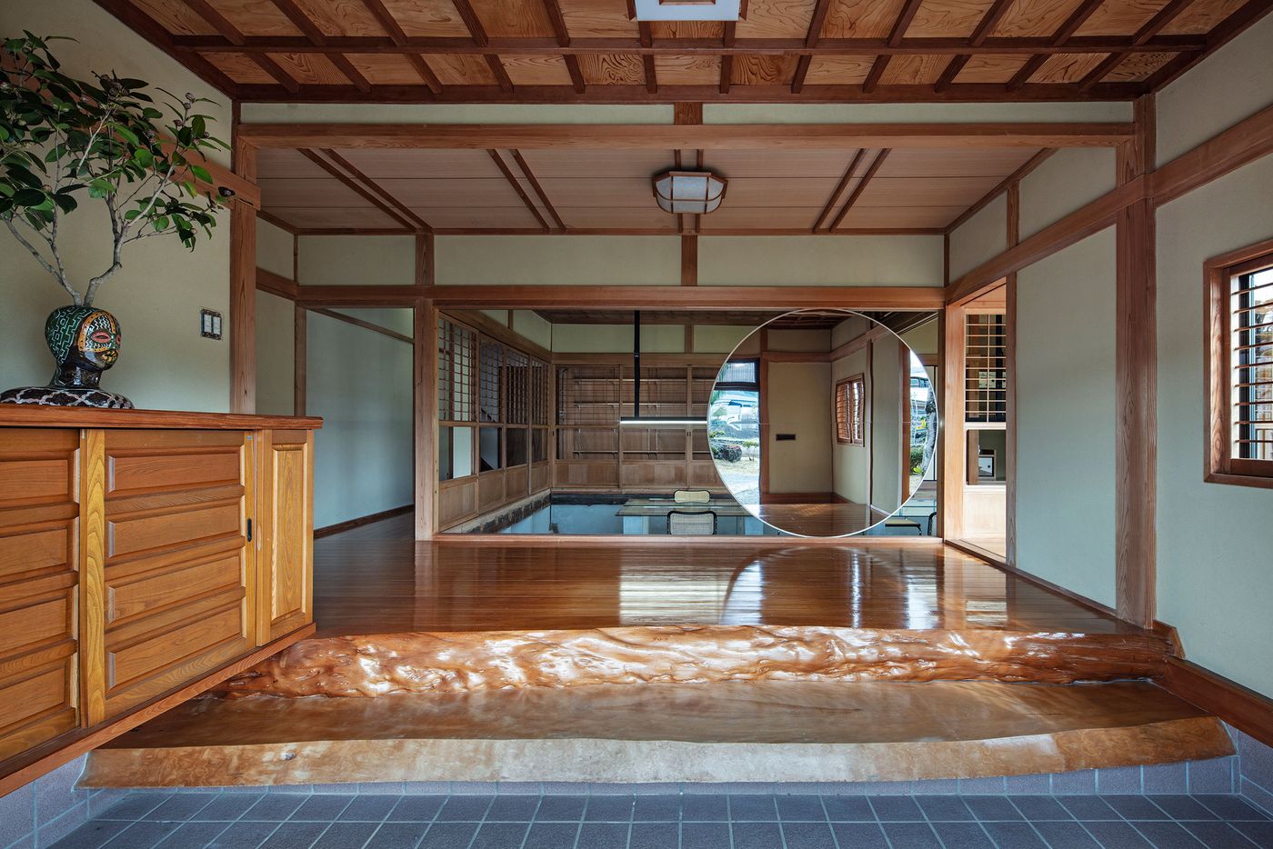
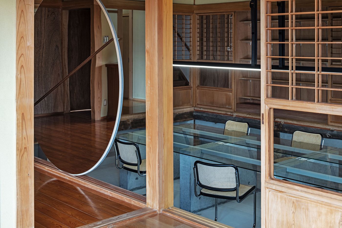
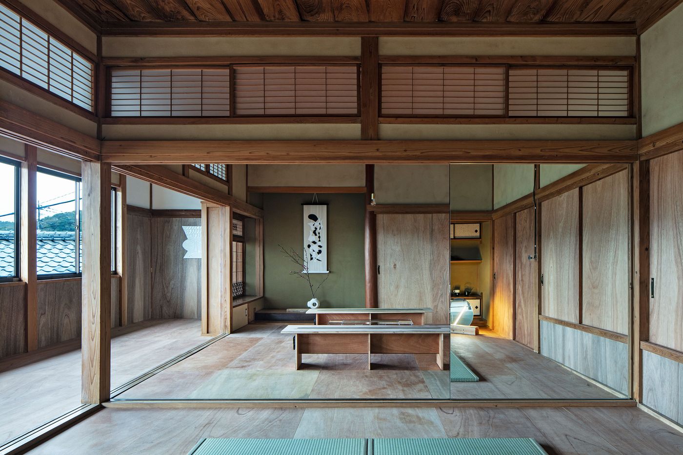
A second major intervention has to do with the ‘shoji’ latticed wooden screens that traditionally function as doors, windows and room dividers in Japanese architecture, typically featuring translucent paper or glass sheets which the team removed in order to allow views over the surrounding gardens and across the interiors. In the entrance space, the original shoji screen separating the adjacent office space has been completely removed and replaced with a round mirror that can be rolled across the length of the room – a bold gesture signalling the brand’s creative sensibility.
Photography by Kenta Hasegawa.
Photography by Kenta Hasegawa.
Photography by Kenta Hasegawa.
Photography by Kenta Hasegawa.
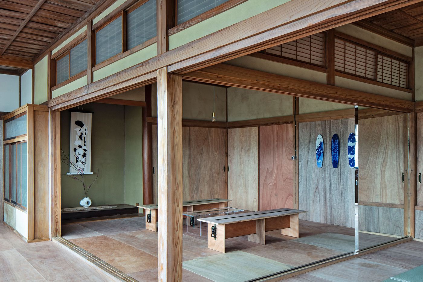
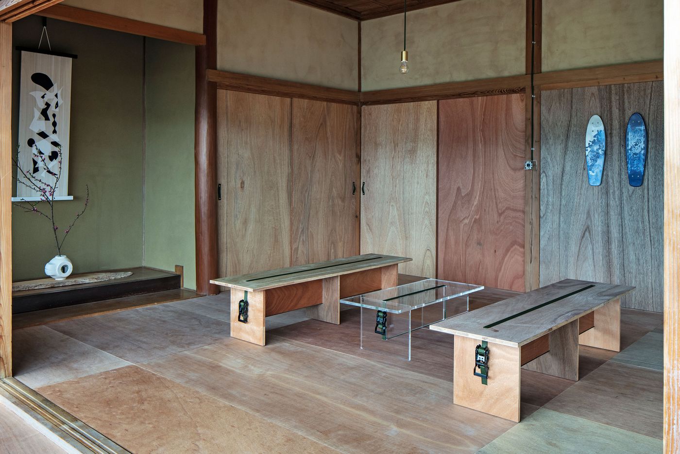
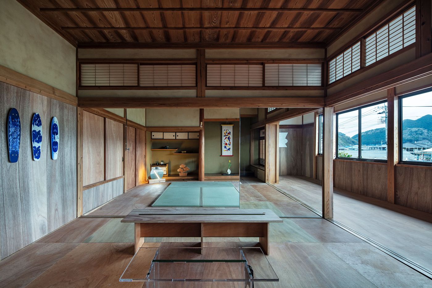
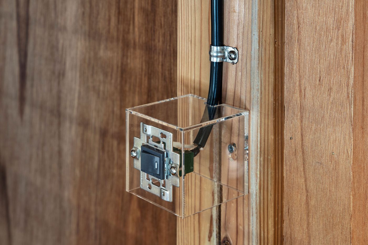
On the second floor, which houses studio spaces for resident artists, the original tatami floors have also been replaced, in this case with Lauan plywood floorboards. The same material has been used for wall cladding, imbuing these spaces with a pared-down aesthetic that hovers between minimalist and rustic. Similarly to the ground floor, the ostensible simplistic interior design belies a range of innovative details such as the light switches which are housed in transparent wall-mounted boxes. In combination with DDAA’s subtle yet brash reimagining of the building’s architectural heritage, such unexpected detailing encapsulates Maruhiro’s practice of blending centuries-old craftsmanship with contemporary design aesthetic and innovative manufacturing techniques.
Photography by Kenta Hasegawa.
Photography by Kenta Hasegawa.
Photography by Kenta Hasegawa.
Photography by Kenta Hasegawa.
