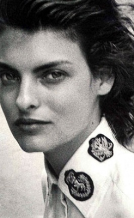
Self-portrait in front of Hervé van der Straeten's mirror in the Library, Hôtel du Marc.
photo © Costas Voyatzis
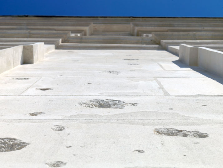
The Hôtel front, damaged by pieces of shrapnels holes and restaured. Hôtel du Marc.
photo by Alain Hatat, Image Courtesy of Veuve Clicquot
It is always a pleasure to discover the hidden talents of a person whose life is signified by so many marketing deals! In your case you are not only the International Marketing Manager of Veuve Clicquot, but you are also the woman behind Bruno Moinard's interior design for the Hôtel du Marc. Tell us about your involvement on this project.
I have been supervising the renovation and interior decoration of the HDM which entails coordinating the team that included the Architects as well as Veuve Clicquot's in-house team which is in charge of all works on our premises. I had a very precise vision and strategic goal with this renovation, and I did my best to make sure that these were shared and reflected in our collective work.

View of the Hôtel Particulier du Marc (Marc Townhouse) with its renovated façade, seen from the garden. Photo by Alain Hatat, Image Courtesy of Veuve Clicquot
photo © Costas Voyatzis for Yatzer.com

photo © Costas Voyatzis for Yatzer.com
photo © Costas Voyatzis for Yatzer.com
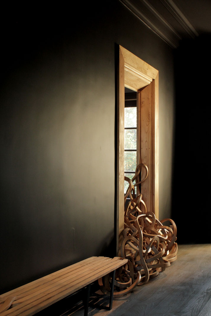
''Cadre de Vie'', Pablo Reinoso bench, Hôtel du Marc.
photo © Costas Voyatzis for Yatzer.com
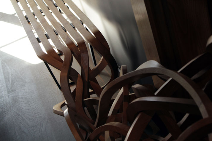
''Cadre de Vie'', Pablo Reinoso bench, Hôtel du Marc.
photo © Costas Voyatzis for Yatzer.com
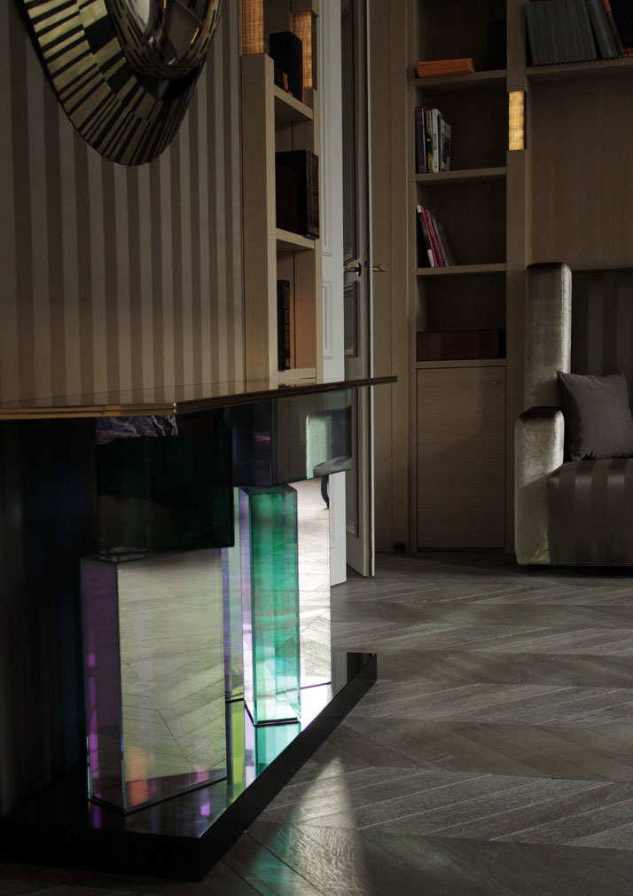
Mirror and console by Hervé van der Straeten
photo © Costas Voyatzis for Yatzer.com
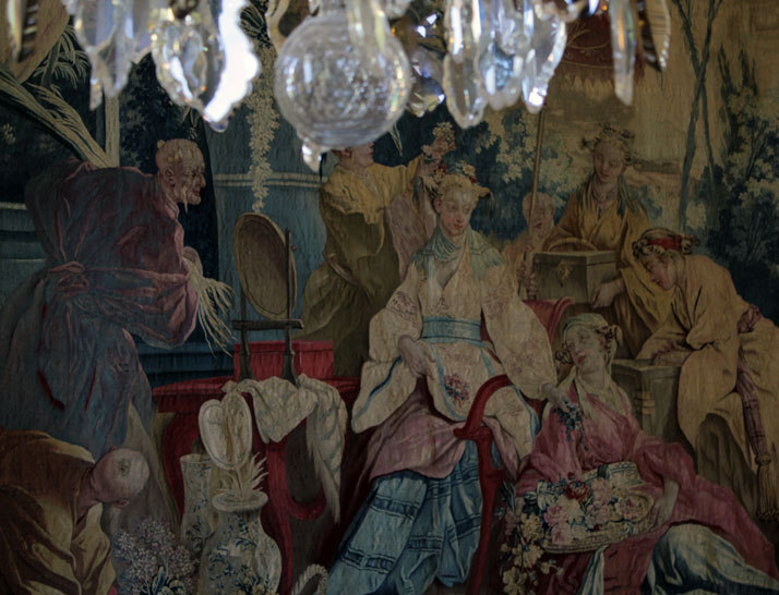
photo © Costas Voyatzis for Yatzer.com

Ponsardin bathroom: Zen, Japanese style
photo © Costas Voyatzis for Yatzer.com
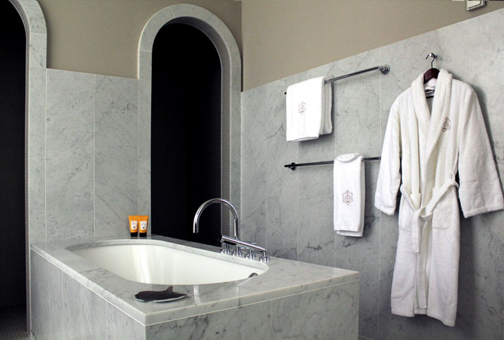
Ponsardin bathroom: Zen, Japanese style
photo © Costas Voyatzis for Yatzer.com
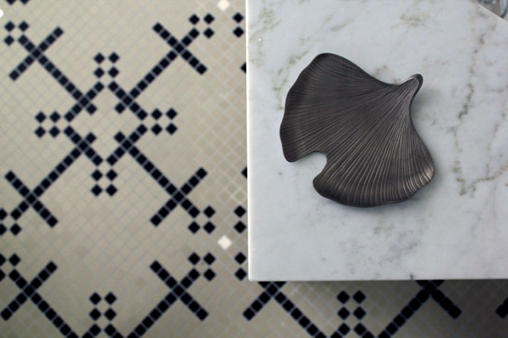
Ponsardin bathroom (detail): Zen, Japanese style
photo © Costas Voyatzis for Yatzer.com
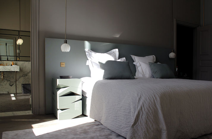
Chevigné bedroom, Hôtel du Marc.
photo © Costas Voyatzis for Yatzer.com

Chevigné bedroom (view on the cathedral): Paneling’s and pastoral trumeau’s, Hôtel du Marc.
photo © Costas Voyatzis for Yatzer.com

Chevigné bathroom (detail), Hôtel du Marc.
photo © Costas Voyatzis for Yatzer.com
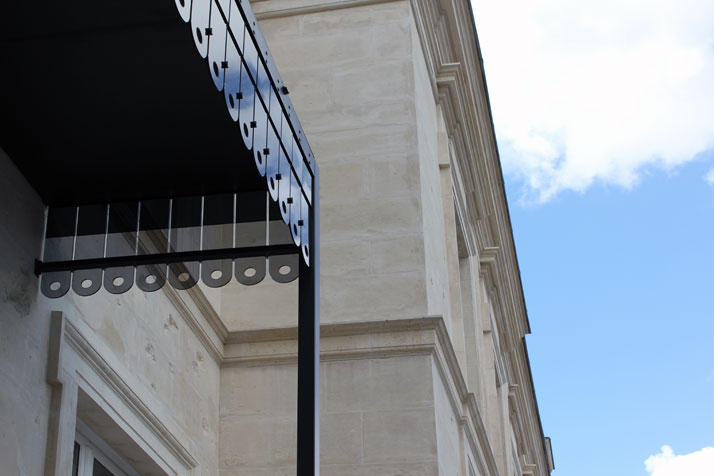
Glass canopy, entrance marquee, Hôtel du Marc, courtyard side
photo © Costas Voyatzis for Yatzer.com
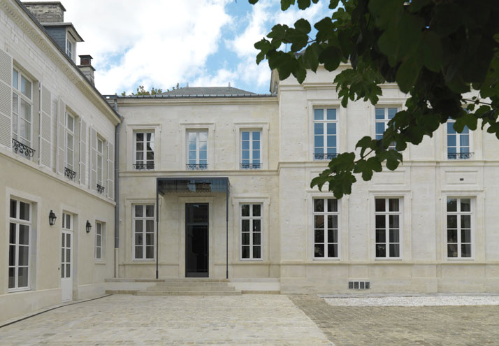
Outdoors, courtyard side, Hôtel du Marc, Grenier à sel
photo by Thomas Duval, Image Courtesy of Veuve Clicquot
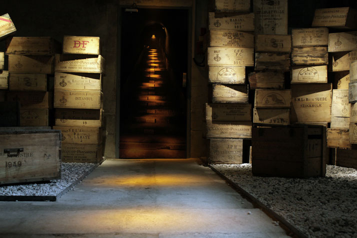
Cellars under Hôtel du Marc
photo © Costas Voyatzis for Yatzer.com
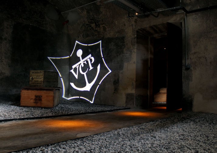
Cellars under Hôtel du Marc
photo © Costas Voyatzis for Yatzer.com
When did the renovation of the Hôtel du Marc start and how long did it take to be complete?
The renovation started almost 4 years ago and followed several steps. The first one was a purely architectural step as it was deemed as extremely urgent to make sure that the building was compliant with the needs of a public space. Then we redesigned some of the floor plans in order to create a site much more in line with the contemporary way of living...making sure that the kitchens were not too far away from the dining-rooms and that the service was made easier for our butlers in terms of circulation. We also integrated more comfort into the rooms and bathrooms...after all we live in the 21st century unlike our ancestors back in 1840...Finally; the third portion of the renovation has been the interior decoration.
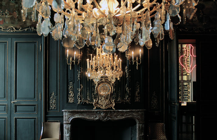
Dining room, black panelling, cristal chandelier, service à la française, set table. Hôtel du Marc
photo © Costas Voyatzis for Yatzer.com
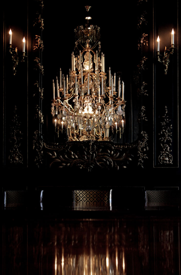
Dining room, black panelling, cristal chandelier, service à la française, set table. Hôtel du Marc
photo © Costas Voyatzis for Yatzer.com
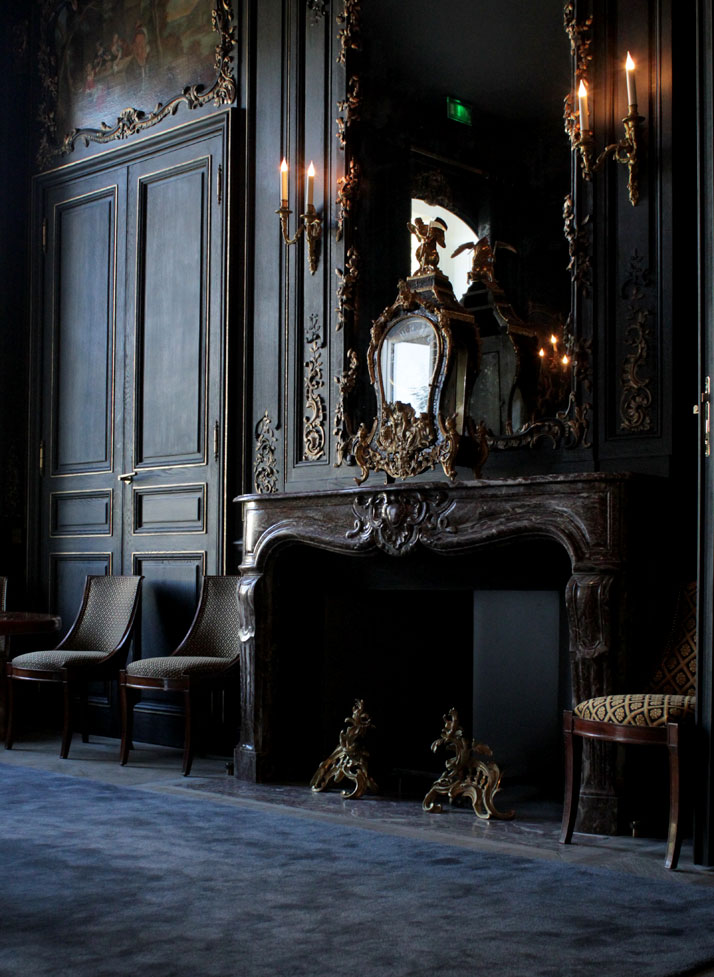
photo © Costas Voyatzis for Yatzer.com
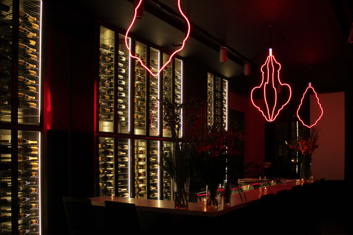
Chandeliers by Jugnet+Clairet in red neon lights in the Atelier.
photo © Costas Voyatzis for Yatzer.com
What was the main reason behind selecting Bruno Moinard for the interior design of the HDM? How does it feel to work beside the principal designer of all the CARTIER shops in the world who is also a former business partner of Andrée Putman?
Bruno Moinard is today one of the most elegant, sophisticated and yet contemporary architects and designers. His work for Cartier, Hermès and several hotels and private houses around the world are great achievements. Bruno is a true gentleman. His personal style and his exquisite manners make the collaboration really easy and appreciable. He has a very clear sense of taste and has an amazing ability in communicating his ideas also thanks to an incredible talent in drawing all his thoughts on paper with his dozens of colourful pencils that he always carries around with him in his old style school-bag...
You didn't choose a traditional, but an avant-garde way to exhibit the famous portraits of the VCP family which stand like guards in front of the doors of each room. What was the source of the inspiration for the 3D Portraits gallery?
One of LVMH’s most successful business models is the art of luxury branding, to make sure that there is always a positive tension between tradition and modernity. In this case, we wanted to integrate the portraits of the people that have had the most impacted on our Maison through the Hotel du Marc’s very spectacular and modern ambiance. We decided to oversize the formats and to casually place the giant frames directly on the floor with very dramatic lighting. The final effect is indeed spectacular and we hope that our visitors will keep this vision in mind as one of the stronger experiences from their visit, and this is what we were aiming for.
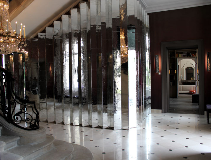
Entrance Hall, banister and ''mirror pleated skirt'' inspired by Issey Miyake's Pleats Please, Bruno Moinard designer.
photo © Costas Voyatzis for Yatzer.com
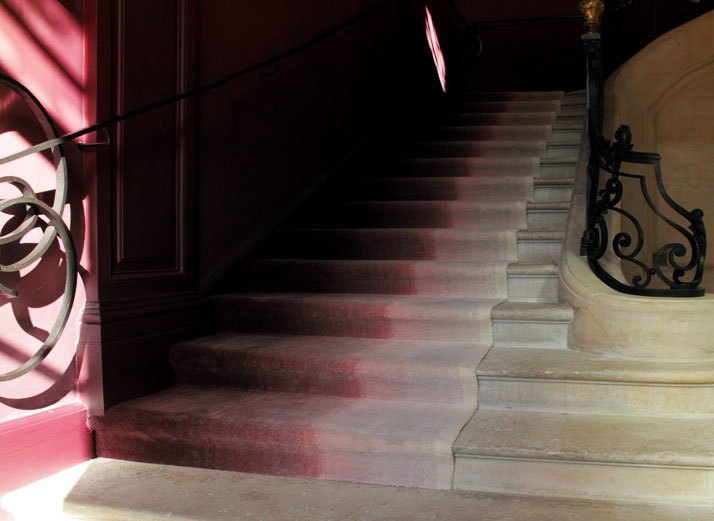
photo © Costas Voyatzis for Yatzer.com
Each room is named after a person, a season and a country. Tell us something about their interiors and their artworks.
We wanted to honour the Champagne Region and to show our respect for Mother Nature which regulated the life of the vineyards and in turn, our products. Also, we wanted to dedicate some rooms to our very great markets, those that ensure our development and our success, and of course also our Maison’s personalities. The first room is dedicated to the ''in between'' seasons of winter and spring. Nature is still very quiet, the colours are very soft, pastel based and misty. Springtime is not far...not there yet! The room is painted in a soft blue and gold colour scheme, and it's dedicated to Asia. The second room is dedicated to Italy and to Autumn. The colours that we used are warm, brick, red, brown like the vine leaves...a collection of Fornasetti plates and pillows honour Italy. The third is the metaphor of the cold Champagne winter. The colours are white and ice, blue like the bright sky, and the textiles are very soft and comfy...needless to say that we are portraying Russia...which a collection of Maison Martin Margiela's white matrioshkas are here to testify... The fourth room is dedicated to Japan and to springtime. Pale and soft greens, this is a tribute to Japan, where we feature a fabulous old kimono from Kyoto which mirrors a very contemporary piece by Chiho Aoshima. Finally...summertime....the last room is an explosion of gold and bright yellow and it's dedicated to the USA.
What is the concept behind the carpet which captivates the guests on the main staircase?
The carpet symbolizes the colours of the Champagne region’s soil, it is a white shade that represents the chalky mineral soil, and then develops into a fabulous deep burgundy red which is the same colour as the Pinot Noir grapes, the signature ofClicquot's Yellow label Brut Champagne.
If you had to mention three artworks that shouldn't be ignored by a guest, which would they be?
The Chandelier by Jugnet+Clairet in red neon lights in the Atelier.
The Bench by Pablo Reinoso
The ''Once upon A Dream'' bed by Mathieu Lehanneur
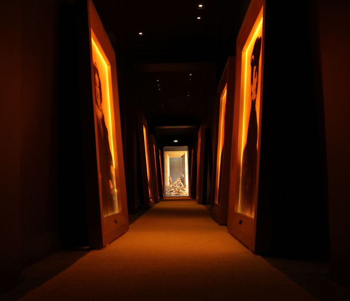
Portrait paintings gallery unlighted, Hôtel du Marc.
photo © Costas Voyatzis for Yatzer.com

Portrait paintings gallery unlighted, Madame Clicquot portrait. Hôtel du Marc.
photo by Thomas Duval, Image Courtesy of Veuve Clicquot
What is the oldest piece of art or furniture inside the Hôtel du Marc?
The actual desk used by Madame Clicquot that is in the Summer room
If Madame Clicquot and her loyal business partner Edouard Werlé were alive today, do you think that they would they be happy about the renovation?
They were both audacious characters, innovative, creative and visionaries....I suppose that these qualities would allow them to be open-minded enough to cheer the result of this renovation.
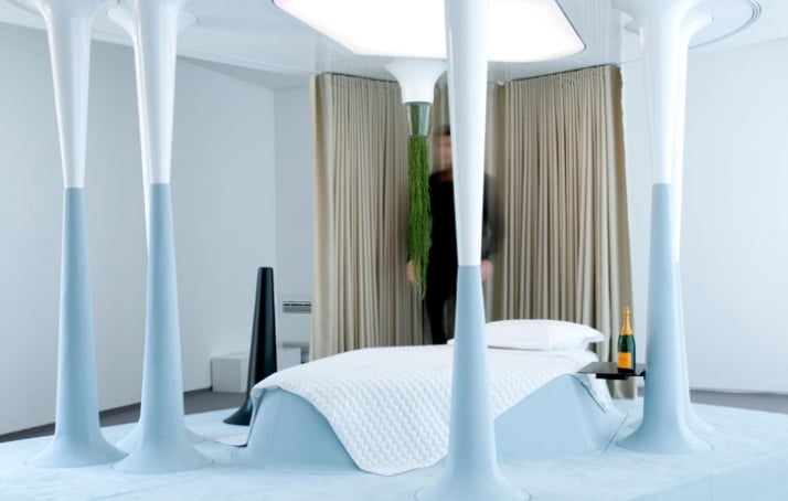
The ''Once upon A Dream'' bed by Mathieu Lehanneur. Image Courtesy of Veuve Clicquot


