Project Name
The Carrer Avinyó ApartmentPosted in
Design, Interior DesignArchitecture Practice
David Kohn Architects| Detailed Information | |||||
|---|---|---|---|---|---|
| Project Name | The Carrer Avinyó Apartment | Posted in | Design, Interior Design | Architecture Practice | David Kohn Architects |
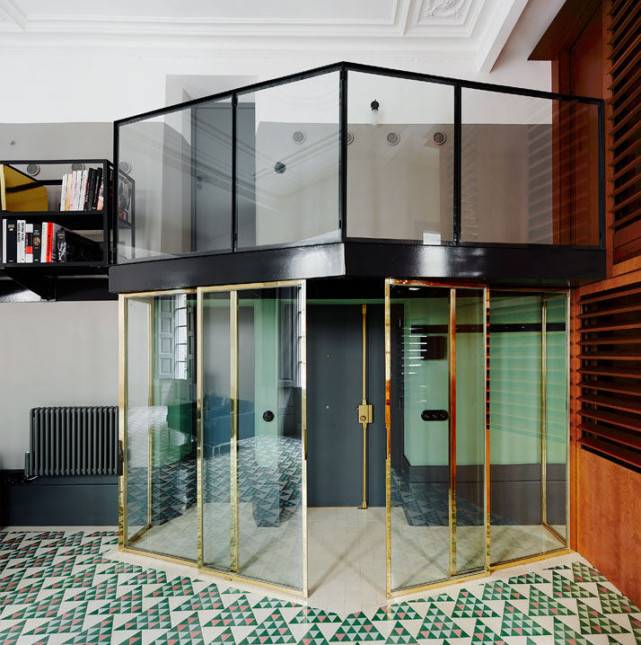
photo © Jose Hevia Blach.
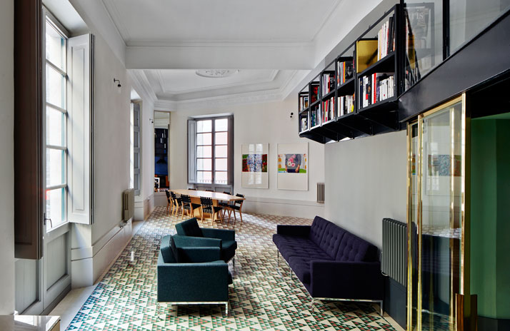
photo © Jose Hevia Blach.
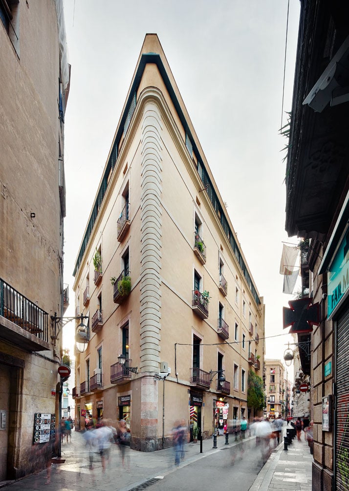
photo © Jose Hevia Blach.
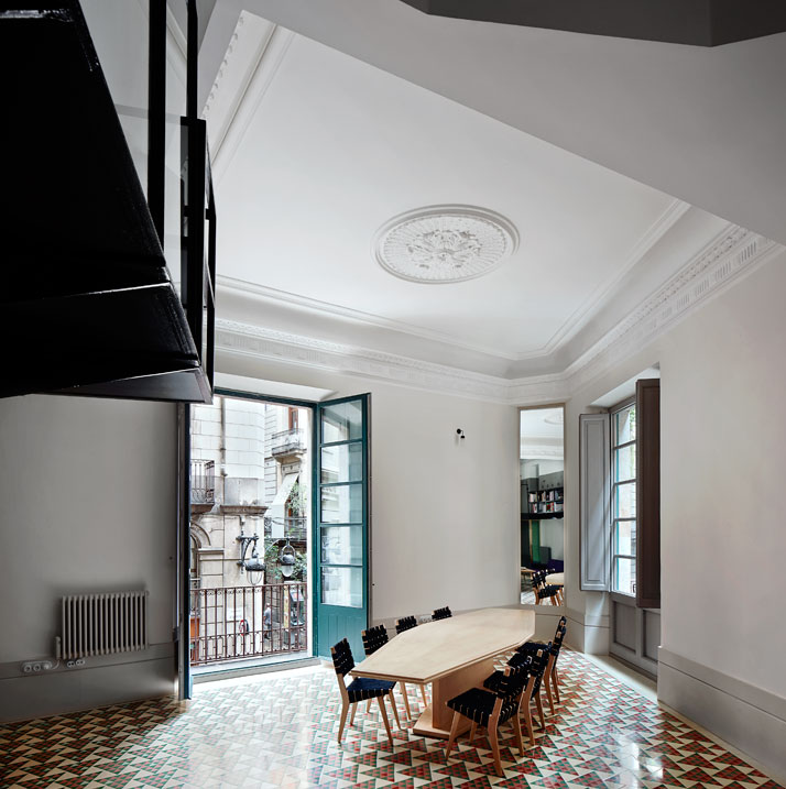
photo © Jose Hevia Blach.

photo © David Kohn Architects.
Barcelona’s Barri Gòtic (gothic quarter) in the Ciutat Vella (the old quarter of town), where the likes of singer/musician Manu Chao lives, is a grimy but extremely atmospheric neighbourhood. And on its Carrer Avinyó, behind a non-descript door set inside a time-worn and graffiti adorned grey stone building, is where you’ll find David Kohn Architects (DKA)’ award winning open plan apartment.
The refurbishment was commissioned by two brothers who grew up in Barcelona but who now live a faster paced life abroad in London and Hong Kong who sought a second home close to their roots. And the apartment had to be designed with the right equilibrium between sharing and intimacy in mind.
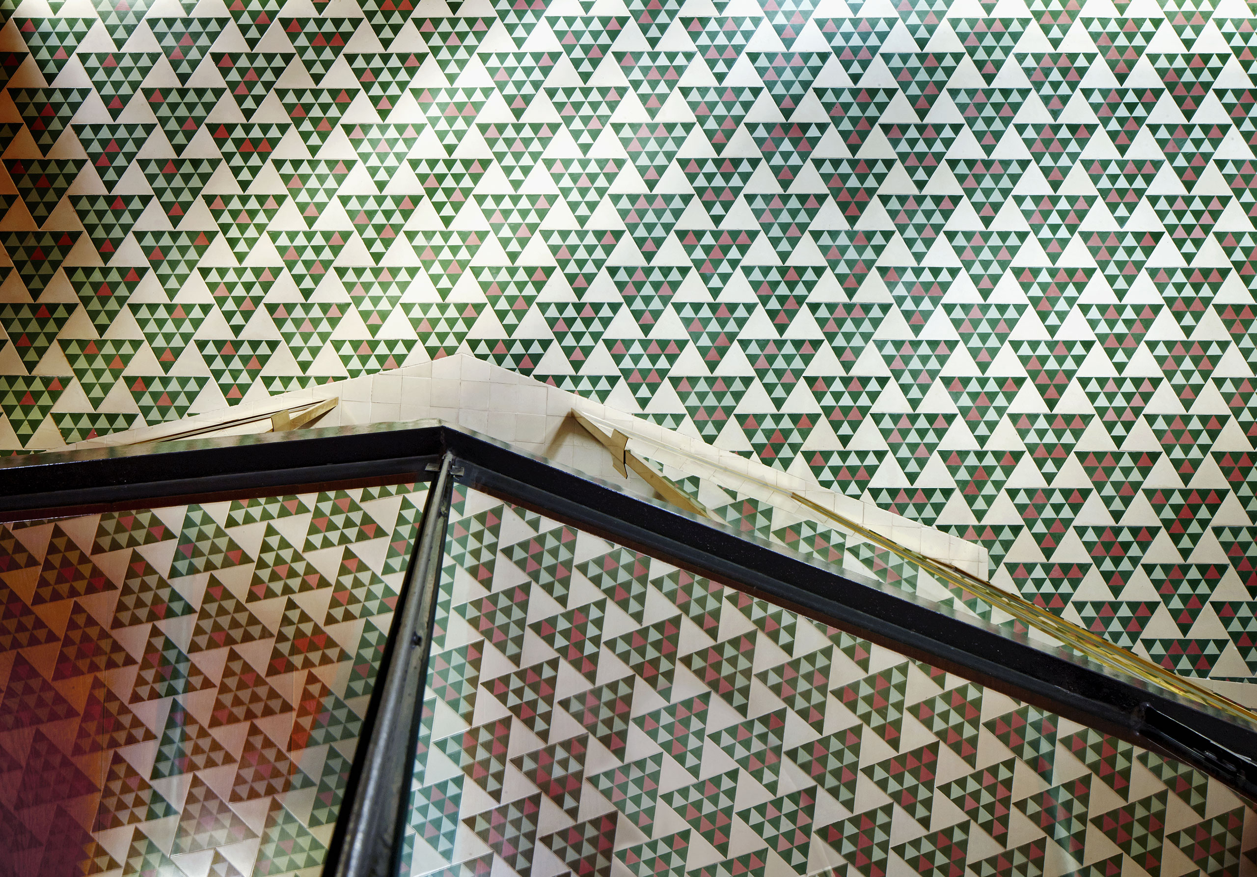
photo © Jose Hevia Blach.
Located a couple of steps away from Plaça George ‘del Tripi’ Orwell, which, before the authorities clamped down on ‘outdoor fun’, was the place to meet for a relaxed evening of beers, the apartment is situated right in the beating heart of Barcelona. And the tiling, a central feature to the space, was inspired by this exact square – or rather triangle (the tiles also match the shape of the unusual floor plan).
The apartment features an open-plan living room, a bathroom and three bedrooms, with the third room an adjoining box room often long and narrow, apartments in the neighbourhood aren’t the easiest to remodel as the spaces within them are usually divided up into an awkward boxy, rooms. While open plan spaces are becoming more fashionable, David Kohn Architects’ Carrer Avinyó apartment is still avant-garde for the area.
DKA have successfully maximised the tricky floor plan as well as the incredibly high ceilings to create several living spaces divided up into two dimensions: the living area incorporating the living room, dining area and kitchen, and the upstairs gallery that doubles up as a library that runs along the walls and links the bedrooms to the bathroom. The suspended library-gallery means that the bottom floor is free of clutter and remains fluid. Asides from the quirky floor plan, DKA have also stripped every traditional aspect of the space and has introduced an Art Deco feel with the wood staircase and shell for the guestroom, a brass frame for the entrance hall and the predominant use of geometric shapes.
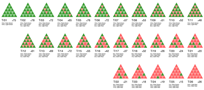
photo © David Kohn Architects.
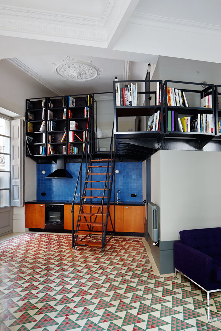
photo © Jose Hevia Blach.
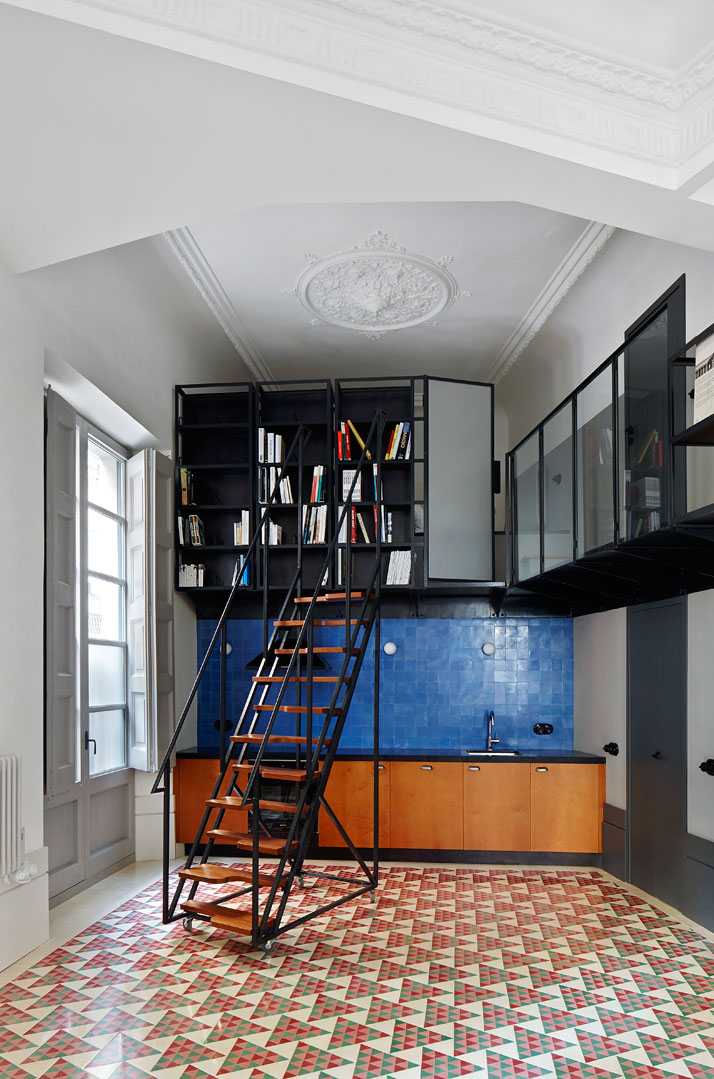
photo © Jose Hevia Blach.
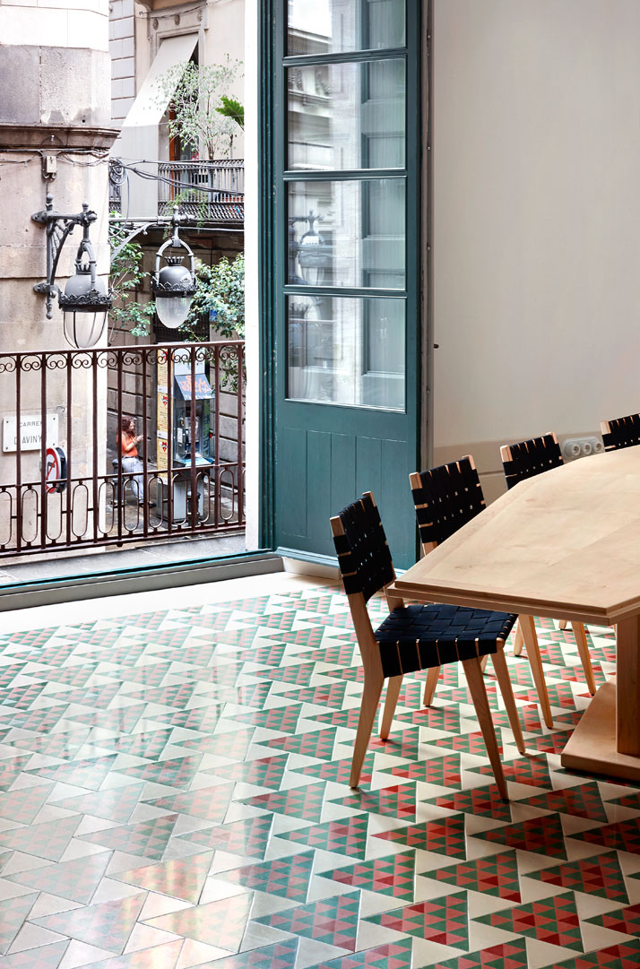
photo © Jose Hevia Blach.
The tiles - as mentioned before, a main feature - were ordered from Mosaics Martí, Antonio Gaudí’s supplier back in the day, and have been designed using 25 colours which progressively change throughout the space not only to maximise the illusion of space but also to create the necessary division of the brothers’ spaces without using anything rigid. For example, the custom designed dining table sits at one extremity, where the two lines converge and lead right outside onto the streets. Where the colours of the tiling are the most mixed, this reflects that this is one of the designated areas to be shared. The rest of the flooring maps out each brother’s personal space - one more red, the other leaning more towards green.
While there is a strong Art Deco feel to the apartment, the colours in the tiling are iconic of Catalan tiling, and act as a reminder of the apartment’s Barcelona location. Although the intricate attention to design doesn’t quite reflect Barcelona’s spirit, a city where most things seem to happen by accident, the small bedrooms set around a large central living area, do. Furthermore, making the most of the high ceilings has accentuated the mouldings that run across the ceiling, giving the space even more local charm. The downside? The design is linear and the lines masculine, perfect for its (male) clients and inhabitants but slightly colder than a Barcelona flat should be. Also, the rooms, on the small side, kind of recall basic boat cabins. However, the strength of David Kohn Architects, comes through in their ability to turn a Ciutat Vella apartment with a tight floor plan into a loft that says more Berlin than Barcelona with a healthy dose of that vibrant Catalan flavour to boot.
The INSIDE Festival judges’ debate concerned the overlap between architecture and interiors, and with this in mind, it isn’t hard to understand why the Carrer Avinyo apartment was chosen as this year’s winner. It’s an example of a typical blurred lines case where the space has had to be entirely rethought bringing the two disciplines together in terms of structural changes and brazen interior design.
David Kohn Architects is a British firm based in London that specialises in architecture and urbanism. Some of the practice’s most high-profile projects include A Room for London perched atop the Queen Elizabeth Hall, Southbank Centre, in 2012. DKA’s forte is its research into materials which results in each project staying very much in context with its location and cultural context. 2012 was an award-winning year for the firm as it took home RIBA, D&AD, Designs of the Year, New London and Condé Nast awards. David Kohn opened the firm in 2007, his associate, Tom McGlynn joined later on in 2010.
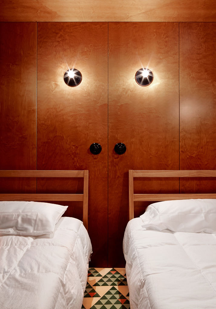
photo © Jose Hevia Blach.
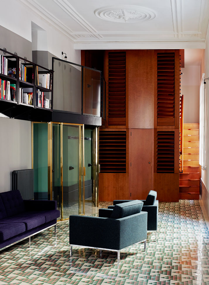
photo © Jose Hevia Blach.
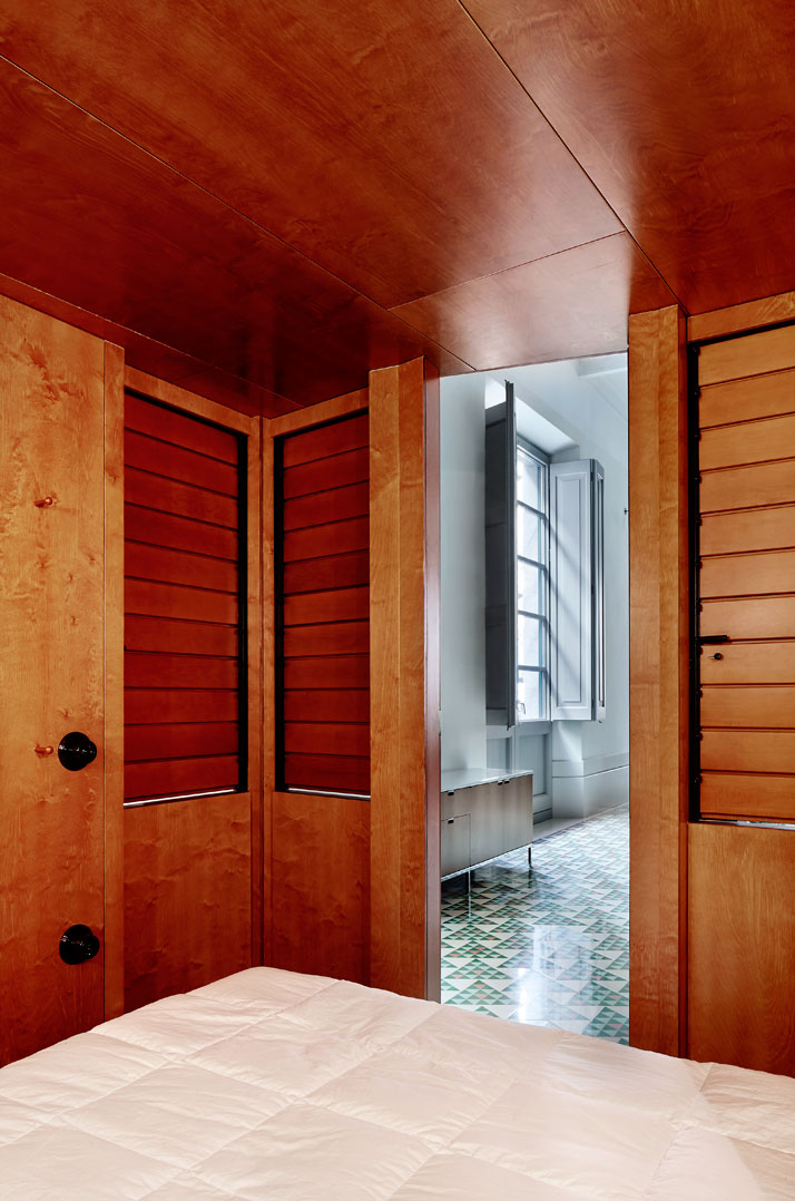
photo © Jose Hevia Blach.
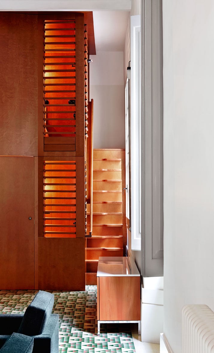
photo © Jose Hevia Blach.
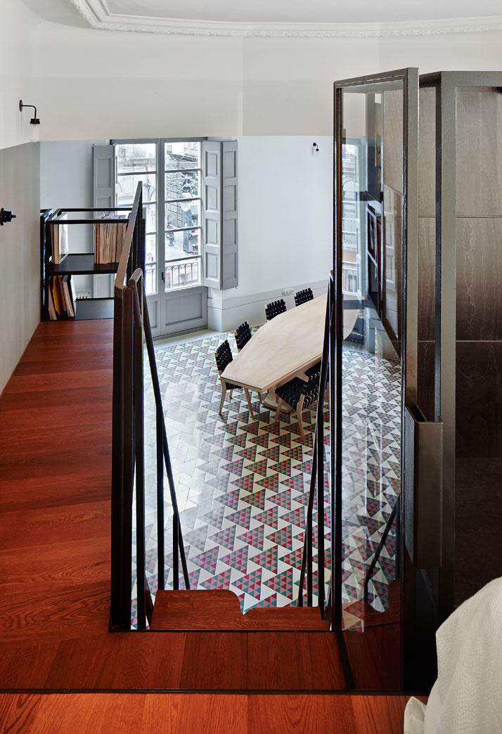
photo © Jose Hevia Blach.


