In Architecture We Trust!
Words by Tina Komninou
Location
Project Title: Capela de Santa Filomena
Location: Lugar de Netos, Ferreira-a-Nova, Figueira da Foz
Client: Câmara Municipal da Figueira da Foz
Arquitect: Pedro Maurício Borges
Assistants: Rita Curica, Tiago Hespanha, Vitor Canas, Filipe Ferreira
Structural Engineer: ARA – Alves Rodrigues & Associado, Lda (Eng. Fernando Rodrigues)
Watering Engineer: Rita Martins
Electrical Engineer: Camâra Municipal da Figueira da Foz (Eng. Antonino)
Construction: Andrade & Teles, Lda.
Project: 2004 - 2005
Construction: 2005 - 2008
photographer: Fernando Guerra, FG+SG Architectural Photography
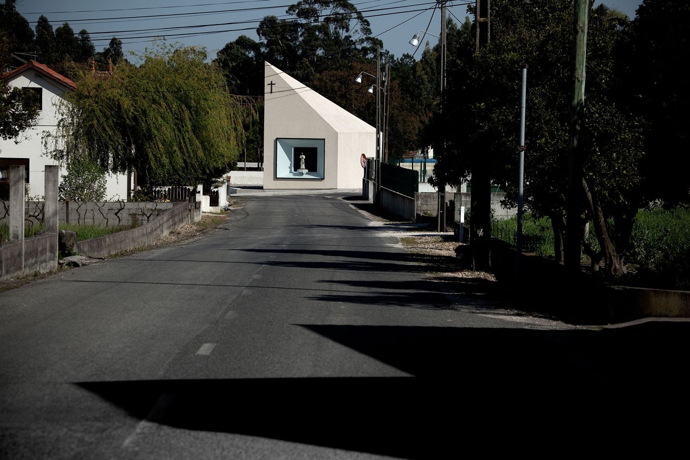
photo © Fernando Guerra, FG+SG Architectural Photography
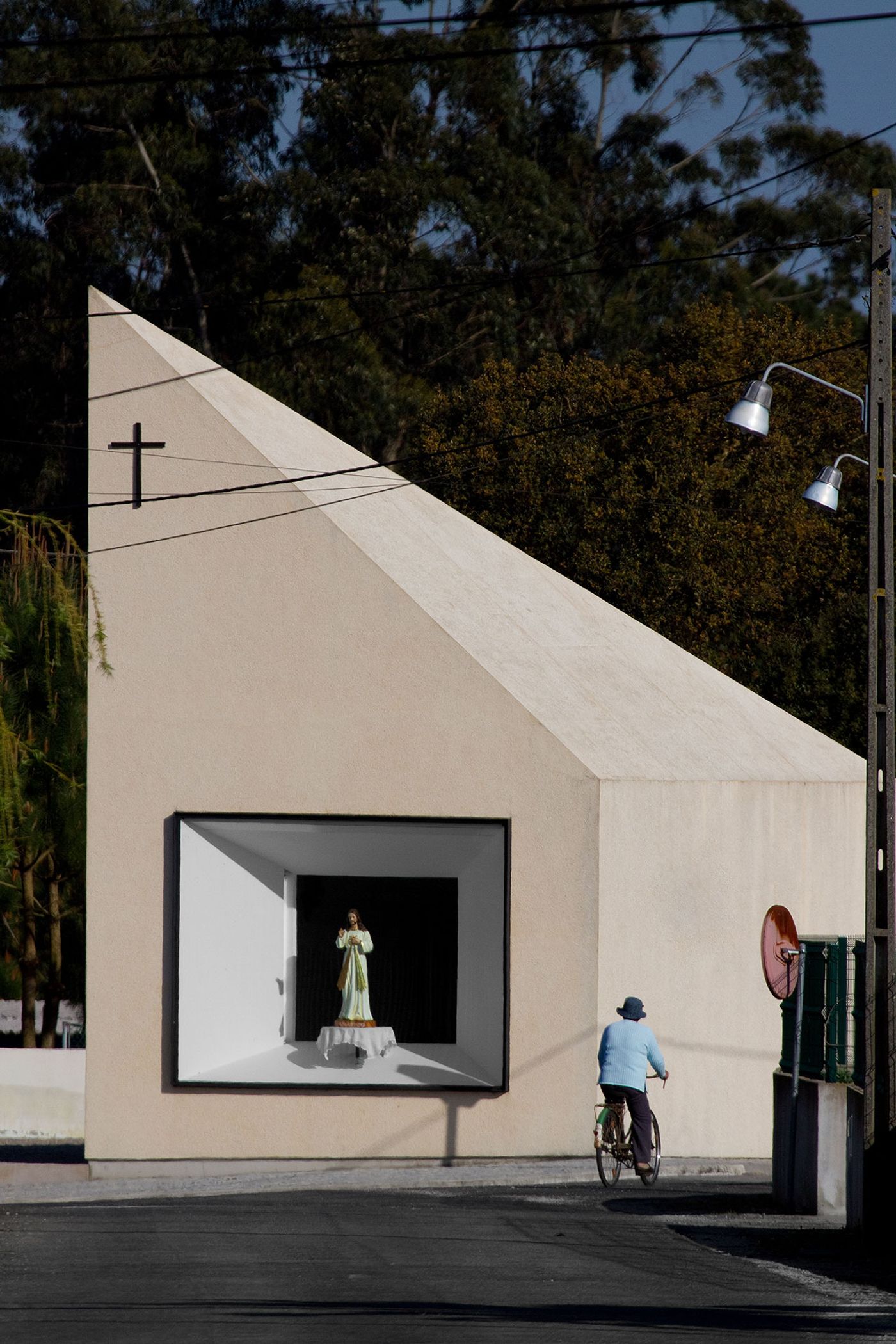
photo © Fernando Guerra, FG+SG Architectural Photography
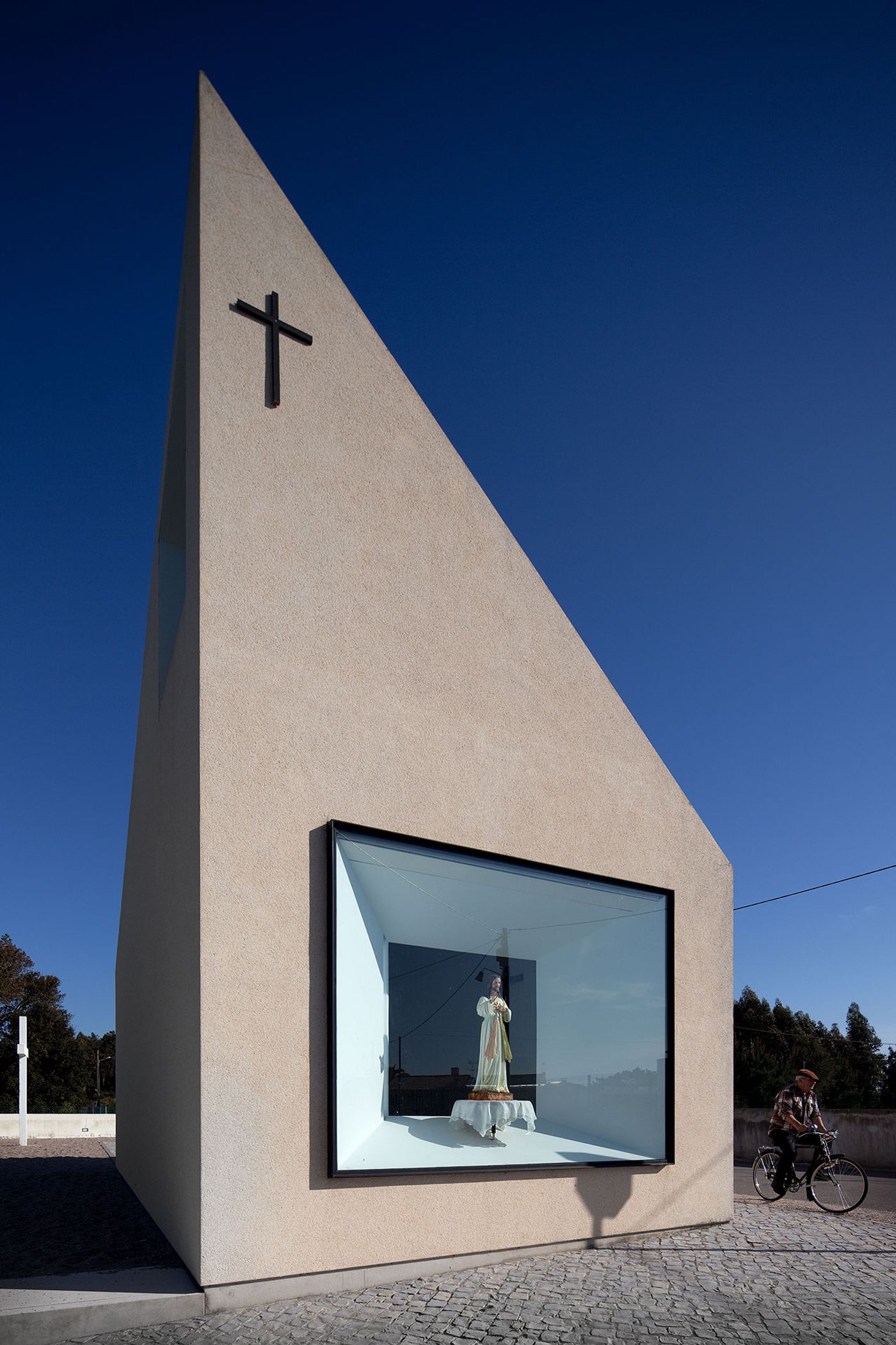
photo © Fernando Guerra, FG+SG Architectural Photography
In 2008 a spiritual modernity opened its doors in Portugal’s Figueira da Foz. The chapel ‘Capela de Santa Filomena’ was designed by architect Pedro Maurício Borges and it did not go unnoticed. A bold, sexy, angular and dominant structure in the middle of a suburbia type area were everything else stands still and pay their respects to this holy place of architecture.
Looking at this chapel from afar you cant help but say ‘ What is it and What is it doing here?’. It is as though you have spotted a ‘CHANEL’ store in the meat packing district. You are gloriously happy to have found it but keep thinking that you are hallucinating. This glorious feeling is instantly projected in this case by two factors. Firstly, the protruded angular shape of the building leading to the sky and secondly the simplistic façade finish which stands out from its surroundings. The actual structure is built on a sloping pavement, as if it has been dropped from the sky. A sloping surface towards either the underground or the holy over world.
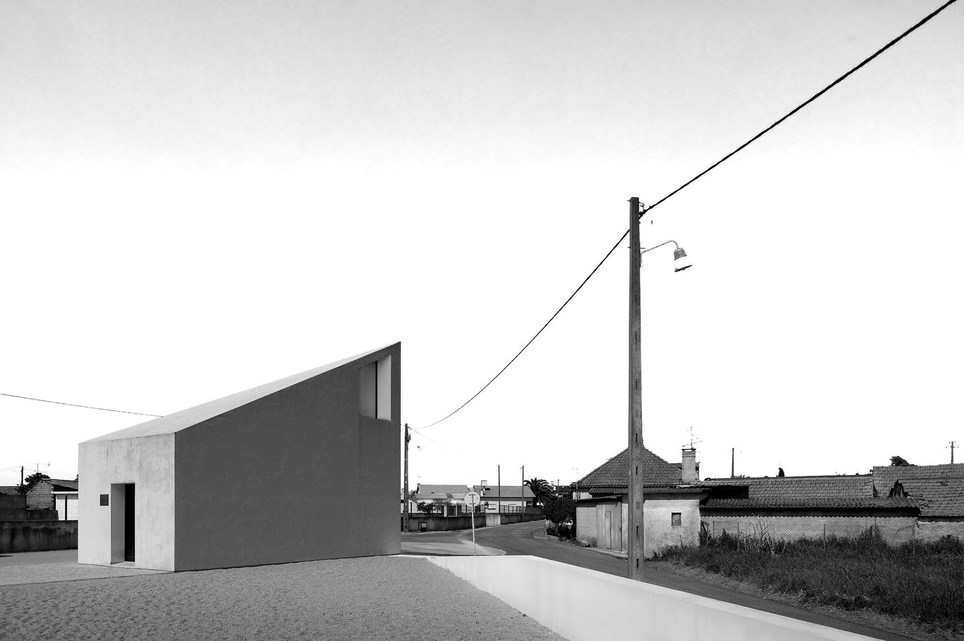
photo © Fernando Guerra, FG+SG Architectural Photography
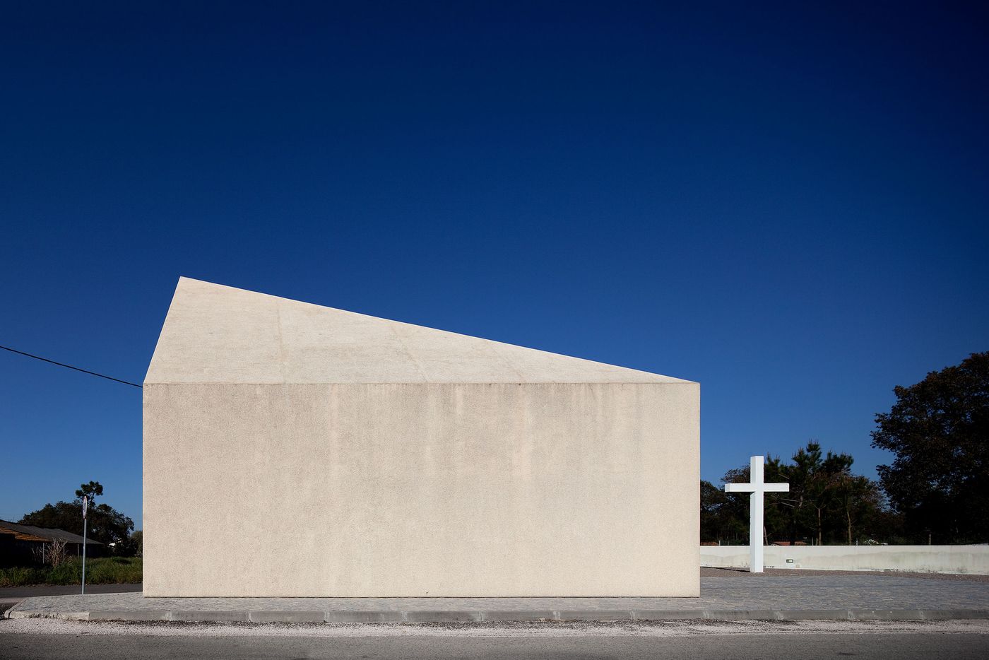
photo © Fernando Guerra, FG+SG Architectural Photography
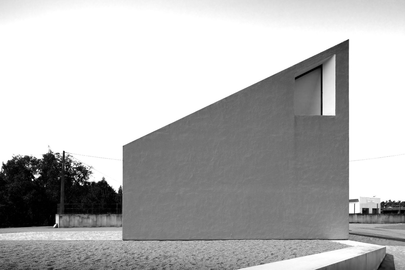
photo © Fernando Guerra, FG+SG Architectural Photography
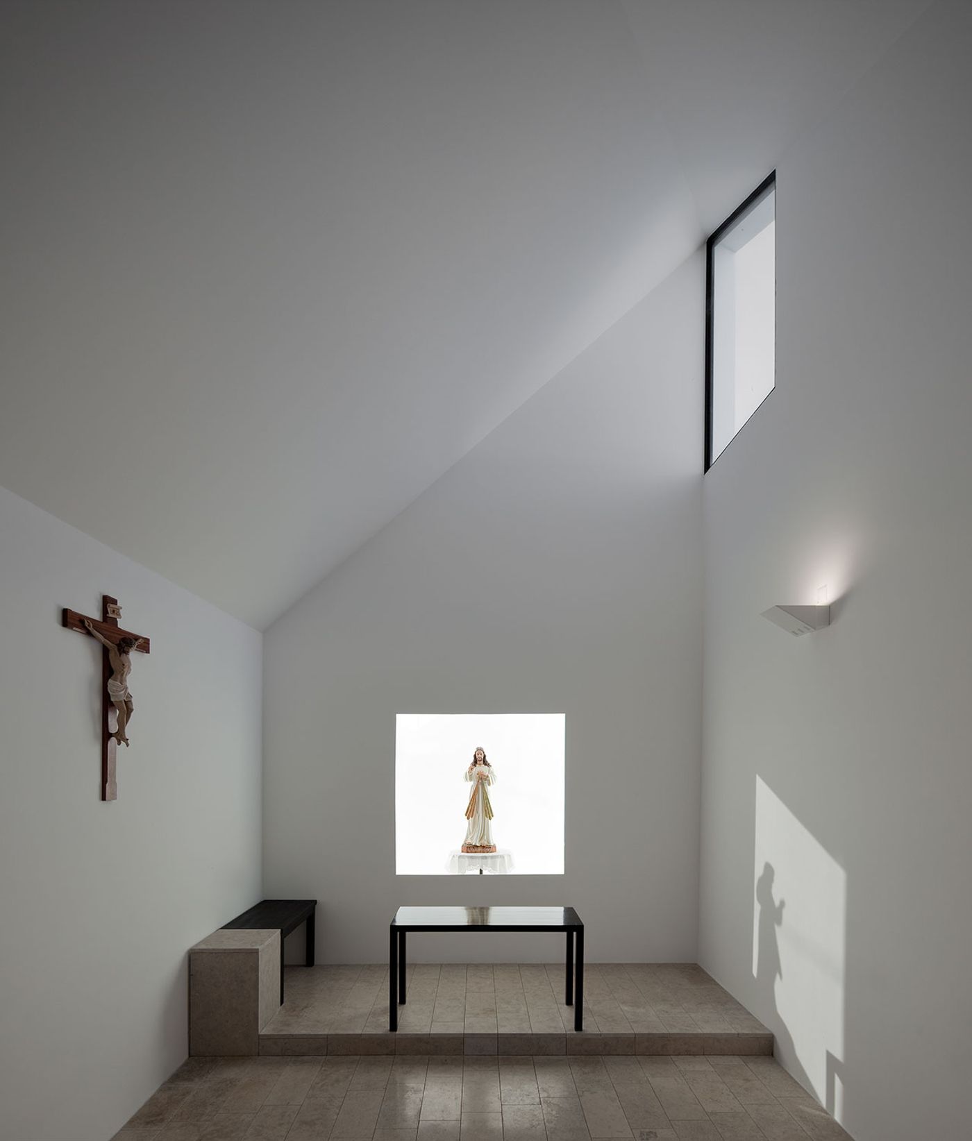
photo © Fernando Guerra, FG+SG Architectural Photography
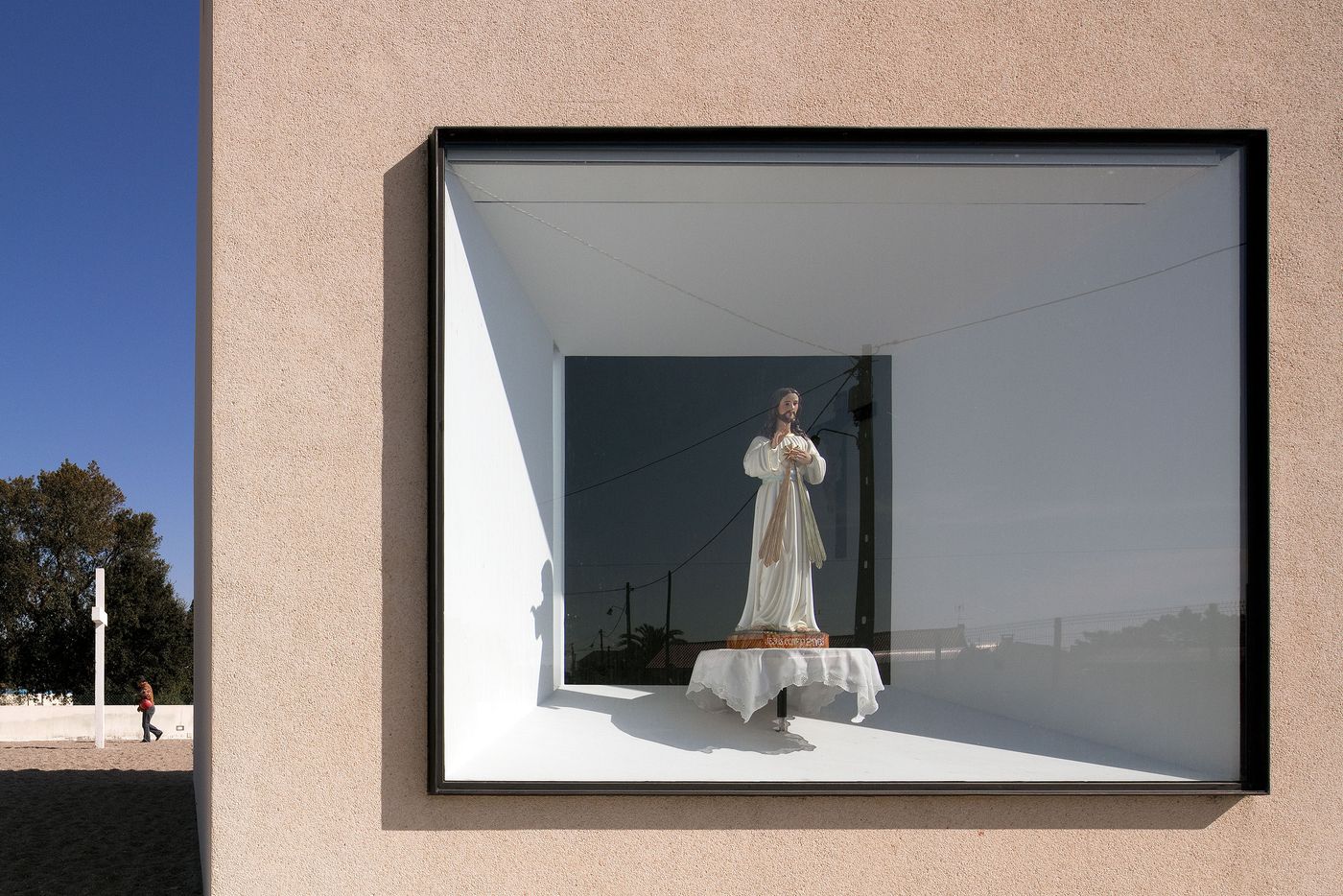
Consisting of just three openings (entrance and 2 windows) the main attraction is what we would call the rectangular display window. Clear cut protruding opening with a visible depth and one single powerful display that is understood worldwide. The window is perceived as a picture frame placed on the façade to attract and symbolise what this architectural brand stands for. This idea is made even stronger with the second window acting as a complete reverse. Here the frame is punched inwards from the exterior shell, bringing it levelled with the interior walls. A clear and contrasting approach between a protrusion of ‘In God we Trust’ to invite you in and an inset detail to express the respect and focus of the subject at hand.
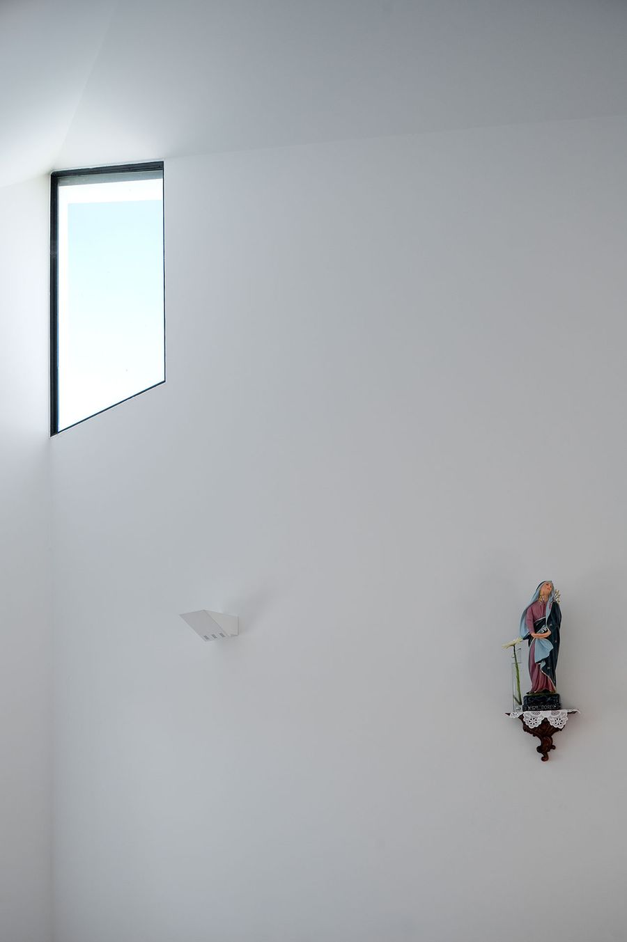
photo © Fernando Guerra, FG+SG Architectural Photography
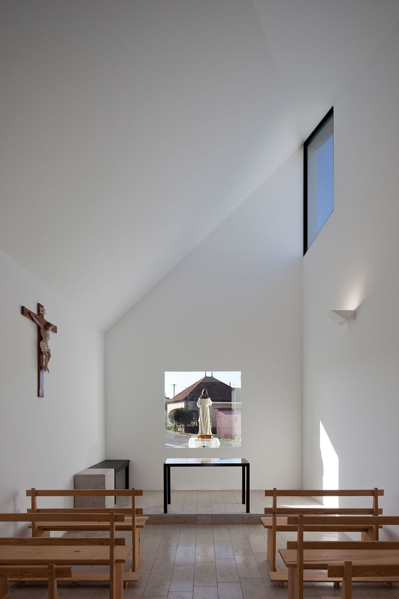
photo © Fernando Guerra, FG+SG Architectural Photography
Once inside, the simplistic and light essence is of prime importance. Clean cute, pure white, natural daylight directly form the nave with a black framed office desk and monasterial seating benches. Everything is discreet with a language of subtleness and openness. In an all white interior The Crucified Christ brings deeper meaning and certainly a more meaningful one. You know what you are here for you don’t need tassels, murals, and vitros to remind you that you are on holly ground. After all we are all here for the man in the window. The recherché that has invited you in and now will rotate around to face you and you will open your heart and soul to him without the feeling of judgement or betray. This comes easily in a chapel such as this. In a chapel were the divine light is entering from either sides of the holy figure in the window and you are left to admire and feel. The dramatic angular lines pointing towards the heavenly clouds through the upper window is a dynamic element filed with symbolism. One main attraction, one man show with many hidden meanings and a world of magic that you have never seen. What else can we ask for in order to enter.
This monument is a true factor in all that it stands for. No excess, no frills no pretend. A strong architectural approach to a strong belief. At the end of the day this is our equivalent religious hierarchy to that of a CHANEL store and we are ready to buy whatever is for sale. However what we want to buy comes with a powerful question ''Is the man in the window for sale?''.
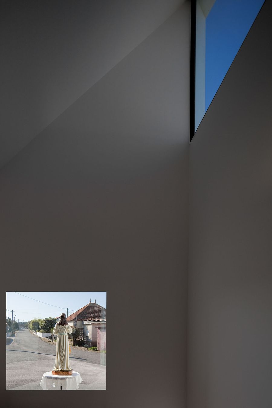
photo © Fernando Guerra, FG+SG Architectural Photography

photo © Fernando Guerra, FG+SG Architectural Photography
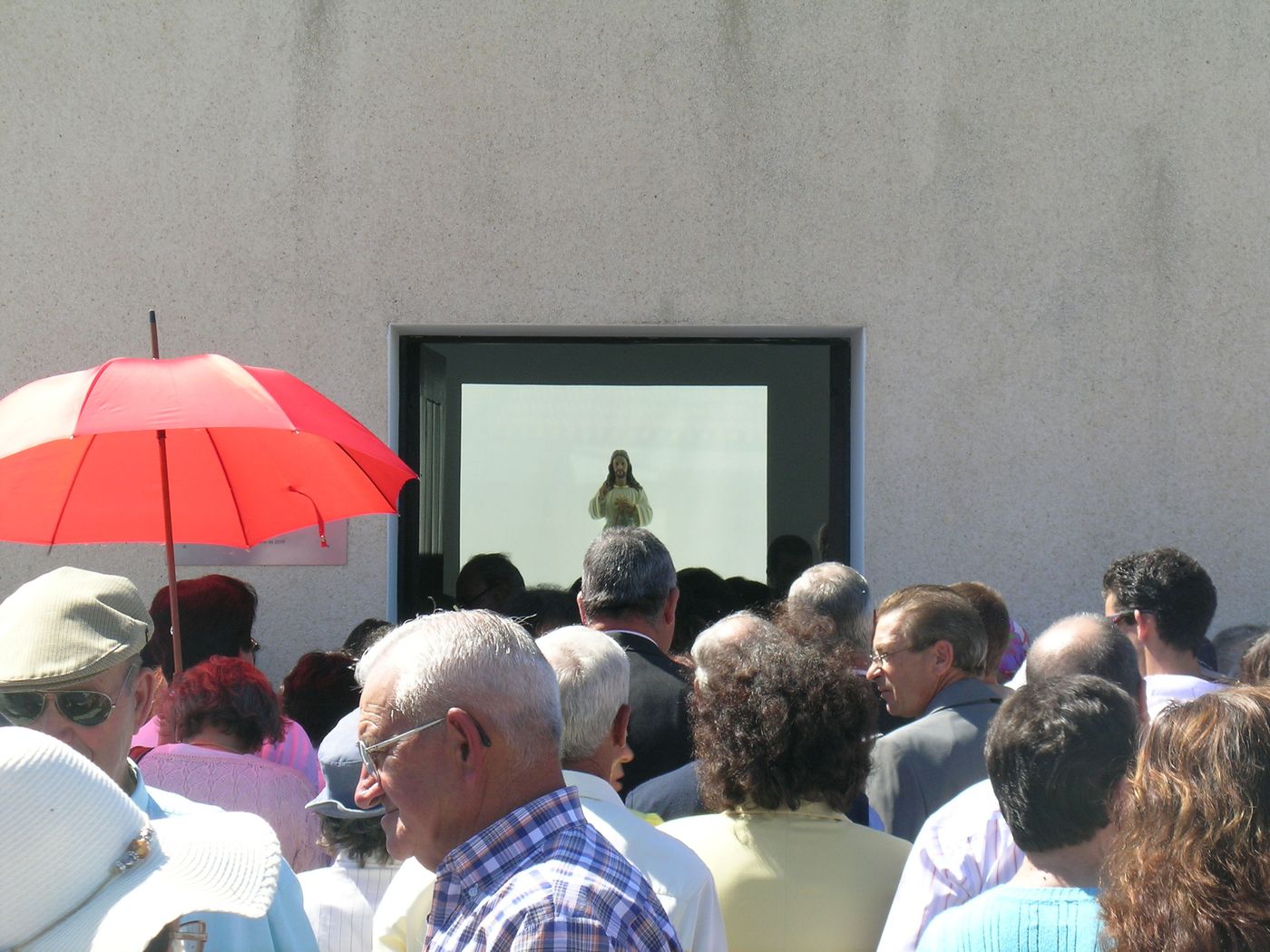
photo © Pedro Maurício Borges
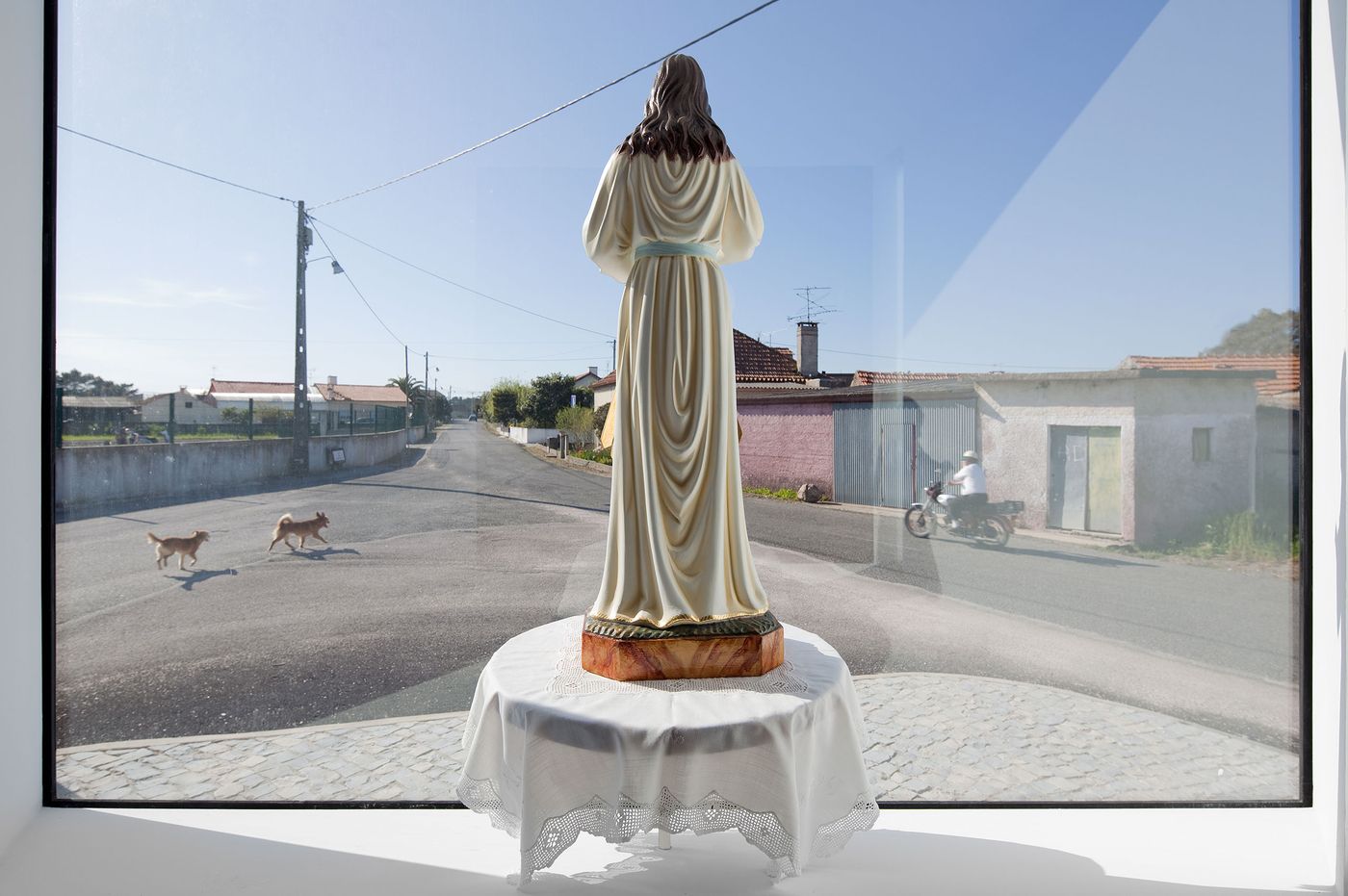
photo © Fernando Guerra, FG+SG Architectural Photography