Photo © 2009 Zooey Braun. All rights reserved.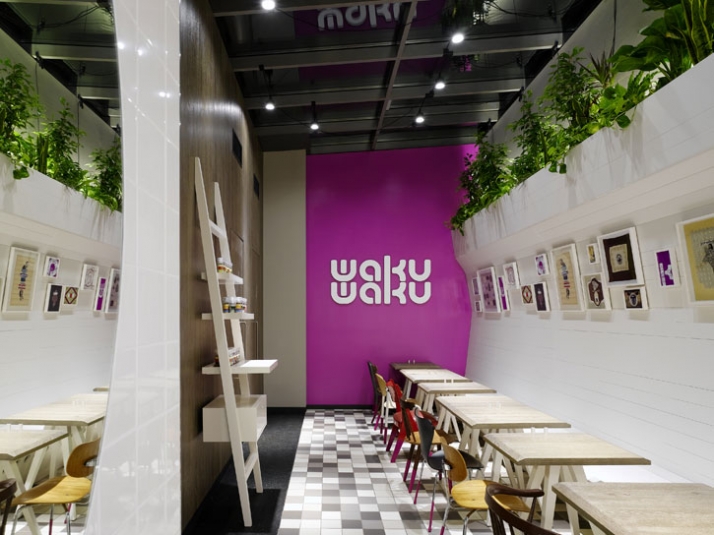
interior design by IF Group (Ippolito Fleitz group)
The opening of the first branch of the restaurant chain WakuWaku in Hamburg gives the starting signal for the company’s self-proclaimed revolution of the fast food sector. WakuWaku’s philosophy revolves around a consistently implemented concept of sustainability and good value, healthy food, which is prepared extremely quickly. The key theme of sustainability is realised in an undogmatic, creative and unconventional way. It is already inherent in the name: ‘Waku’ is Japanese and means stir-fried, cooking hot, and at the same time exciting and tantalising.
WakuWaku’s culinary approach pursues a front-cooking concept, which allows you to watch the cooks at work. All dishes are wok-based and prepared using only organic ingredients. Wok cooking makes it possible to prepare individual dishes very fast (in under 5 minutes); it retains the nutrients and aroma of the ingredients, and uses only a small amount of oil. The menu is also unconventional, offering classic Asian dishes alongside German culinary classics such as Currywurst and Tafelspitz.
The sustainability concept pervades the entire technical restaurant equipment – from energy-efficient kitchen technology, to the team uniform made from FAIRTRADE-certified materials, to economical hand dryers in the toilets.
Ippolito Fleitz studio’s task was to translate the principle of sustainability into an overriding architectural concept.
Photo © 2009 Zooey Braun. All rights reserved.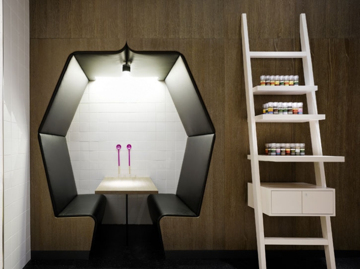
The restaurant is located in Hamburg’s city centre, in immediate proximity of the city’s town hall. The long, narrow space stretches back almost 17 metres into the building. In the rear half of the space, a glass roof admits daylight. The space is divided into two main zones: the dining area and the service area. The latter comprises of an order counter, kitchen and a take-away area as one unit, whose structural edifice acts as a room within a room. On entering the restaurant, the customer first encounters the narrow end of this box. It is painted a strong shade of violet – WakuWaku’s corporate colour – thereby creating a powerful upbeat and strong brand staging. Two digital menu boards suspended from the ceiling display the current menu and images of the food on offer in alternation. The design of the service unit signalises urbanity and speed, both trademarks of WakuWaku. The colourful, lacquered surfaces form a dynamic contrast to the expanses of stainless steel and the service counter, with its natural white, ceramic, mosaic tile surround. The intricate nature of the mosaic also represents the care and attention invested in preparing the fresh products.
Photo © 2009 Zooey Braun. All rights reserved.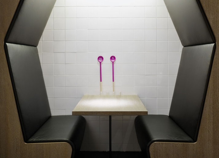
Once the customer has placed his order, he is given a wooden spoon with a 50 cm handle. Its bowl is painted in WakuWaku violet and carries the order number. The customer chooses a table and inserts the spoon in a special sheath on the table. The number on the spoon tells the waiters where to serve the order when it is ready.
The dining area makes a sweeping statement thanks to a floor-to-ceiling bench that runs the entire length of the room. It is constructed from wooden, FSC-certified planks in different sizes. These were nailed to the frame on the premises and then painted with an off-white paint, which strengthens the handcrafted impression. This effect is continued in the sentence that is inscribed in a spidery hand across the top of the bench unit: ‘Waku Waku’s Wacky Wholefood-Wok-Wonder Works Worldwide’, an alliteration that playfully and humorously reflects the multicultural menu as well as the international ambitions of the brand.
The bench wall forms a strong parenthesis and draws you into the depths of the space. It not only makes a powerful architectural statement, it is also a content carrier for WakuWaku: a gallery designed by Stuttgart-based artist Monica Trenkler unfurls across its entire length. In two and three-dimensional collages and pictures, she picks up on the typical WakuWaku leitmotifs, cites the colour palette of the brand, makes ironic side-swipes at fast food culture, the eco hype and our consumption mania, and evokes different associations on the general theme of food. The technique of collage is the perfect artistic counterpart to WakuWaku’s sustainability principle: here sourced objects are reused and recycled into something new. A monitor housed within a frame is also integrated into the gallery. It informs the customers about the world of WakuWaku and current special offers. At the far end of the space, a wall painted in the corporate colour displays the logo in a prominent position and serves as an effective conclusion to the space.
Photo © 2009 Zooey Braun. All rights reserved.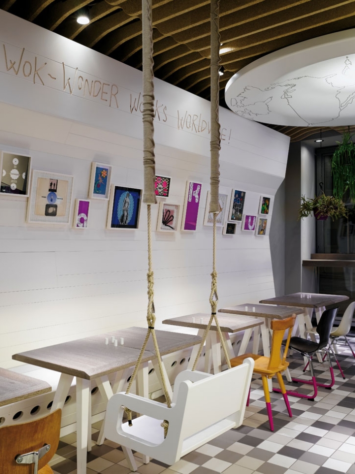
Facing the long bench is a row of tables for two, which can be flexibly grouped together when needed. Wooden table tops with bevelled edges are mounted on white steel trestles. Their brush-finished surface gives the tables exceptional tactile properties. The formal severity of the long bench is broken up by chairs of many different origins, forms and colours. From living room chairs, kitchen chairs and design classics from the flea market, to mass production seating from the gastronomic wholesaler – their sheer variety creates a friendly impression and their individuality enlivens the room. And no matter whether wooden legs or metal tulip base – all the chairs’ legs have been dipped 20 cm into the typical WakuWaku colour, which serves as a connective element. The WakuWaku philosophy is already evident in the recycling principle of using vintage furniture, while the colourful chair legs turn every chair unmistakably into a WakuWaku chair.
The row of chairs is interrupted in one place by a swing hanging on a fabric-covered frame from the ceiling. It awakens childhood memories – of your favourite meal at your grandmother’s house perhaps – and is the perfect location in the restaurant to while away a dreamy hour.
Photo © 2009 Zooey Braun. All rights reserved.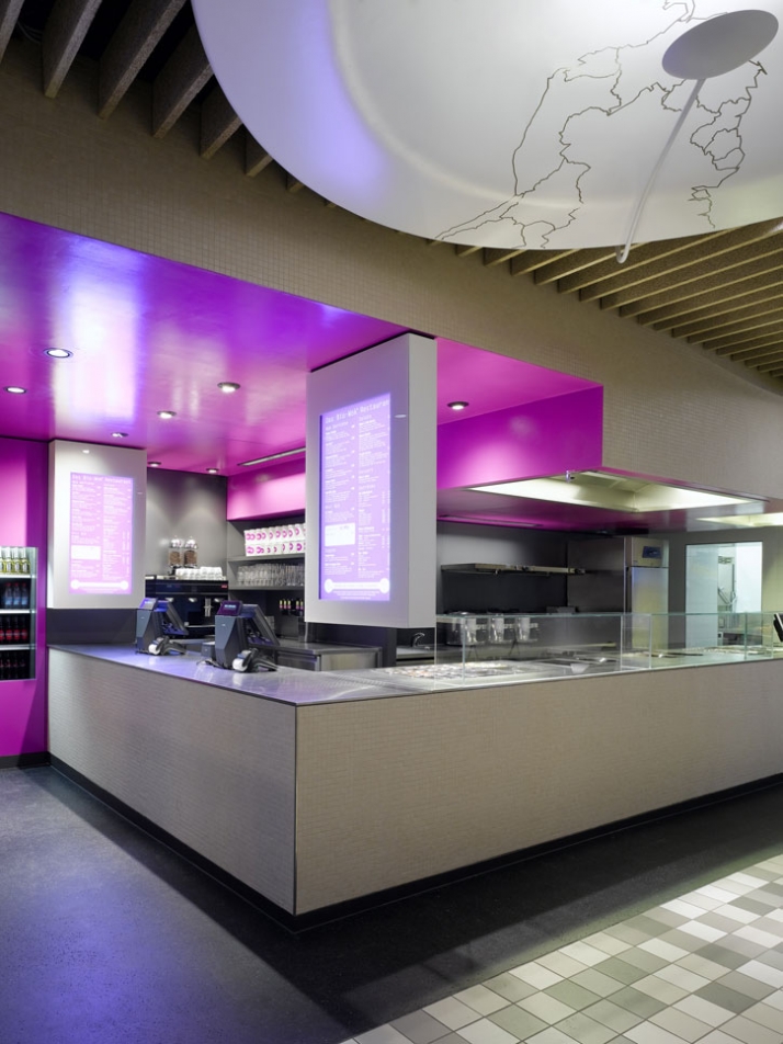
The dining area and the service area stand at completely opposite ends of the spectrum. The kitchen area and the digital technology employed for the order counter are trimmed for speed and are the epitome of a modern, urban lifestyle. The dining area, with its various elements from an ‘analogue’ world, provides a strong contrast and slows down the mood, conveying a cosy farmhouse kitchen feel. The special character of each area is underscored by the flooring. The grey, polished asphalt floor in the service area creates a businesslike and functional effect, whereas the pixellated mosaic of grey, beige and natural white, stoneware tiles in the dining area creates a more cosy feel.
Photo © 2009 Zooey Braun. All rights reserved.
The width of the space tapers at the transition from the kitchen to the rear dining area. A round mirror folds itself around the corner of a white, tiled wall. It fulfils a range of functions by visually guiding the eye towards the rear dining area, dissolving the corner and making the whole room appear larger at the same time.
The rear restaurant area has a particularly snug and welcoming ambience. This part of the space was once a courtyard and is now contained beneath a glass roof. Under the glass roof, a row of plants grows out of the rear wall, forming a living part of the furnishings. And even though an automatic watering system takes care of nourishing this small jungle, the greenery serves as a subtle reminder that natural resources need careful handling, care and attention.
The wall opposite the long bench is wooden panelled right up to the ceiling. It conceals the toilets, which can be accessed through doors marked with discrete chalk lettering. An alcove containing a table for four is inset in the wall and offers a more intimate dining situation. A ladder is leaned against the wall next to the alcove: WakuWaku’s ‘pimp station’ offers you a range of organic spices so you can spice up your food according to your personal taste.
Photo © 2009 Zooey Braun. All rights reserved.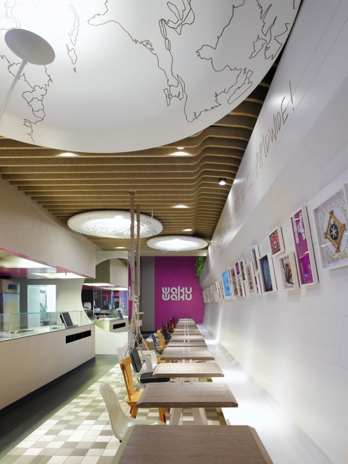
The ceiling in the front area is formed by a series of vertical, Herakustik lamellae, behind which the air conditioning, lighting and speaker system are concealed. The ceiling construction is cut away above the long bench, thereby underscoring the impact of the latter. Three oversized disks of varying dimensions are illuminated by means of spoon-shaped lighting spots and help direct the eye along the ceiling towards the rear of the space. The disks show a map of the world where Hamburg is marked with a pink dot as the very first WakuWaku location, a self-deprecating reference to the company’s global ambitions and the international nature of its cuisine.
An innovative lighting system, consisting of specially made energy-saving, LED spotlights, which dynamically adapts the lighting tone to the daylight situation, is integrated in the ceiling. As a result, the restaurant is perfectly lit at any time of day and WakuWaku always appears inviting from the outside and atmospheric inside.
Photo © 2009 Zooey Braun. All rights reserved.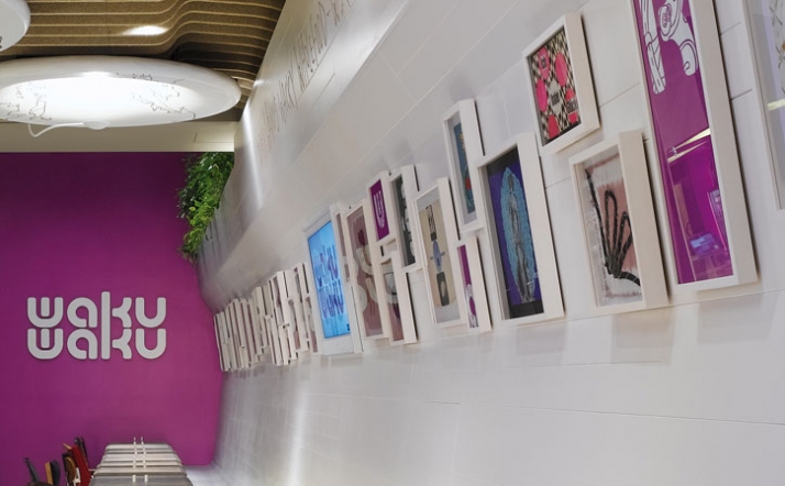
Photo © 2009 Zooey Braun. All rights reserved.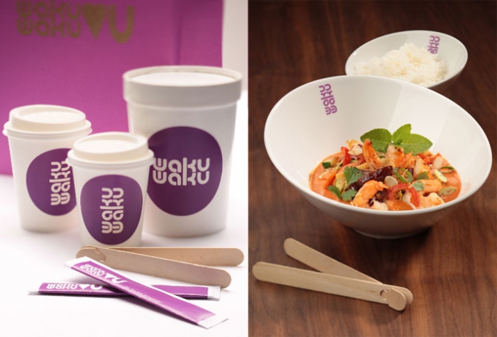
Photo © 2009 Zooey Braun. All rights reserved.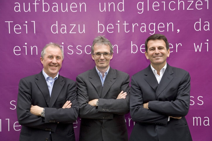
The founders of WakuWaku:
Pascal Le Pellec, Gregor Wöltje, André Lacroix / Photo © 2009 Zooey Braun. All rights reserved.
______________________________________
More Ippolito Fleitz group's posts at Yatzer :
Recent Articles

Palazzo Citterio: A New Chapter in Milan’s Cultural Landscape


